Sherry
Sometimes, it can be challenging to find the right structural design to make your UI look functional and meet basic user experience requirements. For that, it can be time-consuming to optimize one component and then find that it doesn’t fit accessibility requirements or give that pleasing aesthetic look.
However, Google has chipped in and helped designers massively by educating them on various design principles and providing extensive documentation on how to get designs nailed on as your brand should be.
In this blog, we will review the Google design system—focusing on Material Design and understanding key takeaways of a proper UI design.
Part 1. What is Google's Design System Called?
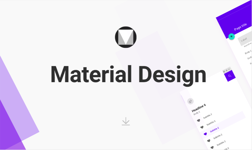
In 2014, Google introduced a design language called Material Design—an open-source ecosystem with design guidelines that improve the overall real-world experience. Whether designing for Android or iOS, its guidelines and principles guide designers to design a UI that users can trust and closely associate with that of a big brand like Google.
Then seven years later, in 2021, Google introduced a new concept known as Material You—which focuses more on the personalized aspect as technology keeps improving each year, and everyone prefers personalization in their devices.
Part 2. Material Design: An Overview
Here are some key takeaways from Material Design’s extensive outline of design principles:
1. Color system
Material Design’s color system believes in a color theme that must be consistent and meet the overall user experience. It has a color palette generator where designers can find the best color combinations for their UI design. In a nutshell, the color theme must help you reflect your brand or style. Moreover, it should meet WCAG accessibility requirements such as text legibility, color contrast, etc.
Here are different color hierarchies to apply color in a UI in a meaningful manner:
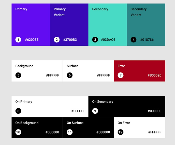
- Primary color: The color that makes up or displays most frequently in the UI. Making use of its dark and light primary variants can help create consistency.
- Secondary color: It is the accent color that helps to distinguish the UI even further. The secondary color and its variants should be applied strategically in smaller portions of the UI.
- Surface color: It is the color that is present on surfaces of various components such as cards, menus, and sheets.
- Background color: The baseline color in the background behind the content.
- Error color: These are usually used to indicate error states such as invalid text or other edge cases.
- On colors: They refer to the color elements displayed on top of surfaces of the different color hierarchies discussed (primary, secondary, surface, background, and error color).
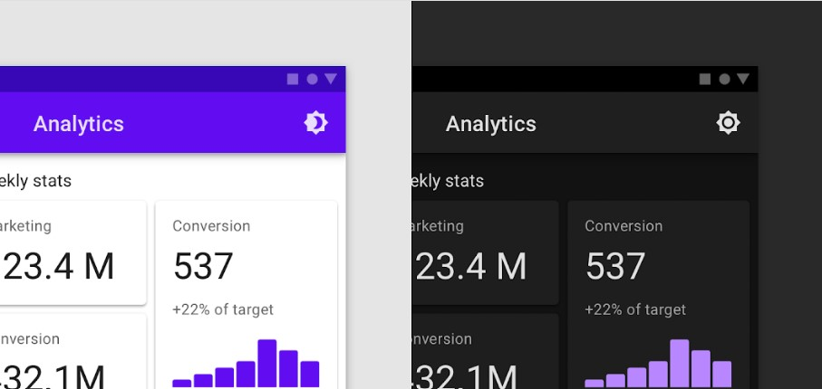
In addition to that, it also supports generating dark themes by illustrating guidelines to improve its aesthetics, applying the right color combinations, and enhancing accessibility.
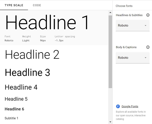
2. Typography
In Material Design, typography is based on a type scale. A type scale is a visual hierarchy of text styles that can be used in different circumstances in a layout. Material Design has your back with a type scale that has around 13 different type styles—each having its unique characteristics and applicational usage.
Each component’s typography belongs to its category. For instance, the text on the button belongs to the button typeface category, or the body text or copy in a UI belongs to the body typeface category. As a result, changing one typography of a component can affect other typography styles in the UI so that they bode well with user guidelines.
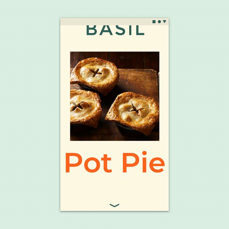
3. Shapes and icons
Material Design makes use of different shapes and icons. Shapes and icons are necessary to direct attention and express the brand in a UI. Imagery should be utilized to tell a story and reflect your message in the UI. Material Design states guidelines to improve visual hierarchy by optimizing the right kind of shapes in an interface—even if it is static shapes or motion shapes.
When it comes to icons, Material Design has distinguished them into three types—Product icons, system icons, and animated icons.
- Product icons are those icons that visually express the brand’s product and services.
- System icons illustrate common actions, files, and directories.
- Whereas, animated icons express actions on an icon that can add a pleasurable experience and grabs attention.
The icons are inspired by Skeuomorphism—which utilizes icons that mimic real-life objects. For example, an envelope icon indicates email.
4. Sound
Sound can help in communicating information to enhance the user experience. In Material Design, sound is distinguished into three types—sound design, music, and voice.
- Sound design is how the majority of the UI is expressed visually. This includes associating sound with a particular UI element, notifications, and implementing other actions in an interface.
- Music should be utilized for setting the mood and expressing storytelling. It should evoke emotions in context, provide pleasure, and express the message effectively.
- Lastly, voice and text-to-speech help to utilize spoken language for communicating various information. Voice can help communicate complex pieces of information and add personality to the UI.
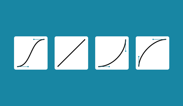
5. Motion
Material Design conveys that motion helps in making the UI more expressive and convenient to use. It highlights key actions of UI elements and grabs focus in transitioning. When it comes to icons and illustrations, adding animation is a playful way to enhance the user experience. In situations involving feedback and status, motion helps indicate the timely response of the interface actions.
In Material Design, the motion system emphasizes transition patterns between components or full-screen views. The four transition patterns are as follows:
- Container transform: It is a transition pattern designed for interactions between UI elements that include a container. For example, when a particular card expands into a separate page.
- Shared axis: These are transitions between UI elements that have spatial relationships. They share a transitional pattern across their x, y, and z-axis. For example, when you tap next in a UI workflow, both the outgoing and incoming pages will move in the same direction—thus perceiving the elements are related.
- Fade through: This transition is triggered by tapping a UI element, and it will fade through a pattern. Utilizing fade-through is a fine choice in navigating to other components or tasks that may not be related to each other.
- Fade: Lastly, the fade pattern helps in UI elements entering or exiting the screen. For example, the most common instance is having dialogs or menus that fade in and out of the screen view.
Learn the Fundamentals with Google Design System…
The Google design system has helped many designers save time and ensure they meet every user-based requirement in their designs. Material design is a valuable open-source ecosystem that many designers should refer to and get inspiration for implementing quality designs. When bringing these designs to life or collaborating on Google-inspired projects, Pixso is a remarkable tool, offering features blending well with the creative process to help designers work more efficiently.
With Material You — focusing on more personalization — underway, it can only help designers adapt to the current climate and add more personalized techniques to their UI.
![[2025] Best UI Animation Tools](https://cms.pixso.net/images/articles/ui-animation-tools.png)