In graphic design, alignment is crucial to make the work visually appealing to everyone. It is an invisible spine that provides support to design elements and arranges them in an organized way.
In this blog, we will explore more about alignment in graphic design — its importance and principles. Also, we will go through some examples. Let’s dive in then, shall we?
Part 1. Definition and Importance of Alignment in Design
What Is Alignment in Graphic Design
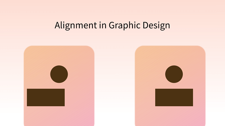
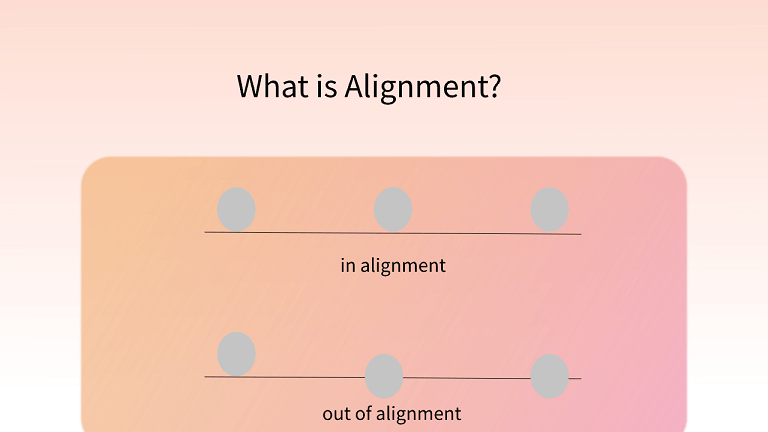
Alignment is an invisible line that ensures the design stays in place and organized. Imagine a library where you see a pile of books not stacked on the shelves properly and all over the place. Or a crowd at the supermarket who are not in a queue and are rushing together towards the cashier. All these looks and sounds chaotic because there’s no order.
When you introduce alignment in these two situations, you will see books neatly stacked on the shelves and the crowd forming a neat queue waiting for their turn at the cashier. There’s now an order thanks to alignment. In graphic design, it is crucial to align elements that complement each other and makes them pleasing to look at.
Why Is Alignment Important in Graphic Design
Alignment is an important design principle because it gives consistency to the work. Even big brand names use alignment to add an aesthetic touch to their logos. Designers usually apply alignment in text, images and shapes to achieve various visual effects.
In a nutshell, effective alignment contributes to:
- Better organization and structure
- Better user experience
- Contextual connection
- Aesthetic appeal
- Harmony
Part 2. Types of Alignment in Design
In design, the alignment is divided into two major types:
1. Edge Alignment
Source: 254 Online
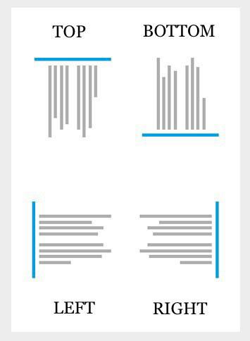
Edge alignment is the positioning of the content towards the edges of the page. It includes aligning content towards the left, right, top, and bottom. On web layouts, you see them used in arranging body texts and menu items.
Content aligned from left to right, or vice versa, can be called a horizontal alignment. Likewise, content aligned from top to bottom, or vice versa, can be called a vertical alignment. Moreover, justified alignment involves placing the left and right sides of text/images against a straight invisible line.
2. Center Alignment
Source: 254 Online
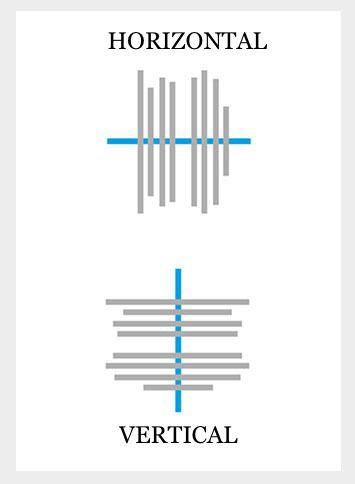
In center alignment, the invisible line is drawn down the middle of the content or elements. Thus, the arrangement is aligned more centrally. It can include horizontal center alignment and vertical center alignment. On web layouts, you see this commonly used in big headings to grab the user's attention and in many logo designs.
Part 3. Principles of Alignment in Design
1. Use Hierarchy
In a design, the importance of elements differs from one another. That's why you need to show the hierarchy in the work. Generally speaking, experienced designers will apply different types of alignment to accentuate the centeral composition.
2. Pay Attention to the Harmony
This principle seems to contradict the previous one, while the truth is not. Balance is vital in any form of art, graphic design is no exception. Design is the work focusing on the whole effect. So when you apply a method, like the hierarchy, you can not ignore the harmony among all elements.
3. Take Advantage of Contrast
Using contrast can help you keep the balance between hierarchy and harmony. And this method is always applied when you have more than 1 points to focus on. In this case, you can use the color contrast as well as alignment contrast in 1 interface. For example, using both the text-left and text-right alignment to tell users that the contents of both sides are important.
4. Leverage Repetition
Again, this principle seems to disagree with the previous one. However, as the most frequently used rules in graphic design, repetition plays a vital role in alignment as well. By applying the repetition, you can make the dsign tidier and neater.
5. Leave Room for Imagination
It is known to all that less is more, which is the same in alignment. No matter what you design and which method of alignment you apply, the final work should not be crowded. Some space should be left for simple beauty or the user's imagination.
Part 4. Examples of Alignment
1. Uniform Alignment
Source: 254 Online
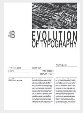
In this example, you can see this is a three-column layout with texts neatly aligned. The repetition of 1 alignment makes the whole interface simple and clean.
2. Mixed Alignment
Source: 254 Online
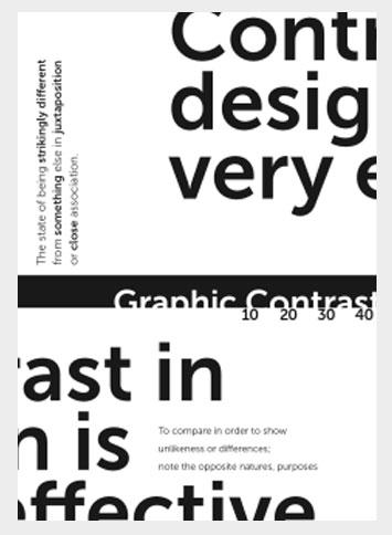
In this example, you can see a mixed variety of alignments. There is a contrast in some of the alignments and texts. Despite that, it still adds some balance to the design and looks appealing. You can see the wonders you can do with mixed alignment in it.
3. Helpful Grid Lines
Source: 254 Online
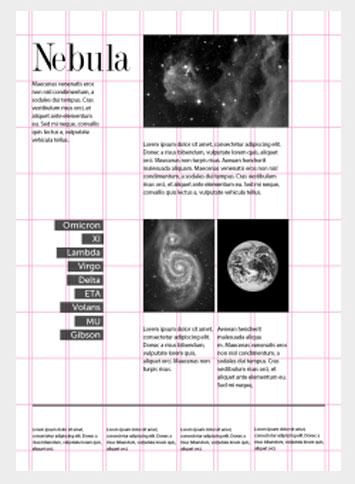
Nowadays, design software provides invisible grid lines which can help designers align text, images, and other design elements in a well-organized way. And sometimes you can also visualize these lines to create an unique style. In the above image, you can see how grid lines assist in positioning the content elements and arranging them neatly.
A Top-notch Design Tool for Better Alignment
Now you know all the basic knowledge of the alignment. So how can you apply these principles better? The answer is using a high-quality design tool.
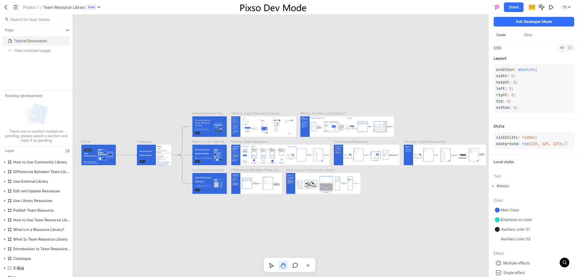
Pixso is a collaborative design tool which is equipped with excellent alignment tool. With it, you can freely use the alignment grid and auto layout to help you arrange all elements in the way you want. Besides, it has many other smart tool like absolute position, prototype animation and more. We can say it is the really all-in-one design tool that aids you in the whole workflow.

Besides, Pixso boost the real-time collaboration and easy access. No need to download anything, you can log into Pixso at any time and any place as long as you have the network connection. And you can work with your mates via various methods like real-time comments and link delivery.
Just go to its official website and give it a try!

