Scott
Color makes your designs come to life. Using color doesn’t simply mean using what you can find. It is all about strategy and some color combinations won’t go well on some occasions. But to make sure you are utilizing the right colors, you will need to stay up to date with the current climate.
Color trends give a sense of direction and ensure designers utilize the right colors that fit their brand. This blog will show you 10 inspiring color trends that you can use and also discuss why you should take these trends seriously in the first place.
Part 1. Why Color Trends are Important?
The psychology of color is fascinating. From a marketing standpoint, it helps to attract prospects especially when the colors are tailor-made for your message. Colors find a way through the emotional part of our brain and this makes it incredibly important for designers and marketers to adopt the right colors for their brands.
The market keeps changing and customer preferences keep changing as well. Color trends help to stay up to date with the ever-changing market and attract more users or prospects. For designing UI, keeping up with color trends help to drive more inspiration and effective designs that give users a pleasurable experience.
Part 2. How to Choose the Right Colors for Your Brand?
Before learning more about modern-day color trends, it is essential to understand how you can choose the right trends for your brand and projects. Here are a few steps you will need to consider first before utilizing the color trends you find online:
Step 1 - Define your audience
Conducting extensive research and defining your target audience is important. Then you will know the right color combinations to target. If you are targeting a female audience, then you will require to incorporate color combinations involving mostly red or pink. If you are target audience is senior citizens, then use majorly cooler colors—especially blue.
Step 2 - Research your industry
While you are researching your audience, it is equally important to analyze your industry. Different industries have different customer segments and you will need to understand which color trends work best in specific industries. Luxury products require more elegant color combinations while children's products can incorporate a more friendly and enjoyable vibe to their color set.
Step 3 - Reflect your brand value
Another important factor to consider is ensuring the colors align with your brand values. This is crucial when it comes to incorporating them into your marketing materials. It has to stay consistent in most parts like how Coco-Cola makes use of its red, white, and black combination and how McDonald’s makes use of its yellow primary color. Give them a consistent color style guide to make them think of your brand instantly.
Step 4 - Formulate a marketing design
You generally use color trends in your advertising and marketing designs. By having a design template plan ready, you can incorporate color trends in places where you need conversions. This includes your landing pages, social media posts, email marketing flyers, and other marketing materials. You can utilize the right color combinations that work for you and that get the best conversion rates.
Part 3. Top 10 Color Trends
1. Calming Coral - #E9967A
Source: Shutterstock
y the calming coral. This pastel goes well with most design works and is ideal for your marketing designs. It is muted and expresses warmth and peace.
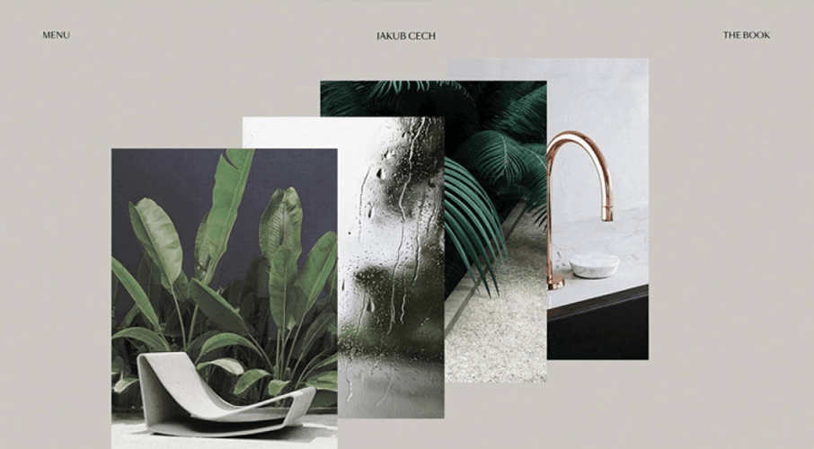
2. Grey-Green - #5E716A
Source: Dribbble
As more customers are conscious of their environment, there is a wide appeal to a color palette that depicts nature. This gray and green combo provides elegance and a theme of natural harmony.
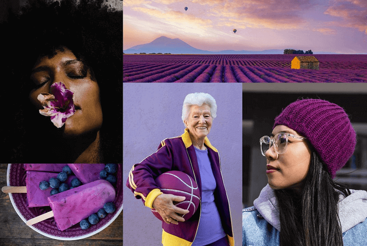
3. Velvet Violet - #80008
Source: Shutterstock
Purple is a fine color but Velvet Violet screams for attention. It dominates anything you use them for—name it marketing designs, UI designs, etc. It is flamboyant and has a touch of elegance in it as well.
4. Warm Neutrals
Source: KIMP
Warm neutrals provide a fine choice for your marketing designs and other artwork. It isn’t energetic by nature but provides a soothing feel and professional outlook to your designs.
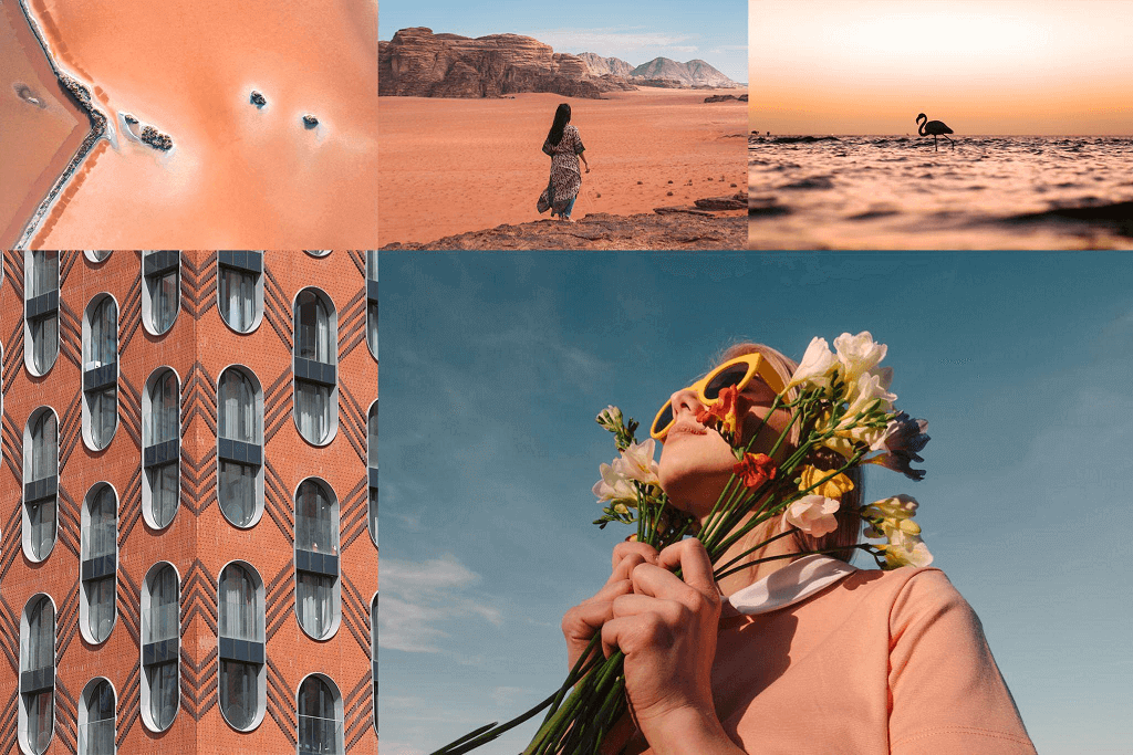
5. Pacific Pink - #DB7093
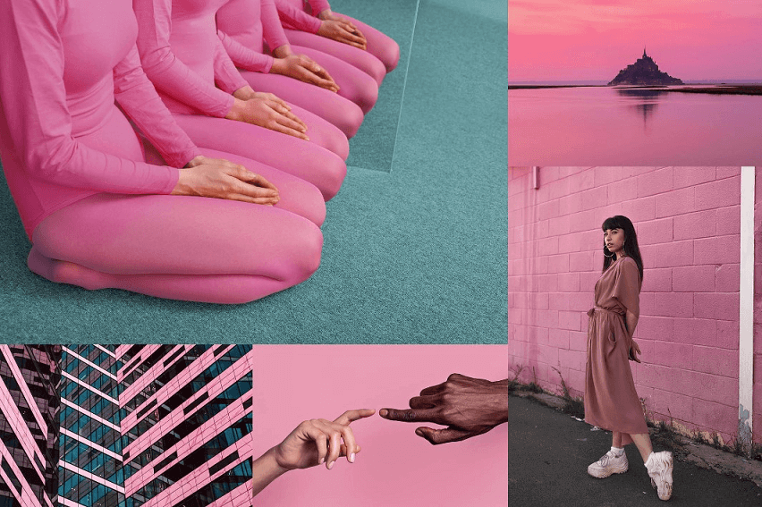
Source: Shutterstock
First up on the list is the breathtaking or should I say the calming coral. This pastel goes well with most design works and is ideal for your marketing designs. It is muted and expresses warmth and peace.
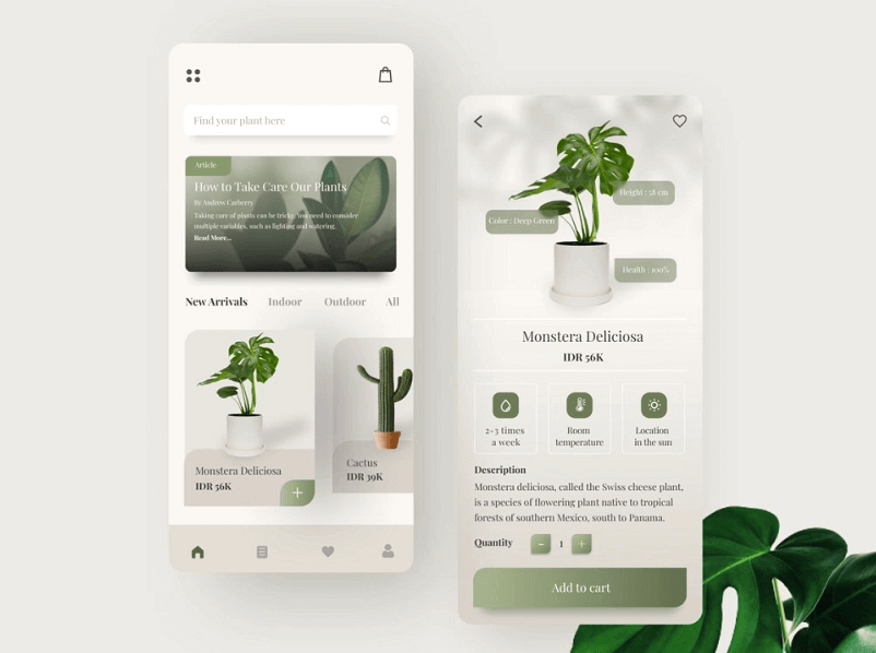
6. Going Green
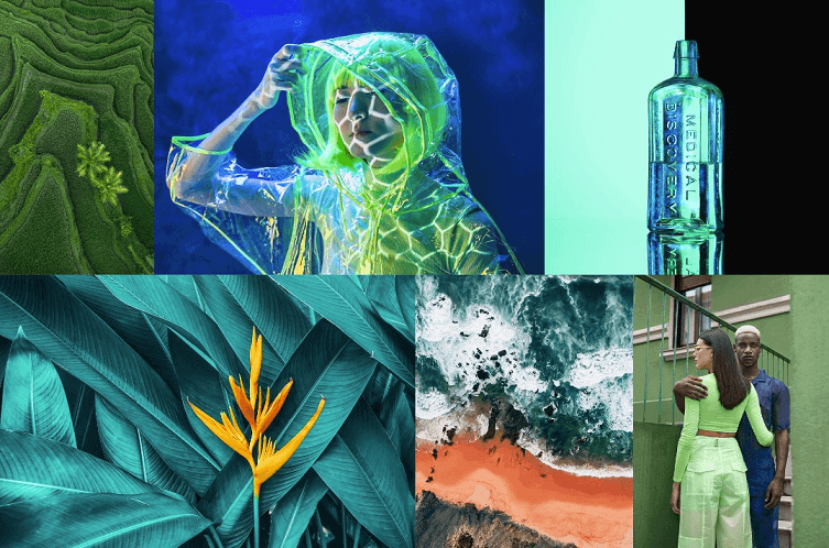
Source: Shutterstock
Who knew green could take designs to the next level? By using different shades of green, you can use the color hue to go well with any purposeful marketing campaigns and UI designs. Explore its shades, tones, and gradients, and use green to your power.
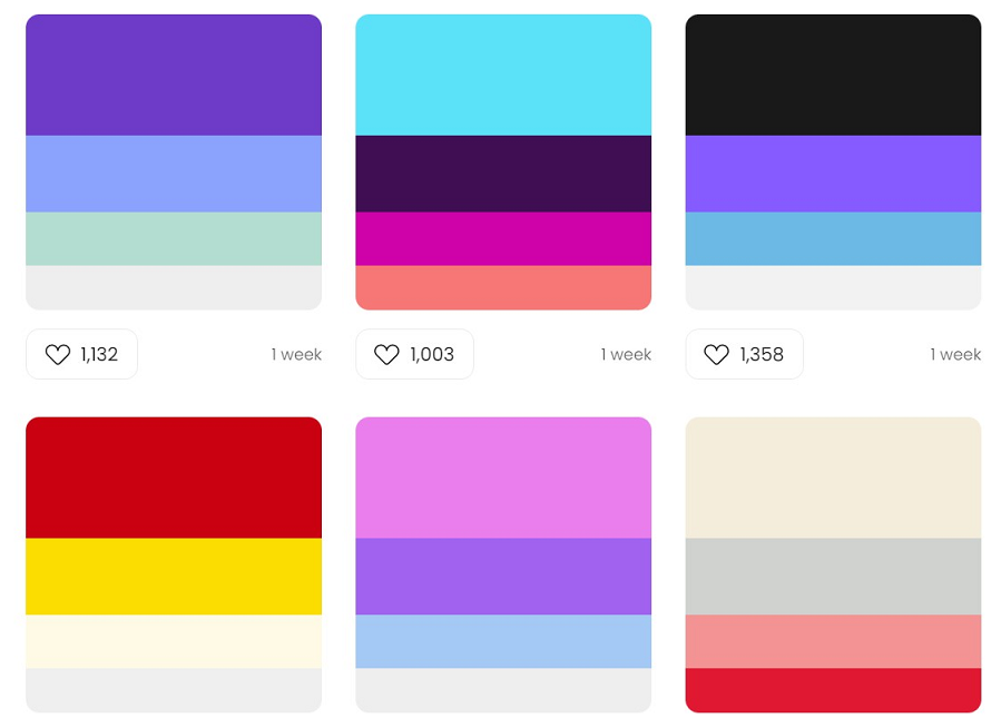
7. Hyper Color Contrast
Source: 99designs
Want something that looks quite fun and energetic? You can use hyperactive color contrast combinations like this one to create a vibrant and sophisticated feel to your designs.
8. Earthy Hues
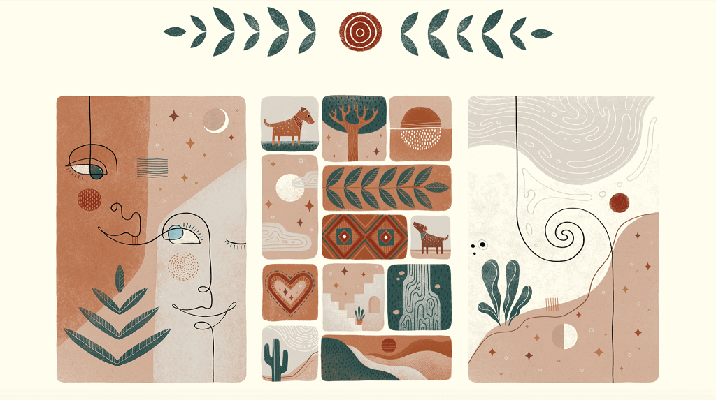
Source: Envato
Similar to the grey-green and all-green approach, the Earthy Hues consist of earthy colors ranging from rich browns to shades of green and grey. This is also an ideal design choice to go with your marketing templates and also for designing the user interface.
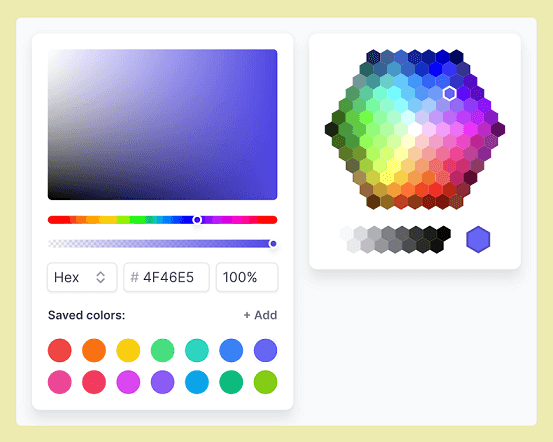
9. Pantone Color of the Year: Very Peri - #6667AB
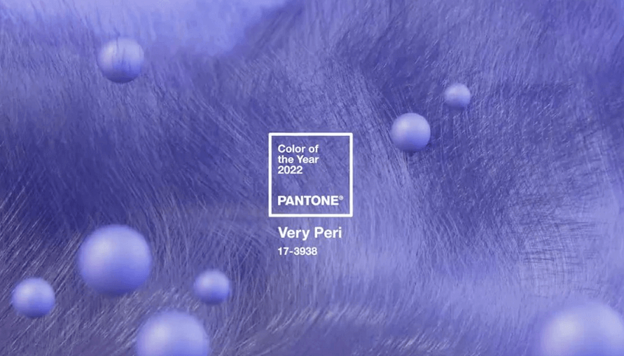
Source: Pantone
Pantone’s pick, Very Peri consists of a combination of periwinkle blues and a violet-red undertone. It goes well with any marketing design templates and in most UI design projects.
10. Retro
Source: Color Hunt
Retro colors evoke nostalgia and we crave nostalgia like anything. In particular marketing campaigns, retro can help bring a good vibe and harmonious graphics to life.
Express Your Designs with These Amazing Color Trends…
After taking inspiration from the above color trends, you have a clear picture of how to approach your design projects next time. Whether it is for strengthening your brand or designing a new interface, you will find colors a powerful tool to evoke emotions and win your users or prospects. Adopt the right color strategy using the latest color palette trends and see your designs take off to another level.
If you want the right design tool to start applying these colors, then use Pixso as your go-to tool. It is a free collaborative design tool that supports importing files from Figma to Sketch. Also, it has a great design community of its own where numerous resources are shared among creatives such as yourself. Express your designs with these amazing color trends by utilizing Pixso today.