On this page

Scott
Android and iOS UI design should deliver the same useful service while respecting how people navigate and control each platform. Keep the brand, information and task outcome consistent; adapt navigation, system interactions and controls where platform conventions differ.
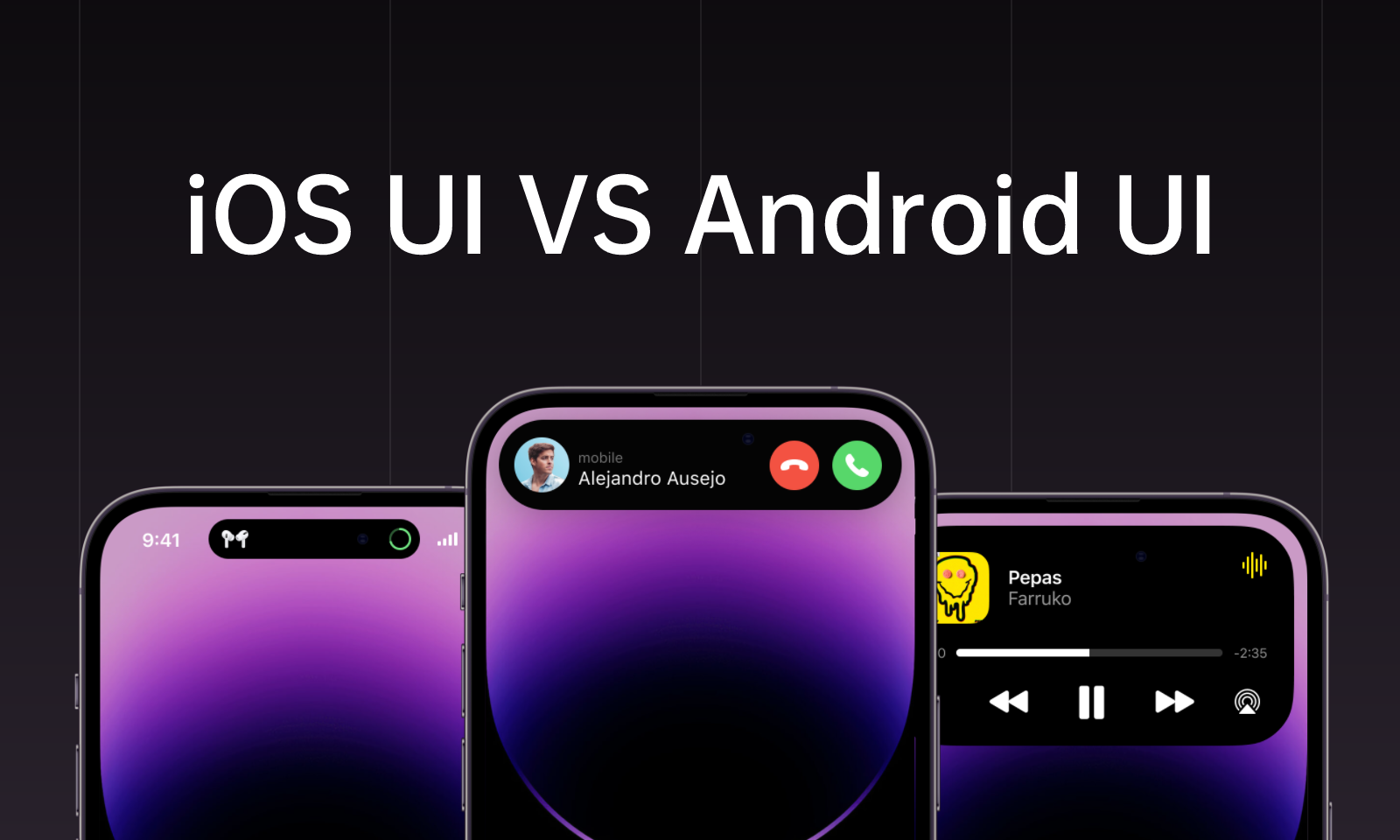
When preparing both versions in a shared UI design workspace, compare the same task side by side. A booking flow is a better starting point than a contest over which operating system looks cleaner.
The differences include navigation behavior, component conventions, typography, icons and adaptation to the available window. A native app and a mobile website also have different constraints, so establish which one you are designing before choosing controls.
This guide compares the decisions that affect an actual task, then applies them to selecting and changing a booking time. The examples are design proposals, not screenshots of a released service.
Differences Between Android and iOS UI Design
1. UI Design Principles
The first major difference in the UI design of Android and iOS is the principles on which these platforms are based.
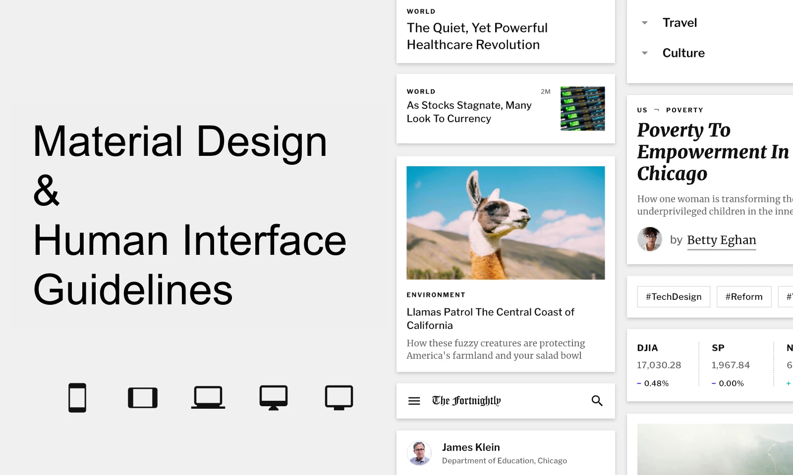
For iOS, use Apple’s Human Interface Guidelines. For Android, consult Android Developers and the applicable Material component guidance. These describe behavior as well as appearance; neither can be reduced to “minimal” versus “colorful.”
Choose guidance for the platform and window you support. A layout that works on a phone may need a different navigation arrangement on a tablet or resizable window. Keep the content hierarchy consistent while allowing the presentation to adapt.
2. Different UI components
Compare components by their job: changing a setting, navigating to another area, confirming an action or recovering from an error. Different names do not necessarily mean that one platform lacks the capability.
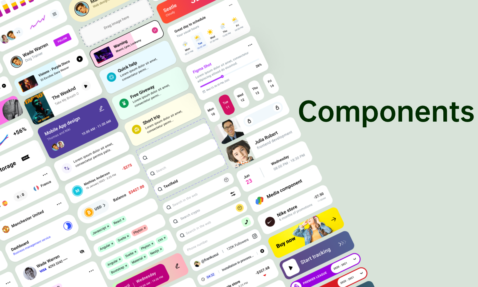
Android UI components
- Navigation: represent movement between major areas separately from actions inside the current area.
- Feedback: make a saved, failed or pending action understandable with text and state, not only a transient color change.
- Selection: explain whether a choice applies immediately or requires a separate confirmation.
iOS UI components:
Toolbars, menus and selection controls must be chosen in context. Start with the native component that serves the task, then check whether its label, state and behavior are understandable. Do not assume that copying a component’s shape copies its interaction.
3. Control Differences
A control’s behavior matters as much as its appearance. A setting switch should communicate the current state and the effect of changing it. A destructive action needs an appropriate recovery or confirmation path. Neither platform is inherently simpler: complexity comes from the task, constraints and implementation.
4. Navigation
Navigation determines how people move between destinations and return to an earlier screen.
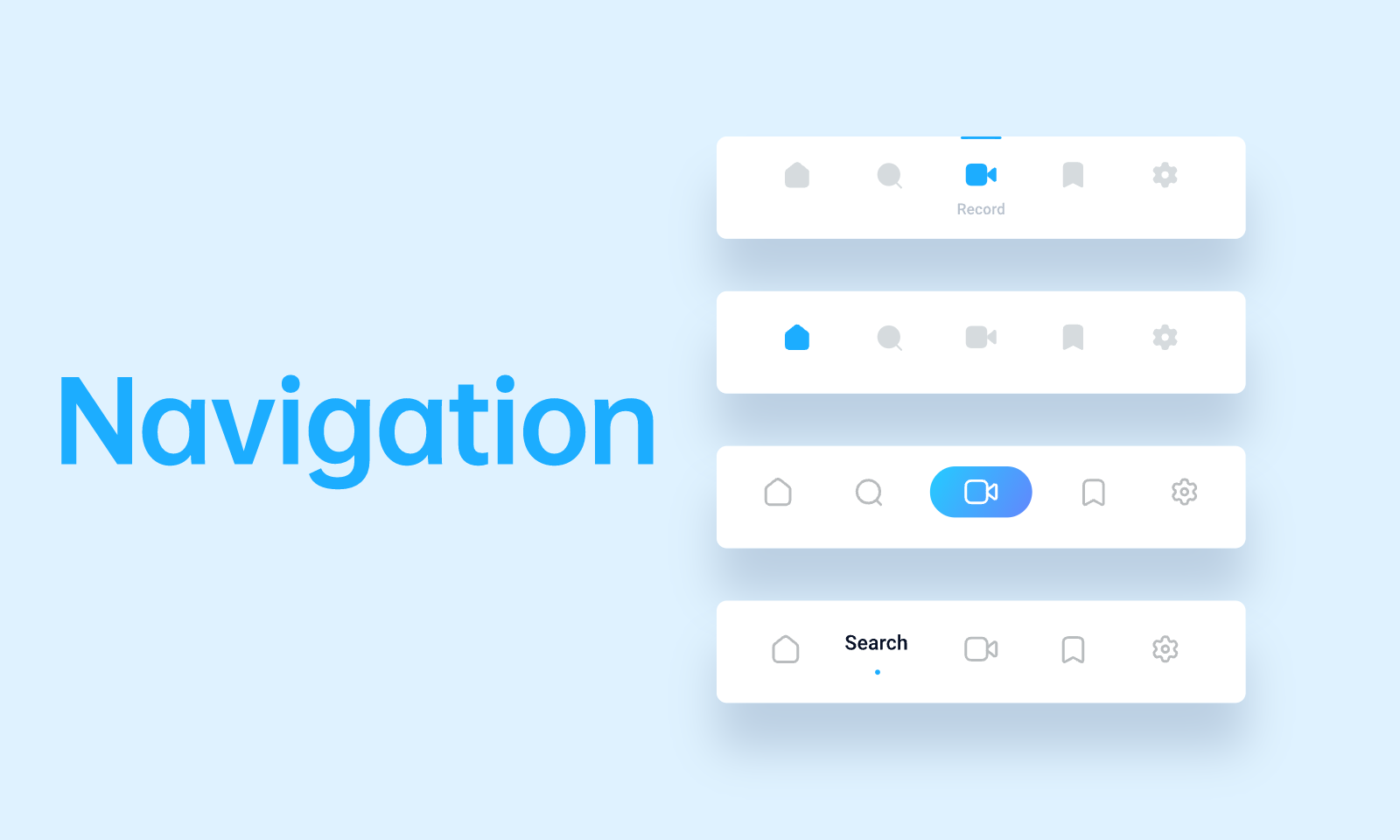
Separate app-level destinations from actions on the current screen. “Bookings,” “Saved” and “Account” are destinations; “Save changes” is an action. An app bar, tab bar, navigation bar or rail should be selected for its role and available space, not assigned solely by the OS name.
Android supports system Back through gestures or navigation buttons, depending on the device configuration. The app-bar Up action and system Back have related but distinct roles, especially when arriving from another app. The Android navigation principles explain why Up should stay within the app while Back can return to the previous app. On iOS, also distinguish moving back through navigation from dismissing a presented task.
Similarities Between Android and iOS UI
Both versions need readable content, recognizable actions, preserved selections and useful feedback. These shared requirements provide a stronger foundation than trying to make every pixel identical.
- Information hierarchy: people need to identify the item, current state and next useful action on either platform.
- Icons: use familiar symbols and clear labels where the meaning could be ambiguous; do not rely on decorative similarity alone.
- Light and dark appearance: both ecosystems support dark interfaces. Define readable colors and states for each appearance; dark mode is not automatically an accessibility or battery-life guarantee.
Example: changing a booking time on both platforms
Consider an illustrative appointment app. The person opens a booking for Tuesday at 10:00, chooses Thursday at 14:00 and decides whether to save the change. The business rule is identical on both platforms: the existing booking remains until a new time has been successfully confirmed.
- Show the same booking facts. Keep the appointment name, location and current time visible before editing. A new navigation style should not change which booking is being edited.
- Separate selection from confirmation. Highlighting Thursday at 14:00 selects a proposal; the save action confirms it. The label and confirmation screen should make that distinction clear.
- Define leaving before saving. On Android, account for system Back as well as the visible app control. On iOS, account for navigation back or dismissal according to how the editor was presented. Decide whether a draft is kept or discarded and communicate consequential loss.
- Preserve context after a failure. If the proposed time becomes unavailable, show that fact without pretending the booking changed. Keep the original appointment and let the person select another slot.
- Return to an understandable result. After success, show the confirmed time in the booking details. Returning to the list should not display an old time beside a success message.
Review narrow windows, longer translated labels, larger text and keyboard visibility on both versions. These conditions reveal missing space and hidden actions that a comparison of default screenshots can miss.
Compare Android and iOS Designs in Pixso
Keep Android and iOS frames together so reviewers can compare the same content and task. Reuse brand styles and shared components where appropriate, while keeping platform-specific controls identifiable.
Pixso provides editable UI design, reusable components, prototype connections and team comments. Use a shared booking-card component for the information that stays the same, then separate the navigation and control variants that need different behavior.
Team members can review and edit a shared design, while Pixso Community provides templates and components that can serve as starting points. Check each resource’s contents before adapting it to your supported platform.
Use the prototype to discuss the intended route, then verify system Back, keyboard behavior, accessibility and actual data persistence in a running app. A design prototype cannot establish how the native implementation handles those conditions.