What Is Filtering UI
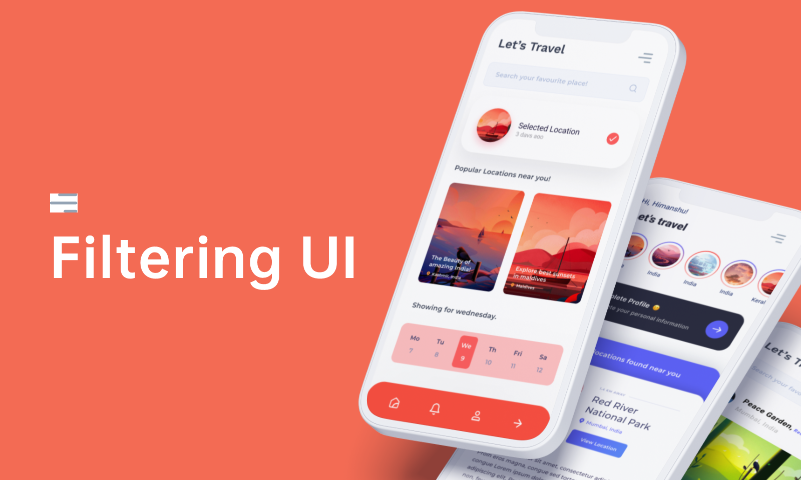
Filtering UI is a proactive approach to finding, selecting, and refining related data. It is a design feature that allows users to refine search results by applying criteria. This can be done by section, category, or even more granular options such as price range, size, and color. Filtering UI is a form of ensuring that only relevant results are displayed. Filters eliminate irrelevant results, so the user can focus on relevant data.
Filtering UI is essential as it enables users to take precise steps toward locating required information and allows users to view what they need to find without getting lost in the clutter.
How to Create Perfect Filtering UI
The focus of the filtering UI should be on value and context. The filtering UI should offer each user a deep and personalized experience explicitly tailored to their interests.

Principles of Filter UI Design
As a designer of the user interfaces for filters, it is essential to follow several principles when creating an excellent filtering UI design.
Below are the principles that will help you create an intuitive and visually appealing experience relevant to the content being filtered in your users' minds.
User Friendly
When creating a filter, remember that it should be as user-friendly and intuitive as possible. If the transition from searching a word or phrase to receiving results is too complicated or intimidating for users, this will be detrimental to your search results ranking.
Consider the Human Language/Behavior
The correct language in an app will make it more approachable, usable, and engaging. When designing a filter, it's best to think about the actual behavior of real people when browsing.
Let's take clothing for example;
If someone is looking for a 'shirt dress,' they probably don't need a 'Bandage Closet' or 'Deface Audio Tape Dress,' so the filter should be able to understand the difference and be able to bring out the suitable options.
Modeling filters after human behavior is essential because it adds validity to your results and increases the discoverability of your product catalog. Using the language of actual users will help provide a better experience for their customers. For example, think about how someone would ask a shop assistant for a dress and what they would look for when attempting to find that type of dress online.
Provide Category-specific Filters
Category-specific filters increase the product variety and help you discover new products. Many people find it a lot easier to shop by category. For example, if they are looking for clothes that are good for jogging, they can easily filter by those properties. The number of categories helps your customer to figure out which ones make sense to use.
Compatible with Multiple Selections
Decisions may not be determined simply on a single data item. Whether we know precisely what we want or we simply know what we don't want, it is logical to allow for many filters to be applied at once. This will help the user narrow their search quicker and more efficiently. Not all your consumers will have quick connections, especially if you sell to individuals in hi-tech sectors. Allowing numerous options also works better for slower connections. It is annoying to have the purpose of picking two or more filters, only to watch the page refresh frustratingly slowly with each option.
Multiple options are also ideal when various traits or criteria may be picked. When many filters are permitted, the user may choose and deselect them as often as they wish. This gives users additional alternatives and boosts their familiarity with the website, so they want to remain longer and explore more frequently.
Adapt to Browser Behaviour
In the browser, clicking the back arrow should not take users to a completely different page if they wish to return to a previous filter selection. Since the content of the page varies, the sense while using filters on the desktop web is that there are many "pages" instead of a single page with distinct filters.
In current browsers, much of the page's information will be cached. This implies that when we refresh our website, the browser will display elements like text and graphics from the previous page instead. When we employ filters on a web page, it is simple for them to fall out of sync with one other and display different results.
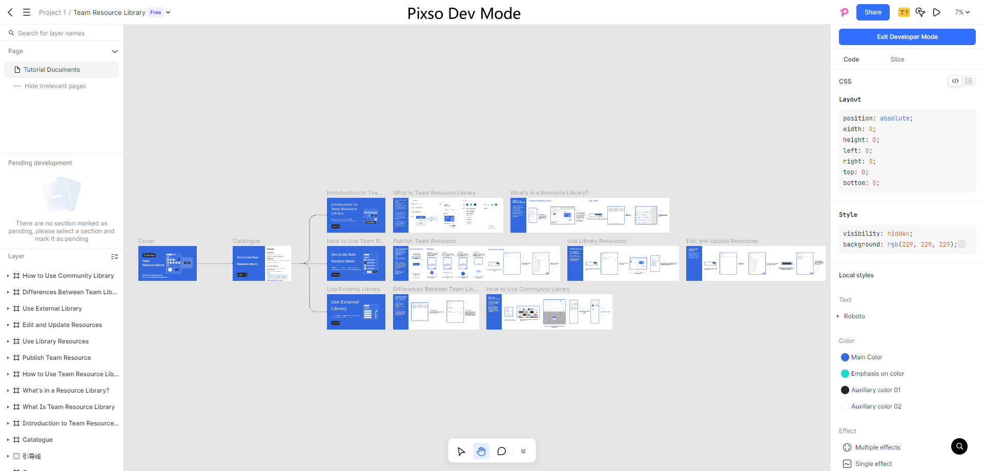
Use a Sophisticated Filtering UI Design Tool - Pixso
Pixso was made for UI/UX Design. It offers everything needed by a designer to create top-notch interfaces. With a rich icon library and easily customizable elements, it is perfect for designing beautiful filter UIs like the ones mentioned before.
One of Pixso's big pluses is its collaborative features, which allow multiple users to simultaneously make changes to a design without downloading files locally.
Pixo is an all-in-one design software and should be the first tool any new designer should get in their arsenal.
[2023] Top 5 Filtering UI Designs
Dashboard/Order Details Page by Caglar Cebeci
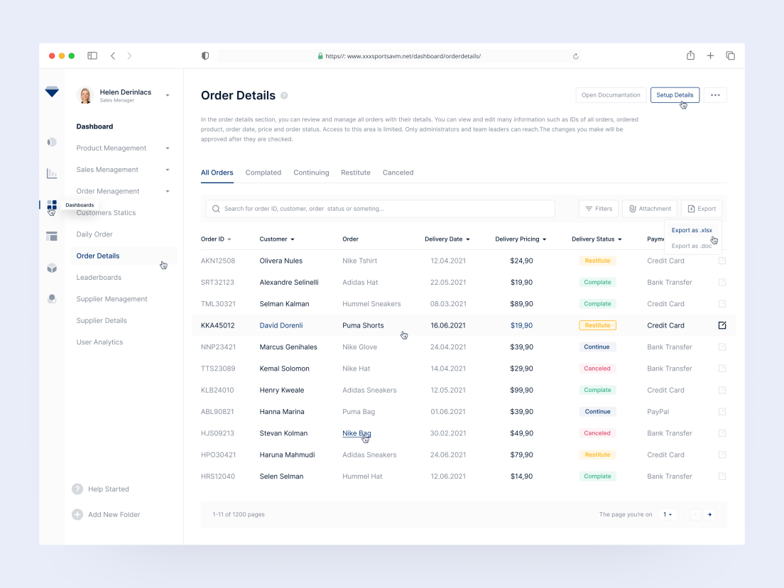
In this filter design, the search bar is pronounced and has a descriptive placeholder that teaches the user how to use it. Great!
Products List Search by Salah Elliman
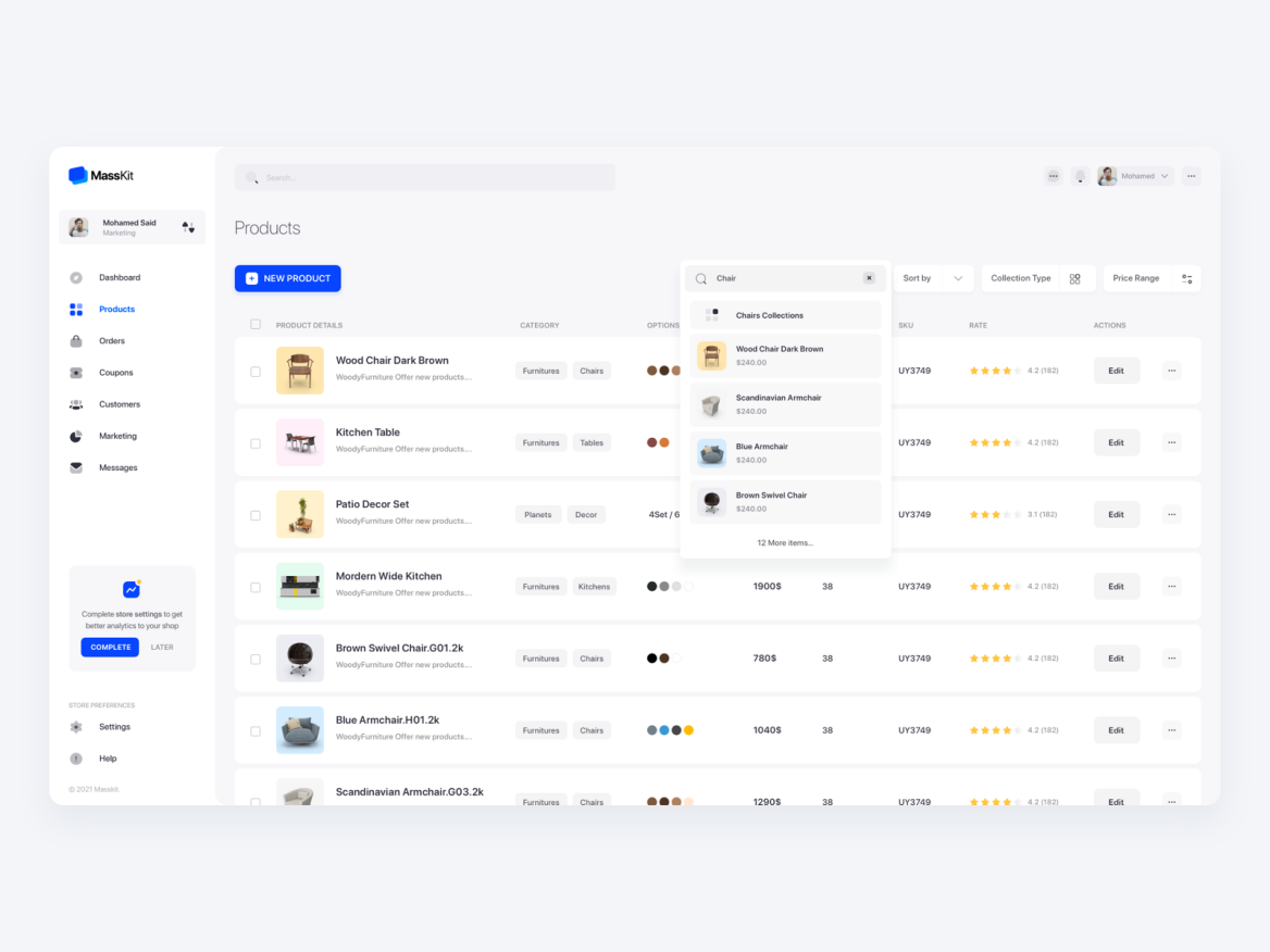
Here, users can search by text, sort by type of product, and filter by price range. The search bar and the dropdowns are perfectly placed at the top right, just above the product list, ensuring good visibility.
Rechain Order Page by usrnk1
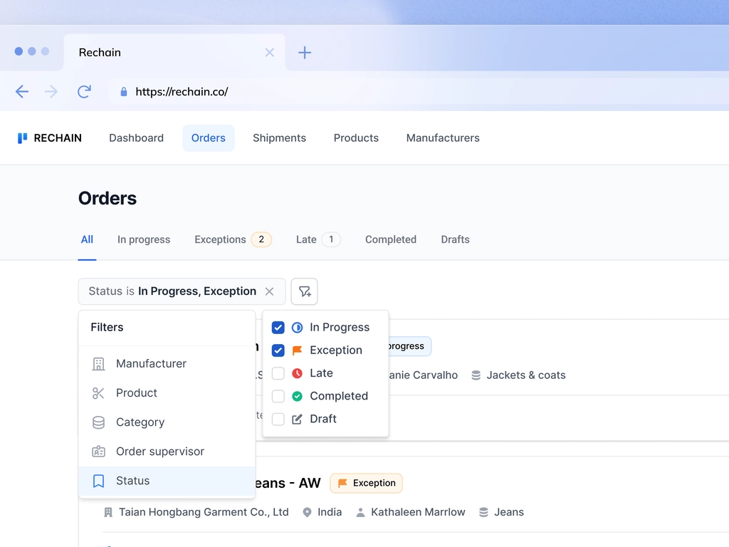
This order page features a dropdown with 5 filter criteria. Each filter has several options to ensure specificity when searching. An order page with a large amount of data helps narrow down the search and improves the experience.
Filtering Component + Table Exploration by Micah Carroll
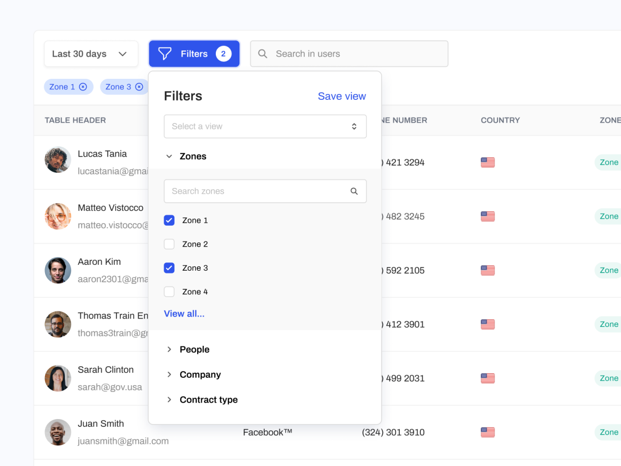
This filter UI design is straight to the point and includes a dropdown filter to select 'zones,'' people,'' company' and 'contract type.' There is also an 'applied filter' section above the users' list. This is a clean and easy-to-understand interface.
Himalayas. app by Jordan Hughes
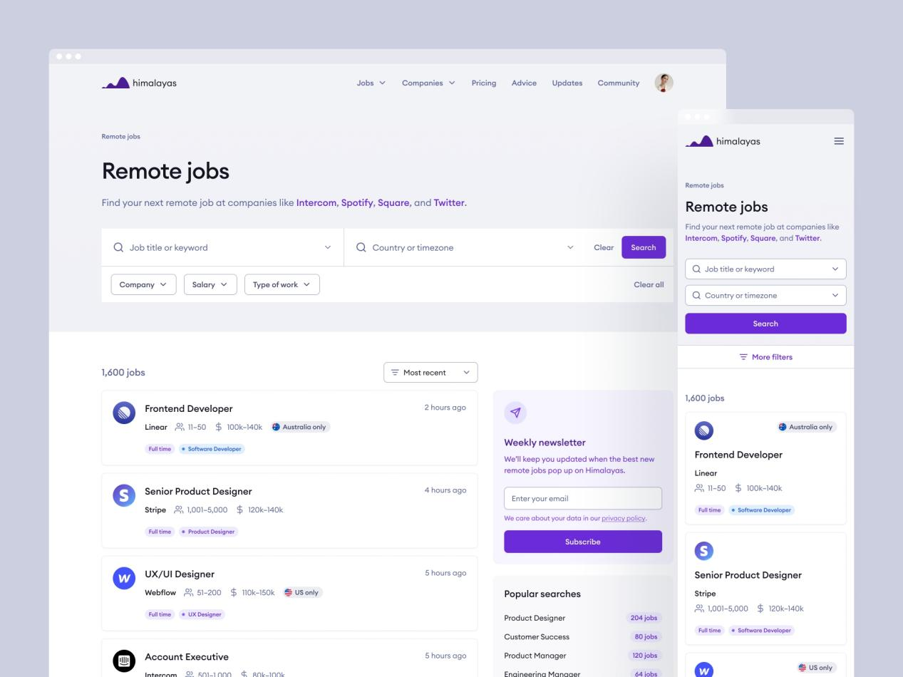
Firstly, the overall UI is fantastic, with a grand color scheme. For an improved user experience, there is a dedicated section for search filters. This is populated with dropdown menus to reduce needs to type - there's also an input bar. Coupled with these features, there is a button to sort items by different parameters.
Conclusion
With all the information mentioned in this article, you can now figure out what is filtering UI and how to make your filtering UI design better! Just start your creation trip by using the amazing filtering UI design tool Pixso!

