Scott
A high-fidelity prototype is useful when the decision depends on realistic content, visual hierarchy or interaction. A low-fidelity prototype is often enough when you are still deciding what belongs on a screen or how a task should flow. Choose the detail that helps answer your design question, rather than treating a polished prototype as a compulsory final step.
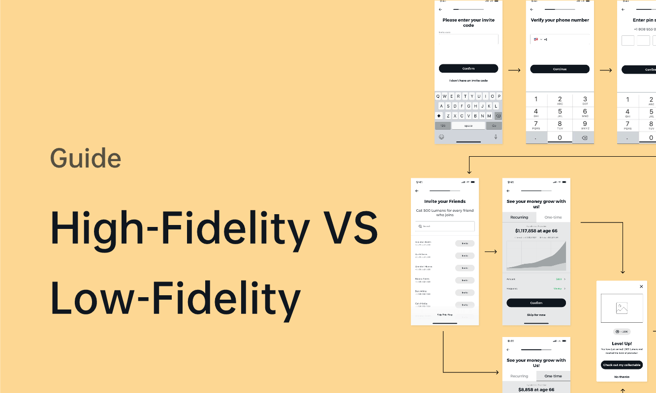
Fidelity describes how closely a prototype represents the intended experience. Its appearance, content and behavior can have different levels of detail. A plain wireframe can contain realistic account information and working navigation; a polished screen can still have no interactions. Decide which of those qualities matters for the task you want to test.
High-fidelity prototypes: what they help you test
A high-fidelity prototype represents important parts of the intended interface in detail: actual labels, typography, spacing, component states and the responses to selected actions. You do not need to build every screen. A realistic account-recovery flow, for example, can focus on entering an email address, receiving a confirmation and correcting an invalid entry.
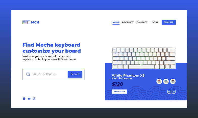
That detail is valuable when the question depends on what people see or how the interface responds. Can someone distinguish the primary action from a secondary link? Is an error message close enough to the field to be noticed? Does a transition explain where the previous screen went? Nielsen Norman Group's guidance on prototype fidelity distinguishes visual, content and interaction fidelity because each can affect what a usability session reveals.
Consider a subscription cancellation screen. A rough layout can establish the order of the options. To examine whether the final wording and hierarchy make “Keep subscription” and “Cancel subscription” understandable, use the actual labels, realistic billing details and the confirmation state. Otherwise, participants may be reacting to missing information rather than to the proposed design.
The cost is maintenance. If the flow changes, linked screens, component states and content may all need updating. Keep the prototype focused on the decision at hand. A convincing preview can expose design problems before implementation, but it does not establish production performance, payment reliability or keyboard and screen-reader behavior. Those need checks in the implemented interface.
Low-fidelity prototypes: explore structure before polishing
A low-fidelity prototype uses simple shapes, wireframes or paper screens to explore an idea quickly. It can be static or clickable. Its value is that the team can change the structure without spending much time on typography, imagery and detailed states.
For a new reporting dashboard, start with the questions a user needs to answer: which period is selected, which metric changed and where to investigate it. Rough screens can help you compare a summary-first layout with a filter-first layout. Ask someone to find a specific report and explain their choices. Their route can reveal unclear grouping and labels before you design the chart styling.
Use meaningful content where it affects the decision. A button labelled “Action” tells you little about whether people understand “Export report.” You can keep the visuals simple while making the labels and sample data specific. Low fidelity should remove unnecessary production work, not the information participants need to complete a task.
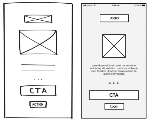
A rough prototype becomes less useful when the unanswered question depends on precise visual treatment, gesture response or timing. If participants cannot proceed because an important interaction has not been represented, add that interaction. There is no need to polish unrelated parts of the product at the same time.
When is a high-fidelity prototype worth building?
Every project needs a way to investigate its important risks; not every project needs a separate high-fidelity prototype. An established component with a small copy change may be easier to review in the working product. A new, consequential interaction may justify a detailed prototype before engineering starts.
| Design question | Useful starting point | Detail that matters |
|---|---|---|
| Can people find the right section? | Simple linked wireframes | Real navigation labels and plausible alternative destinations |
| Do people understand a billing decision? | Detailed screens for that flow | Actual wording, hierarchy, amounts and confirmation or error states |
| Does an unfamiliar interaction make sense? | Interactive prototype of the critical steps | Trigger, response, transition and a way to recover or go back |
| Does an existing pattern work after a small change? | Existing components or a development preview | The changed condition and any adjacent behavior it affects |
For example, moving a familiar filter into a toolbar may need only a small navigation test. Introducing a multi-step approval flow needs more: reviewers must see who acts next, what has been approved and how a rejected request returns for revision. Build the states that answer those questions instead of reproducing the whole application.
Increase fidelity when the current prototype leaves an important question unanswered. If participants cannot understand the task because the labels are placeholders, improve the content. If they understand the content but cannot judge the feedback after submitting, improve the behavior. This gives each additional piece of work a clear purpose.
Build a focused interactive prototype in Pixso
In Pixso, start with one task that has a clear beginning and end. For an account-email change, that could mean opening settings, entering a new address, seeing a confirmation and recovering from an invalid entry.

Prepare the screens and states
Create frames for the parts of the flow you want to examine. Reuse the team's components where possible, replace placeholder text with the intended wording, and include the failure or empty state that could change the user's next action. Auto Layout can help you inspect how the layout responds to longer labels and messages.
Connect the actions people need
Connect the relevant frames and set the triggers and transitions for the task. Use animation to communicate a change of state or location. A decorative transition adds little if the real question is whether a user understands an error. Include a route back so a wrong turn does not automatically end the session.
Preview the flow and observe its use
Open the prototype preview and walk through both the expected route and a plausible mistake. For a mobile task, preview the supported interactions on a mobile device to inspect the screen size and touch flow.
Give participants a goal, such as “Change the email address you use for receipts,” without naming the buttons to press. Observe where they hesitate, what they expect next and whether they recover from an error. Leave review comments on the relevant screens, then revise the parts responsible for the difficulty. See Pixso's prototyping features for the supported interaction workflow.
Choose enough fidelity to make the next decision
Start with the uncertainty that matters most. Use rough screens to explore structure, detailed content to examine meaning, and interactive states to examine behavior. A useful prototype earns its detail by helping the team make a specific design decision. Once that decision is made, carry the findings into implementation and test the resulting experience.