Scott
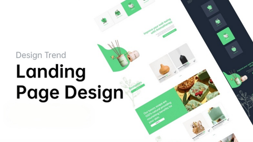
A landing page is a standalone web page, designed specifically to get prospects into your marketing funnel. Oftentimes, it can be frustrating when your landing page doesn’t get you the conversions you are looking for and simply scares your visitors away from the page.
But it all could be fixed if you understood some fundamentals in grabbing their attention and convincing them about your offering. It’s all psychology in the end and this blog will cover crucial tips that you can use to improve your landing page design so that you can convert those prospects into buying customers.
Part 1. Guidelines for Landing Page Design
Determine your purpose
Before designing a landing page, ensure you know what the goal of your landing page is. Are you looking to collect prospects’ email addresses to grow a mailing list? Or are you looking to offer your product and convert the prospect into a buying customer? Knowing this, you can design landing page templates that cater to your goal and purpose.
Think about your audience
To improve your conversion and know you’re sharing your landing page with the right people, understand who your target audience is. When you understand your audience and know which platform they’ll be more active in, you are more likely to get conversions. Additionally, if you have several target audiences for the products you offer, consider designing different landing pages for each specific target audience so the message is specifically tailored toward that segment.
Craft a compelling copy
The harsh truth is your visitors are likely to leave your landing page immediately if they don’t find something interesting or find the information too overwhelming. To grab their attention instantly, write crisp, concise, and compelling copy tailored to your product and audience. Be direct with your product descriptions and emphasize more on its benefits than its features. Moreover, your headline is your essential hook that determines if your visitor will stay on your page and keep reading. Nail it!
Use images to tell a story
A picture speaks a thousand words and you should truly believe that. When you use beautiful, eye-catching background, you are engaging the visitors on your page. Moreover, when you use multiple images and illustrate the end result of what your visitors could be getting, you are more likely to improve your conversions.
Add social proof
Your prospects are more likely to be buying customers when they see other people buying from you. That’s where social proof is necessary to include on your landing page by inserting online customer reviews, client testimonials, and other relevant statistics. As a result, this allows the visitors to trust your offerings.
Include a call-to-action
Lastly, you wouldn’t want your visitor to simply explore your page and leave. For that, you must make them initiate an action that could lead to them giving you their email addresses or purchasing your product. For that, ensure your CTA is clear to their eye and actionable.
Part 2. 5 Best Landing Page Design Examples
Now, let us go through some of the best landing page examples and understand how each one works in its unique way to get more conversions:
1. Shopify
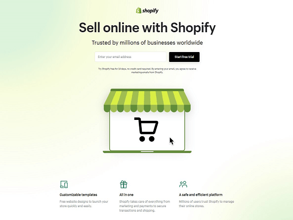
Shopify’s free trial landing page is kept minimalistic and straight to the point. It doesn’t have too many texts on it and takes good advantage of the white space to maintain the visitor’s attention span. Note how the image is simplistic with a shopping cart inside a store—hinting to the visitors that they can create an e-commerce store of their own.
They utilize short paragraphs explaining the benefits of the platform and incorporate a decent amount of brands and client testimonials as social proof. The CTA is one field and easy to sign up for and moreover, they include some FAQs at the bottom to answer more doubts about their service.
2. Wise
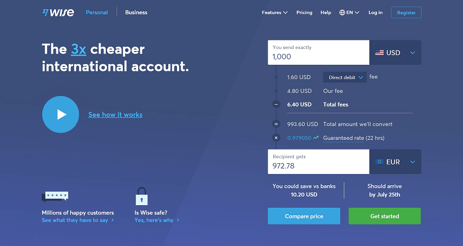
Wise’s landing page makes its send-and-receive-money feature comprehensible to visitors. Firstly, it distinguishes landing pages into two types—Personal and Business, thus, tailoring landing pages for specific target audiences. They illustrate a currency converter to showcase what their offering is all about and even include a short video tutorial to explain its mechanics.
Wise’s landing page is quite lengthy but it highlights safety features and benefits to the prospects to build trust. Its product offering descriptions are detailed and provide good value. Moreover, they make use of FAQs as well to clarify further doubts.
3. Netflix
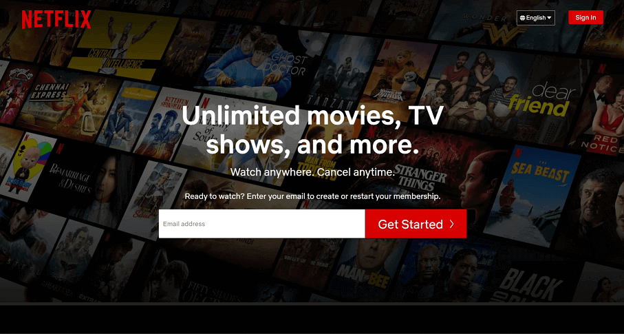
Netflix is already a well-established streaming service but we will still go through why it converts users. First and foremost, the interface is kept simplistic with a brief and concise copy to describe their offering and a background image that entices prospects to get their hands on unlimited movies and TV shows.
Its CTA is one field only, with a big, bright red button—making it appealing to every age group. Note how they utilize only three colors for the landing page—black, white, and red—thus signifying their brand image. Moreover, their short descriptions and brief FAQs make it easy for visitors to understand their service better.
4. Airbnb
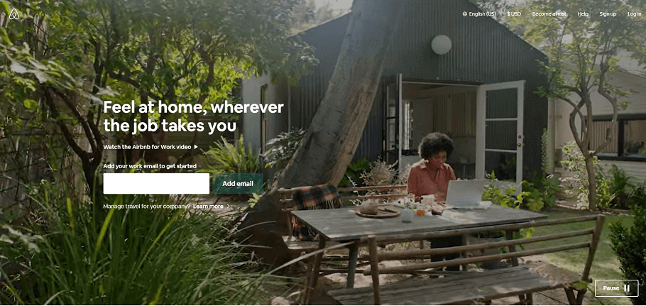
Airbnb makes use of a few landing pages targeting specific segments of its target audience. In the above example, we have a landing page targeting businesses when they require co-working spaces and accommodation while traveling. Note how they make use of a background video to showcase the experience prospects will be getting.
Their landing page engages visitors with many images to paint a story and make them understand their value proposition. The copy is short and straight to the point and mainly pinpoints the solutions they can solve for businesses to maintain their productive team workflow while traveling.
5. Skillshare
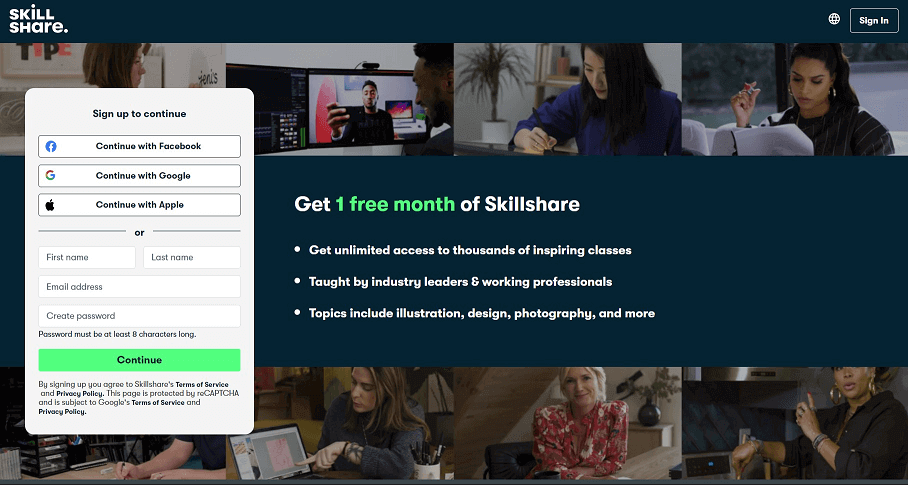
Skillshare’s landing page is the shortest page out of the five and is still effective. It makes use of three colors in the interface—navy blue, white, and lime green. Its compelling headline “Get 1 free month of Skillshare” makes it a killer value proposition and a tough one to turn down. Its features are short and brief.
Moreover, their sign-up form includes options for visitors to sign up quickly using their logged-in Gmail and Facebook accounts. As a result, users can opt-in with a single click rather than typing all the information.
Part 3. Tips Summarized for High-Converting Landing Page Designs
After going through the above landing page designs, here are three takeaways that should be kept in your mind:
Tip #1 - Have a killer value proposition
A landing page without a value proposition is nothing. Ensure to have an offer that provides value to the prospects in exchange for their email address or purchasing your product or services.
Tip #2 - Restrict navigation to grab visitor’s attention
If you noticed in all these examples, the landing page is one stand-alone page with little navigation to distract users. Ensure users are kept engaged by the landing page’s offering with the help of simplistic copy and images. Undoubtedly, less is more.
Tip #3 - Make the call-to-action standout
Your CTA is the key to your conversions. Ensure it is repeated at least twice on your landing page and make it stand out to their peripherals. Make use of strong colors and font to catch the visitor’s eye and conveys what they’re in for.
Part 4. Get Free Landing Page Templates on Pixso!
Looking for effective landing page templates to save time? Then, look no further than using Pixso’s amazing community of landing page design templates. Pixso offers free unlimited files and templates for teams to work on design projects together and allows you to preview designs without installing any apps.
Design Your Unique Landing Page…
No matter what landing page design you go with, it is essential to keep testing and adapting them to your target market. Try various design combinations with keeping the fundamentals in mind to find what best gives you those conversion rates. Don’t hesitate anymore and start designing your high-converting landing pages with Pixso today!