In an e-commerce-driven world, it is important to make your user’s shopping experience as smooth as possible. Long gone are the days when users are bombarded with too much information and design elements that makes them want to walk away without purchasing anything. It is all about making your design simplistic and urging customers to finalize their purchases.
This blog will take you through 10 inspirational shopping cart design examples that can motivate you with ideas for your next project. Also, it gives a small peek at a design tool that can help you create your own customizable templates with ease.
Part 1. Why Does Your Shopping Cart Design Matter?
First and foremost, your shopping cart design makes the shoppers’ lives easier when scrolling through the product page and also reminds them of the products they added to their cart. It is all about bringing more convenience to them whether they use a desktop or a smartphone. And second most important thing is to simply improve conversions for the e-commerce site. Shoppers will walk away if they don’t see guidelines to move on to purchase the products if the UI design looks complicated and congested. Hence, design is crucial when creating an effective shopping cart page or a section.
A few tips that can help you to design a user-friendly and sales-driven shopping cart design are:
- Use product images
- Show the number of product items clearly that are added to the cart icon and also in the cart page
- Make the shopping cart section as minimalist with designs as possible
- Make the pricing as transparent as possible (include shipping charges breakdown, tax estimates, etc.)
- Make the cart easily editable for users
- Include customer support and service details like a pop-up chat for help
- Make your icons easy to spot for users
- Make use of mini-cart previews or pop-ups instead of only a separate cart page
- Make your call to action button vivid to move shoppers onto the checkout page
Part 2. Top 10 Shopping Cart Design Examples
Since most of the stuff you find online related to resumes is more to do with what words and information you need to include in your resume, this blog focuses on the design aspect of it. Here are a few tips that you can use to design a better-looking resume:
1. Dollar Shave Club
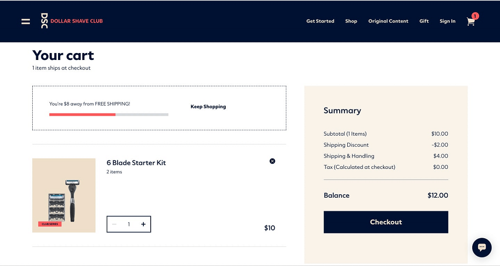
In this example, you can see how simplistic the design is and yet effective. It makes use of a simple color theme by having black and beige colors dominate with the white background. Moreover, its cost breakdown of displaying important pieces of information such as shipping & handling, tax, etc., informs the customers what they’re spending.
2. Optimized column structure shopping cart design
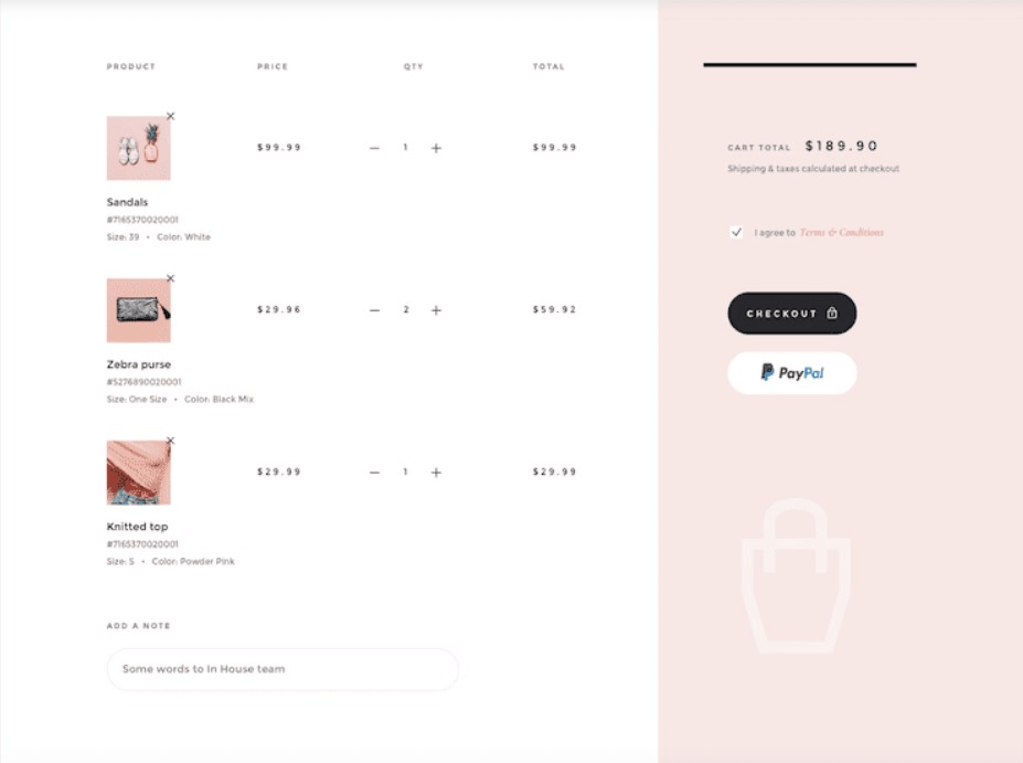
In this design example, the designer does a fine job in optimizing the column structure by keeping the right-hand section static, while the user can simply scroll the left-hand side section to view all the products they added to their shopping cart. Here again, you can see how minimal the color palette usage is which makes the page look visually pleasing.
3. Everlane cart preview design
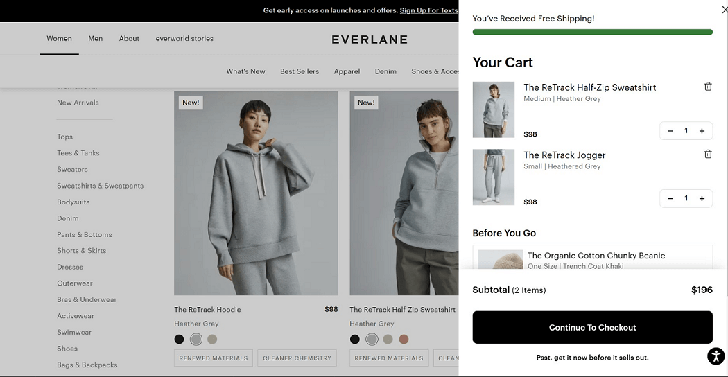
In this interesting example, you can see Everlane does a fine job in implementing a cart preview that emerges from the right-hand side instead of a separate cart page. This makes it user-friendly for users to quickly check their cart price while scrolling through products and is especially useful for mobile users.
4. All-in-one shopping cart concept
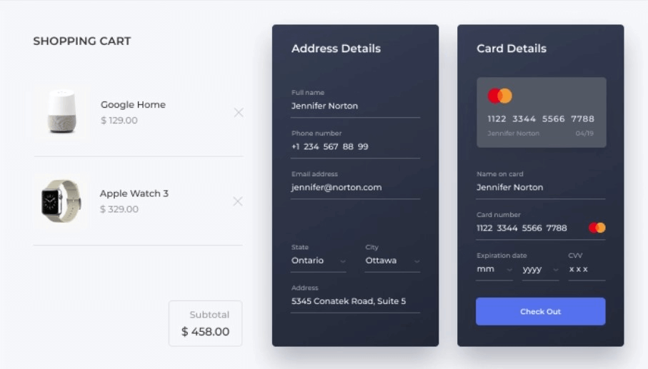
This example is innovative as the designer includes the layout of having the products added to the cart and also an overview of the shipping address and payment details. This design makes use of less space and design elements. Thus, making it more user-friendly and convenient for shoppers.
5. Flo Living - Checkout with confidence
In this unique example, women shoppers view the shopping cart page with a section named ‘checkout with confidence where they can read previous testimonials from customers regarding the same product.

6. Refreshing shopping cart design
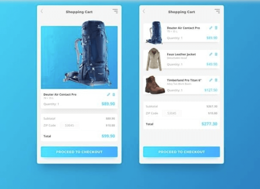
In this example, the designer presents two UI designs—one with the user adding one product and the other where the users add multiple products. You can see by now how the color theme is consistent and it should reflect the brand’s image.
7. Warby Parker
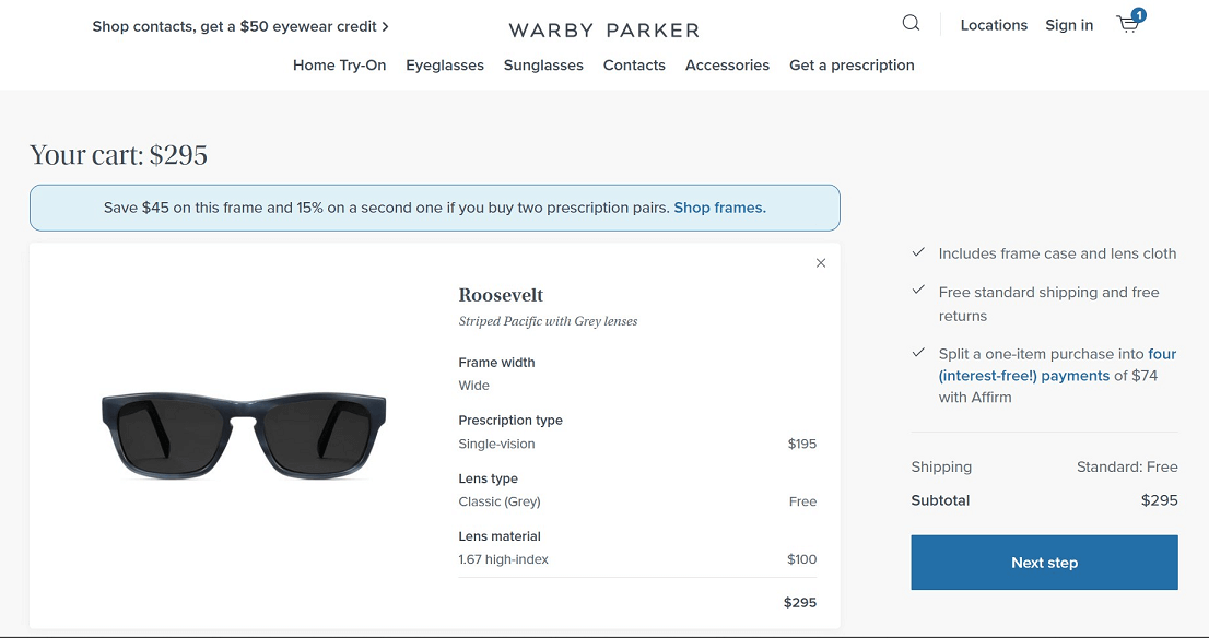
Warby Parker’s eyewear accessories offer a shopping cart where shoppers can view all the details highlighted to make their checkout experience more pleasurable. Inclusion details such as width, frame type, etc., are what shoppers want when finalizing their purchases.
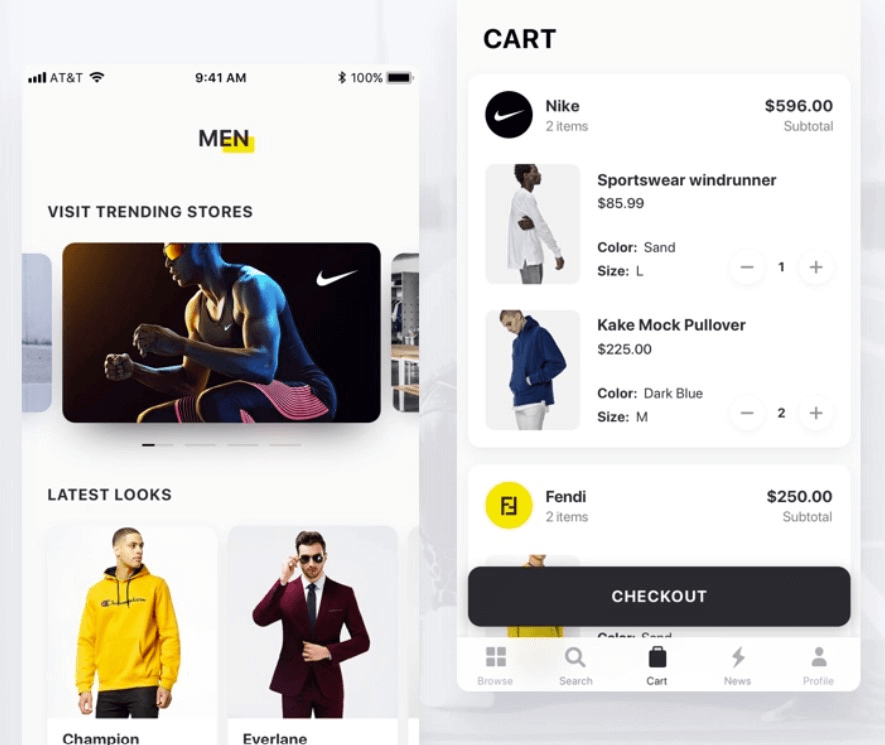
8. UI Design for Fashion App
The designer makes this fashion shopping app for mobile users easy and simple to view. In the cart section, the users can scroll the list with ease but have the ‘CHECKOUT’ call to action button still in their view—a good way to remind the users to buy the products.
9. Solo Stove
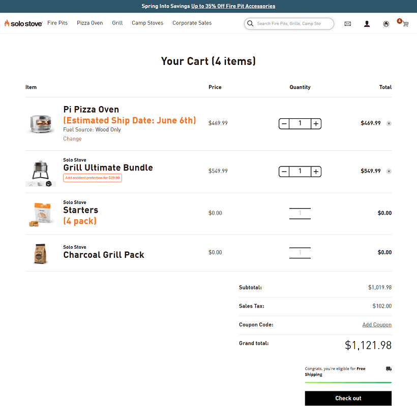
In this example, you can see how simple the UI is which makes the pre-checkout phase smooth for the users. Solo Stove does also a fine job of adding complementary products to the cart automatically once the shopper adds one specific product.
10. Shopping cart for grocery shopping
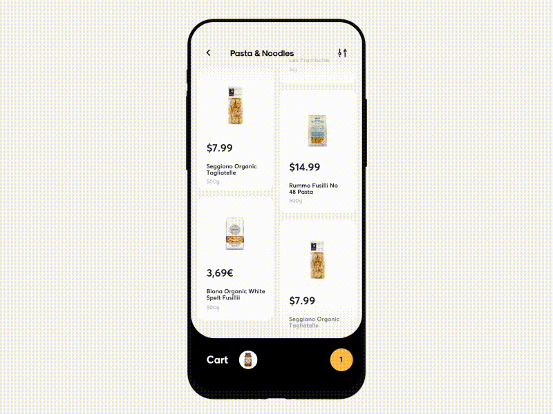
In this shopping cart example, the designer makes the shopping experience very easy to use. With the simple animation shown above, shoppers can instantly add grocery products and scroll the shopping cart up to view a simple overview of the cart list.
Part 3. Best Tool for Shopping Cart Design - with Editable Templates
Want to design shopping cart pages just like the above ones? Why not? It is possible if you use an advanced design tool that will help you work on those intricate designs and create that perfect shopping cart page.
Let me introduce to you — Pixso, a collaborative design tool that allows users to create customizable shopping cart designs comfortably across any screen size.
Pixso’s main features include:
- Advanced design tools that help to include intricate designs to make your shopping cart page look visually appealing. This includes adding a few color gradients, adding drop shadows, or blurring images to make it look good.
- An auto-layout feature so that you can scale your shopping cart design across any screen size—from desktop versions to smartphone apps. You name it.
- Wireframing and prototyping features especially if you want to form interactions in your shopping cart page and you can view the presentation on the desktop app itself.
- A collaborative workspace with user-sharing tools so you and your team can work together on the project.
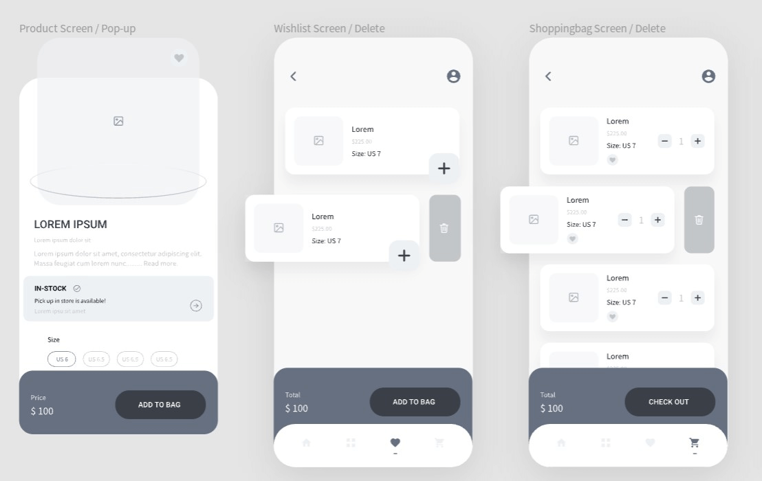
- A design community where you can find more shopping cart design templates that you can copy to your canvas and also connect with many creative designers.
- Ability to export your file into several format files and have others see your creative work.
Free Design Resources Offered by Pixso
![]()
Design Shopping Cart Templates with Pixso
A well-thought and beautiful shopping cart design is essential for making the user experience more friendly and also for increasing conversions.
Utilize an effective design tool like Pixso today to create multiple shopping cart designs and templates with ease and share them with other designers in the community.

