On this page

Scott
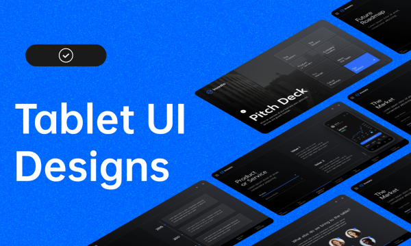
Tablet UI design adapts an interface to the space and input methods available while preserving the user’s task. It is not a phone screen enlarged to fill an iPad, or a desktop page squeezed into a smaller box. Use extra room for meaningful comparison, supporting information or a second pane, while keeping important actions easy to reach.
Start with a realistic task in a UI design workspace, then compare wide, narrow and keyboard-open conditions. This guide explains layout and interaction decisions, works through a tablet check-in example, and examines five existing tablet concepts for useful patterns.
What Is Tablet UI Design?
Tablet UI design covers the visual structure and interactions of apps and websites used on tablets. Screen size matters, but the usable app window matters more: split-screen multitasking, browser controls and the software keyboard can leave much less space than the physical display suggests.
People may hold a tablet, rest it on a table, attach a keyboard, use a stylus or connect a pointer. Do not assume that everyone uses two thumbs, is right-handed or uses landscape orientation for work. Decide which contexts your product supports, then test the actions that matter in those contexts.
The extra space is useful when it reduces unnecessary navigation. A calendar can show an agenda beside the selected day, or a document editor can keep relevant tools near the page. Extra columns that contain unrelated information merely make the interface busier.
How to Design a Tablet Interface
Choose a primary task before choosing the number of columns. A reader opening a chapter needs different controls from a receptionist checking people into an event. Preserve the task’s order as the window changes instead of forcing every tablet into the same “large mobile” layout.
Make actions recognizable
Use labels, placement and visual hierarchy to distinguish actions from information. A text button can be entirely appropriate when its context makes the action clear; flat styling is not automatically unusable. Reserve stronger emphasis for the action that moves the current task forward.
Show selection separately from hover. A pointer may reveal a hover effect, but a person using touch still needs to know which item is selected. Keep focus visible for keyboard navigation as well, and do not communicate a critical status by color alone.
Design touch targets, not just large icons
The visible icon and its interactive area are different. A small symbol can sit inside a comfortably sized button, while a large-looking row can still contain several cramped competing actions. Leave enough separation that tapping one control does not trigger its neighbor.
Avoid nesting a secondary button inside an undifferentiated clickable row without clear boundaries. For a guest list, opening a guest’s details and marking the guest as checked in are different actions. Separate them visibly and in the interaction specification.
Use available width without losing content
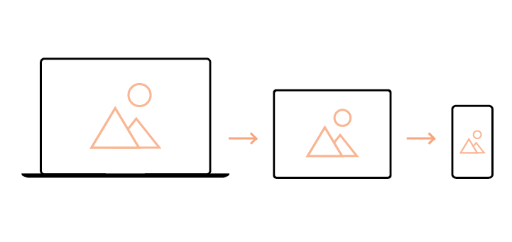
At a generous width, a list and a selected item’s details may fit side by side. In a narrow window, the details can replace the list with a clear Back route. Keep the selected item and useful list position when switching between these arrangements.
Android’s list-detail guidance describes this relationship between wider two-pane and narrower single-pane layouts. The design principle is useful beyond one platform: preserve context when the layout changes, rather than resetting the task.
Scrolling is not a design failure. A long list or document may need it. The important questions are whether the person can find the relevant content, understand which area scrolls and reach the next action. Do not shrink text or hide necessary details merely to keep everything above the fold.
Adapt to orientation and the keyboard
Support the orientations appropriate to the task rather than treating portrait as “reading” and landscape as “working.” Rotation should not discard entered text, change the selected record or unexpectedly return to the start.
When a software keyboard opens, keep the focused field and its error message visible. A fixed footer should not cover the remaining form. If there is not enough height for a list, detail panel and keyboard, prioritize the active task and restore the wider arrangement when space returns.
Provide feedback without unnecessary motion
After an action, show what changed: a selected row, an updated status or a saved value. Animation can connect states, but it should not be the only feedback and it should not delay a repeated task. Important messages need to remain understandable when motion is reduced.
Worked example: event check-in on a shared tablet
Consider an illustrative reception app for a small conference. Staff search for a guest, verify the booking and mark that person as checked in. The tablet sometimes sits on a desk with a keyboard and sometimes is carried by a member of staff.
- Begin with the guest’s identity. Show a search field, the matching name and enough booking information to distinguish people with the same name. Avoid putting private details into the list simply because the screen is wider.
- Keep confirmation separate from selection. Opening Mira Chen’s booking should not itself mark her as checked in. The detail view identifies the guest and event before exposing a clearly labeled check-in action.
- Use width deliberately. In the wide view, keep the guest list beside the selected booking. In the narrow view, show the booking on its own, with Back restoring the same query and selection.
- Handle text entry. With the on-screen keyboard open, preserve the search field and results the staff member needs. Do not let the keyboard hide a confirmation message below the search area.
- Show the confirmed result. Only after the check-in is accepted should the interface say “Checked in.” If the connection fails, keep the guest details visible and distinguish “not submitted” from an outcome that is still unknown.
The design is successful when staff can identify the right person and understand the result, not when every panel remains visible at all times. This example also reveals why enlarging a phone layout is insufficient: the relationship between the list, selected booking and input area changes with the available space.
Prototype the tablet task in Pixso
In Pixso, create frames for the wide view, a narrower window and the keyboard-open composition. Use the same guest names and booking details throughout. Reuse row, field and button components so differences in layout do not accidentally change the meaning of the controls.
Connect search, booking details, confirmation and Back in a prototype. Ask a teammate to find one guest, check the booking and return to the results. Compare the same task on a touch device and with keyboard navigation during implementation review.
Use comments to record which information is preserved across resizing, how the keyboard affects the layout and what the app does when a request fails. The prototype communicates these intended behaviors; actual input, focus handling, networking and device performance still need to be tested in the implemented app.
Five Tablet UI Examples to Study
These portfolio concepts illustrate different uses of tablet space. They are visual references, not evidence of measured usability or a ranking of the year’s best products.
Fomo — Crypto DEX Analytics
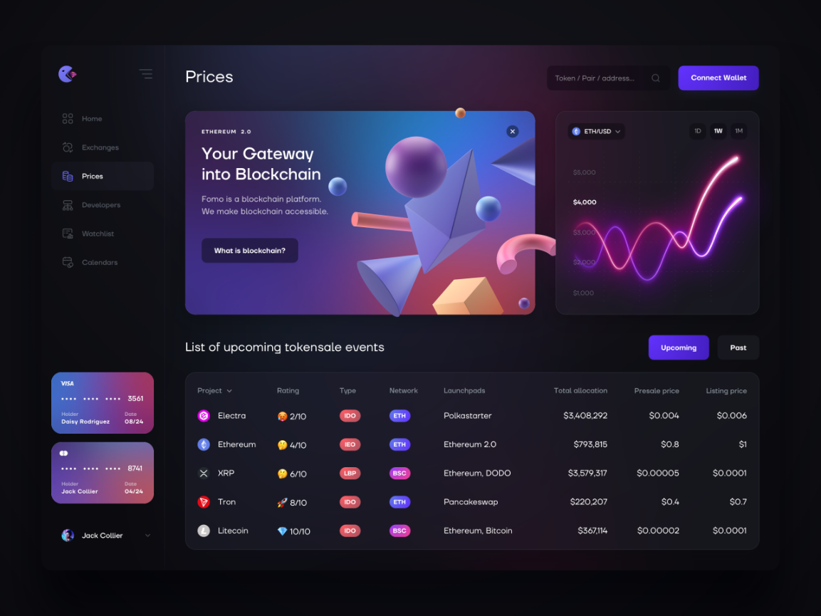
V. Alipov’s Fomo concept separates navigation from a dense analytics area. Notice how the surrounding space helps distinguish major regions. For a similar dashboard, decide which values must remain legible in a narrower window and where a selected chart’s details should appear.
E-Commerce Shophub
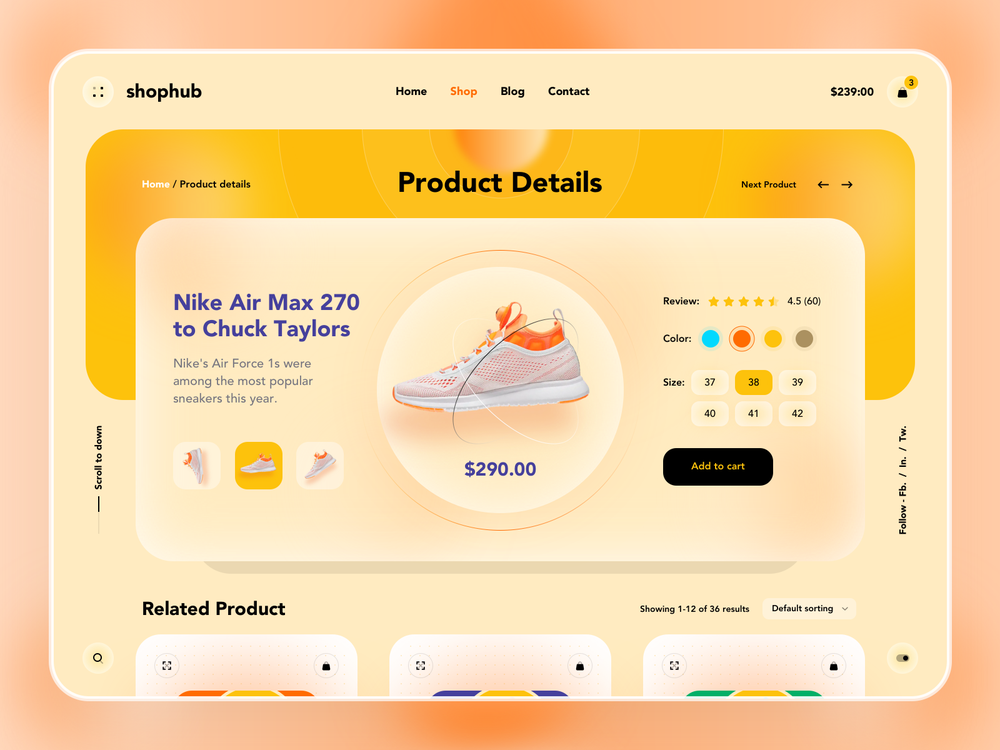
Shophub uses the central area for products and keeps navigation above them. A wider product grid can support comparison, but the card still needs a readable name, price and relevant options. Reducing the number of columns is often better than shrinking every card.
Food Delivery Service
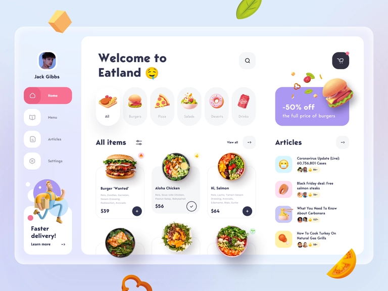
The Eatland concept presents food images with prices in a broad composition. In a delivery task, choosing an item and reviewing an order are related but different activities. Make quantities, availability and the order total clear instead of relying on attractive photography to explain the next step.
Spacepark
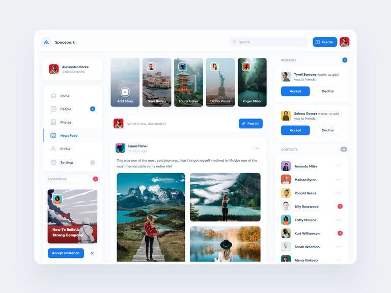
Spacepark separates a central feed from persistent navigation. That can help people keep their place while browsing. If more than one region scrolls, make the boundaries understandable and ensure fixed controls do not cover content when the viewport becomes shorter.
Financial CRM
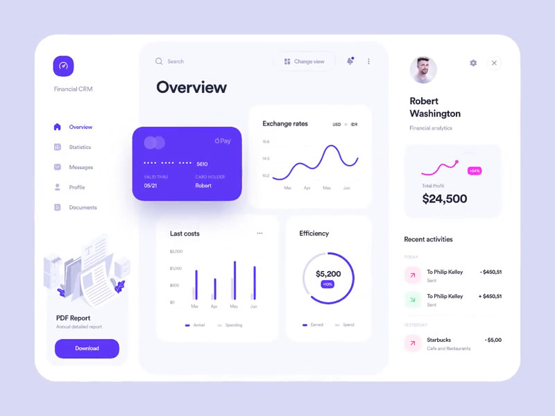
Alex Arutuynov’s financial CRM concept places a familiar central content area between navigation and a supporting panel. The relationship between the panels matters more than their count: keep the selected record obvious, and decide which supplementary content can move behind a labeled action when space is limited.
A strong tablet interface preserves the user’s work across changing space and input. Use these layouts to explore alternatives, then review one complete task with real content, an open keyboard and a smaller app window before treating the wide composition as finished.