User Interface (UI) design involves any website or mobile application features. However, at its heart is the most vital consideration: the users. A good interface results from a solid design process where the user is in the center. Users of websites and mobile apps should be able to navigate smoothly. This is where a user-friendly interface comes in.
Because user interface design encompasses the appearance and operation of your website interface, it is critical to adhere to tried and proven design principles. Otherwise, you risk inconveniencing visitors and permanently turning them away.
That is why this articles introduces several important UI design principles that you must follow to keep your users on board. Let’s get started.

8 Must-know UI Design Principles
Having the creative freedom to curate a UI design for a website is fun, but you still need to follow several principles for optimal results. Here are some of the design principles you have to take note of.

- Keep the UI design simple
- Be consistent
- Maintain a good visual hierarchy
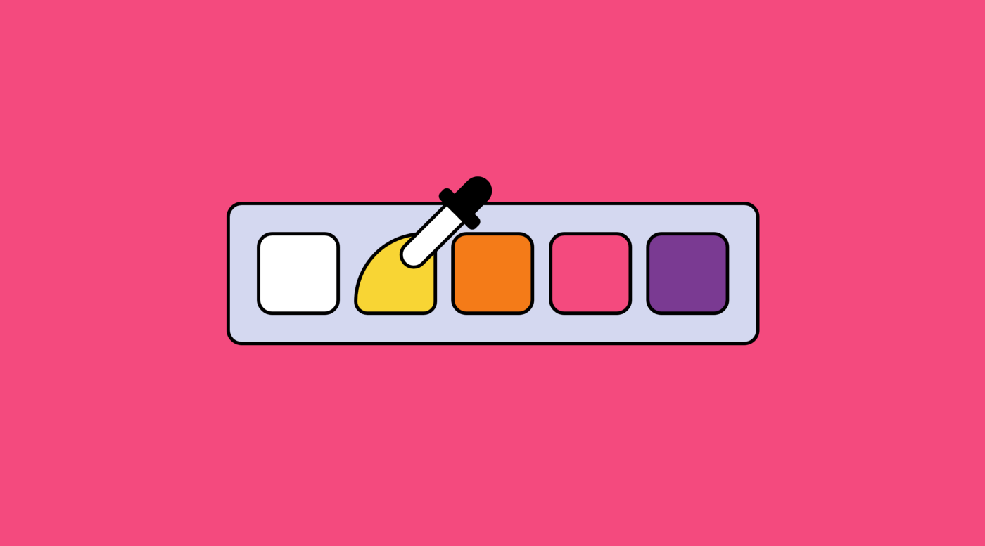
- Use color efficiently
- Give relevant feedback
- Make users feel in control
- Match between system and the real world
- Ensure the design is accessible
Detailed Study of UI Design Principles
Keep the UI Design Simple

Simplicity is essential when designing a user interface. The most crucial of all the primary UI design concepts are forgetting who you are creating for and why. Good UI design is efficient but never decorative. When designing, ask yourself, 'Is this really vital?' Or 'Does this truly contribute anything to the interface?' Simple user interfaces are best.
Prune your design straight down to the basic essentials. Users will feel most comfortable if they can utilize your product without putting much effort into interactions. Due to the diversity in users' habits and skills, keeping your design simple is the best method to allow people with diverse abilities to comprehend your UI.
One of the best practices is to allow users to depend on their prior experience when they engage with your product. Designers may accomplish this aim by employing common concepts and metaphors.
Be Consistent
One of the most fundamental UI design principles to adopt is consistency. Consistency is crucial, as it helps your users feel protected. Consistency is necessary for everything from typefaces and layouts to language and themes. While an aesthetic design might be fascinating, it should also be useful.
Consistency fosters familiarity and usefulness, so people need to acclimate to a product's style and function. A decent interface strives to be consistent with assisting people in discovering what they're searching for fast and without problems. Lack of consistency might mislead the users and produce a negative user experience. Of course, the consistency principle only implies applying it in some parts of your design. Intentional inconsistency may be excellent for user experience in some cases.
Maintain a Good Visual Hierarchy

Visual hierarchy helps consumers realize what is most important about a product. It organizes the components into categories and makes basic parts easier to notice while sophisticated ones are more difficult to identify.
The arrangement of items in a website interface draws the user's attention. Bigger pictures and stronger lettering are more prominent than lighter, smaller ones. This is also why most newspaper sites have bigger headlines but smaller fonts for the news bodies - since the headlines capture the attention of the readers, and this is where they initially put their eyes.
Visual hierarchy is a key element of user interface design. Your interface will be overwhelmed or disorderly if you provide equal priority for each individual piece.
Use Color Efficiently

Color can communicate as powerfully as any other aspect of your interface. Humans tend to be naturally drawn by appealing aesthetic appearance. Color is one of the key factors that can create the fundamental tone and mood of interfaces.
Color can express the personality of a company and even affect the purchase decision. Having a well-designed color palette makes an interface both functional and good-looking. Color is an easy approach to bring attention to certain aspects, particularly those supposed to be a 'call to action.'
Give Relevant Feedback
One of the simplest methods to connect with the user is to deliver timely and contextually-relevant feedback. On the other hand, the absence of feedback creates anxiety.
Keep users updated about their progress. Provide acknowledgment that their activities have been received. Let them know that things are progressing as they should. Users should know precisely what's happening at all times without having to consciously seek out this information or be left wondering whether the app has become unresponsive.
Make Users Feel in Control

Users should feel fully in control—whether or not they truly are in charge. This involves making the UI blend in with the background. It should always be present when the user needs it, of course. And precisely where they anticipate it to be, too. But nobody should ever feel that the interface forces them into a specific act or making decisions for them. Even though, in certain circumstances, this may be exactly what's going on. Always offer users the opportunity to pick or choose since people only feel in control when they can make choices.
Match Between the System and the Real World
Your design should speak the user's language and employ the same notion that people are already acquainted with in the actual world. Avoid jargon or technical phrases; plain language simplifies your design. Likewise, items used in a design should be comparable to what they represent in the real world. For example, the trash can symbol in Gmail guides the user on where to retrieve deleted emails.
Ensure the Design Is Accessible
Your design should be useable for as many individuals as feasible. It should be accessible for those with disabilities like vision impairments. Texts should have a clear contrast to the backdrop and avoid using hues that everyone can't see.
Use Pixso to Practice UI Design Principles
Having extensive knowledge of UI design principles is required to produce clean, appealing, and intuitive interfaces. However, you also need a decent UI design tool to execute and practice these ideas.
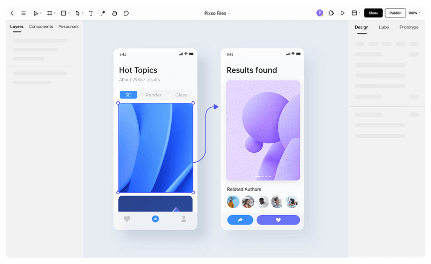
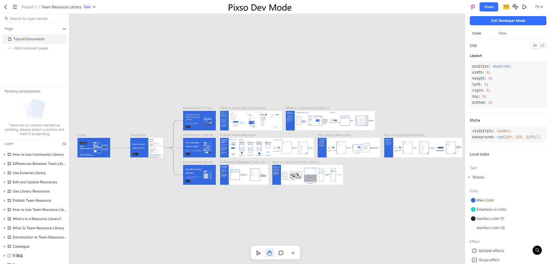
An excellent UI design tool offers you the opportunity to develop spectacular designs. And Pixso is one of the finest UI design tools that you can experiment with from the get-go.

Pixso allows designers thttps://cms.pixso.net/images/articles/principles-of-user-interface-design.pngo develop dynamic prototypes and mockups, test them for usability, and sync up the work. Pixso enables a collaborative environment where numerous individuals may work on a project simultaneously, much like Google Docs – allowing you to experience the real-time collaboration. It's also browser-based, making it available to everyone in an instant. And as an extra plus, it is absolutely free to use for starters.
Want to put all these UI design principles into practice? Use Pixso right now to see what will happen!


