Wonder why some companies that operate on a global scale (such as Airbnb, Uber; AliExpress) still function effectively after many of existence? Well, Constant innovation in their design system has been their major secret which has helped in setting their brand apart from the competition and improving the user experience, especially for brands that operate on a global scale.
Creating their own design system has helped their business to increase its productivity, generate unique inspiration, and create efficacy among teams.
Part 1. What is the design system?
A design system is the all-in-one source of information made up of various elements to help team members in product/project design and development.
The word design system can also be defined as a set of reusable components, guided via way of means of clean standards, that may be assembled collectively to construct any number of applications.
It lets you manage everything related to designing products on a larger scale for multiple applications. The overall result of this set of guidelines is a consistent order in systems that covers every step from action buttons to a landing page.
Part 2. Why do firms create design systems?
A design system is created based on the collection of information that evolves with products as the business grows or customer needs change.
Increased productivity and ease of collaboration are two inseparable results of design systems in teamwork. They can help businesses in many ways in their growth. The predominant motive of a design system is to assist and facilitate teams that are running on an unusual place product. It allows for the efficacy of the product's evolution. A design system will allow groups to create a product which each production is faster and better. This will assist your commercial enterprise to be at its best advantage and additionally help to keep vintage clients and attract newer ones at the same time as lowering support costs.
Design System helps create visual consistency across products, and channels, once groups add silos, wherever every product or channel operates severally from the others, the absence of an organization-wide design system will cause inconsistent visual looks and experiences to seem fragmented or unrelated to the brand. Design systems give one supply of components, patterns, and designs, unifying disjointed experiences in order that they're visually cohesive and appear to be a part of the identical ecosystem. As one more bonus, any major visual rebrands or redesigns will be managed at scale through the design system.
Part 3. Top 10 Design system examples to get inspiration from
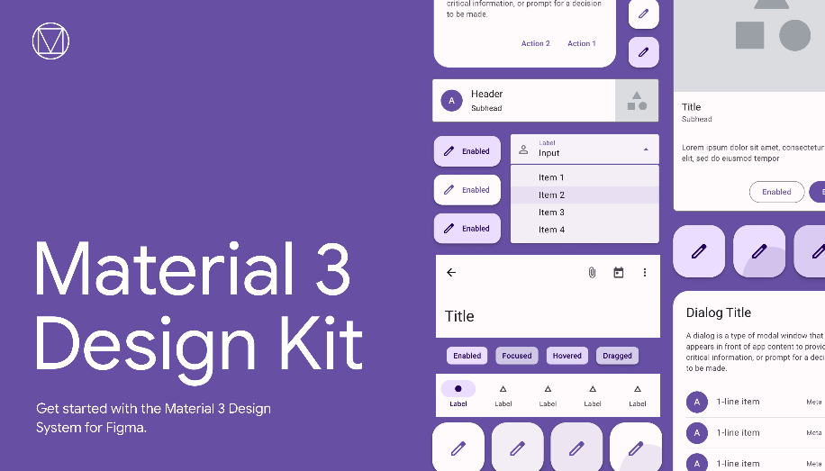
#1 Google Material Design system
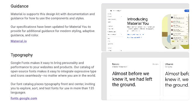
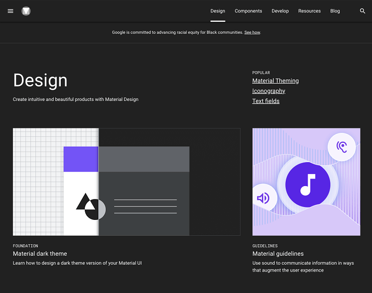
Material Design allows other brands and individuals to have a strong foundation design system to build upon when it comes to their own approach to atomic design, industry innovation, and unique brand expression.
With this design system, users can get valuable information that perfectly unifies UI/UX across different devices, platforms, and input methods.
#2 Mailchimp
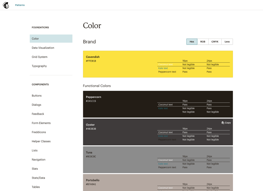
Marketing can be complicated, but Mailchimp makes it easier because Mailchimp is an all-in-one marketing platform.
But guess what? Mailchimp has now updated its branding and identity system, to help design a system with new illustration styles, which allows it to communicate about complex tools and marketing practices in a simpler and more human way.
#3 Microsoft Fluent Design system
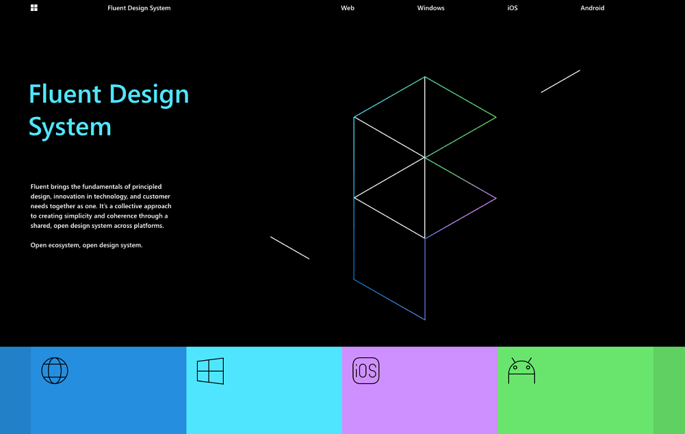
Fluent is an open-source, cross-platform design system. It gives designers and developers the frameworks they need for creating compelling product experiences, including accessibility, internationalization, and performance.
Fluent has taken Microsoft back to the basics of design, with a much bigger focus on simplicity. Instead of bold typography and borderless content, Fluent focuses on subtle elements like light, depth, movement, and material. We've seen it pop up on Windows with motion cues and blur effects. It also appeared in Office and on the web across services like OneDrive, Office Online, and Outlook. Microsoft is gradually making Fluent a core part of how the company thinks about design.
#4 Apple Human Interface Guideline
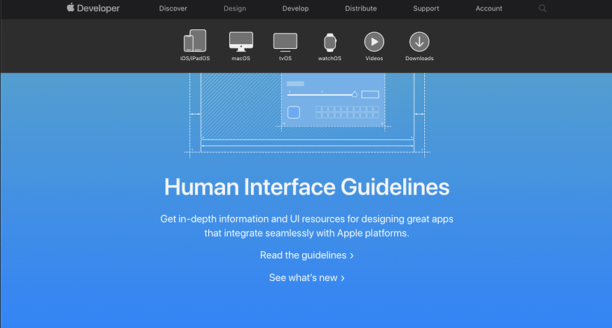
The HIG (Human Interface Guideline) contains guidance and best practices that can help you design a great experience for any Apple platform.
The HIG is one of the best places you can start when you’re making design and engineering decisions about your app. It lays out the principles that define design across all Apple platforms, and it makes recommendations to help you anticipate and implement what most people want when using the software.
#5 Atlassian
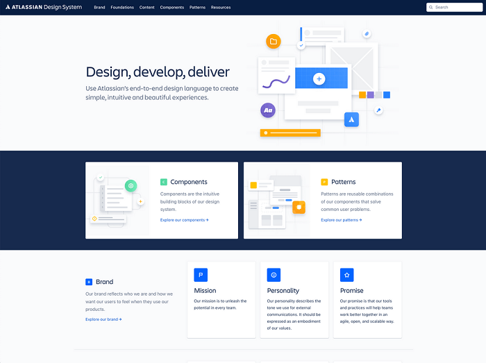
Today’s timelines are too tight for outdated project workflows to keep up. The Atlassian Design System helps teams to create simple, intuitive, attractive, and pleasant experiences through its self-service guidelines, reusable components, and platform capabilities which allows the design system to scale its impact.
#6 Shopify Design System Polaris
Shopify is an e-commerce platform that creates the belief that trade may be made higher for and greater on hand to everyone.
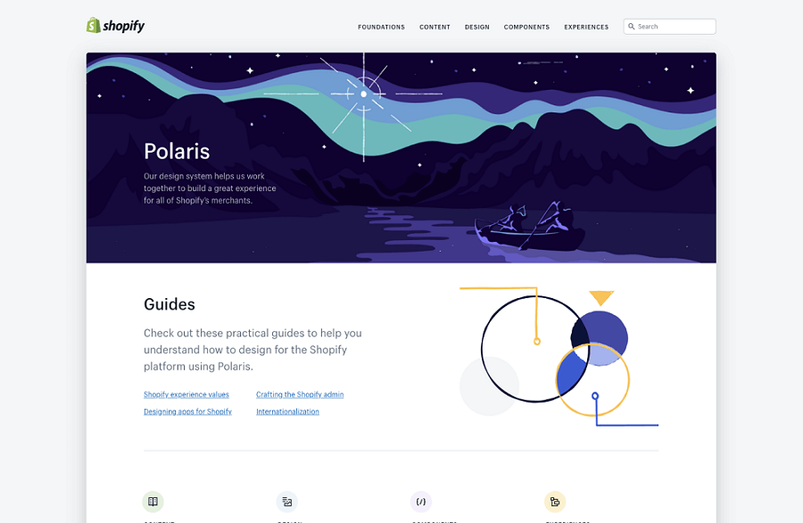
The Shopify Polaris design system is a set of comprehensive guidelines and principles that designers can use while building apps and channels for Shopify. It offers a range of resources and building elements like patterns and is available to all Shopify partners. Its intention is to assist humans to acquire independence by making it less complicated to start, run, and develop a business.
#7 Adobe Spectrum
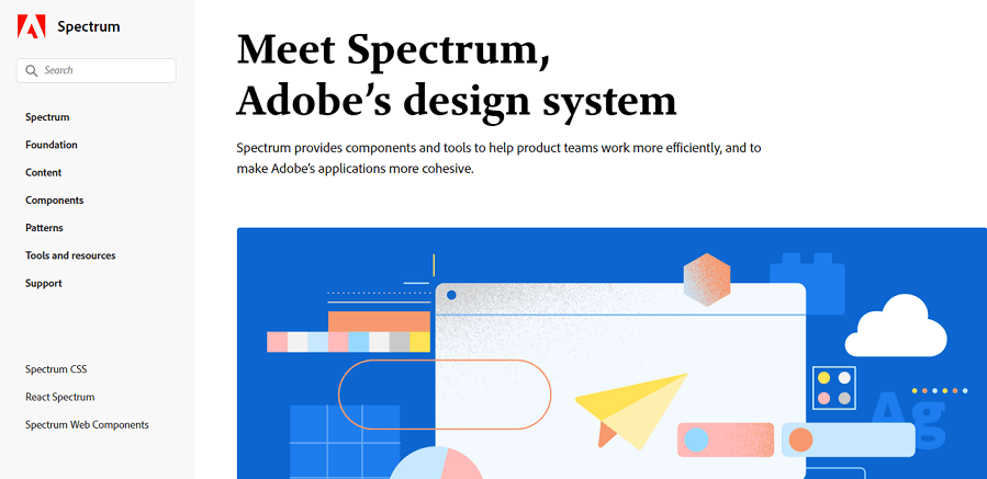
Spectrum is Adobe's design system which includes design guidelines and recommended components to create a unified experience for all Adobe Clouds. It provides components and tools to help product teams work more efficiently and to make Adobe's applications more cohesive. The initiative to create a common design system for Adobe Spectrum is to publicly release and gain more and more traction and community support from different brand identities.
#8 Uber
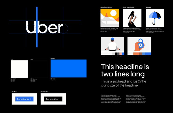
Uber Design System is an application for launching, developing, and unifying web applications. It's an open-source toolkit of React components and utilities that align to the Base Design System, essentially translating designs into code.
All the screens are well organized and named as per their content. It is very easy to change any and all of the designs.
#9 Salesforce Lightning Design System
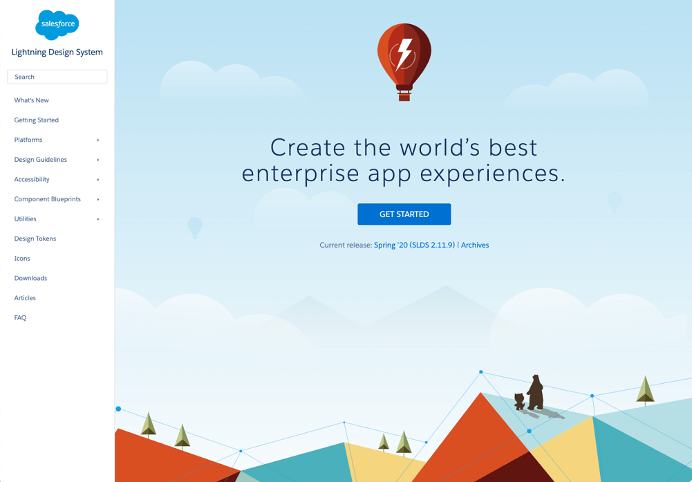
The Salesforce Lightning Design System helps you build apps that look and feel like Lightning Experience without writing a single line of CSS. SLDS is a CSS framework that gives you access to the icons, color palettes, and fonts that our developers use to build Lightning Experience.
One great advantage of Salesforce Lightning is that Lightning has a greater integration with Einstein AI and the ability to use Einstein AI features like forecasting, opportunity insights, and automated contacts.
#10 IBM Carbon Design System
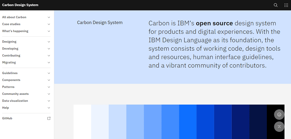
Carbon is the open-source design system for all IBM software products. It is a series of individual styles, components, and guidelines used for creating unified product experiences.
This design system is specially developed to allow users to design systems for products and digital experiences. It has plenty of visuals, code guidelines, and standards for the IBM cloud platform, including the services offered on the IBM platform.
Summary
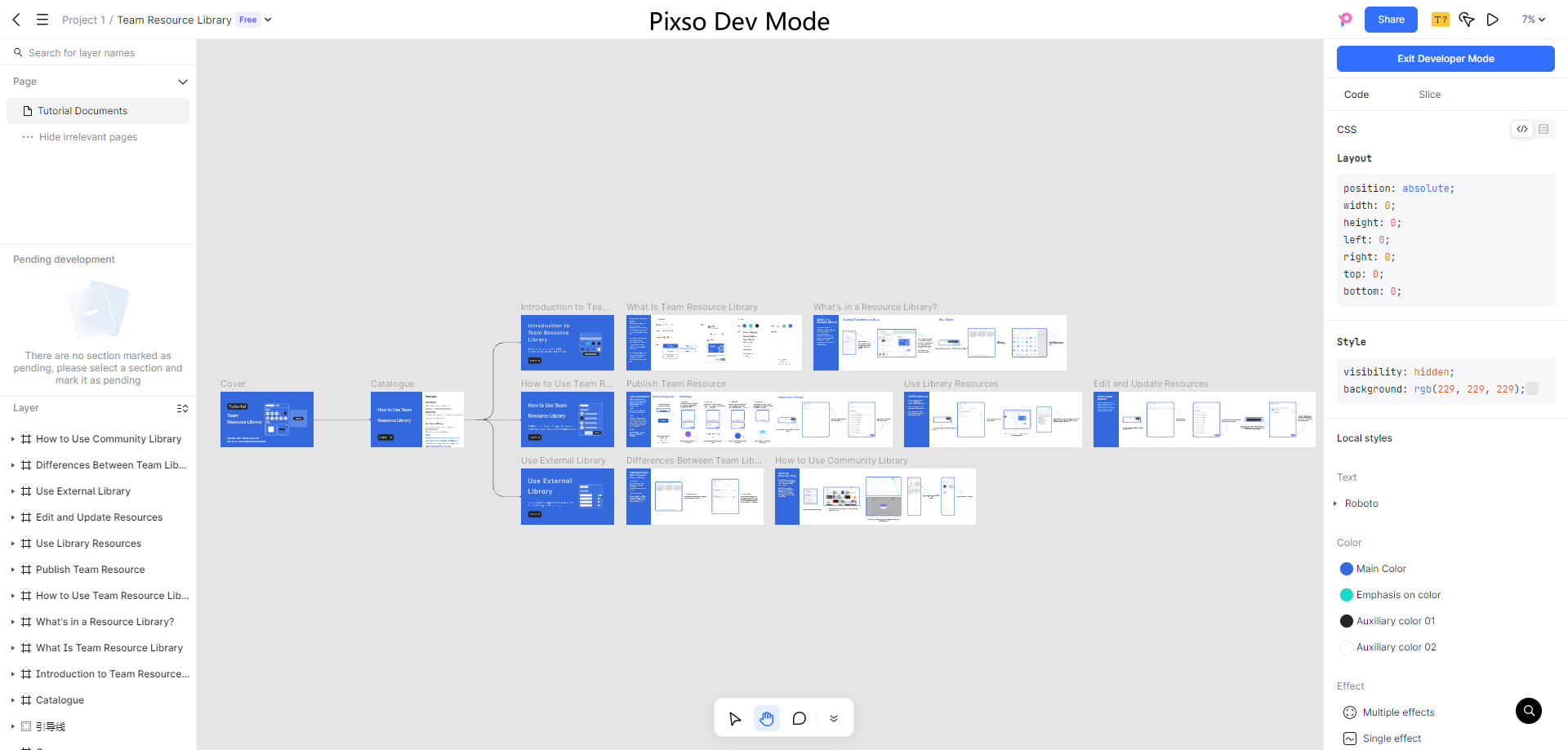
It's important to note that a design system is never truly "finished"; it grows and develops like any other product. As a website or product changes over time, new user interface patterns must be created. When it comes to creating and managing design systems, Pixso is a great tool that offers efficient solutions. By ensuring the right governance processes are in place, teams can understand when and how best to introduce new items into the system.
Through these design systems, we can see companies taking a variety of approaches to ensure exceptional user experience across their digital products and services.
