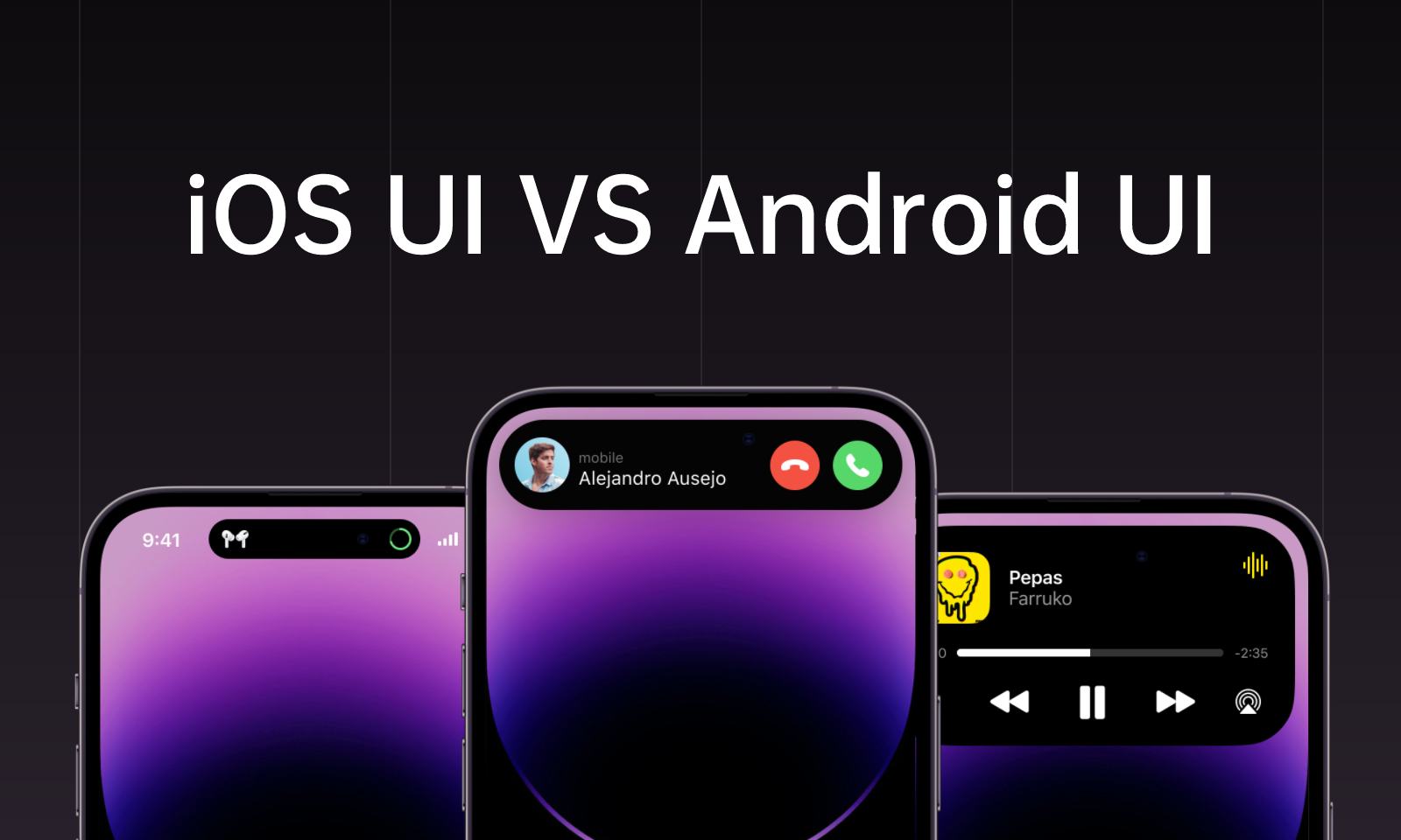
As Apple released iOS 16 recently and introduced the Dynamic lsland, designers were all excited to explore this epoch-making integration of UI design and hardware. Does iOS beat Android in the game of UI design? This is the question that causes a hot discussion among designers around the world.
For the longest time, Android and iOS have always been put up together in comparison, which isn't surprising as iOS and Android are the sole contenders when it comes to mobile devices.
When you see an Android and iOS app design right off the bat, you can pick out the differences in the user interface. These differences include aspects such as look, controls, typography, icon style, and several other elements that have to do with UI design.
In this piece, we are not going to be settling any fights or placing anyone above the other; rather, we are looking to make an in-depth comparison between mobile app UI designs in Android and iOS, highlighting the similarities and differences between iOS and Android UI design and recommending the best tool to churn out the best UI designs. Stay tuned!
Differences Between Android and iOS UI Design
1. UI Design Principles
The first major difference in the UI design of Android and iOS is the principles on which these platforms are based.
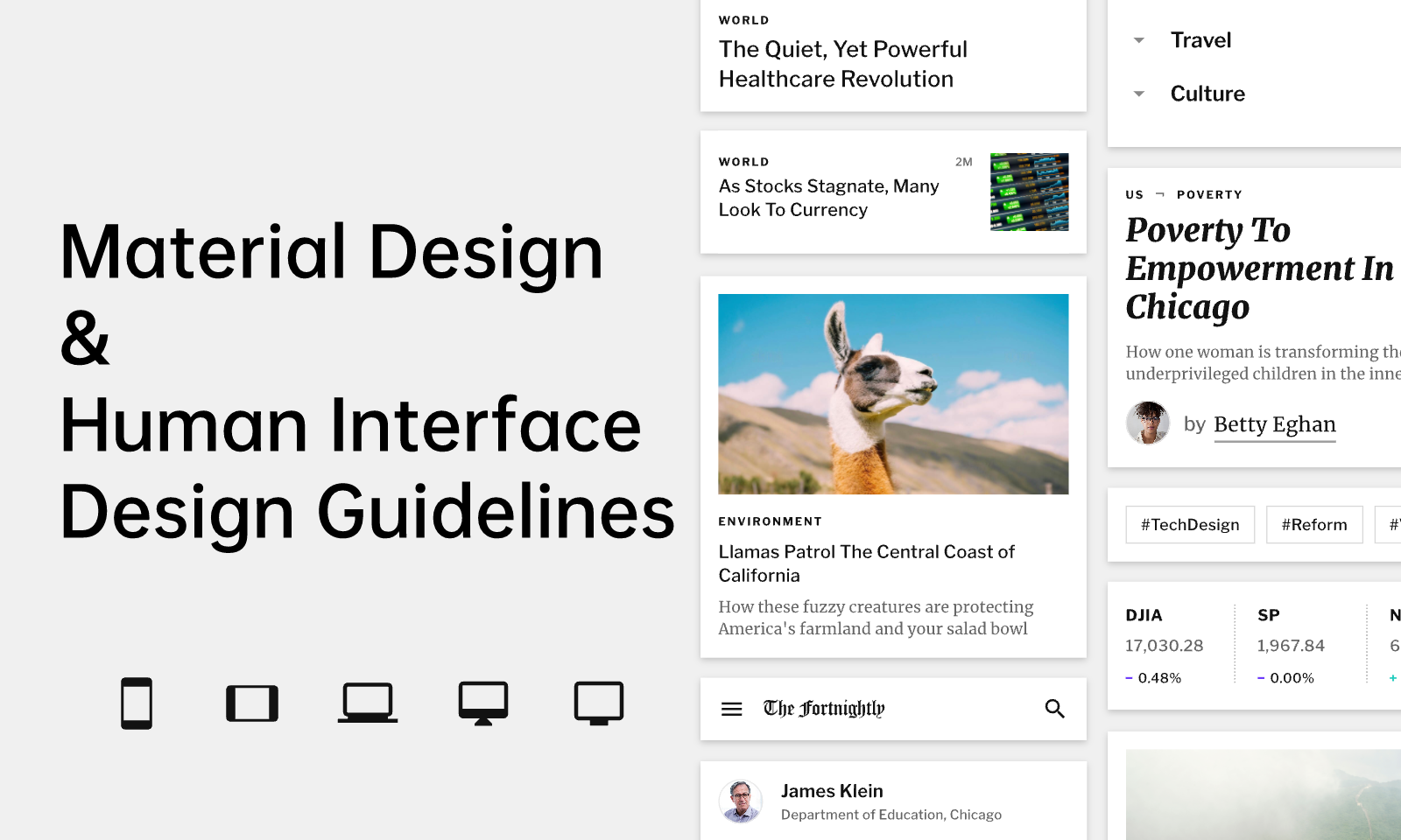
While iOS uses the principles of Human Interface Design Guidelines(HIG), Android uses Material Design. These two have different guidelines, which are responsible for the overall difference in the user interface of both platforms. The human interface design guideline of iOS is a design type that seeks to emulate and provide an idealistic mobile environment. It speaks of clarity and minimalism when it comes to design elements, a content-first approach, and a flat design that entails the use of fewer shadows.
Material design for Android UI is based on the principles of metaphoric nature: the presence of elements on different levels at different heights with shadows to facilitate a more intuitive interface. It also embodies bold graphical design incorporating typography with the hierarchy to highlight the attention of needed elements. The material design is adaptive and flexible and involves a good deal of animations.
2. Different UI components
You can also spot a difference in the exciting elements of the user interface design of Android devices, and iOS also has some peculiar components. Here is a list of the disparity of components in iOS and Android's UI design.
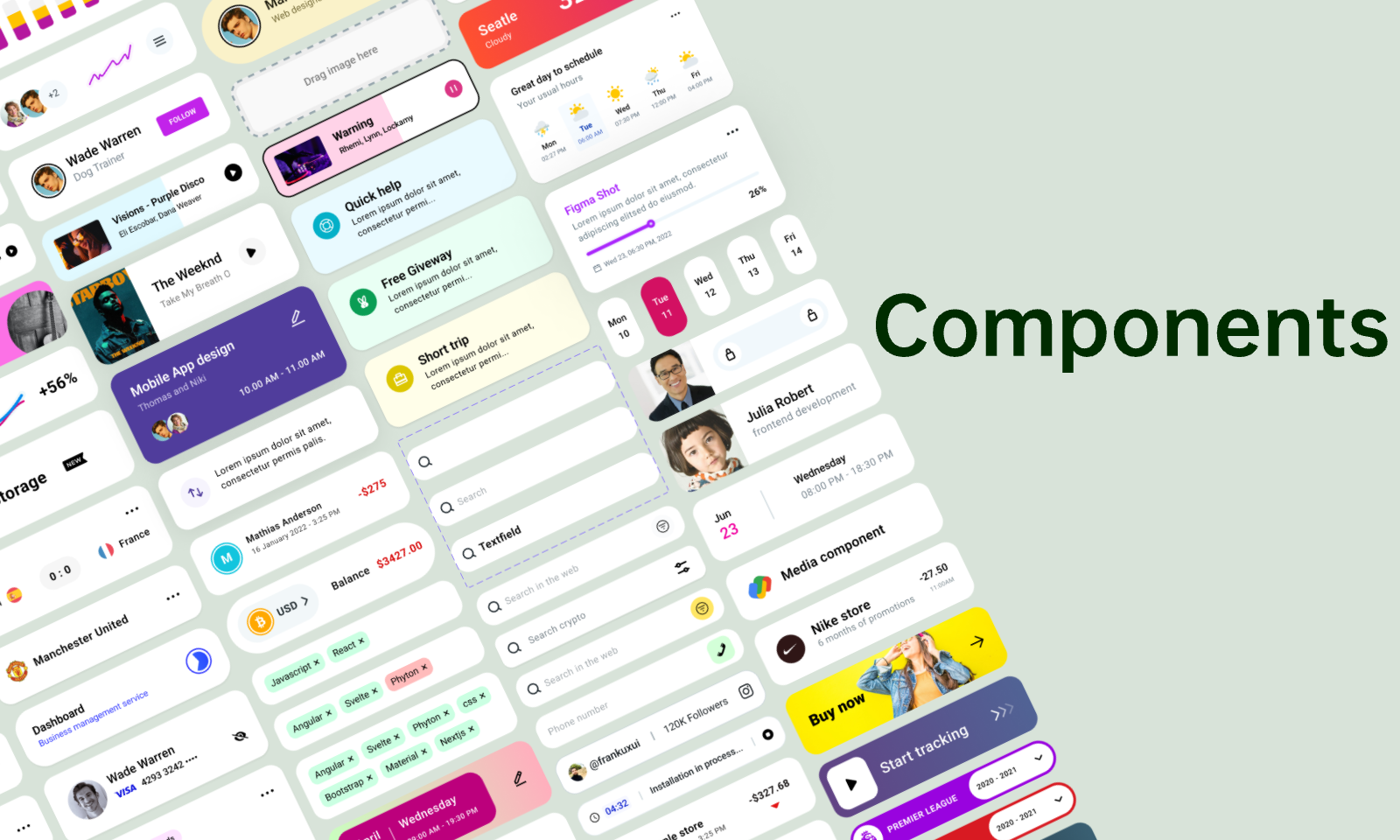
Android UI components
-
Backdrops: The backdrop is a feature of the material design, which is what android UI is based upon
-
Banners and snack bars: A banner is used for transmitting information to the user of the device and also suggests possible actions to be taken. Similarly, snack bars give results about these actions; the snack bars and banners are not present as iOS UI components.
-
Other components which are not found in iOS UI design include the bottom navigation drawer, bottom app bar, and chips which are used for information descriptions and actions.
iOS UI components:
Some companies, such as the toolbar, page control which reveals a page user is on, and steppers which are not present in material design, are among the differences in the UI components of ios devices.
3. Control Differences
The iOS and Android platform control only difference in the visual representation. Generally speaking, the controls from Android are considered to be more complex, while iOS has more simple controls.
4. Navigations
Navigations represent how users interact with an application on the iOS and Android platforms.
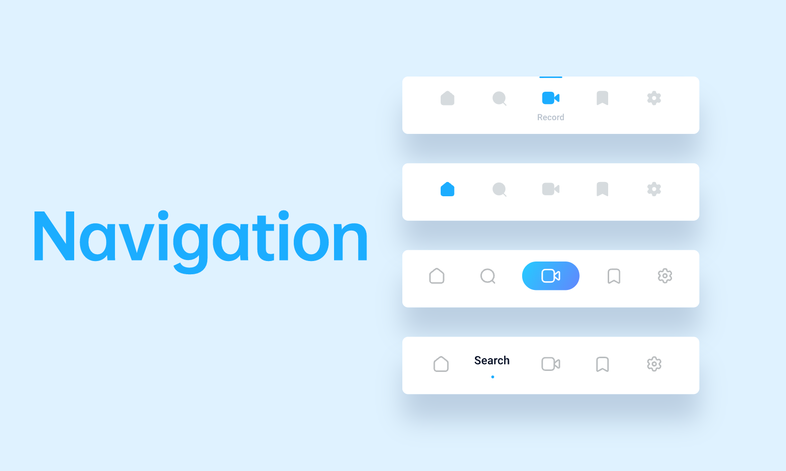
Top-of-the-screen navigation on these platforms possesses some slight differences. For instance, on iOS, the name of the previous tab, the current tab, and the action button are present, while on Android, you can have a current tab, a search bar, and an optional back button.
On the Android platform, the primary navigation destinations are spread across the interface, while for iOS, they are arranged horizontally at the bottom of the screen. Another very obvious difference in navigation is the presence of the Back action at the top left corner in iOS or simply sliding the screen from left to right, while in the Android platform, the Back button is always at the bottom of the screen.
Part 2. Similarities Between Android and iOS UI
Though we can point out a ton of differences between Android and iOS UI, this does not eliminate the similarities that they share. Here are a few ways iOS and Android UI are alike.
-
Design Scheme: iOS and Android UI design are deep-rooted in Flat Design. Flat design is the concept of using basic two-dimensional elements and bright colors for the design. This allows for responsive designs to be quick loading, as it is based on a simple outlook. The product of this kind of design is an enhanced user experience on these platforms compared to other design concepts.
-
Presence of icons: Well, if this isn't the most obvious fact. What is a UI without an icon? Icon forms an integral and is one of the most common components of any UI design. It represents a unique identification for different applications, and thus it is found on both iOS and Android devices. Although it is established that the UI of Android and iOS share this feature, there are slight differences. For instance, iOS is drawn to the simple background in the icons without words and necessary interface elements.
-
Dark mode design: The dark mode was launched with the iPhone some years back, and Android has recently joined the party by making available dark mode design for the most recent operating systems. Virtually all applications on both platforms can be completely adapted to the dark mode, and it is said to confer battery-saving benefits on both platforms.
Your Ideal Android and iOS UI Design Tool - Pixso
Regardless of whether you have to do a UI design for Android or iOS, one thing is not certain; an excellent user interface design has to be produced.
Pixso equips designers with the most recent and advanced features to enable them to create stunning, responsive, and aesthetically functional user interface designs for Android and iOS. Pixso allows designers to create high-fidelity UI designs using several features present in the software. It embraces design dynamism by offering a variety of custom styles to choose from with great and wide-ranging component variants. Pixso is adequately equipped for web design, iOS design, illustration design, and Android design. For ease and accessibility, it is compatible with several file formats, and thus designers can choose to import and export Fig, XD, SVG, Zip and other forms of files.
Pixso offers a much-needed environment for team product design by allowing real-time collaboration. It also owns a community serving as a resource library where everyone can find or publish various templates and components.
It now also has iPhone 14 Pro mockups that make UI design on the newest iOS 16 more easy. Get a start at Pixso with free access to powerful functions and high-quality design resources!

