As a designer, applying solid colors to a canvas can bring life to your designs. There is an array of color combinations that gives great vibes to your UI design. Though plain solid colors can look dull at times, that’s where designers make use of gradients to take the look to the next level. Gradients make everything more appealing—from social media posts to advertising boards.
It gives designers another creative perspective to make use of different color schemes and blend them into a powerful gradient mix. If you haven’t made full use of gradients in your design, then fear not. In this blog, you will learn more about gradient design and how you can use different types of gradient colors in your projects.
Part 1. Gradient Design: What Is It?
1. Gradient colors
Gradient colors involve blending two or more colors together and illustrating a gradual transition from one color hue to another. As a result, this creates an aesthetically pleasing look and designers can make use of different color combinations—even contrast colors.
For example, to illustrate a color gradient of a shore, designers make use of ocean blue and sandstone colors to depict a real-life shore color transition.
2. Uses of gradient design
What makes gradient designs wonderful? Because it can be used in most projects. It can be used in a business presentation or a creative project. Here are a few common places where you can use gradient designs:
- Social media posts
- Website design
- Presentations
- Backgrounds
- Videos
- For branding and marketing purposes
Part 2. What Are the Types of Gradients?
Now you have understood what gradients are and where they are used, let us explore the different types of gradients used in designs:
#1 Linear gradients
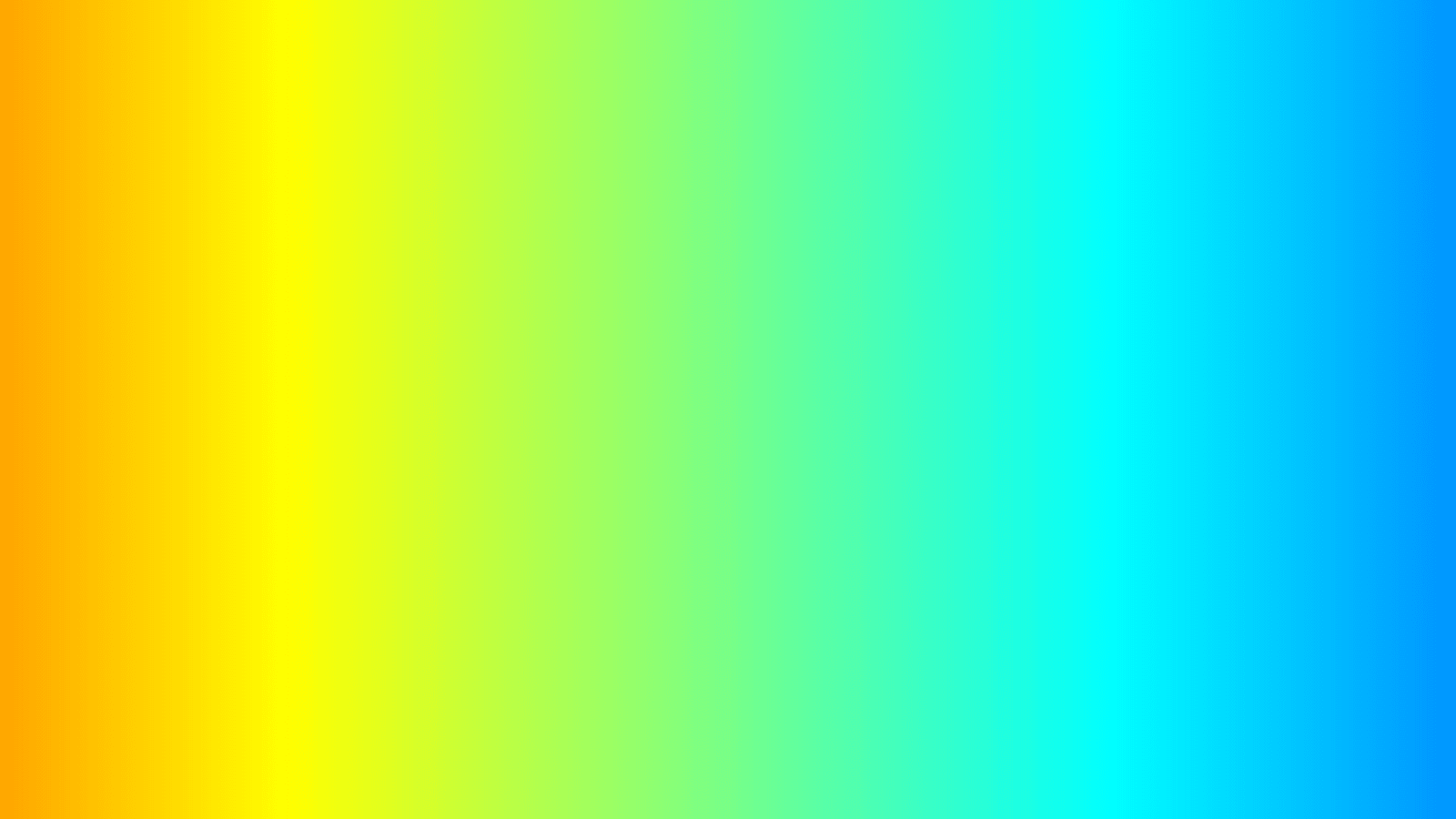
The first type of gradient is the most commonly used one. Linear gradients feature a straight line for a smooth transition from one color to another. This straight line can be either horizontal or vertical. Moreover, it can be a combination of multiple colors in a linear manner.
#2 Radial gradients
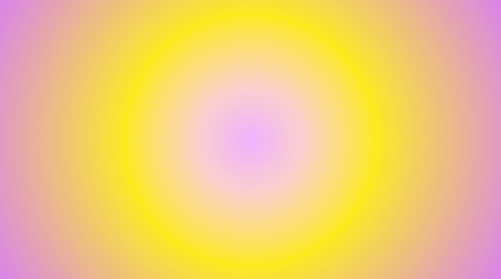
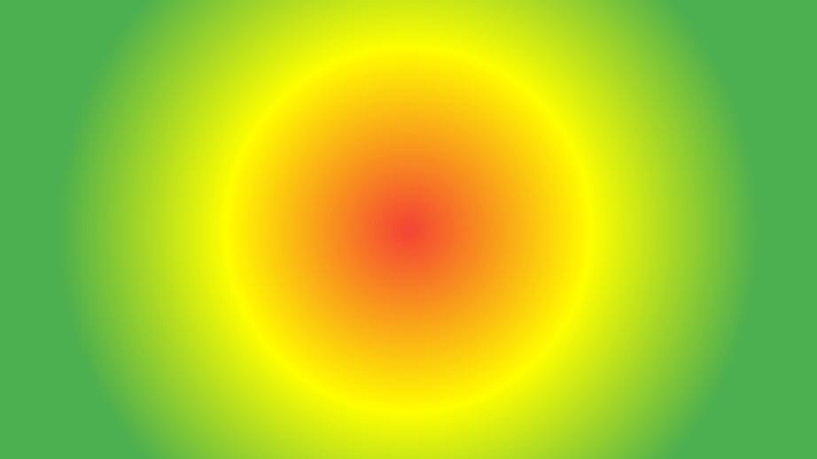
Radial gradients, as the name suggests, would have a circular transition of two or more colors. The main focal point is located at the center of the canvas and it bursts out as a radial transition.
#3 Corner gradients
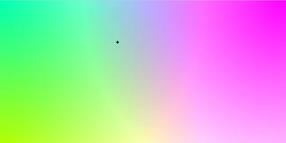
While the first two transitions took place in a linear and radial manner, this gradient color transition occurs from corners. This gradient design can take place from any corner ranging from the top-left corner to the bottom-right corner. These gradient designs are commonly used for social media posts and other marketing posts.
#4 Diamond gradients
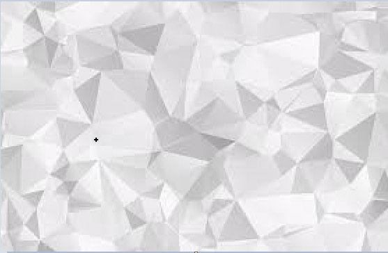
Diamond gradients are similar to radial designs as the focal point is situated at the center. However, instead of a circular design, it forms a diamond transition instead. This is a rare type of gradient design used for particular creative artwork and is not as commonly used as the others above.
Source: stock adobe
#5 Other gradients
Your options don’t end there. You can utilize other gradient designs based on your creative touch. You can use a reflective gradient design where you can reflect the same image or element in the canvas or use different shapes to transition one color to another utilizing different angles.
Part 3. Why Are Gradients Still So Trendy?
Why are gradient designs still trending? Simple. Gradient colors offer aesthetic appeal and evoke a vibing sensation when implemented in backgrounds or other designs. It provides designers scalability to incorporate different gradient design variations—whilst maintaining its intriguing nature. As a result, it offers a more modern look and you see them utilized a lot in marketing campaigns and other UI designs.
You can use gradient trends in UI design by:
- Combining gradients with illustrations - When you blend gradients in your web design elements and illustrations, it provides a third-dimensional look.
- Combining gradients with textures - When you add design elements like lines and dots, you are adding texture to your gradient designs. Thus, enhancing its look for the users.
- Conveying emotions - Gradient colors are a fine way to convey a message by depicting emotion in your colors. Users can get a sense of your brand or interface by studying the gradient design.
Part 4. How to Create Gradients in Pixso
Let us learn how to create a gradient design. For this blog, we will use Pixso – a free collaborative design tool that offers numerous design capabilities. You can design UI and other prototypes using Pixso’s amazing features. So without further ado, here are a few simple steps to follow for making a gradient design on Pixso:

Step 1. In the Pixso canvas, create a frame by clicking on the frame icon or pressing the F key.
Step 2. After making the frame, head over to the right-hand side of your screen and click the option under the Fill section.
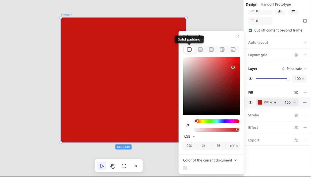
Step 3. You will then open the color setting and have the option automatically set on solid padding. You will see in the same row that you can implement different gradient options: Linear gradient, radial gradient, and angle gradient.
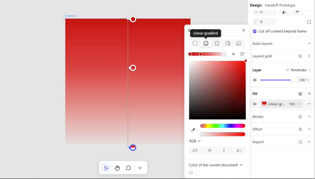
Step 4. Click on linear gradient and you can now modify a linear gradient design according to your preference. You can add a secondary color by adjusting the color bar below.
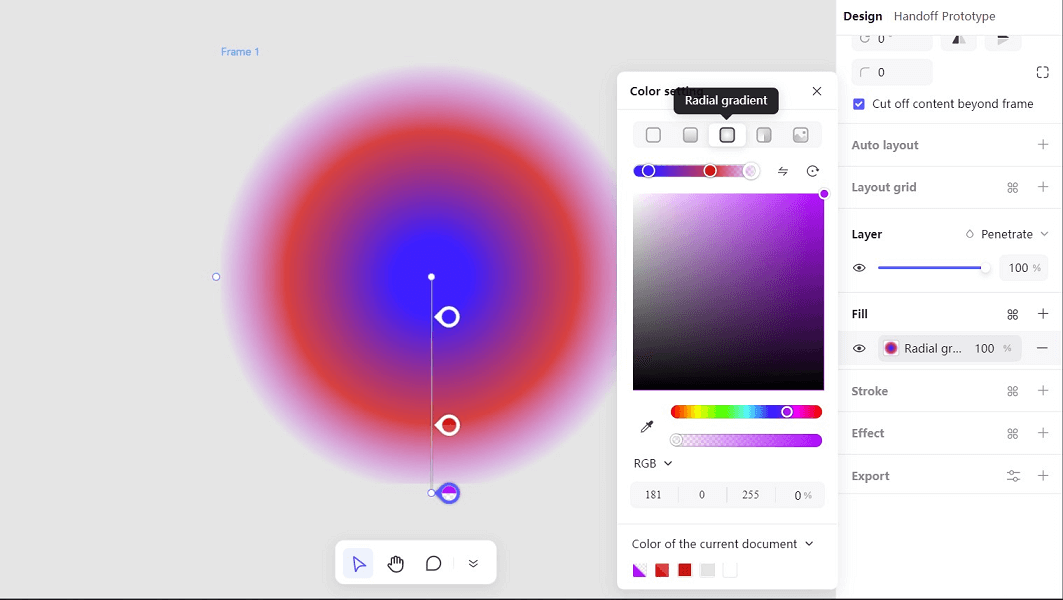
Step 5. You can modify it by adjusting the gradient's order, rotation, and transparency level. You can also click on other gradient options and use the same settings.

Step 6. After making your preferred gradient design, simply press Ctrl + Alt + K to create a component and use it conveniently in your designs frequently.
Use Gradients to Take Your Creativity to Another Level…
Now that you have learned more about the importance of gradients, their types, and how you can easily use them in your designs—you are equipped to take your designs to the next level. The trend won’t fade away and designers like yourself should make good use of gradient design to add substance and harmony to your modern designs.
Utilize different color palettes of your choice and ensure it meets your target audience. The most important aspect is to ensure your message gets conveyed clearly and gradient colors can help to support that if used correctly in your designs. Draft your creativity with Pixso Pixso now!
