As a designer, you have once or twice faced issues with your design structure while working hard to achieve an organized design. Rest assured this is normal, we've all been there. If you want to lessen your struggles, the easiest way to control your layout structure is to apply a grid system. The grid system is like a tight invisible glue that can hold the design together and allow you to tie different elements to create better products simultaneously achieving effective hierarchy, alignment, and consistency. Now, let's explore the grid design in detail, including its importance and types, as well as top tips for using a grid.

Part 1. What is Grid Layout Design
First, let's figure out what a grid is. A grid is simply a system used to organize and structure layouts. Every grid consists of three elements, columns, and margins. Practically, you can't build a user interface without a grid. It might be invisible, but it's still there.
Parts of a grid
There are several parts of a grid. However, not all parts are present in every grid, it all depends on the type of grid. Let's explore the important parts present in every grid that you might recognize from the programs that you usually use like Microsoft Word, pages, and google docs.
1. Format
The area where you will lay the final design is the format. The browser window is the format in a web design while the page is the format in a print design.
2. Margins
The space between the format edge and the content is the margin. The margin size is usually a rectangle and it's what gives the content a shape.
3. Flowlines
Flowlines also called hang lines or baseline. They are horizontal lines that separate the different grid sections into parallel bands. The flowlines allow a reader to follow the content of the layout. Furthermore, they create edge points.
4. Modules
Modules are the backbone of all grids. The modules are spaces between the flowlines and vertical lines. The vertical module groups together build columns and the horizontal groups build rows.
5. Spacial zones
Special zones are created from the groups of adjacent modules in horizontal and vertical areas.
6. Columns
Columns are the vertical lines presented from the top to bottom margin.
7. Rows
Rows are the horizontal lines from left to right margins.
8. Gutters
Gutters are the spaces between columns and rows. And it's important to keep the gutters equal to maintain a visual balance.
9. Markers
The areas situated in the header or footer are the markers. They indicate where repeated information is placed.
Part 2. Why is the Grid System Important to Design
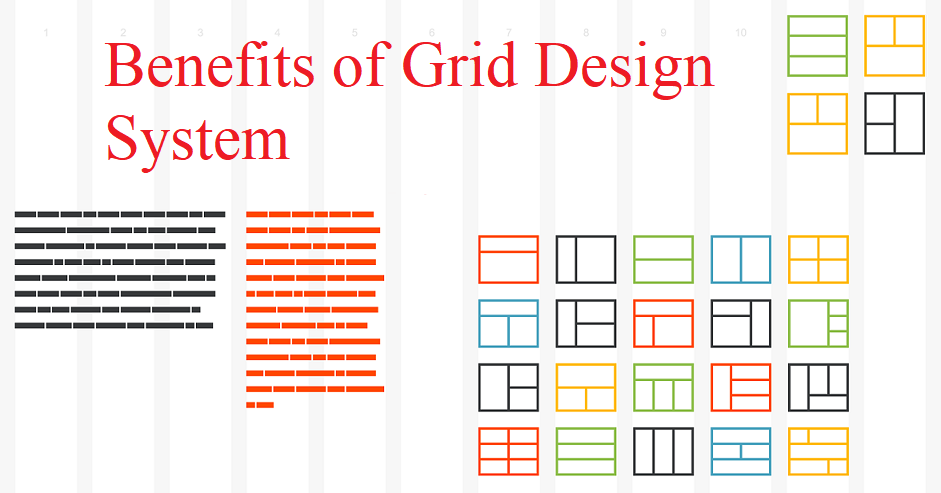
Among the reasons grid design system will improve your design include
- To keep your content organized: One of the important benefits of using a grid system is that it will keep your content organized and appealing. So before using any grid, make sure it can align your elements.
- It will simplify your work: Now that technology is advancing, everybody is looking for efficiency, so the grid can make your work a lot easier and quicker by guiding you to place and position your elements.
- It will help your type: We all know type and grids work together hand in hand, so a good grid can assist in making your type-heavy layout look neater and organized.
- Help maintain cohesiveness in multi-page layouts: A strong grid will help you maintain cohesiveness in your layouts. Especially if your website has different pages, structures, and compositions.
- It will improve visual hierarchy: Hierarchy is important to every design, a grid can fasten the hierarchy process and make it easier.
- It prevents cluttered layouts: Immediately you start using a grid system, you will say goodbye to cluttered layouts, it will make your design look more clean and neat.

Part 3. What Are the Types of Grids?
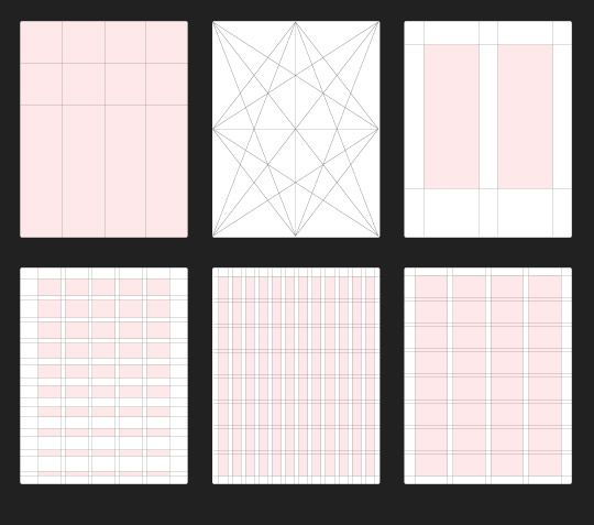
There are multiple types of Grids, but here we will look at the essential four.
1. Manuscript Grid
The manuscript Grid is the simplest and easiest grid of all, it's a rectangular area that takes up a large part of space in the format manuscript Grid is usually used for broad and continuous blocks of text like books and long essays. It's also called a single-column grid or block grid.
2. Columns Grid
To make a column grid, you just need to make a lot of columns inside a format. This grid can depend on each other.
3. Modular Grid
Modular grids are like column grids but with even divisions expansions by rows. A modular Grid is normally used in projects that need more control than what column grids can offer. It's mostly used in graphs, schedules, navigations, etc.
4. Hierarchical Grid
Most hierarchical grid is found on the web. Build mostly with respect to the position of an element that can be adjusted based on the data needs.
Part 4. 5 Top Tips for Grid Design
#1 Understand the grid anatomy
Basically, all types of Grids have common components which define them as a layout. Be it how simple or complex the design is, and big or small. So the best way to understand the best practice is to know the anatomy of the grid system. (Already stated above.)
#2 Select the right grid layout
A grid structure has both types and subtypes and each has a different use design. So choose the right layout that will align with your page without compromising the appeal.
#3 Respect the golden ratio
Many designers the golden ratio concept because it helps in enhancing the size, balance, and layout of a grid design. The proportion of the golden ratio equals 1.6180.
#4 Obey the rule of thirds
The rule of thirds is a design technique that helps a designer create grid layouts with visual balance and proper image placement. The rule of thirds helps in determining some vital grids and some decisions of layout-related design.
#5 Create room for white space
White space plays an essential role in the design, especially in details like readability, scalability, information hierarchy, etc.
Final Thought
Now that you've understood the grid design system and its importance, it's time to start building better UI Designs so you will have a great design workflow, and Pixso is an excellent tool that can help you have a great design workflow.


