Icons, small little symbols that express so much, are everywhere these days. They have a massive impact on the success of user interfaces (UIs). Whether you're an aspiring user interface designer or a UX designer seeking to brush up on some visual design abilities, the icon design process is vital in your arsenal.
So how to polish your icon design and make it both aesthetically pleasing and practical? That’s what this article is going to discuss. Keep reading.
What Is Icon Design
Humans have employed symbols throughout our history. These little but very technical graphics provide a worldwide language for service, guidance, features, warnings, design, marketing, and much more . Icons are little in a size but they have a significant impact and they are an essential feature to employ navigation.
![]()
Icon design is the process of creating a visual symbol that represent some actual, fantasy or abstract purposes, things or activities. In the context of software applications, an icon frequently signifies a program, a function, data or a collection of data on a computer system.
Icon design creates a visual representation of a program, object, data, interactions, or activities in software, websites, and apps. These widely familiar symbols help people from around the world to navigate quickly through a website or application.
How to Create Amazing Icon Design
In this part, we'll walk through the icon design process and introduce some basic principles as well as a powerful tool for icon design.
![]()
Step 1: Get familiar with the object.
To start, get familiar with what your icon's item looks like. A straightforward approach is to Google what you're going to design.
You'll find numerous variants of this thing, yet they will possess identical properties. Make sure to incorporate these characteristics in your design since they'll make your icon easily recognizable to a large audience.
Step 2: Break it down.
Next, you should begin to seek simple forms. Are there any circles, squares or rectangles you can use to build? Go through a few drawings and revisions to help you identify them. These will be your construction blocks.
Step 3: Start designing!
With all of this information, you can proceed to the computer. Start by creating a frame that is 24x24px, then switch on the pixel grids. On it, sketch the fundamental forms that make up the distinguishing qualities you mentioned previously. Make sure all the forms fit tightly on the pixel grid.
Step 4: Test your design.
To ensure your work reads clearly, you'll want to test it. Share your work with a co-worker or friend. Ask them what they see. Did they quickly recognize your icon, or are you not quite there? Take note of the feedback and make changes if required.
Step 5: Tidy up.
Before you complete your icon, double-check for any decimal points. These fractions might make your icons seem fuzzy at the borders. Look at the inspector numbers and ensure they are all entire.
Step 6: Export your design.
Save your work and export it, and make use of it.
Principles of Icon Design
Before tackling icon design, several standards and principles are worth knowing. To create good icon designs, you should take a holistic approach to the audience, size, simplicity, lighting, perspective, and style. This section provides a solid starting place for generating icons that function well together and integrate effortlessly into your designs.
![]()
1. Build with simple forms
Everything can be broken down into fundamental forms. Once you've established your icon, try to break it down into basic shapes. This is the best method to begin to design and simplify your icons.
2. Use familiar concepts
It's tempting to develop an entirely new, wild, unique symbol or set. We're creatives, after all! However, we've got standards we want to conform to. We've gotten used to distinct characters that denote basic functioning. For example, the magnifying glass used for "search". However, we've used them so frequently that they have become the standard search symbol. A different icon forces the user to learn something new, slowing them down. This is not very conducive to a seamless user experience!
As long as the icon and its function are still clearly recognized, it's completely OK to add your own design flare! If the icon isn't reflecting functionality defined by standards, you can let your creative juices run. If it is, you may still give it a creative spin.
3. Design the icon at sizes to be utilized
If you design using a vector design program like Illustrator, there is a human tendency to scale the design and try to utilize it at any size. This doesn't work with icons. What appears beautiful at 512px seems like a hazy smudge at 16px. Icons should have a base design used as a starting point, but each output size has its own optimal design.
![]()
4. Use simple details
We often put symbols in tiny areas, like the tab bar on an iPhone. As things grow little, too much detail tends to get lost.
When you design, be thoughtful about the sorts of detail you choose to incorporate. Go gentle on the smaller portions and make sure your symbols read well, especially at small sizes.
5. Be consistent
When you develop a group of icons, they should feel like a family. They won't all look the same but will have comparable aesthetic features, making them seem associated.
As you design, make consistent stylistic decisions. If, for example, you've utilized rounded corners and ends in one icon, make sure you do it for all the rest. Styling, size, and degree of detail should all be consistent. This adds to consistent visual language—a critical aspect of branding!
6. Test your work
The best method to ensure your symbols communicate clearly and swiftly with consumers is to test them. Once you've created your icons, conducting a brief test is an excellent practice.
Show your symbols to a buddy or someone else on your team. What comes to their minds when they see them? If it matches what you've planned to express, you're in excellent shape!
7. Harmonious Lighting
The realism you bring to your designs must all operate harmoniously. If you utilize a light source from one direction, stay with it, or you risk losing the integrated look of your icons. Also, consider the light source of the design your icons will be in. If the light source of the icons is at odds with the website or application design you're employing them in, then the design will seem unprofessional.

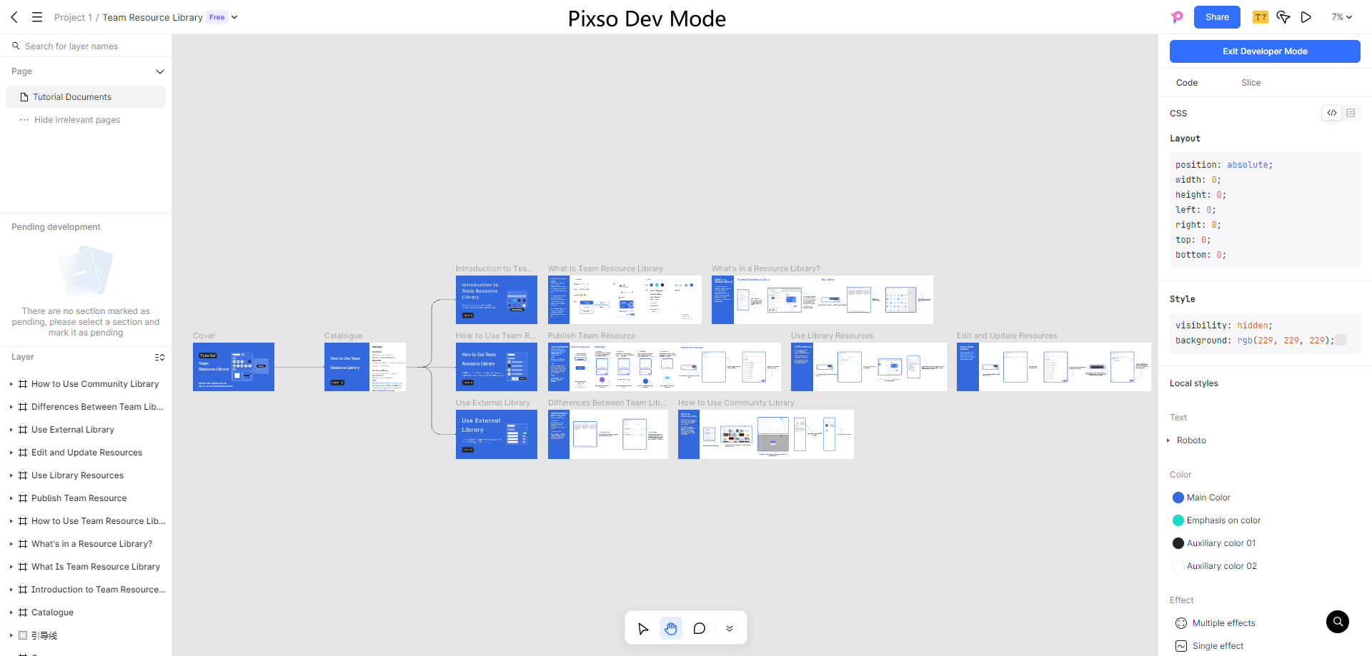
A Powerful Icon Design Tool - Pixso
Pixso is an excellent tool for making personalized icons. It provides unlimited possibilities in the UI/UX industry and is the ideal tool for designers. With Pixso, you may explore the icon design process and produce a coherent set of basic icons to utilize in a digital project.

Because Pixso is compatible with a broad range of file formats, customized icons from vector design applications like Illustrator may also be imported simply for usage. Likewise, your unique icons produced using Pixso may be exported in numerous formats as well.
Rich Icon Design Resources in Pixso Community
Other than developing new icons from scratch, Pixso includes a large icon resource library. There are hundreds of free-to-use icons accessible for designers. This speeds up the process of designing and boosts efficiency. Looking for pre-built, clean icons for your project? Explore the Pixso resources library now!
![]()


