Apple revolutionized the way people interact with hardware and software when they introduced the iPhone. And, as iOS has developed, they have inspired thousands to try iOS app design by providing their development tools for free, alongside their software frameworks, to help people take their first steps in software design.
But as well as learning how to code and manipulate objects, iOS design demands that careful thought and attention be paid to the app’s interface. Apple has produced lengthy guidelines of how apps should look and work, and are unlikely to put apps that don’t meet their standards in their App Store.
As anyone who had used iOS apps knows, this does not mean all apps look the same. But it does mean that they can all fit into an iOS design system that offers users a consistent experience on their devices. So, what are the key things that Apple demand from developers?
Part 1. What Are the Principles of iOS App Design?
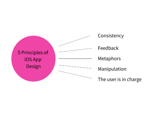
The iOS UI design standards come from the Apple Human Interface Guidelines. Starting in 1977, the document has evolved, covering design for all Apple platforms. While this article covers iOS for the iPhone, many of the principles are the same for iPadOS. Although the latest, 2023, edition of the guidelines has changed some language, the five core principles remain.
1. Consistency
iOS app design should be consistent, both within the app and outside. This means that even a new user should be able to recognize and predict what elements will do. For example, buttons should offer a clear indication of the action they will perform.
2. Feedback
An app should not leave the user guessing what has happened. Whether it’s visual, audio, or haptic feedback, the iOS design system offers many ways to keep the user informed.
3. Metaphors
iOS UI design should use visual cues to inform users of what elements are. These will frequently relate to real life, like the desktop metaphor in computing, but they can increasingly reference virtual actions, like the ‘share’ icon.
4. Manipulation
iOS design centers on touch, and therefore there should be direct interaction between the human and the object. Users should be able to directly manipulate objects, for example dragging items on the screen, and not have to use separate controls for this.
5. The user is in charge
From the very first guidelines, it was emphasized that a UI was there to serve a human. iOS app design continues that. The UI should empower the human, so while warnings are appropriate, it should never attempt to push the user into a specific choice or action.
Part 2. How to Design an iOS App: The Interface Essentials
There are three core elements to iOS design: views, bars, and controls. Each should have a clear purpose in the interface.
1. Views
The view is the most important element in the design since this will be the main focus of the user. It will contain the main content they are using or interacting with, such as text, graphics, or interactive objects. As such, it will likely be the dominant feature of the screen.
2. Controls
As the name suggests, the controls are part of the iOS design system that can initiate actions, such as buttons or sliders. They can also offer some feedback, such as a progress indicator integrated with the button.
3. Bars
Bars occupy a hybrid position between views and controls. They can support the view by providing things like navigation or status. But they can also offer some control-like functions, such as offering a toolbar or search.
Part 3. Five Tips and Recommendations When Designing an iOS App
Perhaps the best tip is to read Apple’s Human Interface Guidelines and think about how they have been applied in the apps that you love. That will provide inspiration and understanding that can inform your design. However, here are some general, important tips for iOS app design.
1. Design for humans holding the device
Always think about how people will use the app. Consider how people hold their phones and how they reach the controls. Is everything within thumb reach? Or will simple, but necessary, actions require a difficult stretch or a second hand?
2. Make sure the UI adapts
iOS design has become more complex as new screen sizes and features are added. Think about how your app will react not just to changes in orientation, but also to things like switches between light and dark mode, or how the changing color palette of NightShift will affect the display.
3. Use points, not pixels
With a variety of screen sizes, you should design using points, so your iOS UI design will scale elegantly across different devices. Use actual devices, or an emulator, to test out your design at various resolutions to ensure you won’t have a group of users that have a less than perfect experience.
4. Inform at a glance
You should endeavor to make sure your UI contains enough, but just enough information, that the user only needs to glance at it. Aside from being a smaller screen, which can look cluttered, users may be using your app while doing something else. Ensure you use bars and controls are effective to allow them to do that.
5. Keep it focused
Use features like pop-up warnings or notifications only when necessary, and always offer a clear route for someone to cancel an action. As the Human Interface Guidelines say, your iOS app design should be there to serve humans, not to annoy them with alerts or frustrate them with irreversible options.
Part 4. Four iOS App Examples That Will Inspire You
There are many great apps out there, but here are four Apple award-winning apps that highlight how different and innovative iOS UI design can be.
Carrot Weather
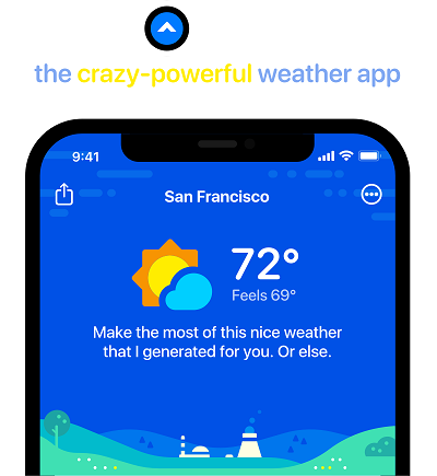
Perhaps best known for the ‘attitude’ it brings, Carrot Weather offers information at a glance, while invisibly integrating with several iOS services to make it useful to the user.
Slopes
Again, Slopes integrates with other iOS features to make it easy, and even automatic, to track boarding runs, but then allows sharing with friends and others with a single, intuitive tap.

Darkroom
Darkroom is a photo editor, but uses the views and controls to make even powerful editing tools simple and intuitive for a novice user.

Toca Life World
Although a children’s app, the view offers endless interaction options, allowing creative play on a screen within an intuitive app.

Bonus. The Best Free Design Tool for iOS App: Pixso
iOS app design, like any design, often begins elsewhere. And Pixso is a great place to start designing your app. With built-in templates and reactive design tools, you can quickly and precisely generate prototypes of your app, all the way through to a design draft.
Using Pixso for your iOS design also means you can take advantage of its powerful collaborative tools, getting instant feedback from project members, and helping you to test and iterate your design before you even have to write a line of code.

Conclusion
Much of Apple’s success is built on its intuitive, but powerful, OSs. Its Human Interface Guidelines are an extension of this, offering you tips to build apps that people simply love using because they are easy and intuitive. Starting your iOS app design in Pixso gives you the opportunity to test it out and make sure it’s perfect, so you can build that killer app in no time.

