In recent years, the demand for mobile applications and mobile website versions has significantly increased. For this reason, mobile UI design has become essential for every designer that wants to create apps that users will love. A mobile UI is quite different from the typical desktop UI since it is affected by the screen resolution and the way users interact with it. Therefore, you will need to study these differences and learn the principles of mobile app UI design.
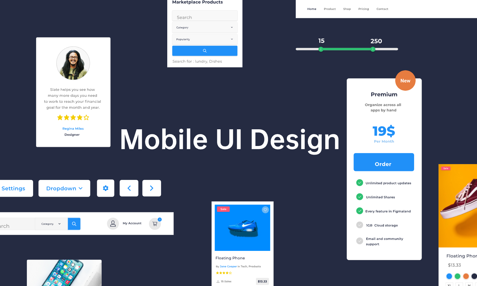
In this article, you will learn what you need to know to design a mobile UI that users will love.
Part 1. Quick Overview of Mobile UI Design
1.1 What Is Mobile UI Design
When we are talking about it, we are referring to the process of designing a user interface for mobile devices. This mobile UI consists of several graphic elements that construct a website or application that is meant to be displayed on mobile phones or tablets. When designing a mobile UI, the designer should consider various elements, such as hand gestures and screen resolution.
1.2 Mobile UI Design Vs Common UI Design
One of the most common questions is how mobile app UI design is different from traditional UI design. The truth is that both design processes have to follow some similar principles, while also keeping in mind the different screens and uses.
First of all, both mobile UI design and desktop UI design have the user at the center of the process. No matter the system, users should always be able to find what they are looking for without needing to search for it. Moreover, both UIs need to be extremely readable and accessible to everyone.
Nevertheless, a mobile UI has some unique elements. For instance, every designer should be aware that it will be displayed on a touch screen, and for this reason, he will need to implement interactions based on hand gestures. This is an element that isn’t present in desktop UI design.
Part 2. How to Make Your Mobile UI Design Outstanding
2.1 Basic Elements
Before we get into the particulars of mobile UI app design, you need to be aware of its basic elements. When you are trying to design a mobile UI, you will be required to create the following screens.
#1 Menus
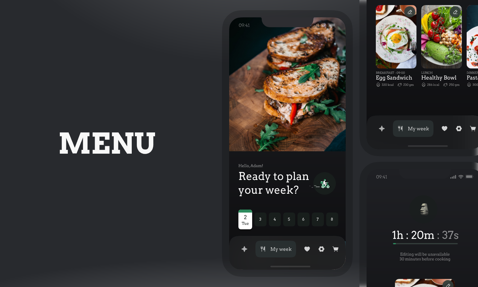
Menus are an integral part of any website and application. This is where users will try to find what they are looking for. However, in a mobile UI, the right design of the menu screen becomes even more important. Every category in the menu should be big enough so that the user can tap the item he needs without tapping another one by accident. Moreover, it should be easily distinguishable from the other elements on the app.
#2 Forms and Log-in Screens
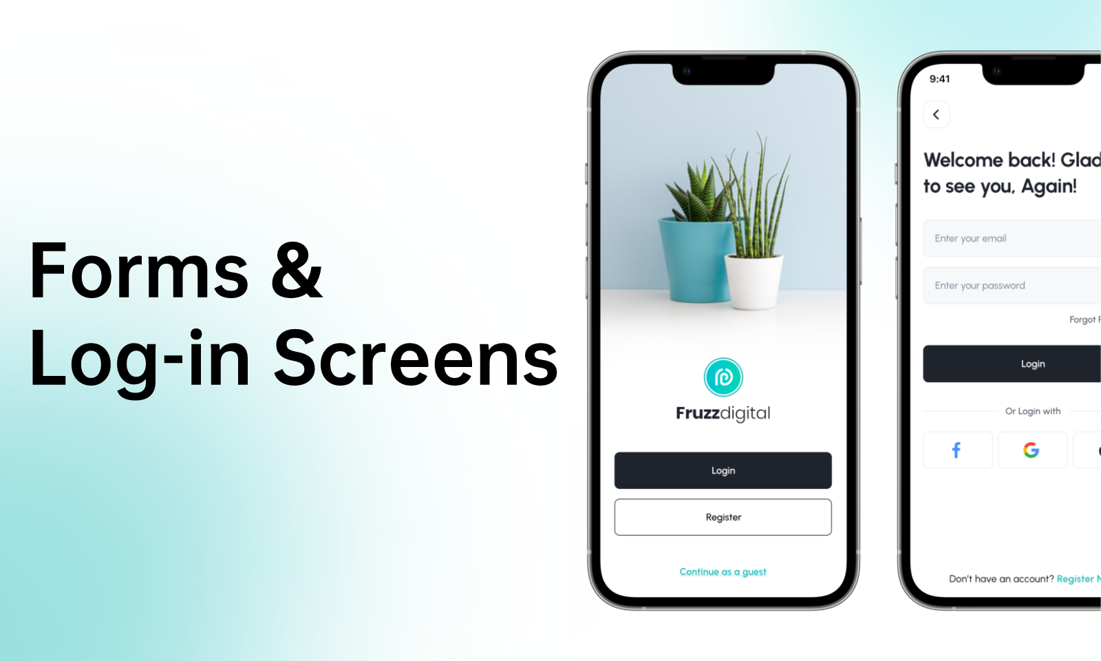
Another important screen in a mobile app is the various forms that users will be asked to fill out. For instance, it might be a sign-up or a checkout form. No matter its use, the form should guide the user to fill in all the information that are needed and no more. It is useful to remember that users will abandon the task if they feel like they need to type too much information.
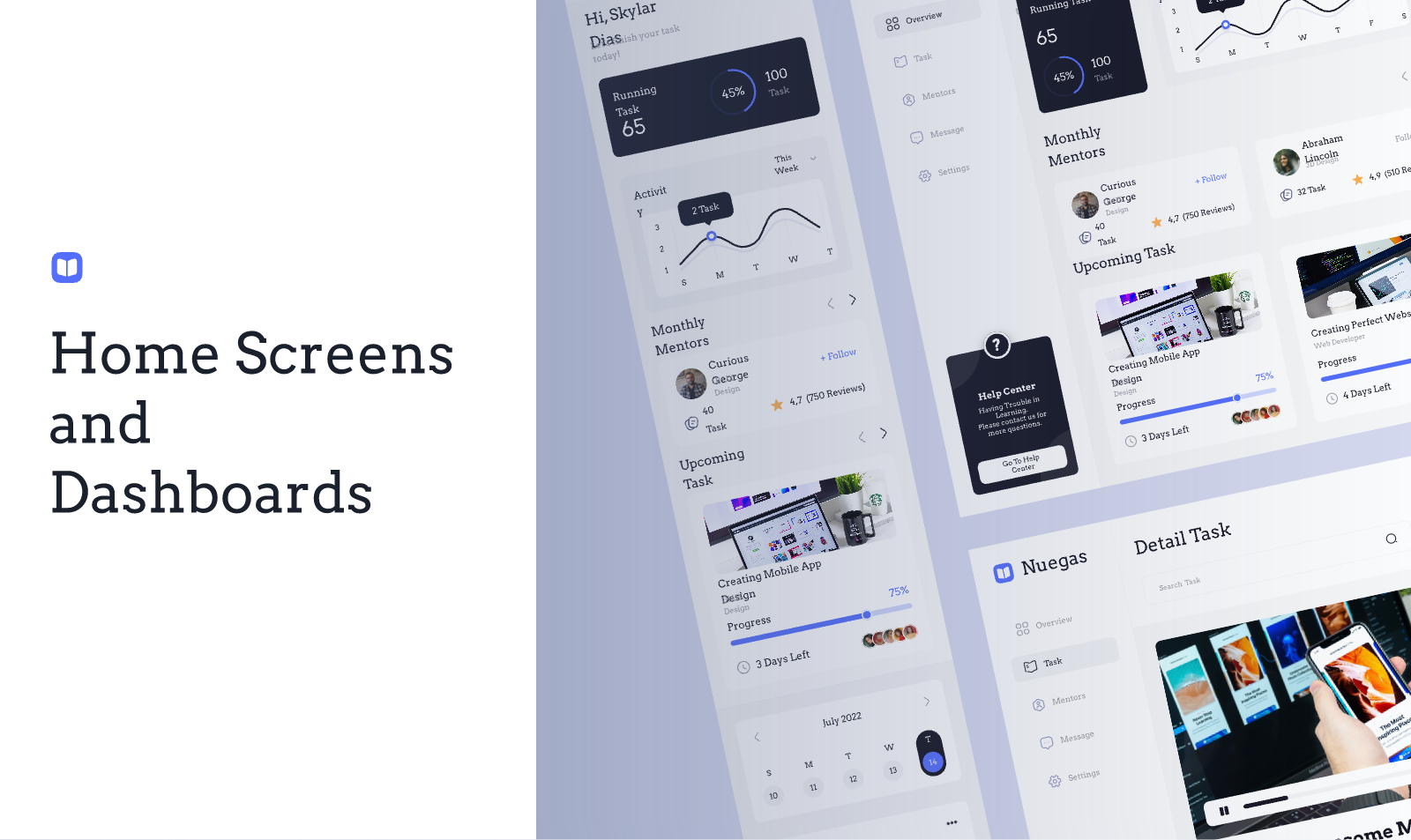
#3 Home Screens and Dashboards
Some other screens that are a big part of mobile UI design are the home screens and the dashboards. This is where users get an overview of their activity and find the section they want to visit. In essence, once they sign up, the home screen is the first thing that users will see whenever they launch the app. This is the reason why it is essential to create one that caters to their specific needs.
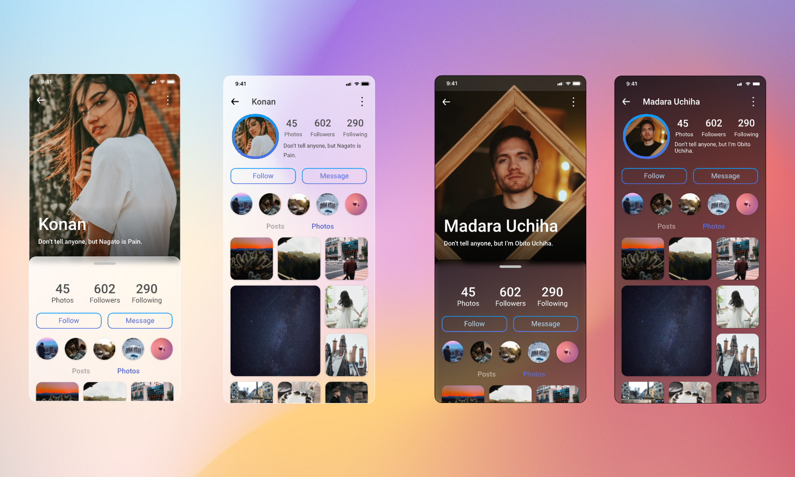
#4 Profiles
Lastly, one more screen that you need to build for any mobile app is the profile. Every user should have access to a screen where he can view his account’s information. In the case of a social media type of app, he should also be able to find and edit his posts. These are all things that you need to consider to design a great profile page.
2.2 Basic Principles
Now that you know the basic elements of the mobile user interface, it’s time to learn more about the principles of mobile UI design. Namely, these are the following:
#1 Prioritize Content
On a mobile device, users have countless options, and for this reason, each app needs to do its best to capture their attention within the first couple of seconds. The easiest way to ensure that is to offer something of value. Of course, when it comes to mobile UI this valuable thing is none other than the app’s content.
#2 Don’t Overstuff the Screen
One of the things that make mobile UI design so challenging is that you have limited space. This means that you will need to find ways to fit everything into a small screen. However, this bears the risk of overstuffing the screen and overwhelming users. Instead, you can take a more minimalist approach and retain only the most useful elements.
#3 Emphasize User Flow
Having limited screen space means that you will also need to split the content into multiple pages. For this reason, mobile UI design prioritizes user flow as they will need to navigate the app. Of course, the user path is very important on both the mobile UI and the desktop UI and it is an element that you need to thoroughly review before you release the system.
#4 Think for the Small Screen
One of the most basic principles of designing for mobile devices is that you have limited space. In essence, you must place the information in a way that they are easy to read and that all the clickable elements are easy to tap. A great way to achieve that is to take advantage of the white space so that you give elements enough room.
#5 Don’t Ask Users to Input Data
As we have already mentioned, users won’t complete a task that requires them to type a lot. This applies to every element of the mobile app. Therefore, eliminate any elements that ask users to type information they don’t need to.
2.3 A Suitable Tool – Pixso
Designing for a mobile UI can be a challenging process for every designer. However, you have tools at your disposal that can truly facilitate it. One of the best UI/UX tools that you can use is Pixso.
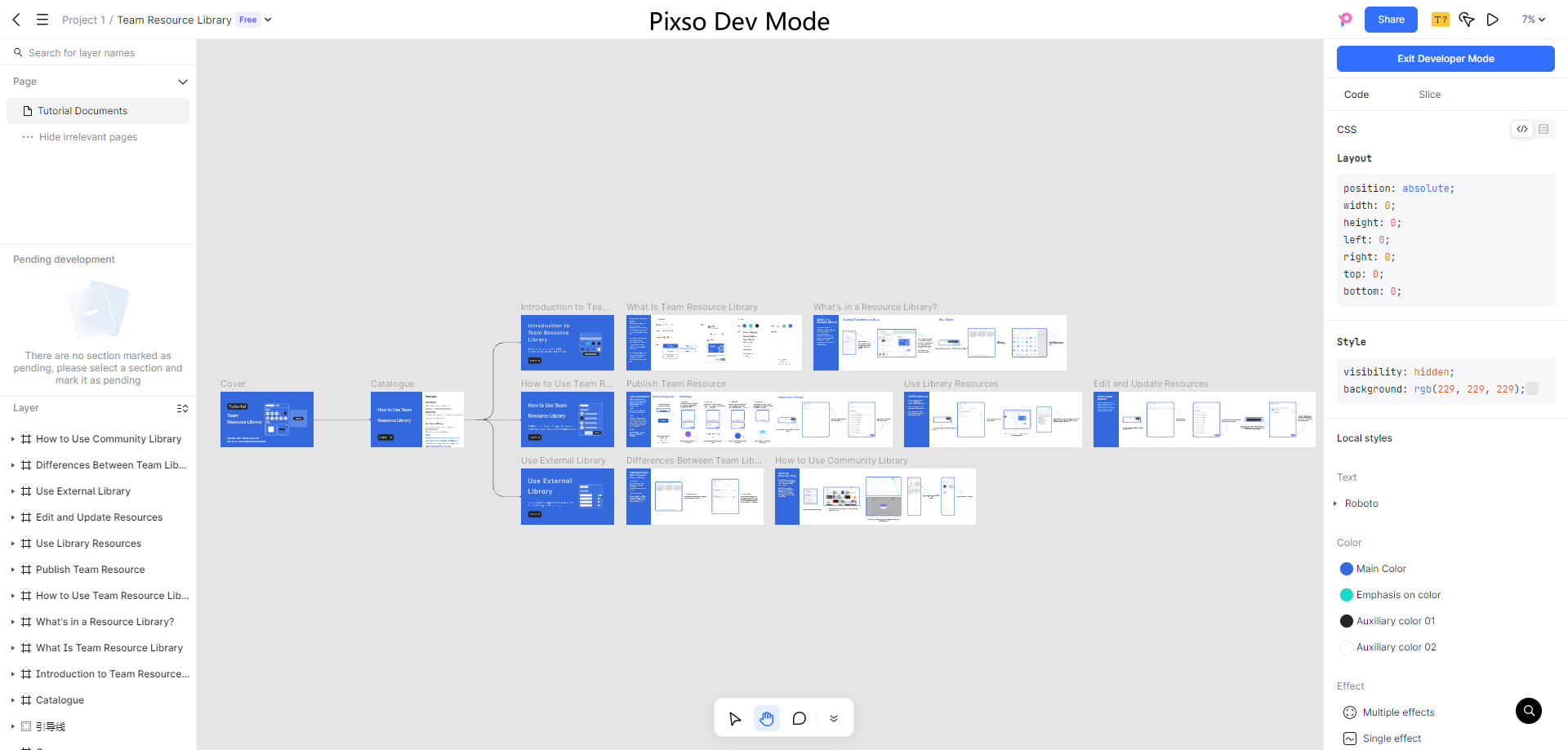
This tool has been developed to help designers and teams create high-fidelity prototypes quickly and easily. Pixso offers you a large library of components that you can simply drag and drop into the mobile UI you are designing. Moreover, you can also design the user flow and get a prototype that is close to the final system. This way, you are in a position to immediately try your design and spot the areas where you can refine it.
In addition to this, Pixso also encourages collaboration between team members. You have the chance to share the project with the rest of your team through the cloud. By doing this, you can receive their feedback in real-time, a thing that will make the whole process quicker. And when you are done with the mobile UI design, you can export slices of code with one click.
Part 3. Mobile UI Design Trends [2025]
The truth is that such UI design is ever-evolving. For this reason, it is important to study the current trends so that you can implement them into your designs. Here are the most prevalent mobile UI trends in 2025.
#1 Implement Dark Mode
Dark mode has seen a sudden rise in the past few years. These months you will find more and more apps and websites implementing this option as users seem to prefer it. Therefore, you should also add dark mode to the mobile UI you are designing.
#2 Add Animation
Another element that has been dominating the mobile UI trends is animation. This can be a transition between screens, or GIFs, and other video content. Depending on the purpose of the app, you will need to find ways to add these animation elements to your mobile UI.
#3 Utilize Chatbots
The trends also ask that you include chatbots in the system. Users are bound to have some questions and they will try to reach out to customer support. A chatbot can really help them by providing answers to the most frequent questions.
#4 Introduce Logging in with Face ID or Biometrics
This mobile design trend has emerged over the past few years as people have gotten more interested in the privacy of their data. Enabling logging in with face ID or other biometrics adds another level of security.
The Bottom Line
Now you know the basics of mobile UI design. By following these principles and trends, you will create a system that users will want to use. If you are seeking a quick way to create interactive prototypes with clear user flow, you need to try Pixso. This app provides you with the tools you need to perfect your designs and bring them to the next level. The individual version is free now. Just try it out!

