When you are designing an interface, you need to consider every page that you will need to include. For example, you will need a home page, an about us page, a contact page, and several others to cover all of the website’s content. In addition to this, you must also include some other elements, like popups, which will contribute to the growth of the website. For this reason, you will need to learn what pop up UI design demands.
For many designers, popup UI design is a bit tricky as it is an element that many users might find annoying. In this article, we are going to show you how you can make it effective so that you have the best results.
Part 1. What Is Pop Up UI Design
A popup is a very useful element that is often used to encourage users to complete a specific task. For instance, it can promote a special offer, and be used for lead generation or data entry. Therefore, pop up UI design is the process of creating this visual element. As it happens with every other page, popup UI design has specific rules and principles that you need to follow.
This way, you can be sure that it will serve its purpose without causing frustration to the user.
Part 2. How to Create Excellent Pop Up UI Design
2.1 Quick Learning of Pop Up UI Design Basics
Before you see examples of great pop up UI design, it is important to understand the basic. These principles will guide you through the creative process so that you bring your popup UI design to the next level.
#1 The Pop Up Should Be Consistent with the Rest of the Design
A pop-up window is an element that is only visible for a little while since the user can choose to immediately close it if they aren’t interested. However, this doesn’t mean that the pop up UI design should neglect the overall design of the website. Instead, consistency is key to making this new window seem like an integral part of the website.
#2 Take Advantage of Colors and Shapes
Popup UI design focuses on catching users’ attention at a glance. For this reason, you will often find that designers are utilizing colors and shapes that can draw the eye. For instance, you can use bold colors and high-contrast color combinations. Moreover, you can also take advantage of bold typography to highlight specific words that users need to remember.
#3 Make the Purpose of the Popup Clear
One of the most basic principles of pop up UI design is that this window needs to serve a specific purpose. And to take this one step further, it needs to make this purpose clear to the user. Therefore, your popup UI design should show what this element is all about and each button should complete the task that users think it does.
#4 Add Personalization Elements
Pop-up windows are often considered annoying as they disrupt users’ navigation of the website. However, there are ways with which you can make your pop up UI design interesting. A great technique is to add personalization elements that take advantage of the cookies on the user’s browser. This way, you can show a personalized message to every single user.
#5 Don’t Disrupt the User Path
As we have already mentioned, a bad popup UI design is one that prevents users from getting to the content they want to consume. To avoid this mistake, you will have to consider the right timing for showing the pop-up window. Moreover, the pop up UI design should also make it easy for the user to close the window.
#6 Make the Close Button Visible
In continuation to the previous point, we must mention how frustrating it is not to be able to find a way to close the pop-up window. Some designers think that by doing this, users will complete the task so that the window closes. However, this practice can backfire and users might just abandon the website altogether. That’s why a good popup UI design is to make the close button as clear as you possibly can.
#7 Design a Separate Popup for the Mobile UI
All of the above principles become even more important when you create a pop up UI design for mobile devices. You should keep in mind that screen resolution will affect the way that your pop-up will look like. In most cases, it will take up the whole screen, which might dissatisfy users if not done correctly. For this reason, many designers create separate pop-ups for mobile UIs.
2.2 Get Inspired by the Popular Popup UI Designs
Now that you know the basic principles of popup UI design, it is time to see some examples of it. Below, we have selected some great designs to inspire you.
#1 Data Entry Popup
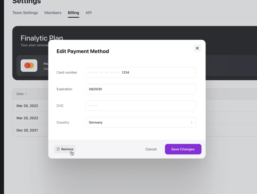
The first example of good pop up UI design is this data entry pop-up by Kevin Dukkon. What makes this design great is that it has a clean and minimalist design that doesn’t overwhelm users. Everyone that sees this window knows which data he should type in each field. Moreover, every button is easily distinguishable.
#2 Onboarding Popup
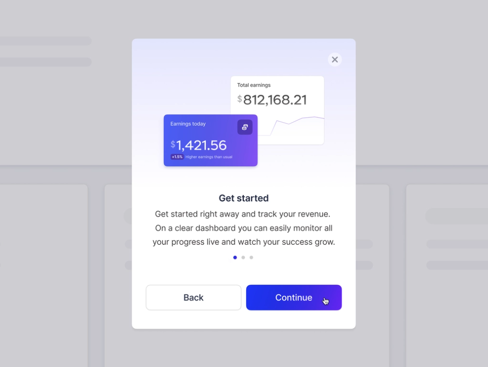
Another great example of popup UI design is this onboarding window by Diana Palavandishvili. The purpose of this pop-up is to offer a quick guide to the users, who can close the window at all times. Moreover, the pop up UI design has made sure to include a clearly visible “Continue” button, as well as a button to go back to the previous step.
#3 Project Management Popup
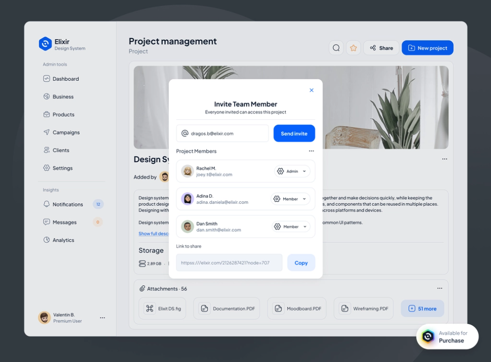
The truth is that the pop up UI design will take different forms depending on the application or website. For instance, this pop-up window by Bubu Dragos is dedicated to inviting team members to a project management system. This popup UI design works because users can control permissions, invite by e-mail, or immediately copy an invitation link. This means that they can find everything they need in just one window.
#4 E-commerce Popup
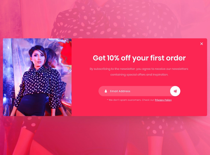
Usually, when you are thinking of pop up UI design, an e-commerce pop-up window might come to mind. This window by Ahmed Hamdy is an excellent example of a popup UI design for an e-shop. This creation works because it states clearly the purpose of subscribing to the mailing like, while it also makes the link to the privacy policy visible.
#5 Mobile Popup
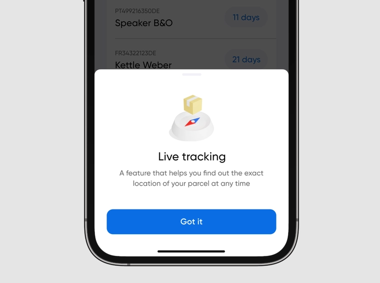
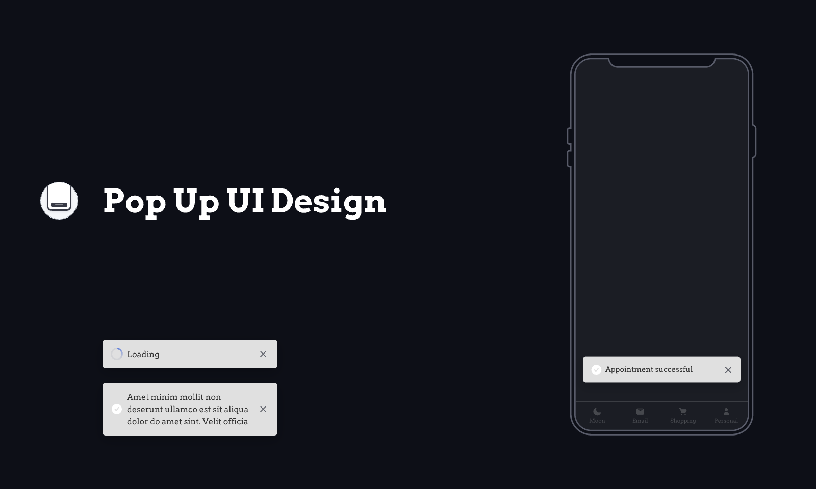
Yet another example of great popup UI design is this one by Dmitry Tomashevsky. This particular design is specifically created for a mobile phone. This creation follows a minimal approach and makes it easy for the user to close it.
2.3 Find a Satisfying UI Design Tool
As you may understand, pop up UI design is quite demanding as you need to get users interested without annoying them. To find this balance, you will need to carefully test your designs by creating interactive prototypes.
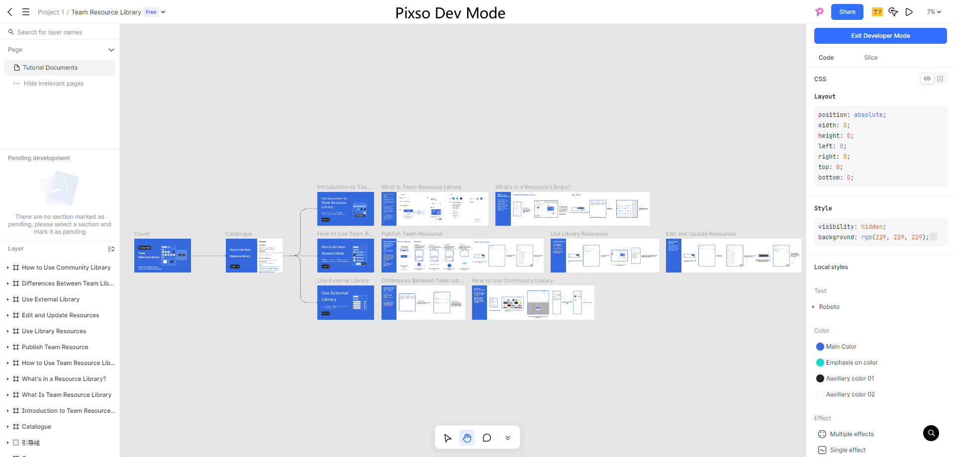
Pixso is the best tool that you can use to refine your popup UI design. When you start using this app, you will soon discover that you have a huge library of components at your disposal to create the exact designs that you have envisioned. Furthermore, the prototypes are interactive and allow you to test the path that the user is going to follow.
Additionally to this, Pixso can also make the pop up UI design process quicker as it enables you to collaborate with every member of the team. Namely, you can add any team member who can view the project in real-time. This immediate feedback will contribute to perfecting your popup UI design in no time.
Wrapping Up
No matter the system, you will need to discover popup UI design and its potential. Fortunately, you can use Pixso to immediately test your designs by creating high-fidelity prototypes and interfaces. Try this app to find out how you can refine your pop up UI design.
