Are you searching for a post telling you everything about tablet UI designs? Are you new to this UI design field? Then this article is what you want! Here we will introduce everything about tablet UI design, what is it, how to create great designs and 5 best tablet UI designs of the year. Keep reading.
What Is Tablet UI Design
Tablet UI design primarily refers to developing the aesthetic and interactive interfaces of tablet devices like iPads or Android tablets. It is a collection of compressed browser-sized UI designs. These designs frequently have a chrome-less and app-like feel, controlling the whole screen and creating a powerful flow across the information.
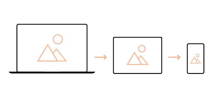
With the widespread usage of mobile devices like phones and tablets, consumers have grown extremely fond of the mobile interface. The most significant distinction that impacts the UI design of mobile and tablet applications is screen size. All functioning buttons, visuals, and text must adapt to match the screen.
UI design is also determined by how consumers interact with technology. We generally use our mobile phones with one hand (right or left), and the thumb is the primary way of interacting with apps. On tablet applications, interactions are different. Since tablets are larger, users' interactions occur with the aid of two hands and two thumbs in portrait or landscape positions.
How to Create Amazing Tablet UI Designs
We begin to understand that differences must be established when user context shifts, even within the area of mobile development and design. To that purpose, bearing in mind the distinctions in usual usage and accompanying UI adjustments for phone and tablet applications is immensely important.
Using the benefits on each device will enable a complete and fulfilling user experience on each screen size. So how can you build outstanding tablet UI designs? Before answering this question, you need to learn the standard of tablet UI designs first. And you need a handy design tool to finish the task.
Standards of Tablet UI Design
This collection of user interface principles will assist designers in understanding how to develop the best aesthetic and user experience for tablets.
Improve Visibility
Use colors with excellent contrast against background colors.
Don't use flat buttons as call-to-actions since consumers interpret them as readable texts. Operational aspects demand focus. When developing an active state, ensure visual feedback indicates to the user what they have picked.
Selectable items require precise button treatments. Make sure tappable items on a screen get a standard button handling. Without these visual indications, they might seem like lists or labels.
Optimize for Touch
Make targets visually easier to tap by increasing the size of buttons and words.
Make touch target sizes more significant than the button size. If buttons can't surpass the maximum size requirement, the touch target size should be changed in development.
Make more prominent interface elements.
Don't embed buttons inside clickable regions. There should be a suitable location to prevent unintentional clicking. Reduce the necessity for scrolling. Components should be succinct enough since scrolling lowers the pace of doing activities.
Make Content Accessble
Important material should never be concealed. Users have a range of skill levels, and material ought to be available on the first try, or else it might be annoying.
Form Factors Should Dictate the Architecture
Portrait mode is more suited if the material on the interface is to be consumed, like reading, over time. However, for task-based activities, landscape designs are the preferable option for creating since it allows both hands to cover a greater surface area.
Elements should be made accessible. It should be taken into mind that most users are right-handed, and target locations should be located closer to the edges and corners for ease of reach.
Offer Visual Feedback
There should be a good use of tiny animations to provide users visual confirmations of their activities.
Use spatial transitions when the user is traveling from one page to another. It's an excellent method to attach them to the next activity. However, keep it basic.
A Handy Tablet UI Design Tool
With the knowledge of good tablet UI design standards, designers and developers can build fantastic application interfaces. But they can't do this with their bare hands!
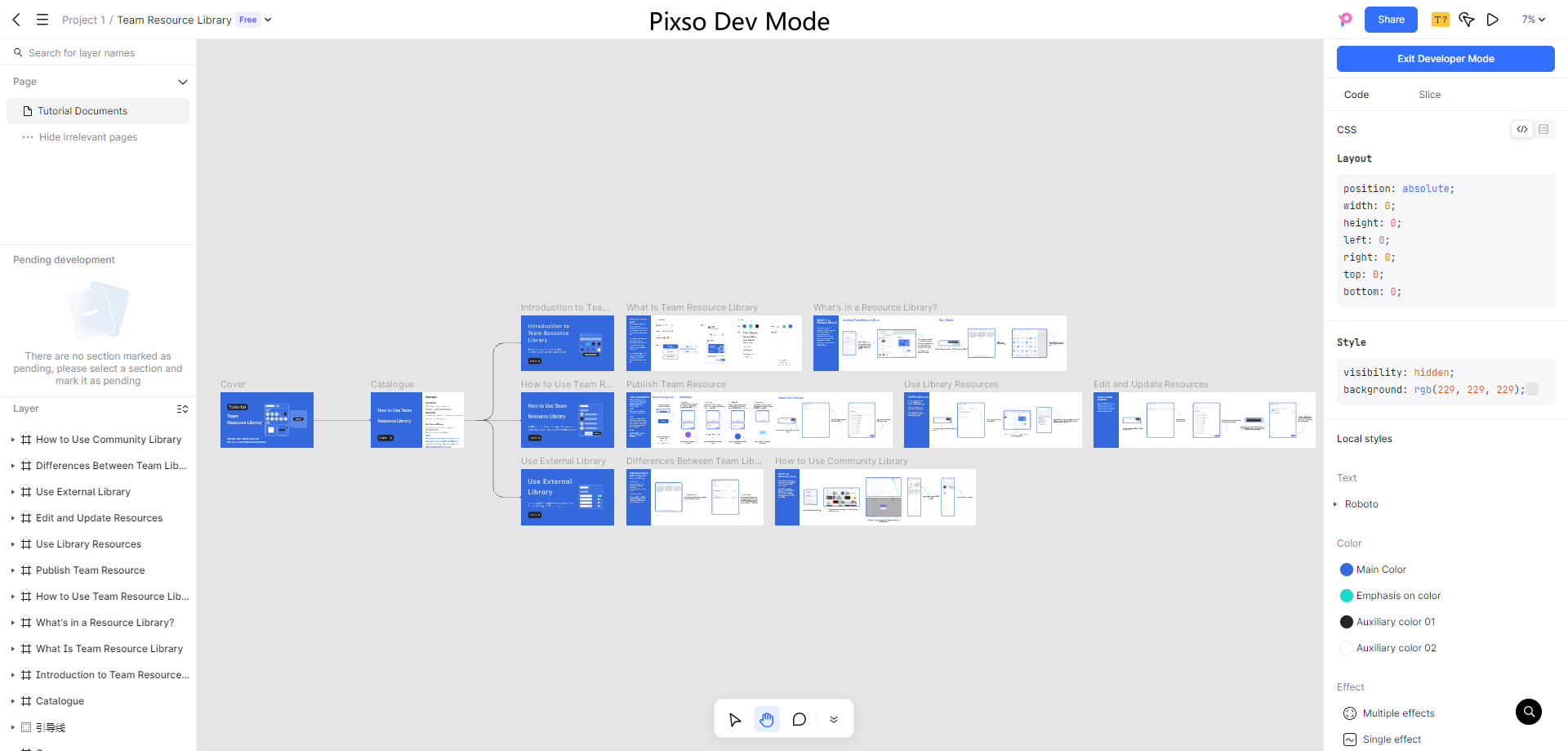
Numerous tools are used for designing tablet interfaces; however, a great tool stands out among others. Pixso is a one-stop UI design tool that will help you create fantastic tablet designs while ensuring you stick to the standards required for an excellent interface.

It allows designers to achieve complete consistency with the final product. With wireframing, accessibility, and design system documentation tools to complement, Pixso is a tremendous end-to-end tablet UI design tool that facilitates the creation of incredibly interactive interfaces.
It also has excellent collaborative features. This software is convenient for a team of designers as each team member can leave real-time feedback and notes, increasing efficiency.
With the wide range of possibilities Pixso offers designers, it has established itself as a great option and stands out when compared with others. All of these come at no cost!
Top 5 Tablet UI Designs
Fomo — Crypto DEX Analytics
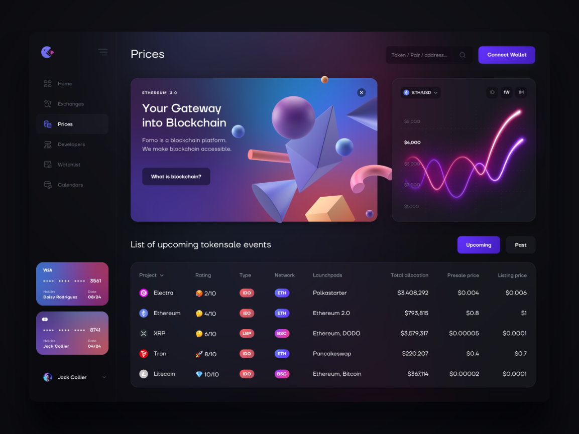
The crypto wallet app Fomo designed by V. Alipov, has a great UI design that is well optimized for Tablet interfaces. It has a net layout with the call-to-action buttons located close to the right edge and the navigation bar close to the left edge. Making for easier use.
E-Commerce Shophub
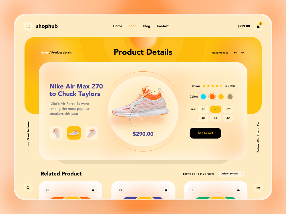
This shophub application meets all the standards of a great tablet UI design. It has easy navigation bar at the top. Great emphasis on the products at the middle of the screen!
Food Delivery Service
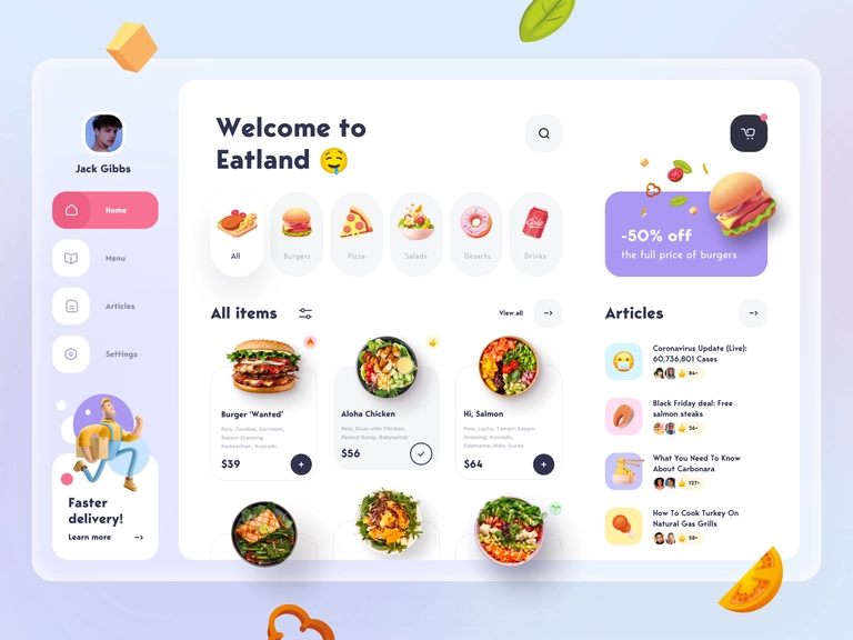
This food delivery app Eatland has tongue watering layout design. The screen shows the different kinds of food as well as their prices. Great use of visual animations.
Spacepark
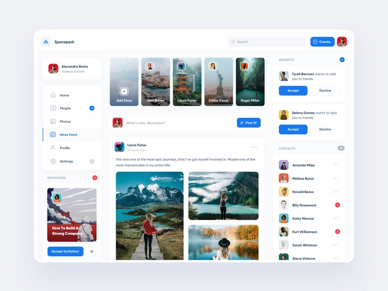
Spacepark gives the modern, beautiful and easy to understand feel at the first glance. Every component is well spaced out and visble. The feed section is more central and allows for scrolling while the navigation options remain static. Amazing use of colors too!
Financial CRM
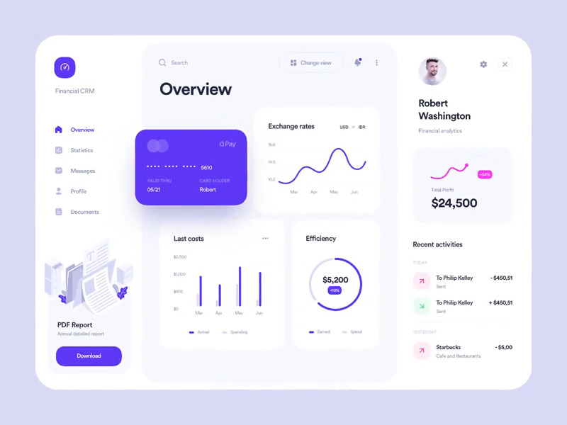
Another great dashboard UI design example is this Financial CRM dashboard by Alex Arutuynov. This dashboard has an almost identical version of the mobile UI displayed in the middle, with a navigation bar to the left and a profile display to the right. This makes it easier for users familiar with the mobile UI to adapt to the tablet version.
