Scott
Slow websites kill conversions. When you build a modern website, picking the right graphic assets directly dictates how fast your pages load and how crisp your visuals look. Designers often get stuck choosing between perfect clarity and lightweight files. Navigating the modern web ecosystem requires a solid grasp of your asset options. Finding the best image format for web design isn't about picking a single winner; it's about matching technology to the right user experience. Comparing different image formats helps your team balance aesthetic choices with technical execution. Ultimately, discovering the best image format for web projects comes down to understanding your specific layout demands and performance budgets.
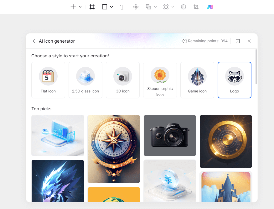
Part 1. Streamlining modern design asset pipelines with Pixso
Before diving into individual file specs, let's talk about the toolchain where these assets are born. Modern workflows move fast, and teams can't afford to waste hours manually exporting, renaming, and compressing images. That's where collaborative design platforms step in. Pixso has emerged as a powerhouse in this space, offering a cloud-native environment that challenges traditional players like Figma, Sketch, Axure, Adobe XD, and Invision. Instead of jumping between disconnected apps, product teams use Pixso to handle everything from initial wireframes to production-ready handoffs. The platform focuses heavily on promoting Pixso AI and smart design features, which fundamentally changes how we manage visual assets.
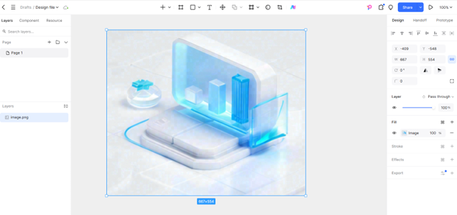
With embedded AI tools and intelligent design systems, the platform removes the tedious manual labor from asset preparation. If you want to optimize images for web apps, you need a system that supports instant, multi-format exports. In Pixso, a developer or designer can click a single component and export it into various sizes and configurations simultaneously. The ecosystem also supports powerful plugins for batch processing, allowing you to compress large folders of illustrations or convert heavy legacy assets into modern variants without leaving your canvas. By shifting asset management directly into the collaborative design file, teams maintain a single source of truth, ensuring that what looks great on the canvas transfers perfectly to live code.
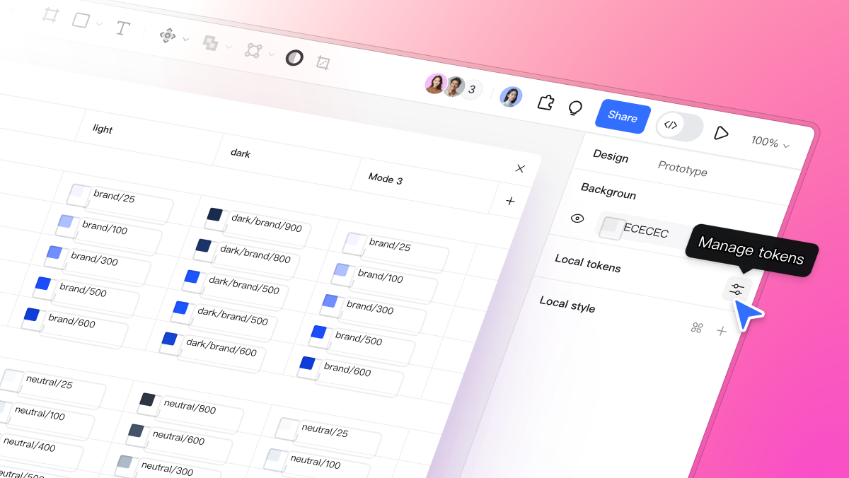
Managing a variety of image formats shouldn't require a separate standalone utility. A cohesive style guide built within a cloud tool keeps engineers and visual artists on the same page. When everyone shares a unified asset library, you slash maintenance costs and minimize human error during handover. Pixso delivers on these demands by giving teams an all-in-one workspace where asset generation happens in the background, keeping creators focused on design rather than technical grunt work.
Part 2. Core architecture: SVG vs. PNG vs. WebP
To make smart decisions on production sites, we need to peel back the layers and look at how these image formats operate under the hood. The web graphics world splits cleanly into vectors and bitmaps.
SVG represents the vector side. It relies on XML code to draw paths, shapes, anchors, and color fills using mathematical calculations. Because it is code rather than a collection of static pixels, an SVG scales infinitely. You can stretch an icon from a tiny smartphone menu to a massive desktop display, and it stays perfectly sharp. Plus, the file size remains incredibly small because the browser just reads a few lines of coordinates instead of heavy data grids.
On the flip side, the classic png image format is a lossless bitmap structure. It maps out precise pixels onto a grid to preserve intricate details, rich textures, and complex transparency. While it ensures pixel-perfect fidelity, the trade-off is file weight. High-resolution PNGs quickly bloat your page, slowing down mobile users who are browsing on spotty data connections.
Enter the webp image format. Developed to solve the internet's performance crisis, WebP is an all-around modern champion that supports both lossy and lossless compression models. This flexibility gives it a massive edge over older types, enabling rich color retention alongside aggressive file size reduction. When choosing the best image format for web design, you have to weigh how well a container compresses data without introducing ugly artifacts.
Evaluating svg vs png comes down to a choice between infinitely scalable mathematical shapes and fixed pixel grids. When we analyze webp vs png, the primary focus centers on loading speeds and compression intelligence. Finally, comparing svg vs webp helps us determine when a lightweight vector path is superior to a heavily optimized modern bitmap. Every single one of these unique image formats plays a specific role on the frontend, and mixing them correctly keeps your site running smoothly.
Part 3. Precision scenarios: what to use and when
There is no single best image format for web setups that solves every problem. Instead, high-performance UI design relies on using the right tool for the right job.
For brand logos, interface icons, UI buttons, and clean geometric illustrations, SVG is the undisputed king. These elements don't need complex shadows or millions of color gradients; they need to remain perfectly crisp on retina displays. Using SVG ensures perfect scaling without any pixelation.
When your interface design requires transparent layers, sharp product shots, or detailed graphics with see-through backgrounds, the webp image format serves as your ideal starting point. Its lossless compression handles transparency with a much lighter footprint than older legacy alternatives. For standard photography, hero images, and editorial banners, WebP lossy compression should be your default choice. It trims file weight dramatically while keeping any visual compression entirely invisible to your site visitors.
The traditional png image format still has a place during the early, raw design phases when you need uncompressed master files for archiving or deep editing. But for live production web servers, converting those files to modern web assets is an industry-standard best practice. Having a clear grasp of svg vs png and webp vs png enables teams to place the right asset type into the correct layout container, dropping heavy data weight before a single user loads the page.
In real-world testing, understanding svg vs png also means acknowledging browser rendering engines. Vector paths render instantly, whereas large bitmaps take time to decode.
Part 4. Performance engineering and responsive design
Responsive web design means delivering tailored experiences to every screen size without draining user data. Visual assets must adapt smoothly across desktop screens, tablets, and low-end mobile phones. An SVG file makes this incredibly simple because a single asset handles every viewport automatically, scaling flawlessly without requiring developers to create separate files for different display classes.
Bitmaps demand a more methodical, complex approach. When relying on a png image format, developers have to export multiple versions—like 1x, 2x, and 3x graphics—to prevent elements from looking blurry on high-density screens. This approach clogs up your storage and adds messy lines to your codebase. Switching over to the webp image format simplifies this entire system. WebP lets you establish adaptive asset frameworks where files provide state-of-the-art compression at every single scale, cutting your overall asset weight roughly in half compared to older formats.
To properly optimize images for web deployment, modern frontend engineering relies heavily on responsive structures like the HTML picture element. This approach lets the browser evaluate the user's current screen resolution and network conditions to fetch the ideal asset. When determining the best image format for web platforms, real-world loading speed always trumps theoretical perfection. Testing svg vs webp inside responsive layouts shows that vectors rule the user interface navigation, while compressed bitmaps dominate heavy photographic galleries. Looking closely at the svg vs webp dynamic, vector paths win for UI layout elements, but WebP wins hands down when you need to display dense photos.
Part 5. Design systems, fallbacks, and long-term maintenance
Modern development demands that digital assets fit cleanly into automated design systems and modular content management platforms. From an engineering and maintenance perspective, SVG offers incredible power because its underlying XML code allows developers to tweak colors, borders, and animations on the fly using standard CSS or JavaScript. WebP complements this approach by establishing a unified asset library that keeps repository sizes light, significantly lowering long-term maintenance costs.
Achieving broad browser compatibility requires a smart fallback strategy. While all modern browsers fully support modern image formats, older systems or strict enterprise environments might still struggle with them. A standard implementation pattern uses the webp image format as the primary asset, while listing a png image format or a JPEG as a safe backup inside the code structure. Comparing webp vs png data reveals a massive drop in file size with zero visible loss in aesthetic quality, making it the perfect primary choice for performance-first websites.
Using cloud-based tools like Pixso guarantees that your graphics move smoothly from the design canvas to live development servers. Designers can configure automated export rules that generate both next-gen performance assets and legacy fallbacks at the exact same time, keeping cross-functional teams completely aligned. By embedding these automated delivery paths into your workflow, teams can easily optimize images for web applications without adding boring, manual export tasks to their daily design cycles.
Conclusion
Balancing visual quality with rapid page load speeds is the hallmark of professional web design. By adopting a smart strategy—using SVG for interface controls, WebP for photographs, and PNG only when raw lossless data is mandatory—you can systematically optimize images for web performance. Integrated platforms like Pixso help bridge the gap between creative layouts and clean code, streamlining how you handle multiple image formats. Ultimately, selecting the best image format for web design ensures your digital products stay razor-sharp, lightweight, and perfectly responsive for every single user across the globe.
![Beautiful Travel App UI Design Case Studies [2025]](https://cms.pixso.net/images/cover/travel-app-ui.png)


