Responsive Web Design Tool



Design Responsive Web
Layouts with Confidence

Scalable Interfaces
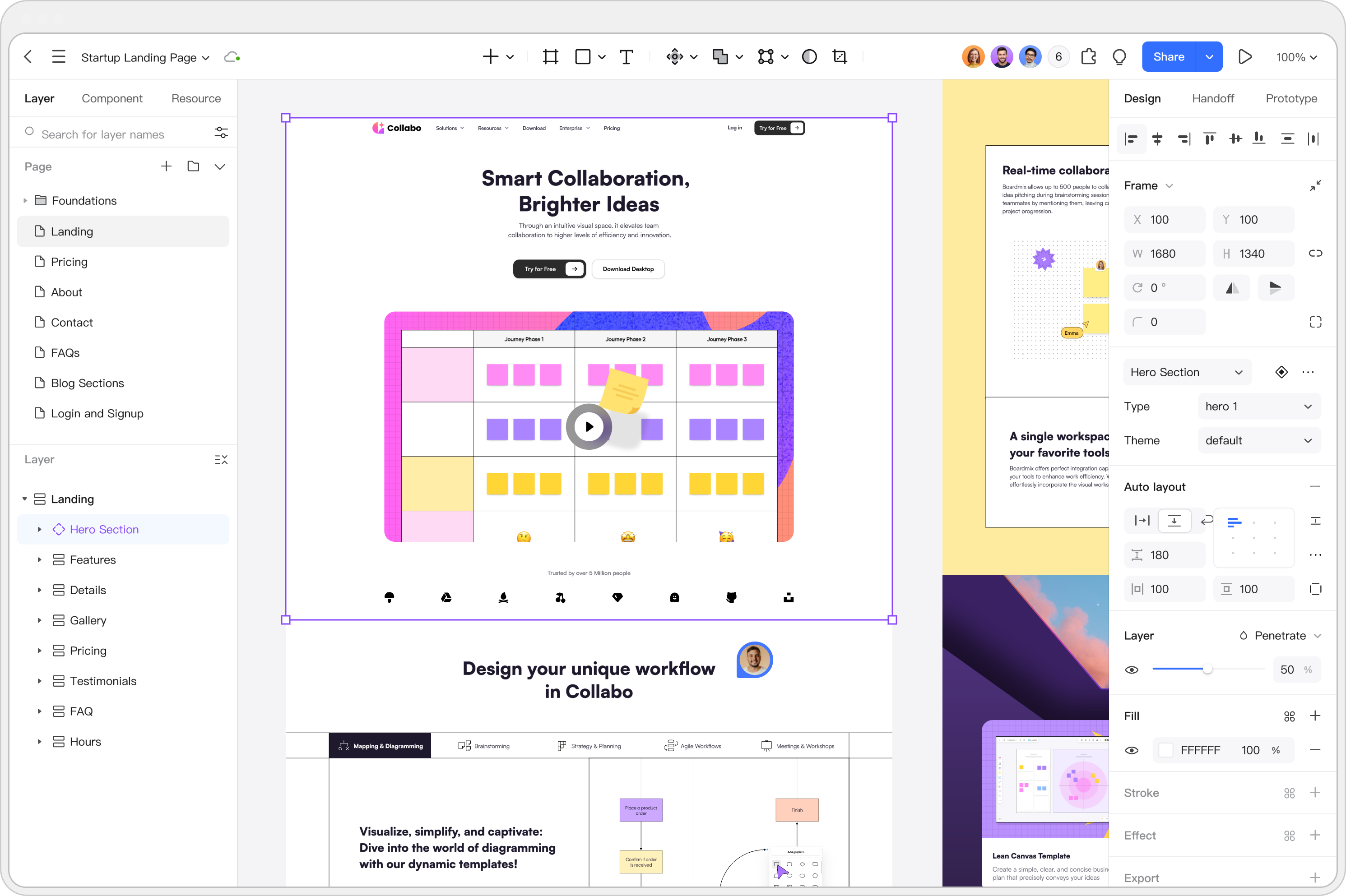
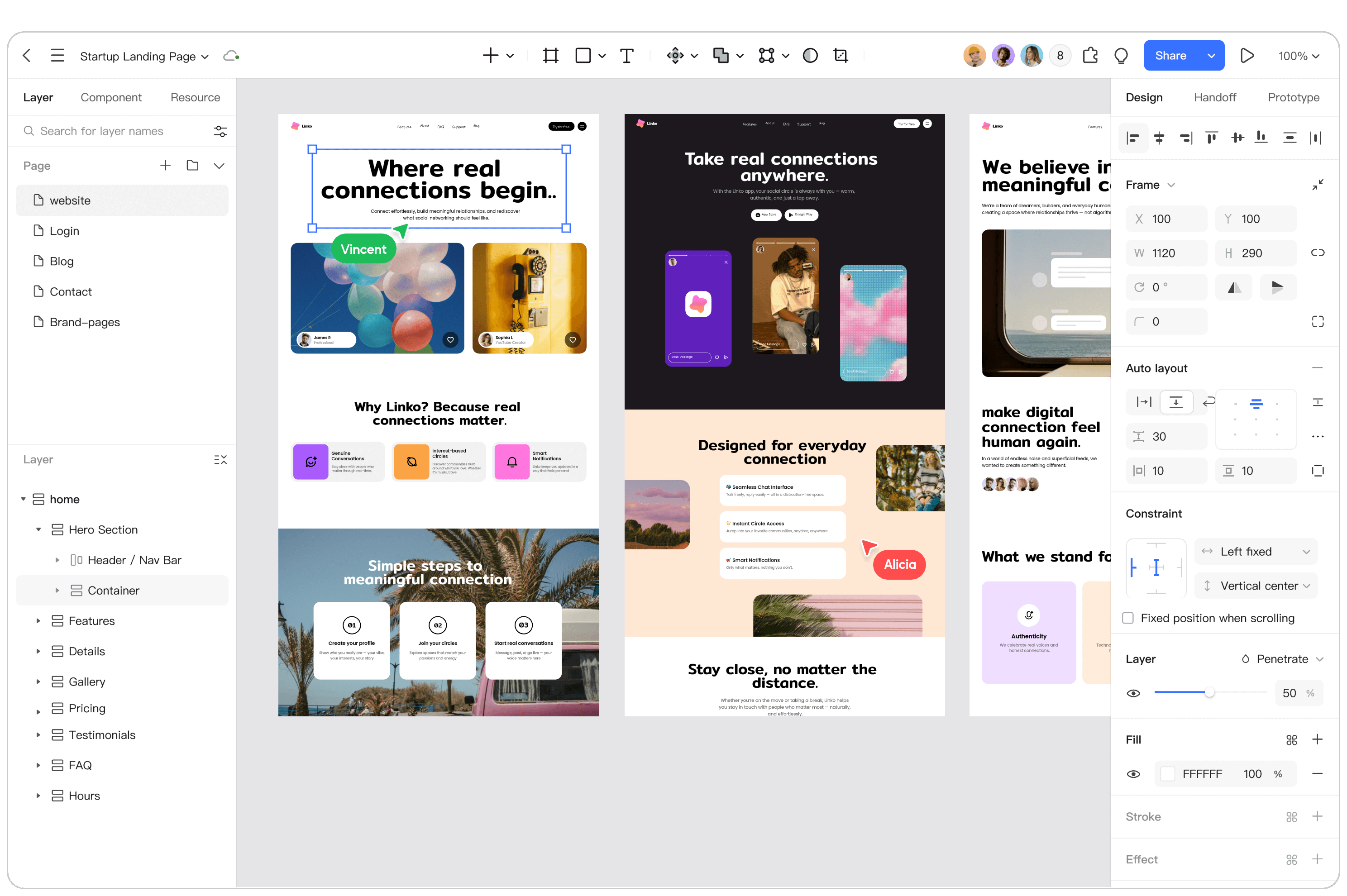
Use Auto Layout, components, and shared styles to organize a responsive layout. Check how content changes across common screen sizes.

Smart Auto Layout
Add layers to Auto Layout, adjust spacing, and review how content reflows as labels or components change.

Customization & Sync
Define fonts, colors, and effects as shared styles so related components stay consistent when you update a design.
Resources for Website
Design Projects

Free Community Resources
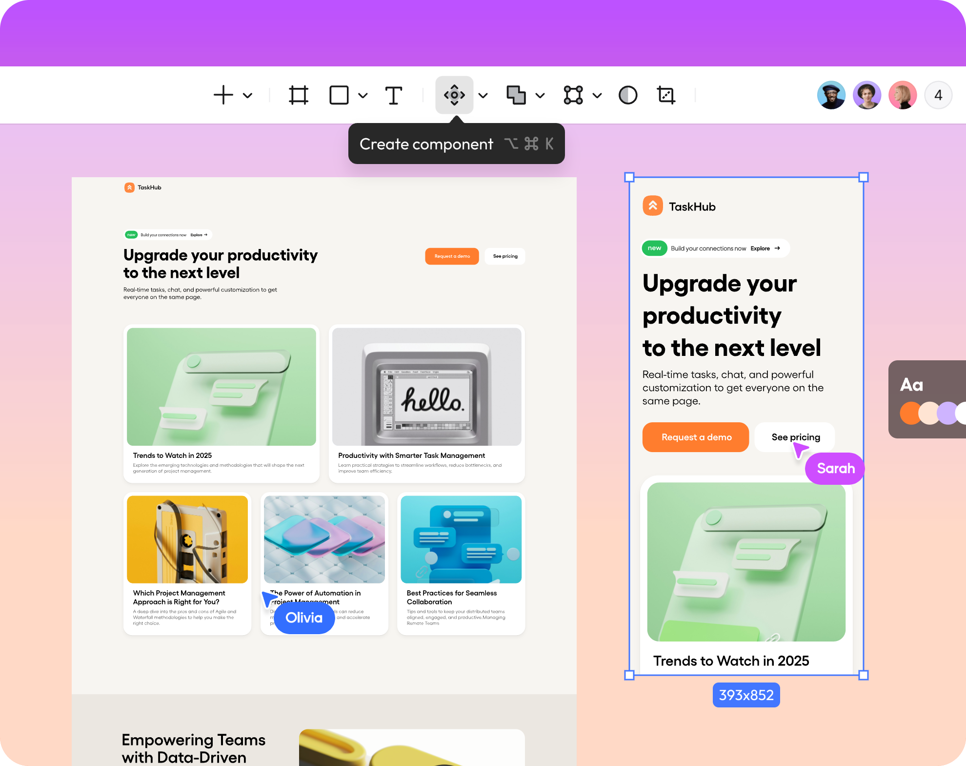
Use community templates and UI kits as starting points for a landing page, dashboard, or product site, then adapt them to your brief.

Diverse Templates
Browse responsive templates, choose a structure for your project, and replace sections with content that fits your audience.

UI Component Libraries
Reuse UI components and their interactions across screens to keep the website structure consistent as you iterate.
Prepare Website Designs for Handoff
A Practical Website Design Workflow
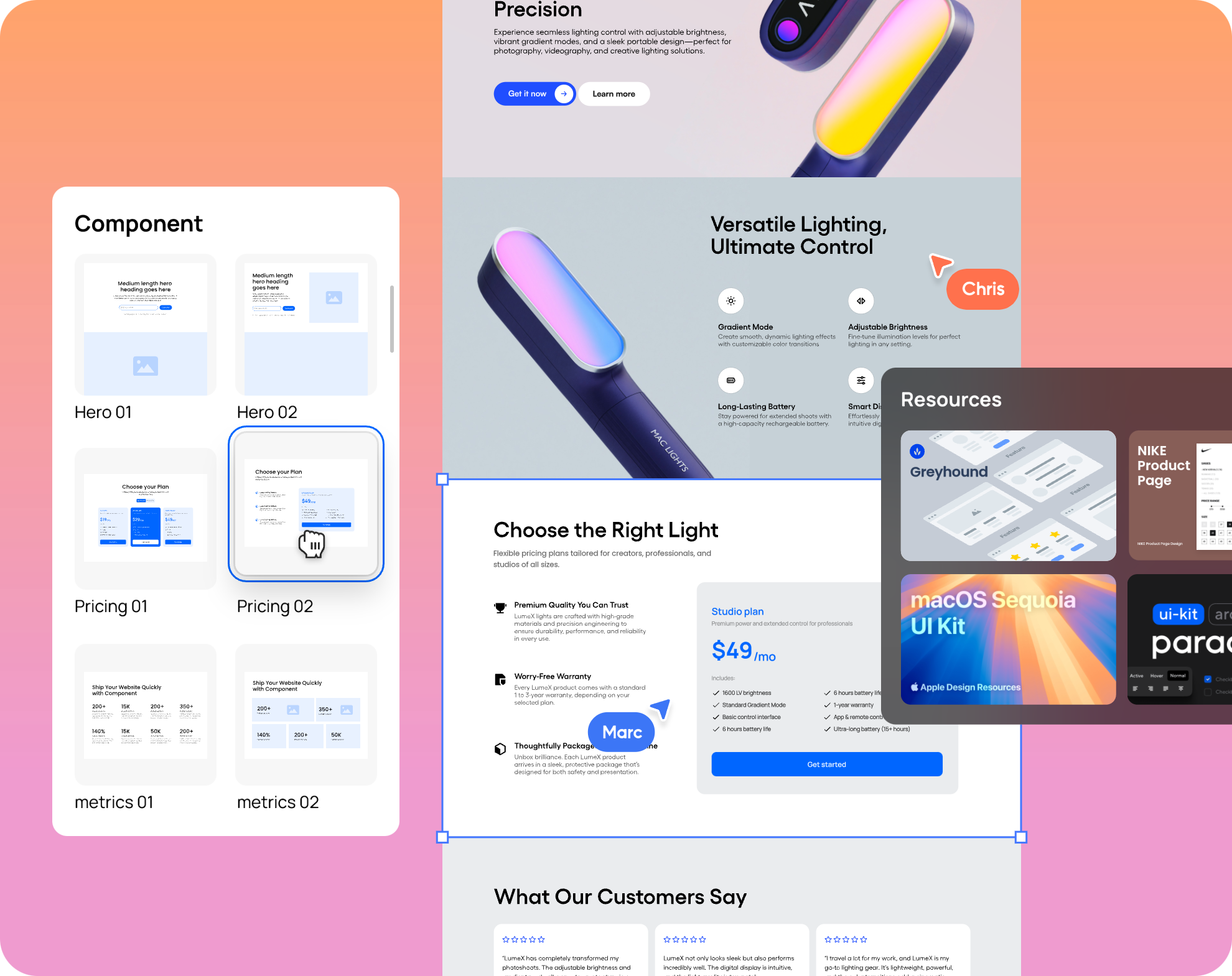
Move from structure to detail with templates or a drag-and-drop editor. Review responsive states, document decisions, and share the design for implementation.
Explore Advanced Web Design Features

Support Local Fonts
Use available fonts and supported local font options for your website designs. Check font licensing and availability before sharing files or handing off designs.

Smart Selection
When there are multiple objects to be aligned, smart selection can be used to evenly arrange selected layers into rows and columns.

File Compatibility
Import supported design files and use available asset export options. Review fonts, layout, and interactions after import because some features may need adjustment.

Design Systems
Create shared styles and reusable components for website pages and web applications. Review updates across connected screens as the design evolves.

Batch Export/Import
When dealing with a design file containing numerous images, you can use the batch import/export function to enhance your efficiency.

Design Handoff References
Share measurements, available CSS references, and exportable assets with developers. Verify generated values and responsive behavior in the implemented website.

Access Permissions
The file owner can give collaborators view or edit access to a shared file. Enterprise users have more flexible access permissions.

Version History Management
Name design milestones and return to earlier versions when available for the file. Access and history availability depend on workspace permissions and plan. For the next step, review the web interface design guide and mobile UI patterns.
Related Website Design Workflows
UI Design
Create interface screens with shared styles and reusable components, then review the details with your team.
UX Design
Map user flows and preview interactions in the browser before sharing designs for feedback.
Team Brainstorm
Use a shared whiteboard to collect references and discuss website concepts with teammates.