Scott
Every digital product relies on crisp visuals, but relying solely on generic stock libraries often dilutes your brand identity. Creating a custom ui icon from scratch might seem intimidating, especially when manipulating complex vector paths. However, the secret to pixel-perfect iconography doesn't lie in painstakingly drawing freehand curves; it revolves entirely around mastering boolean operations. By combining simple geometric shapes using a robust boolean tool, you can construct incredibly intricate graphics in minutes. In this guide, we will break down exactly how to leverage these mathematical combinations within a modern online vector design tool, helping you build a scalable, consistent, and highly professional visual language for your next big interface project.
Part 1: The core challenges of modern iconography workflows
Creating a highly cohesive set of visuals is notoriously difficult, and many creative professionals constantly struggle with maintaining a standardized workflow. If you are just merging and flattening shapes recklessly, you inevitably end up with destructive edits. This makes it utterly impossible to adjust a subtle corner radius or tweak a line width days later when a client requests a revision. Without rigid grid constraints and proper layer management, maintaining tiny details and style uniformity across a library of fifty different graphics becomes an absolute nightmare.
Furthermore, there is the massive headache of the design-to-development handoff. A poorly constructed graphic often exports as a messy, bloated SVG file full of unnecessary path nodes and hidden overlapping layers. Developers absolutely hate this because it bloats the codebase and severely hurts rendering performance. You need a reliable system that guarantees clean, code-friendly SVGs, heavily optimized paths, and seamless multi-format exports. Relying on outdated software or sloppy drafting techniques directly sabotages both your visual consistency and your team's overall productivity.
Part 2: Why Pixso is the ultimate workspace for vector crafting
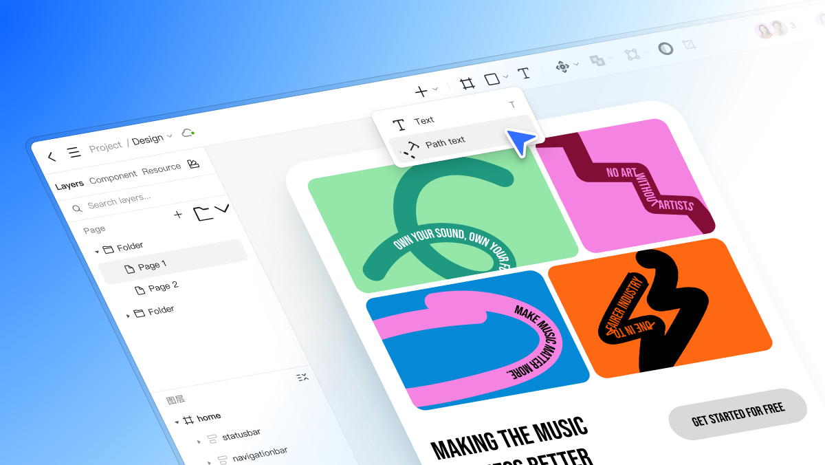
To solve these exact frustrations, you need an environment built specifically for precision, speed, and deep collaboration. This is exactly where Pixso shines as a premier online vector design tool. Unlike clunky legacy software that requires heavy local installations and constant file saving, Pixso offers an incredibly efficient tool experience with a refreshingly low learning curve. It is built natively for the cloud, meaning you and your distributed remote team can seamlessly collaborate on a single master library simultaneously without ever passing messy files back and forth.
What makes Pixso genuinely stand out for sophisticated icon design is its highly intuitive boolean tool and strictly non-destructive editing framework. When you combine raw shapes here, the original base geometry remains perfectly intact within your left-hand layers panel. This means you can revisit a graphic weeks later and adjust the underlying circles or squares without having to start over from scratch. Additionally, Pixso perfectly bridges the dreaded gap between visual creation and actual frontend code execution. It automatically optimizes your vector paths in the background, ensuring that when you finally hand off a custom ui icon to your engineering team, the resulting SVG markup is incredibly lightweight and perfectly aligned with strict technical standards.
Part 3: Decoding the four pillars of boolean operations
Before jumping directly onto the digital canvas, you have to precisely master boolean operations on a conceptual level. Think of them as spatial math equations for overlapping shapes. When you deeply understand how these four specific functions interact, you can mathematically build literally anything without ever touching a freehand pen tool.
- Union (Add): This operation simply glues two or more overlapping shapes together into one single, unified silhouette. It is absolutely perfect for creating natural cloud shapes, combining a rectangle and a triangle to make a basic home button, or merging multiple circles to create a speech bubble.
- Subtract (Minus Front): This is arguably the most utilized boolean tool in modern interface drafting. It uses the top layer as a sharp cookie cutter to punch a permanent hole straight through the bottom layer. If you want to make a crescent moon, you just overlap two circles and subtract the top one. If you need a user profile graphic, you can subtract a circle from a larger curved body shape to create a clean gap.
- Intersect: This function keeps only the specific overlapping area where two shapes collide, completely discarding the rest of the geometry. It is incredibly useful for creating organic leaf shapes, an eye graphic from two intersecting large circles, or a precise shield emblem.
- Exclude: The exact opposite of the Intersect function. It keeps everything except the overlapping middle portion, leaving a fully transparent hole exactly where the shapes cross. This is excellent for creating complex overlapping rings, warning signs, or abstract geometric logos.
Mastering the precise scenarios for these four boolean operations is the exact fundamental skill that separates amateur sketching from highly professional, systematic icon design.
Part 4: Step-by-step: crafting a complex download graphic in Pixso
Let's put this essential theory into actual practice. We are going to meticulously build a clean, precise cloud-download graphic using Pixso's interface, proving just how fast this workflow can be.
Step 1: Establish strict grid constraints
Start by logging into Pixso and opening a fresh design file. Press the 'F' key to create a new frame, and set it exactly to a standard 24x24 pixel size. Look over to the right-hand properties panel and turn on the layout grid, setting it to a rigid 1px spacing. This strict grid constraint ensures every single edge of your shapes snaps perfectly to whole pixels, keeping your final graphic incredibly sharp and completely eliminating blurry anti-aliasing issues on standard monitors.
Step 2: Construct the base geometry
Press the 'O' key to select the ellipse tool and draw three overlapping circles of varying sizes to form the fluffy top section of your cloud. Next, press the 'R' key for the rectangle tool and draw a wide, flat block to form the bottom base of the cloud, making sure it overlaps the lower half of your three circles.
Step 3: Execute the union operation
Highlight and select all four of these basic geometric shapes. Look directly at the top center toolbar and locate the boolean tool dropdown menu. Click it and select "Union Selection." Instantly, the messy internal overlapping paths disappear, leaving a flawless, unified cloud silhouette. Because Pixso is non-destructive, if you look at your layers panel on the left, you will clearly notice you can still open the new Union group and individually move the underlying base circles around if the cloud looks slightly lopsided.
Step 4: Create the cutout using subtract
Now, we need to create the downward-pointing arrow. Draw a tall vertical rectangle for the arrow's main shaft, and draw a polygon triangle for the sharp tip. Select both and use the Union function to combine them into one solid arrow shape. Drag this combined arrow and place it directly over the exact center of your new cloud. Finally, select both the unified cloud layer and the unified arrow layer. Go back to the top toolbar and select "Subtract Selection." The arrow instantly punches a perfect, transparent hole directly through the solid cloud. You have just successfully leveraged complex mathematical combinations to build a flawless graphic in mere seconds.
Part 5: Perfecting visual consistency and standardization
Building a single graphic is relatively easy, but maintaining extreme visual consistency across a massive library is where most design teams ultimately fail. In highly professional icon design, unified details and microscopic adjustments are absolutely everything. Because Pixso utilizes non-destructive boolean operations by default, you can easily select your finished graphic and globally apply specific styling rules that instantly update the entire shape.
You can easily assign a unified stroke width from the right-hand panel, ensuring that every single asset in your massive library has exactly a crisp 2px outline. You can globally adjust the corner radius, mathematically softening the sharp edges to perfectly match your specific brand's friendly visual identity. Because the underlying geometry is safely preserved in the layer stack, tweaking these micro-details takes mere seconds instead of hours of tedious manual node adjustments. This meticulous, mathematically driven approach guarantees a refined, standardized visual language across your entire product. You are no longer just guessing at visual proportions; you are actively utilizing a highly structured, maintainable workflow that scales effortlessly as your enterprise project grows in complexity.
Part 6: From canvas to code: componentization and handoff
A beautifully crafted custom ui icon is essentially useless to a product team if it just sits statically on a random digital canvas. Modern web and mobile applications require highly dynamic, adaptable assets. Once your custom shape is perfectly merged and styled, you must turn it into a reusable system asset.
In the Pixso environment, you simply select your finished graphic and press 'Ctrl+Alt+K' (or Cmd+Option+K on a Mac) to instantly convert it into a main component. This instantly integrates the graphic directly into your broader design system. If you ever need to tweak the subtract layer or slightly adjust a corner radius next month, you only perform the edit once on the master component. That tiny change will then automatically ripple across every single screen, button, and layout in your entire project file.
Furthermore, you can seamlessly wrap these newly minted components inside an Auto Layout frame. This advanced feature allows you to create highly responsive interface elements, like complex navigation bars or dynamic dropdown menus, where your new custom graphics stay perfectly aligned. The Auto Layout engine will automatically adjust the padding and spacing whenever text labels grow or shrink alongside your graphics.
Finally, when it is time to actually ship the product to the live server, the developer handoff process is completely seamless. You simply select your component, head directly to the export panel on the right sidebar, and choose the SVG format. Because you strictly used proper mathematical combinations instead of messy, overlapping freehand paths, Pixso exports incredibly clean, exceptionally code-friendly SVGs. The paths are highly optimized and stripped of unnecessary code bloat. This drastically reduces the final file size, ensuring that your custom graphics render flawlessly and load lightning-fast in the final coded application.
Conclusion
Crafting your own custom ui icon library certainly doesn't have to be a frustrating battle against messy anchor points and destructive layer edits. By strategically utilizing boolean operations, you seamlessly transition from merely sketching arbitrary shapes to actually engineering precise visual data. Powerful online vector design tools like Pixso elevate this creative process entirely, championing non-destructive editing, perfect pixel alignment, and flawless developer handoff. When you fully commit to this highly structured, mathematical approach, you not only drastically speed up your personal daily workflow but also guarantee an incredibly polished, scalable visual language for your entire product ecosystem. Stop settling for generic visual assets and start engineering exactly what your brand deserves today.