Color plays a pivotal role in design, influencing emotions, perceptions, and decisions. Among the different color schemes, complementary color schemes are particularly notable for their capacity to produce bold contrasts and lively visuals. In this guide, we will explore what are complementary colors, how they function in design, their importance, and provide some compelling complementary colors examples to inspire your creative journey.
What Are Complementary Colors?
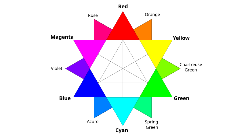
Complementary colors are color pairs that, when mixed together, neutralize each other, resulting in a grayscale tone. When positioned side by side, they generate a striking contrast and vibrant appearance. These color pairs sit directly across from one another on the color wheel. Classic examples of complementary colors include blue and orange, red and green, as well as yellow and purple.
In color theory, complementary colors can be divided into two categories: primary complementary colors (red, blue, yellow) and secondary complementary colors (green, orange, purple). Understanding the relationships between these colors is fundamental for designers aiming to create visually dynamic compositions.
How Do Complementary Colors Work in Design?
In design, complementary colors can be an effective tool for achieving balance and harmony within a composition. When used strategically, they enhance visual interest and guide the viewer's eye through the design. Here's how they work:
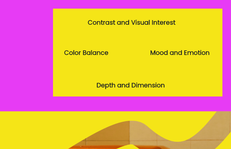
- Contrast and Visual Interest: Complementary colors create a stark contrast that draws attention. This contrast can highlight important elements, making them stand out in a design. For example, using a bright orange button on a blue background can make the button more noticeable.
- Color Balance: By combining complementary colors, designers can achieve a sense of balance. For instance, if a design predominantly features warm colors, introducing a complementary cool color can create equilibrium and prevent the design from feeling overwhelming.
- Mood and Emotion: Different colors evoke different emotions. By carefully selecting complementary colors, designers can elicit specific feelings. For example, a combination of blue and orange can convey energy and excitement, while red and green might evoke a festive atmosphere.
- Depth and Dimension: Using complementary colors can create a sense of depth in a design. When one color recedes and its complement advances, it creates a three-dimensional effect, enhancing the overall visual experience.
Why Are Complementary Colors Important in Design?
The use of complementary color schemes is crucial in design for several reasons:
- Enhanced Visibility: Due to their high contrast, complementary colors improve readability and visibility. This is especially important in graphic design, where text and important elements need to stand out against backgrounds.
- Aesthetic Appeal: Complementary colors add visual intrigue to a design. They make compositions more engaging and can elevate the overall aesthetic quality of a project.
- Brand Identity: Brands often use complementary color schemes to convey their identity. For instance, a brand that uses blue and orange may evoke feelings of trust and enthusiasm, aligning with its messaging and values.
- Emotional Impact: Colors can significantly impact how a message is perceived. Utilizing complementary colors effectively can enhance emotional resonance, making designs more impactful.
- Guiding the Viewer: Complementary colors can guide the viewer's eye through a design, directing attention to essential elements and creating a desired flow.
Complementary Colors Examples
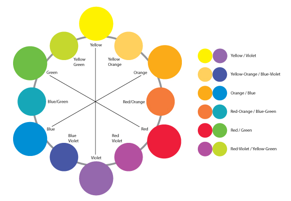
Here are some striking complementary colors examples that illustrate how effective these color pairings can be in various design contexts:
- Blue and Orange: This combination is often used in sports branding and marketing materials. The vibrancy of orange against the calmness of blue creates an exciting and energetic atmosphere.
- Red and Green: Commonly associated with the holiday season, this pairing can evoke feelings of festivity and joy. It's often seen in marketing campaigns for Christmas decorations or food.
- Purple and Yellow: This duo is popular in fashion and interior design. The regal feel of purple contrasts beautifully with the brightness of yellow, creating a luxurious yet playful vibe.
- Teal and Coral: A modern and refreshing combination, teal and coral work well in web design and branding. The coolness of teal balances the warmth of coral, making it perfect for health and wellness brands.
- Pink and Green: Frequently used in beauty and lifestyle brands, this pairing can convey freshness and vitality. It's often employed in product packaging and advertising to attract a youthful audience.
- Navy and Gold: This sophisticated combination is popular in luxury branding and high-end design. The richness of navy paired with the elegance of gold creates a timeless and chic aesthetic.
- Brown and Blue: In nature-inspired designs, this pairing evokes a sense of earthiness and tranquility. It's commonly used in eco-friendly products and outdoor branding.
These complementary colors examples showcase the versatility and effectiveness of using contrasting colors in design, providing a wealth of inspiration for your projects.
Unlock the Power of Complementary Colors with Pixso
To effectively harness the potential of complementary colors in your designs, consider using tools like Pixso. Pixso offers a user-friendly platform for creating stunning visuals, allowing designers to experiment with complementary color schemes effortlessly. With its intuitive interface, you can easily explore various complementary colors examples and apply them to your projects.

Whether you're designing a logo, a website, or marketing materials, Pixso provides the resources you need to elevate your designs and make an impact. By utilizing the power of complementary colors, you can enhance your visual storytelling and engage your audience like never before.
