Scott
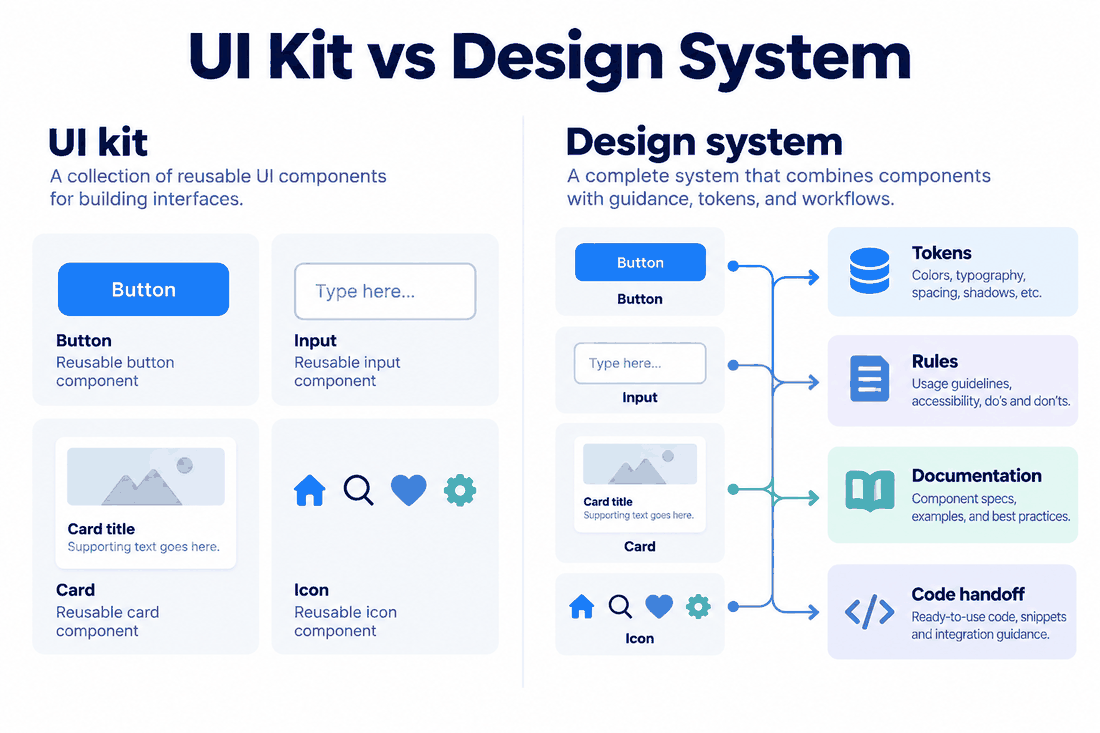
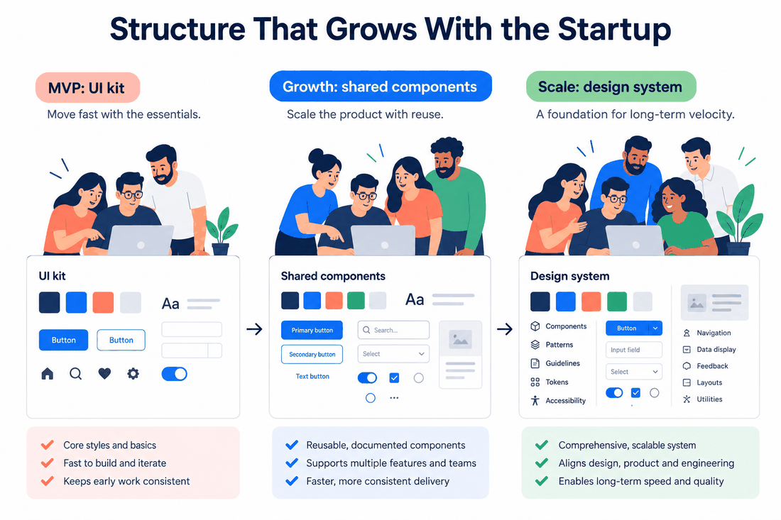
A UI kit gives a team reusable interface pieces. A design system adds the rules, ownership and review process that keep those pieces useful as a product changes. A startup does not have to choose one forever. Start with a small kit when repeated screens need consistency; add system practices when variation and rework become expensive enough to justify maintenance.
For example, a team designing its first customer dashboard may need a shared button, form field and card. A team shipping the same patterns across a web app, mobile app and admin workspace needs more: state definitions, content rules, accessibility checks, implementation references and someone who can decide how changes are released. Pixso's shared components and styles can hold the design assets; the team still has to agree on the rules around them.
The difference is not the number of components
A UI kit is typically a collection of visual building blocks: buttons, fields, icons, cards, navigation and example screens. It can be a useful starting point even when it contains only a few patterns. Its value is faster assembly and a common visual baseline.
A design system includes those assets but also answers questions a kit cannot answer on its own. Which button variant belongs in a destructive confirmation? How does an error message appear and how is it announced? What happens when a translated label wraps to two lines? Who approves a component change, and what should developers update when a token is renamed? These decisions turn a collection of files into a maintained agreement between design, content and engineering.
When a small UI kit is enough
Choose a compact kit when a small team is exploring one product, has few repeated patterns and can resolve exceptions directly. Create the components that already recur in real screens, not a catalog of every imagined future control. For an early dashboard, that may be a primary action, text field, status badge, navigation item and content card. Show at least their common states, including disabled and error states where relevant.
Keep a short note beside each component: its purpose, its variants and an example of when not to use it. This takes little time and prevents the kit from becoming a folder of attractive but ambiguous shapes. Avoid calling a polished library a design system if nobody owns changes, documents usage or checks whether implemented screens match it.
Signals that the kit is becoming insufficient
The trigger is repeated decision cost, not a funding round or a fixed headcount. Look for a few concrete signals:
- The same component is copied into several files and receives different fixes.
- Designers and developers repeatedly ask which color, spacing or behavior is authoritative.
- Accessibility or localization issues recur because the component has no documented constraints.
- A change to a shared pattern creates unplanned work across products or teams.
- Reviewers cannot tell whether a variant is intentional or an accidental divergence.
If these issues are occasional, improve the kit and its notes. If they consume regular review time, begin system practices around the patterns that cause the most rework. One owner and a clear change process can help more than a large new component taxonomy.
A practical transition from kit to system
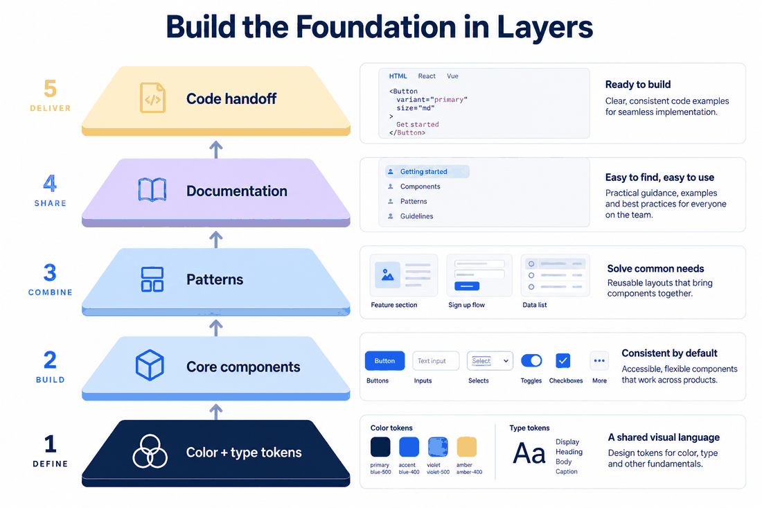
- Audit shipped patterns. Identify buttons, fields, cards and navigation elements that are already repeated. Compare actual states and note the differences that matter.
- Name foundations by role. Use semantic color, typography and spacing roles, then connect the most reused components to them. A role such as
text/primarysurvives a palette change better than a shade name embedded in every screen. - Document one complete component. For a form field, specify label, helper text, error, disabled and focus states. Include long-label and narrow-screen behavior. Make the implementation counterpart explicit where one exists.
- Assign ownership. State who can propose a change, who reviews it, and how consumers learn about a breaking change. A component without a decision owner eventually forks.
- Release in small steps. Publish one agreed pattern, use it in a real feature, collect exceptions, and revise the guidance. Repeat with the next costly pattern.
In Pixso, a shared library can make the agreed components and styles reusable in design files. The library does not automatically guarantee that shipped code follows the same rules. Pair the design source with implementation examples and review the differences during handoff.
Worked example: a request form used in two products
Suppose a startup has a public contact form and an internal support form. Both need a text field and confirmation state, but the internal form adds an assignee. First, reuse the same field anatomy, focus treatment and error message placement in the kit. Do not force the public form to display an irrelevant assignee field merely for visual consistency.
As both forms evolve, write a shared field rule: the label stays visible, validation explains how to recover, and a submitted request shows what happens next. Document the optional assignee as a product-specific composition, not a fork of the base field. Review a long translated label and a narrow width before publishing the pattern. This is the point where the kit starts functioning as a system: the component has a purpose, constraints, examples and an owner who can evaluate changes.
Keep the system small enough to maintain
A system adds work. Someone must answer questions, review contributions, communicate changes and retire patterns that no longer fit. If the team cannot support that work, a smaller, well-kept kit is better than an elaborate library nobody trusts. Conversely, if teams repeatedly fix the same issue in several places, the maintenance cost may already exist; it is simply hidden in rework.
Review adoption by looking at actual screens and implementations. Are teams reusing the agreed component? Do they still have to rebuild common states? Which exceptions are genuine product differences? Use those answers to decide whether to extend the system. The aim is not to maximize the number of assets, but to make repeated decisions easier and safer.
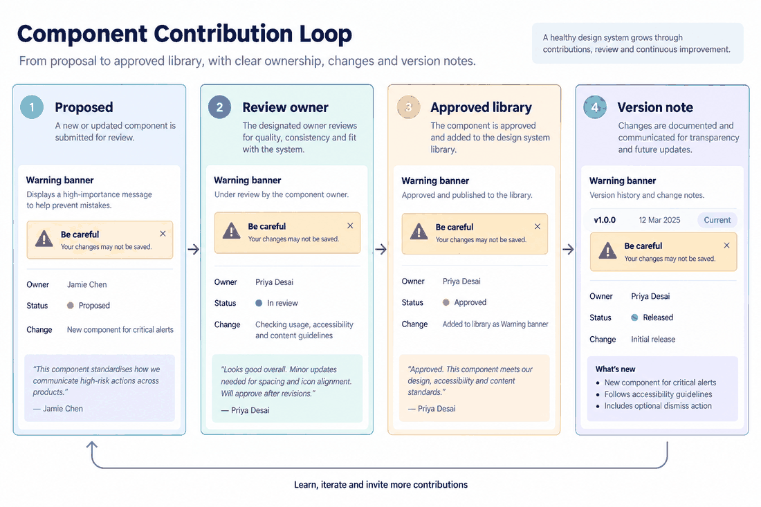
For the next step after this decision, see the guide to building and maintaining a design system. It covers the foundations, shared components and contribution process in more detail.