Scott
Grid Layout provides a two-dimensional layout system based on rows and columns. It allows you to place, organize, and arrange content within a structured grid, enabling responsive layouts and offering greater flexibility and consistency in your design.
I. Introduction
Introduction to Grid Layout
Grid Layout is a new type of Auto Layout in Pixso that provides two-dimensional layout control, including rows and columns, for building structured designs.
- Once a frame has a Grid Layout applied, it can arrange content simultaneously in both horizontal and vertical directions.
- This allows you to create responsive layouts more easily, without relying on multiple nested single-direction Auto Layout frames.
- Incorporates modern layout concepts, it is perfect for masonry, responsive, and other design layouts.
- Quickly align, expand, and position elements through intuitive controls, reducing the operational threshold.
- The Grid Layout appears as the third option alongside other layout types. The original Wrap Layout has been incorporated into the Horizontal Layout.
- You can now create and edit responsive layouts without the need for complex nested Auto Layout configurations.
- Grid Layout has both micro and macro applications: it can be used to create components as well as to build larger layout frames.

- Grid Layout builds upon your existing knowledge of Auto Layout and includes controls such as frame filling, padding, and spacing.

When to Use Grid Layout
Using a grid layout allows you to balance flexibility and structure within your design.
- Grids can provide greater control over layouts, supporting everything from product design to marketing assets and enhancing UI and design composition.
- Use it to design and build components, while also serving as a frame for elements.
- A grid is a new auto-layout option, not a replacement. Use auto layout for handling unidirectional stacking or content wrapping.
- Auto layout frames can be nested within a grid, and grid frames can be stacked with auto layout. Both options are available to meet your design needs.
Grid Layout appears as the third option alongside other layout types, while the original Wrap Layout has been merged into the Horizontal Layout.
You can now create and edit responsive layouts without the need for complex nested Auto Layout setups.

Using Grids in the Layout Panel
In the Layout tab of the Properties panel, when a frame is selected, you’ll notice new grid options. The grid appears alongside the standard auto layout options. Select a frame and choose between the auto layout direction or the new grid layout.
Note: After selecting a horizontal auto layout, the “Wrap” option is now available for auto layout.
II. Cell Settings
Learn how to set up a grid framework in Pixso
Configure Grid
Every grid starts with a frame. You can add a grid to an empty frame or to a frame that already contains nested items.
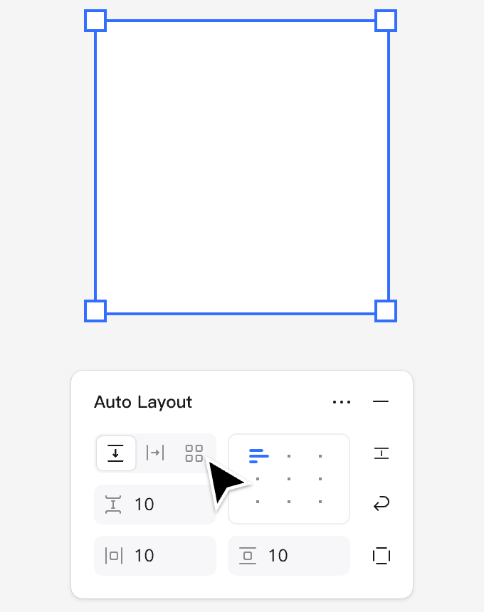
- Start by adding a frame from the canvas. This frame has dimensions of 320 × 320.
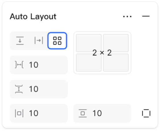
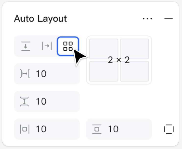
- With the frame selected, go to the Auto Layout section in the Design panel and click the grid icon.
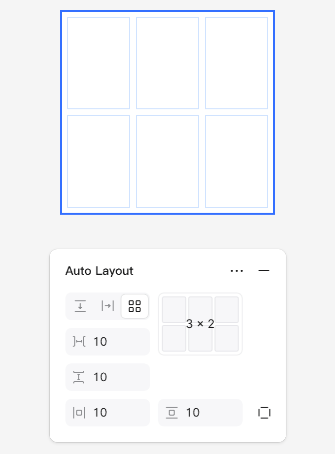
- Add columns and rows. By default, Pixso uses a 2×2 grid with 10-pixel spacing between cells and 10-pixel padding. You can increase the number of columns and rows according to your design needs.
- Create a new frame using the F/A shortcut, or by selecting the Frame tool from the top toolbar.
- To apply a grid to your frame, click the grid icon in the Auto Layout section of the right-hand panel.
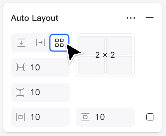
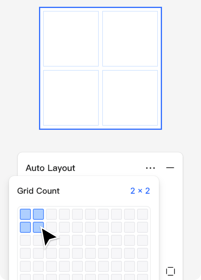
- In the Cell Settings area, click to select the number of rows and columns you want for the frame, or enter the values directly in the input fields.
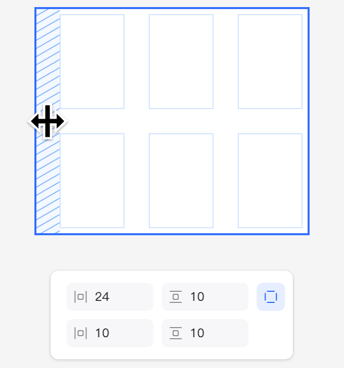
Adjust Grid Spacing
When a frame has a grid layout applied, you can adjust its grid properties in the right-hand panel.
- Grids use gaps and padding just like auto layout, defining the spacing between grid cells as well as the padding inside the grid frame.
- Use the spacing controls in the Layout panel to set the horizontal and vertical gaps between grid items.
- Select a grid frame to edit the vertical and horizontal spacing, as well as the padding.
- Spacing can be edited in the Layout panel and cannot be adjusted directly on the canvas. Elements nested within grid cells that have frame padding will respond dynamically to changes in spacing.
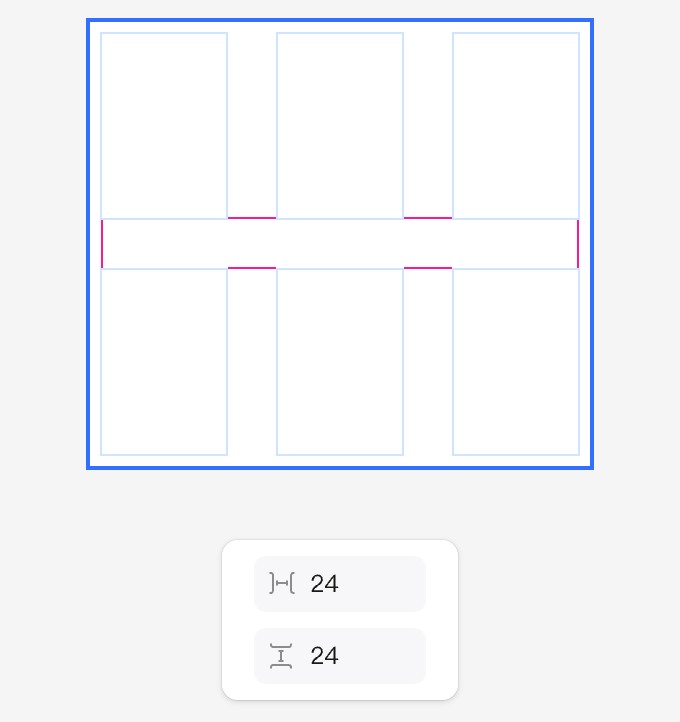
- Padding can be adjusted at any time to control the space along the edges of the grid. Each side of a grid layout frame can have its padding set independently.
III. Grid Basics
Learn the fundamentals of discovering and using grids, including how to position and rearrange elements.
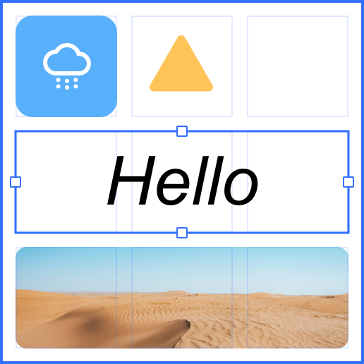
Add Content to Grid Cells
Add content to grid cells while maintaining alignment and a clear structure.
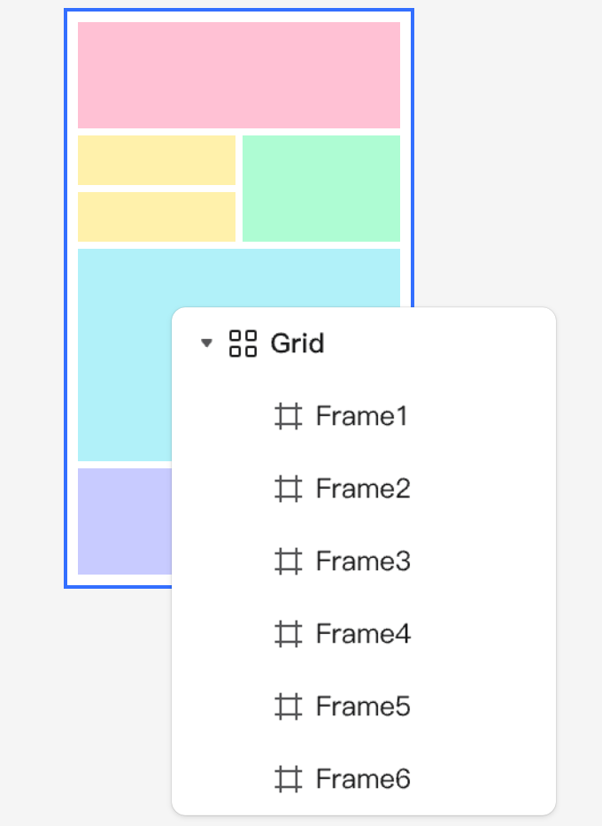
- Drag elements such as shapes, frames, or text into a cell within your grid layout. Each cell can hold only one element, but an element can span multiple cells.
- Elements are automatically placed within the cells, arranged from left to right and top to bottom, filling the available space.
- Drag elements between cells to reorder them.
⚠Note: You can drag elements horizontally or vertically toward the left or top, allowing them to rearrange and fill available space. This ensures that other cells are not pushed forward during reordering.
- When you drag an item into the grid, the target cell is highlighted underneath. Cells can also be selected, allowing items to be pasted directly into the selected cell.
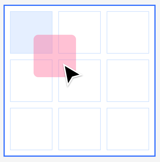
- When multiple elements are dragged into the grid at once, they will attempt to fill the available cells.
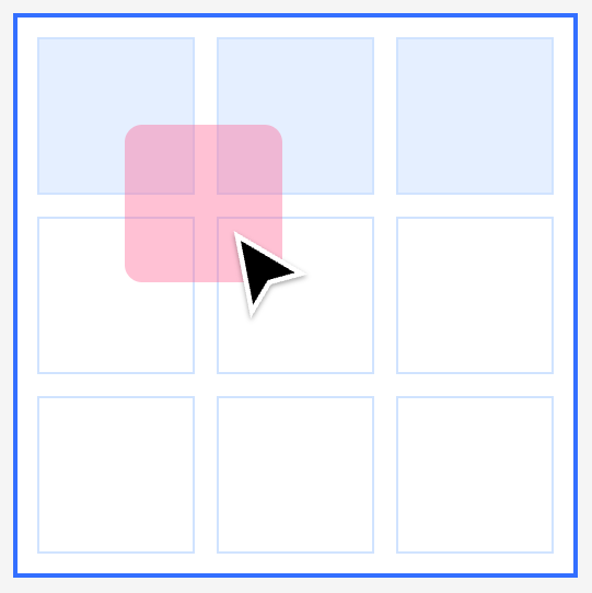
- Easily rearrange elements within the grid by dragging one or more items to your desired positions. It’s best to reorder elements from left to right and bottom to top to ensure there is enough space for rearrangement.
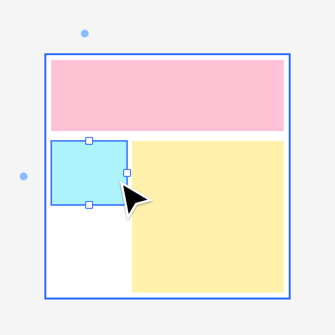
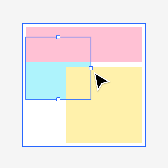
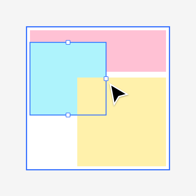
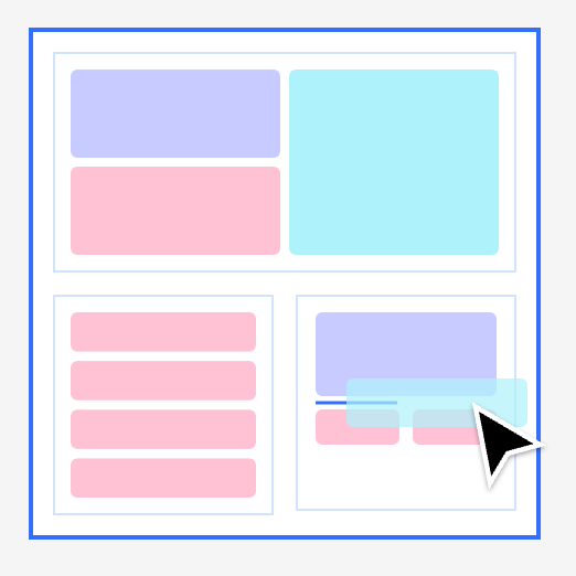
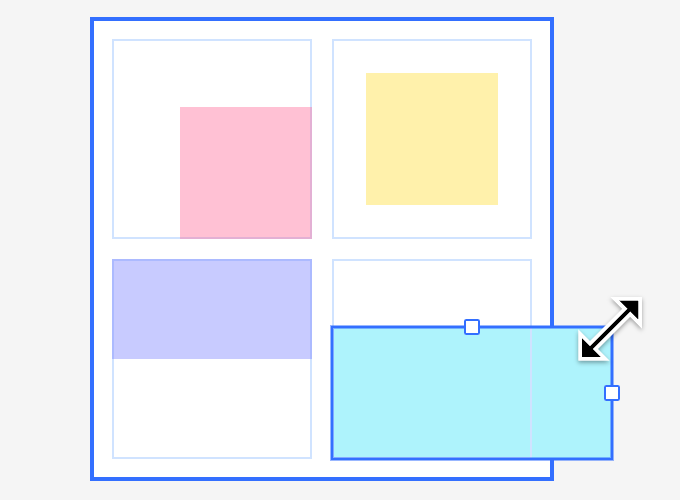
Resize Elements and Span Cells
Want an element to occupy more space? Grids support flexible resizing.
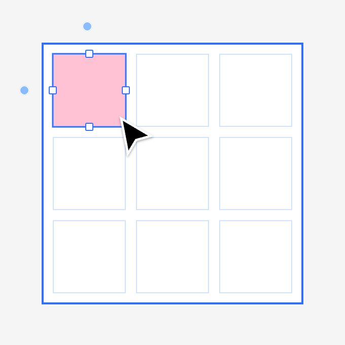
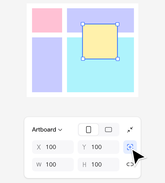
- Select an element within the grid and resize it manually using the handles on the canvas, or enter the desired dimensions in the Design panel.
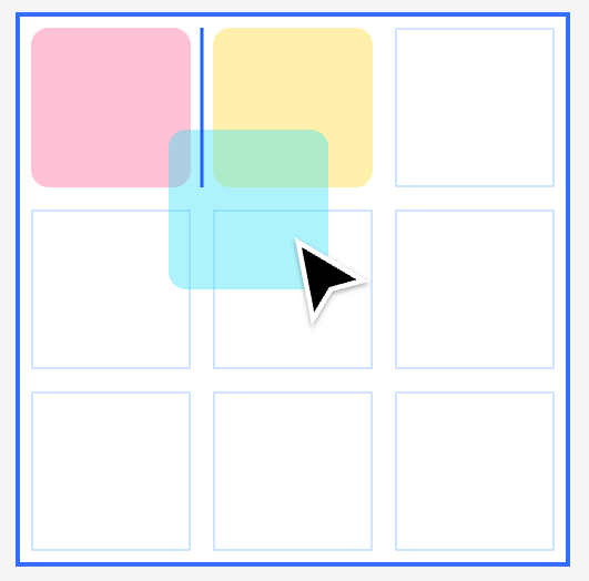
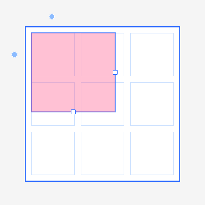
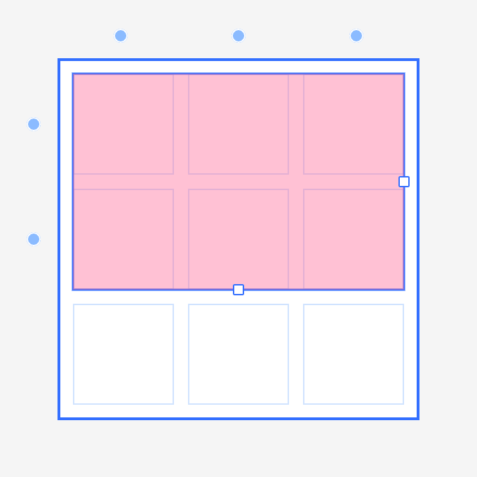
- Resize elements to span rows or columns. Drag to adjust the element's size, and as you reach the edges, it will "snap" to fill the cells. Elements can span both horizontally and vertically.
- Use padding for dynamic scaling. Align the edges of an element with the grid cells when resizing to allow it to span across its designated cells.
When you select an element within the grid, control points appear around it, and you can adjust additional properties in the right-hand panel.
To resize an element within the grid, simply click and drag its handles. You can also stretch the element both vertically and horizontally.
Align an element to the edges of a cell to set it to "Fill Frame" resizing. When set to fill, the element will respond dynamically to changes in the cell’s size.
Overlap and Arrange Elements
Overlap elements across different cells and define their stacking order.
- When adjusting elements, they may extend beyond their current cell and overlap with other cells.
- Use layer arrangement shortcuts to reorder the stacking order of elements:
Bring Forward:
Send Backward:
Bring to Front / Send to Back:
- The stacking order of overlapping elements in the Layers panel can be freely adjusted without affecting the grid’s structure.
IV. Nest and Align Cells
Learn how to effectively nest and align frames, components, and other grid frames within a grid layout.
Nest Elements Within Grid Cells
Grids work seamlessly with nested frames and components.
- Nest Pixso objects within grid cells. Each cell can contain only one object.
- Frames and component instances can be nested within grid cells. They behave like regular objects, with their child elements responding to constraints and auto layout resizing when filling the cell.
- Use to place layers deeper within nested frames. This is especially useful for precise positioning when working with deeply nested frames.
- Use the grid to organize elements such as icons, text, shapes, images, and groups. Each cell can contain only one item.
- You can nest frames, auto layouts, and other grids within the grid. When resized, frames and components will adhere to the constraints of the nested objects.
- Hold while dragging an element into a nested frame to place it inside the nested frame.
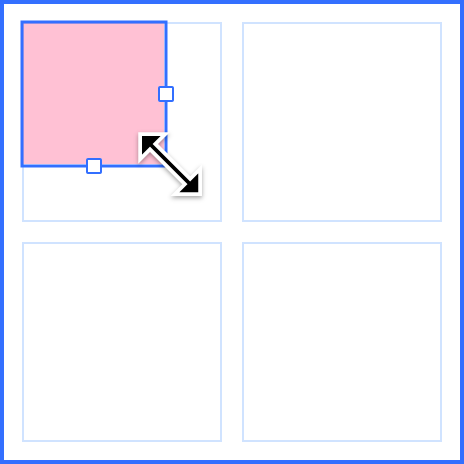
Align Elements Within Grid Cells
Change the alignment of elements within non-filled cells (i.e., when elements are smaller or larger than the cell).
- By default, fixed items are aligned to the top-left corner of the cell.
- Use the alignment tools in the panel to adjust how objects align within their cells.
- The control points on an element change based on its alignment within the cell. For example, an item aligned to the bottom-left will have handles on the top and right edges for resizing.
- Fixed-size elements that are not set to "Fill" are by default aligned to the top-left when resized within a cell. They can then be resized to extend and overlap other cells toward the bottom and right.
- Use the alignment tools in the Position panel to change how items are aligned within a cell. The element selected above will now be centered within its cell.
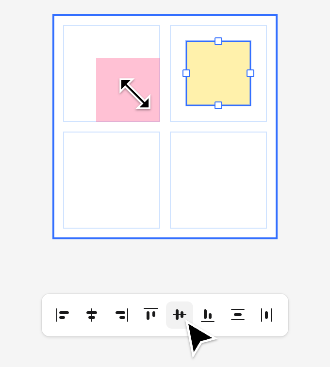
- Resizing the UI reflects the element's alignment, affecting how it can be adjusted within the cell. An element aligned to the bottom-left can be resized from the top and right edges.
V. Resize and Positioning
Discover how to create layouts ranging from simple to complex using grids.
Ignore auto layout/absolute positioning
Want to break the grid? Absolute positioning allows you to freely place elements within the grid.
- Elements with absolute positioning will not follow the grid layout rules, giving you creative freedom for custom placement.
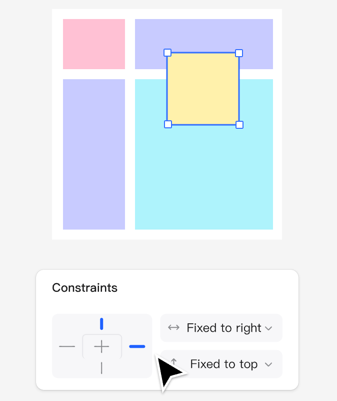
- Set constraints (top, bottom, left, right) in the Design panel to control the alignment of objects within the grid frame when resizing.
- Elements with absolute positioning can be freely placed anywhere within the frame.
- When an object is set to ignore auto layout, the icon will be highlighted. The icon in the left layers panel will also show a border around the corners.
- Setting constraints for "Ignore Auto Layout" will determine how the element adapts when resizing the parent grid frame.
VI. Grid Layout in Dev Mode
Explore various ways to incorporate grids into your daily workflow.
Grids and Dev Mode
Since grids are based on CSS grid design, what you see is exactly what developers can achieve. It not only offers visual advantages but also ensures that the code implementation is developer-friendly.
- CSS grid terminology is preserved, with terms like "grid-column", "grid-gap", and "grid-row" directly corresponding to elements in development mode. These terms are consistent with what developers use in their code.
- Developers can directly copy values from the Layout panel or use them as references when writing CSS.
- This unified design streamlines the handoff process. From the design phase to production, the grid layout remains consistent, intentional, and easier to debug and implement.
CSS Grid
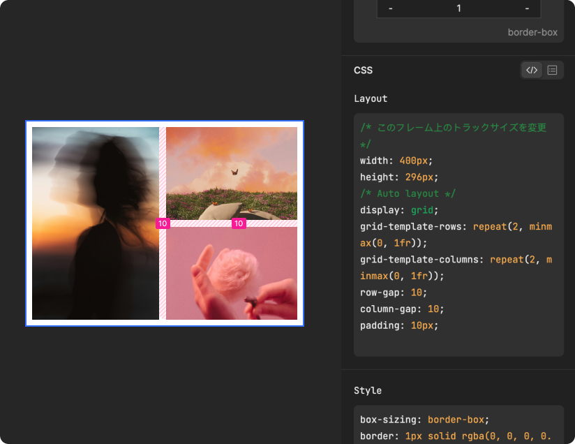
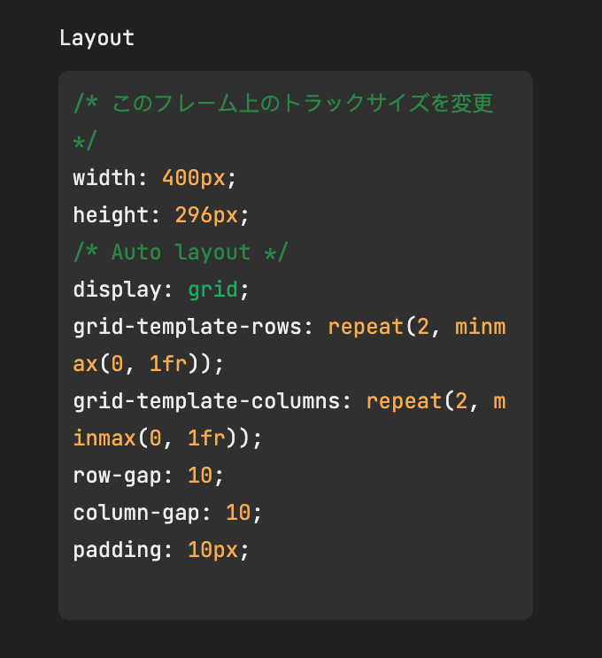
Inspecting the grid framework and its child elements in development mode allows developers to understand how the grid framework is rendered in CSS.
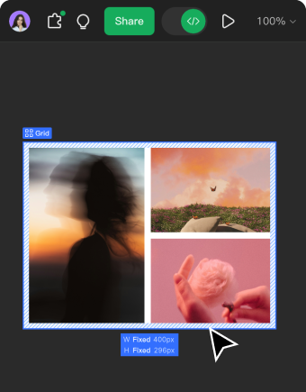
- Select a grid frame and press to enable development mode.
- When a grid frame is selected, it will display the grid properties for row and column gaps as well as padding.
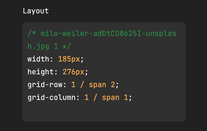
- When selecting elements that occupy grid cells, their properties, such as span and aspect ratio, will be displayed.
- In development mode, select a grid frame to view properties such as the number of columns, rows, gaps, and padding, while also checking the layout spans and alignment.
- The grid frame code will provide the properties and values for the grid settings.
- Elements within the grid cells will display how they are laid out in the grid frame, along with their corresponding properties and values.
VII. Example
Explore these examples to see how grids can unlock powerful layout possibilities.
Grids in Websites
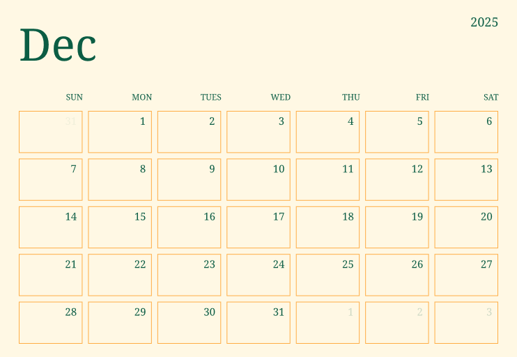
Grid Calendar

![Trendy Banking App Design Case Studies [2025]](https://cms.pixso.net/images/cover/banking-app-design-cover.png)


