Elodia
When designing text for interfaces or creative projects, arranging it along curves or custom shapes opens up new visual possibilities. Using a type on a path tool allows designers to control the orientation and placement of text with precision. From logos to headings and infographics, text on path techniques help integrate words seamlessly with graphical elements. In this article, we’ll explore practical tips for typing on a path, demonstrate how to use type on a path, and show how text on a path can enhance your design projects.
Part 1. Mastering Pixso's Type on a Path Tool
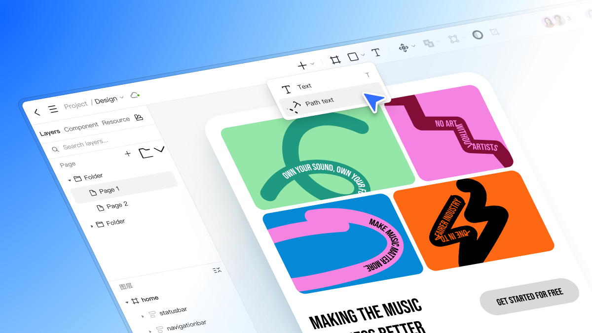
Pixso 2.0 has an adaptable type on a path tool allowing you to place text along any vector path accurately. Contrary to traditional text tools, which limit content along straight lines, Pixso allows you total control of the placement of text and alignment, making it ideal for UI design as well as UI/UX design processes.
The major features of the Pixso type on a path tool are:
- Horizontal Offset: Move the text forward or backward along the path. This feature assists designers to position their text exactly where it is needed, especially on circular or curved paths.
- Vertical Offset: Locate the text above or below the path with vertical alignment control.
- Start Point Flip: Change where the text begins along the path, convenient especially for symmetrical designs or multi-path designs.
- Baseline Flip: Flip the text on its baseline to create reflected or reversed effects, giving your typography a creative spin.
These four attributes provide control and flexibility, allowing text on path arrangements that look professional and refined. While curved text capabilities exist in other tools like Illustrator, Pixso is specifically designed for the UI/UX design industry, providing smoother workflow, real-time collaboration, and alignment with your design system. This makes Pixso a favorite of designers who need creativity and speed.
Part 2. How to Type on a Path in Pixso
Now that you are aware of the features, let us walk through a practical workflow of typing over a path in Pixso.
- Create or Select a Vector Path
Firstly, create a vector path within your project. You may create a simple curve, circle, or specific shape that best meets your design needs. Pixso allows ease in creating paths with its simple-to-use vector tools.
- Activate the Type on a Path Tool
Once your route is determined, select the type on a path tool. This tool is able to recognize vector paths and automatically add text to them, removing the effort and time of doing it yourself.
- Type Your Text
Double-click on the path and start typing. Your text will adhere to the shape of the path, and you'll be able to see immediately how it fits with your layout design.
- Modify Horizontal and Vertical Offsets
Make use of the horizontal offset to shift the text on the path. Make use of the vertical offset to fine-tune its offset from the path. These small tweaks contribute significantly to readability and visual beauty.
- Flip the Start Point or Baseline
For achieving sole layouts or resolving alignment issues, use the start point flip or baseline flip. The two are made to allow text to start from different points or reverse along the course, giving you absolute artistic freedom.
- Preview and Refine
Preview your text along the path at all times to make sure that it is in harmony with the layout environment. Pixso has real-time rendering, and therefore you can instantly receive feedback on the effect of your actions.
By doing this, designers are able to create curved headings, circular text for logos, or create text elements for use as decorations in UI elements with professional-level spacing and alignment.
Part 3. Best Practices for Text on Path in UI/UX Design
When working with text on path in UI or UX design, consider the following few best practices so that your typography becomes both readable and engaging:
- Prevent Overly Tight Curves: Exaggerated curviness distorts letters and makes text hard to read. Always favor creativity over confusion.
- Take Advantage of Real-Time Preview: Pixso allows one to see the changes in real time. Use this feature to quickly iterate and avoid misplaced text.
- Use with Component Systems: Add path text in your UI components such that consistency is maintained between screens and design components.
- Experiment With Multiple Paths: You can superimpose several path texts in order to achieve dynamic effects such as rounded heads around a logo or curved captions on a map screen.
With these rules, designers are able to use typing on a path without compromising on readability or design flow.
Part 4. Advanced Tips for Flexible Typography in Pixso
For designers looking to experiment beyond basic curved text, Pixso has some advanced features
- Multi-Path Text Layouts: Overlain various paths in a single design to create stacked text effects.
- Combine Standard and Path Text: Combine regular text blocks with path text for hierarchic legibility.
- Color and Font Variations: Pixso supports higher-end styling, with the option for every element of path text to be of varied colors, weights, and styles.
- Integration with UI Design Workflow: Since Pixso is a collaborative tool for UI design, teams are able to modify path text in real time, which helps them achieve consistency across projects and components.
These expert tips show how Pixso's tool for path text extends beyond mere curves, allowing for intricate and innovative typography that is appropriate for contemporary digital design projects.
Part 5. Common Issues and How to Fix Them in Pixso
Even with powerful tools like Pixso, designers can still encounter common issues when working with text on path:
- Misaligned Text: Text may not align exactly to the path. Use horizontal and vertical offsets to fine-tune.
- Baseline Errors: Some letters will appear upside down or incorrectly oriented. Use baseline flip to fix this.
- Overlapping or Clipped Letters: Letters may overlap because of close curves or complex paths. You can tighten the spacing or the shape of the path.
- Start Point Confusion: When a piece of text begins unexpectedly, you can fix the issue by flipping the start point.
These issues are easy to fix with Pixso's intuitive interface, and the tool's real-time rendering ensures that you can see fixes immediately, which saves valuable design time.
Conclusion
With mastering of type on a path in your design process comes new possibilities for creativity, where your text can move along curves, circles, or your own paths. Pixso's powerful type on a path feature allows designers to control horizontal and vertical offsets, start positions, and baseline flips entirely. Its flexibility makes it perfect for UI and UX design, where professional-grade text arrangements are supported and collaborative workflows are enabled.
By exercising these methods and researching more advanced alternatives, designers are able to enhance their UI/UX projects through visually appealing typography. From curved headings and round logos to ornate decorations and annotations, Pixso has the tools to make your creative idea a reality while still achieving precision and readability.