Elodia
A dominant force in the rapidly evolving field of web design is minimalist website design. It's classic, sophisticated, and always in vogue, much like the little black dress of the internet age. If you work as a designer, you have undoubtedly observed this style become more and more popular. However, what is minimalist website design and why is it important? Let's get started.
What Exactly is Minimalist Website Design?
Reducing everything to the essentials is the main goal of minimalist website design. It's a deliberate strategy to use the fewest components feasible to build a website that is both functional and aesthetically pleasing, rather than removing elements randomly. Imagine it like constructing a house with only the most necessary rooms—no extras, just functioning.
For example, a minimalist e-commerce site might have a simple layout with a single product image, a short description, and a prominent "Buy Now" button. There is nothing to divert the user's attention from the primary objective, which is to make a purchase. You may easily realize this simple idea with Pixso. Like arranging furniture in a well-planned room, you may precisely arrange items thanks to its user-friendly interface.
Why is Minimalist Website Design So Popular?
Enhanced User Experience
Using minimalist websites is a breeze. They resemble orderly filing cabinets in which everything has a designated spot. Users can find what they're looking for more quickly when there are fewer distractions. A news website with a simple layout, for example, can present stories plainly, allowing visitors to quickly skim headlines and get to the material they're interested in. A better user experience results from this simplicity, and satisfied customers are more inclined to return.
Faster Loading Times
Every second matters in the digital society we live in today. Because they have fewer components, minimalist websites load considerably faster. It can go faster through traffic (or in this example, the internet) than a large SUV, much like a lightweight car. In addition to enhancing the user experience, faster loading times also lower bounce rates. Additionally, you can use Pixso to optimize your design so that it loads quickly on websites. To ensure that everything is functioning properly, you may preview and test your designs in Pixso.
Clear Focus on Content
The content becomes the main focus when the extraneous elements are removed. The key information on the page is highlighted with a simple design, which functions as a spotlight. This implies that there won't be any distractions to the photos on a photography portfolio website. Without being overloaded with extraneous details, users may enjoy the work to the fullest.
Design Strategies for Minimalist Websites
Harness the Power of Whitespace
Whitespace, or negative space, is a crucial element in minimalist website design. It's like the breathing room in a crowded room. You may establish a feeling of peace and order by leaving empty areas surrounding objects. Whitespace, for instance, can be used to divide paragraphs and photos on a minimalist blog, improving readability. Pixso makes it simple to modify the distance between components to achieve the ideal whitespace balance.
Choose Colors Wisely
In minimalist design, color is crucial. Use a small color scheme, typically one to three hues, to keep things simple. It's similar to picking a color plan for your living room—too many hues can be too much to handle. For example, a monochromatic color palette might produce a polished and elegant appearance. You can choose from a large variety of color selections using Pixso. To make your website stand out, you can experiment with different colors, change the opacity, and generate color gradients.
Simplify Typography
Another area where simplicity is crucial is in typography. Make use of a clear hierarchy and no more than one or two fonts. While body text should be easy to read, headings should be bigger and more noticeable. Similar to a road sign system, it uses large signs for key information and smaller ones for specifics. This hierarchy may be simply created in Pixso by adjusting the font size, color, and alignment of your text pieces.
Incorporate Intuitive Grids
Grids are a great way to organize content on a minimalist website. They're like the shelves in a pantry, keeping everything in an orderly fashion. You can use grids to divide the page into sections for different types of content. Pixso offers grid-based layout tools that make it easy to align and arrange elements. To make sure your elements adapt to changes in screen size, you may even use the auto-layout option.
Add Menus and Navigation Bars
Even in a minimalist design, navigation is essential. Menus and navigation bars are like the maps of your website, guiding users through the content. Make them obvious and accessible. Pixso allows you to construct unique navigation components that blend in perfectly with your minimalist style.
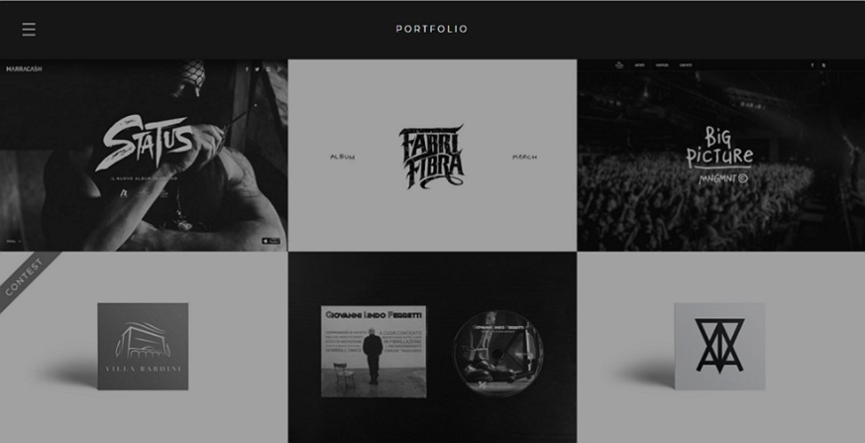
Use Images Strategically
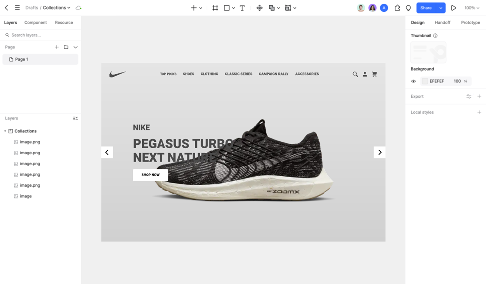
Images can be a powerful addition to a minimalist website. They can tell a story or provide information in a way that words can't. An e-commerce website, for instance, can display its products with excellent product photos. Importing and resizing photographs is simple with Pixso, and you can even add effects like cropping or blurring to further emphasize the minimalist style.
Minimalist Website Examples to Inspire You
After checking the design strategies for minimalist websites, we will turn to some minimalist website examples now.
Airbnb
Airbnb's website is a great example of minimalist design. It features large, excellent photos of houses in a neat manner. The search box is prominent and the navigation is easy to use. This facilitates users' search for their ideal lodging. Observe how the white space surrounding the text and images creates an air of openness on the page.
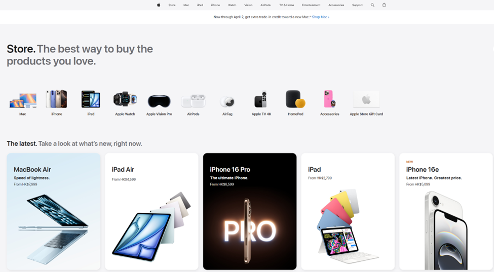
Apple
Apple's website is noted for its simple design. The product pages have huge product photos, straightforward descriptions, and clear calls to action. The color scheme is minimal, but the typography is clear and easy to read. This design style captures the brand's sleek and sophisticated image.
Medium
Popular blogging site Medium features a simple layout that emphasizes the content. The layout is simple and the text is easy to read. The articles are enjoyable for readers because of the usage of whitespace and clean font.
Tips for Designing Minimalist Websites
Start with a Clear Plan
Before you begin developing, make sure you understand what your website will be used for and who your target audience is. It's comparable to making travel plans: you have to know where you're going and how to get there.
Simplify Gradually
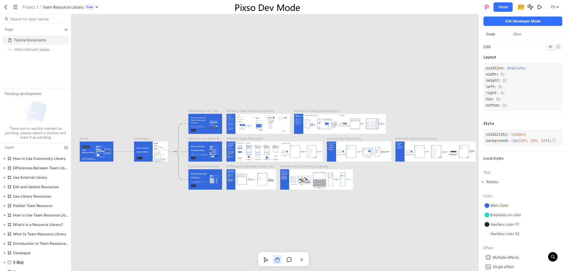
Do not attempt to simplify everything at once. Begin by listing all of the parts you require, and then gradually reduce or simplify them. Pixso's version-control tool enables you to easily go back and make adjustments as needed.
Pay Attention to Details
Every little element matters in minimalist design. A design can be made or broken by small details like button color and icon size. To make these details better, use Pixso's precision tools.
Conclusion
A strong strategy with numerous advantages is minimalist website design. You may use Pixso to develop beautiful websites by adhering to these design principles and studying excellent examples of minimalist websites. Therefore, embrace simplicity; your users will like it!