Scott
There is a very specific kind of headache that usually hits right around sprint planning. A gorgeous, fully fleshed-out interface sits in a design file, but looking closely at the implementation, things just feel off. The padding is weird, the animations are jarring, and the entire team is frustrated. Creatives feel their vision got butchered, while engineers feel they were handed an impossible, illogical spec sheet. Fixing this friction isn’t just about having better meetings. It requires overhauling how we think about the entire handoff, building shared systems, and using modern platforms that actually speak both languages to turn static pixels into breathing interfaces seamlessly.
Part 1: The real disconnect: building a cognitive foundation first
Before we even look at software or sprint boards, we have to talk about how different disciplines view a screen. The root of almost every messy handoff comes down to fundamentally opposed mental models.
When a UX designer looks at a fresh canvas, they are usually thinking about empathy, user journeys, spatial harmony, and visual hierarchy. They want the interface to feel organic. But when a React developer looks at that exact same mockup, they aren't seeing harmony. They are mentally slicing that picture into component hierarchies, worrying about prop drilling, complex state management, and the limitations of the virtual DOM. Meanwhile, a Vue developer might be staring at a complex modal window trying to figure out how to handle the reactivity overhead, slot distribution, and scoped styling without breaking the entire application architecture.
These people are looking at the same picture but speaking entirely different languages. To break down these professional barriers, you have to build a two-way cognitive foundation. The design team needs to grasp the basic constraints of modern frontend frameworks. They need to understand why a seemingly simple "custom dropdown" might add three days of dev work if it behaves outside standard browser parameters. On the flip side, engineering needs to stop treating typography scales and whitespace as optional decorations. Establishing this shared cost consensus—understanding the actual technical debt of a creative choice versus its user value—is the only way to stop the constant back-and-forth arguments before they start.
Part 2: Why Pixso is the tooling support you actually need
Mindset changes are great, but they fall apart instantly if your tech stack fights you at every turn. For years, the industry standard was a fragmented mess. You had one tool for wireframing, another for high-fidelity mockups, maybe a third for prototyping, and a bunch of clunky plugins just to spit out some semi-usable CSS. That disjointed environment is where alignment dies.
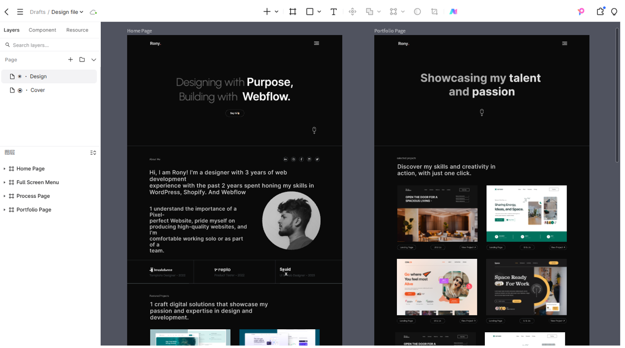
This is exactly why you need an all-in-one hub, and it’s why I recommend bringing Pixso into your workflow as early as possible. While there are plenty of competitors out there like Figma, Sketch, Axure, InVision, and Adobe XD, Pixso is fundamentally built to handle the design to code pipeline natively. If your core goal is to eliminate the gap between visual intent and frontend reality, you need a tool that acts as a central source of truth for both sides.
Pixso natively bridges this gap by acting as the ultimate translation layer. It doesn't just hold static vector shapes; it structures data in a way that makes sense to technical teams. Through its dedicated Dev Mode, deep design system linking, and bidirectional syncing, Pixso creates an environment where a React developer can log in and immediately see the component architecture they need to build. It removes the guesswork. You aren't forcing engineers to use digital rulers or reverse-engineer hex codes anymore. You are giving them a D2C environment that actually understands the complexities of modern web development.
Part 3: The workflow core: moving to component-driven collaboration
The old waterfall method of software development is actively sabotaging your frontend delivery. You know the drill: the design team works in a silo for a month, gets stakeholder approval on fifty screens, and then throws a massive file over the wall to the engineering department. This serial approach is a disaster because technical blockers are always discovered way too late.
Modern web frameworks are modular. You don't build a page; you build Lego bricks that form a page. Your workflow has to match that exact reality. To align properly, teams need to adopt an iterative, component-based, parallel collaboration model.
Because Pixso operates in the cloud and updates in real-time, parallel work is actually possible. A React developer doesn't need to wait for an entire dashboard to be finalized before starting their work. If the team agrees on the structure of a core "User Profile Card," the engineer can start scaffolding the API calls, writing the state logic, and setting up the basic component structure while the UX designer is still tweaking the final drop shadows or border radiuses.
This tight feedback loop is crucial. If a specific hover animation turns out to be a performance killer, a Vue developer can leave a comment directly on that specific node in Pixso. The design can pivot that same afternoon. By syncing the creative rhythm with the agile, componentized reality of frontend work, you completely eliminate the bottleneck of massive, overwhelming handoffs.
Part 4: The delivery standard: achieving zero-deviation handoffs in Pixso
We need to talk about standards. The ultimate goal here is zero deviation. What gets approved on the canvas should be exactly what renders in the browser, down to the last pixel and transition curve. You can't achieve this by just sharing a link and hoping for the best. You need strict delivery standards encompassing componentized structures, aligned design variables, and complete interactive logic.
Here is how you actually execute a flawless design to code handoff using Pixso's specific operation paths to truly solve the translation problem:
Step 1: Aligning Variables with a Token-First Approach
Do not let anyone hardcode a color or a font size. In Pixso, your design team must use Design Tokens. When creating a new button, the designer should go to the right-hand properties panel, click the style icon, and define local variables. Instead of picking a random blue, they name it "primary-brand-color". When a Vue developer clicks on that button in Dev Mode later, they don't see a useless hex code; they see the exact semantic token name that matches their project's CSS variables or Tailwind config file. This ensures instant, 1-to-1 visual translation.
Step 2: Structuring Layouts with Auto Layout
Engineers build with Flexbox and CSS Grid. Designers often just drag things until they look centered. This causes huge issues with responsive behavior. Pixso’s Auto Layout feature solves this entirely. By selecting a group of elements and hitting Shift + A (or clicking the '+' next to Auto Layout in the right sidebar), the designer wraps them in a dynamic frame. They can define exact gap spacing, padding, and whether elements hug their contents or fill the container. Because Auto Layout perfectly mirrors Flexbox properties, a React developer can literally map the Pixso alignment rules directly to their flex containers without guessing how a card behaves on mobile screens.
Step 3: Documenting the Interactive Logic
A static screen is a dead screen. It doesn't tell engineering how a modal transitions or what easing curve a dropdown uses. To fix this, designers must use the Prototype tab in the top right corner of Pixso. By dragging connection nodes between frames, they can set specific triggers (like 'On Click' or 'While Hovering') and define the exact animation styles, like 'Smart Animate' with a 300ms ease-in-out curve. This gives the engineering team a playable blueprint.
Step 4: Extracting with Dev Mode
This is where the magic happens for the technical team. By toggling the Dev Mode switch at the top of the interface, the entire workspace shifts to cater to engineering needs. A React developer can click on any component and instantly see the generated code snippets in the right panel. You can copy exact CSS properties, export optimized SVG icons directly from the assets panel with one click, and view the exact box-model spacing. It dramatically speeds up the implementation phase and removes manual pixel-pushing from the equation.
Part 5: The long-term guarantee: anchoring everything in a design system
Securing a smooth handoff for one sprint is great, but maintaining that efficiency across two years of product development is a completely different beast. As teams scale, keeping everything consistent becomes a massive operational headache. Without a central source of truth, entropy takes over quickly.
This is where treating Pixso as your foundational design system becomes your long-term insurance policy. A mature D2C pipeline relies on unified libraries. You aren't just storing buttons; you are storing the company's entire visual DNA. You build a master file in Pixso containing all your global tokens, typography scales, standardized icons, and interactive components, and then publish it as a team library.
When a new Vue developer is hired and needs to build a complex data table, they don't start from scratch. They look at the Pixso library, see the exact approved table row component, and pull the matching pre-built code component from their repo. And because it's dynamically linked, if the lead UX designer updates the core brand color in the master Pixso file, that change cascades across every single project file automatically. This guarantees that your large-scale team maintains absolute consistency, drastically reducing tech debt and preventing your application from looking like a patchwork quilt of different UI styles.
Part 6: The value and return: why this alignment matters
So, what is the actual business value of overhauling your workflow and heavily investing in this kind of alignment? The return on investment is frankly massive. Getting design and frontend on the exact same page is the most efficient way to build digital products today.
First, it absolutely destroys the visual QA cycle. You know that horrible phase where a developer finishes a ticket, only for a UX designer to send back twenty comments about wrong font weights and missing hover states? By using a rigid, token-based D2C pipeline, that "ping-pong" effect practically disappears.
When you eliminate that friction, you save incredible amounts of money and time. It accelerates your time to market because every React developer on your roster is spending their time solving complex logic problems and optimizing backend integrations instead of manually tweaking CSS margins for three hours. It lowers operational costs, boosts team morale, and most importantly, it guarantees that your end users actually get the polished, premium experience they were promised.
Conclusion
Closing the gap between creative ideation and technical reality doesn't require a miracle, but it does require systemic change. You have to move away from isolated silos, establish a shared vocabulary, and rely on robust platforms like Pixso that are built from the ground up to handle the complexities of modern handoffs. When your team aligns their mental models and utilizes parallel, component-driven workflows, the friction melts away. Engineering gets the structured data they need, design gets their vision accurately realized, and the entire production cycle becomes faster, happier, and infinitely more efficient.