Elodia
In this day and age, where technology is advancing at a breakneck speed, the Internet of Things (IoT) has woven itself into the fabric of our daily lives. Smart home applications have become an essential part of modern living. As more and more people strive to boost their quality of life with the help of technology, the need for well-designed app interfaces has shot through the roof. For us designers out there, it's super important to stay one step ahead and create interfaces that aren't just practical but also look great and are a breeze to use. In this blog, we're going to take a deep dive into 8 seriously cool smart home app interface design examples. These will not only inspire you but also give you some really useful insights for your own projects. And, we'll show you how to get your hands on these designs using the amazing Pixso design tool.
Accessing Design Resources on Pixso
Before we jump into the design examples, let's quickly go over how you can score some relevant materials on Pixso. It's all free!
Create a Free Account and Dive into the Resource Community
First things first, sign up for a free Pixso account. Once you're all signed in, head over to the Pixso resource community. Pixso is like a treasure trove for designers, offering a ton of resources to play around with.
Search for Smart Home App Design Cases
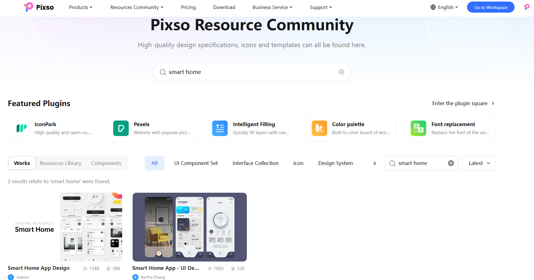
Once you're in the resource community, just type "smart home" in the search bar. You'll be greeted with a whole bunch of app interface design cases. It's like opening a box of surprises, with so many options to explore.
Copy Design Materials to Your Personal Document
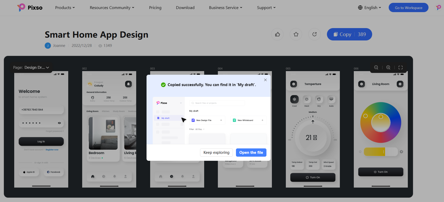
Find a smart home app interface design that really catches your eye. Click on the detailed page of that material, and look for the "Copy" button in the upper-right corner. Click it, and voila! The design material is now in your Pixso personal document, ready for you to use.
Top 8 Smart Home App Design Styles
1. Soft - Neumorphism Style
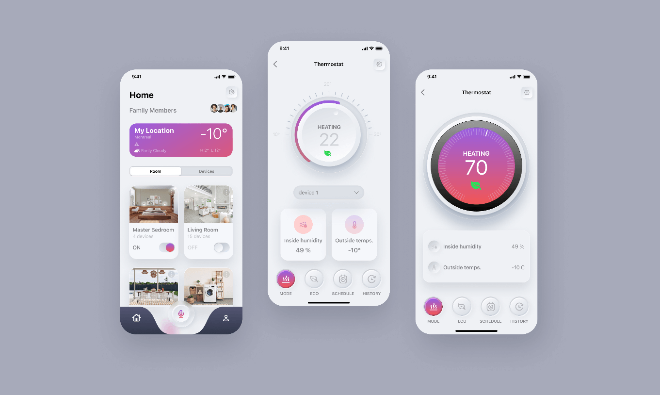
You know, the flat design style has been ruling the roost for a while, but lately, people are starting to get a bit tired of it. Enter the soft-neomorphic style, which has been gaining a lot of popularity. This style can show off light, shadow, structure, and perspective, all while keeping things sleek by toning down the contours, details, and textures. It's perfect for showing off the layout of smart home app interfaces. Take a look at the soft-neomorphic-styled app interface in the example. It not only gives off that modern, high-tech smart home vibe but also makes it super clear which content is primary and which is secondary. You can understand and operate it with just a quick glance.
2. Minimalist Black - and - White Style
They say "Simplicity is the ultimate sophistication," and that rings so true in UI design. A minimalist design can really up the usability and readability of a product, giving users a much better experience. The classic black-and-white combo is a great way to bring out the modern and high-end feel of a smart home app interface. It's simple, yet really refined. Check out the minimalist black-and-white app interface in this example. It's clean, doesn't have any clutter, the white space is used just right, and the functional layout is crystal-clear. Designers, this is a great one to study.
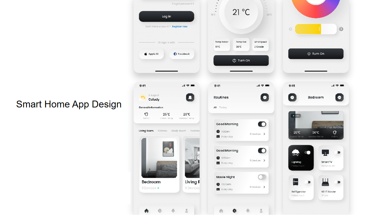
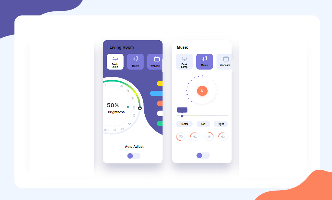
3. Clean Flat Style
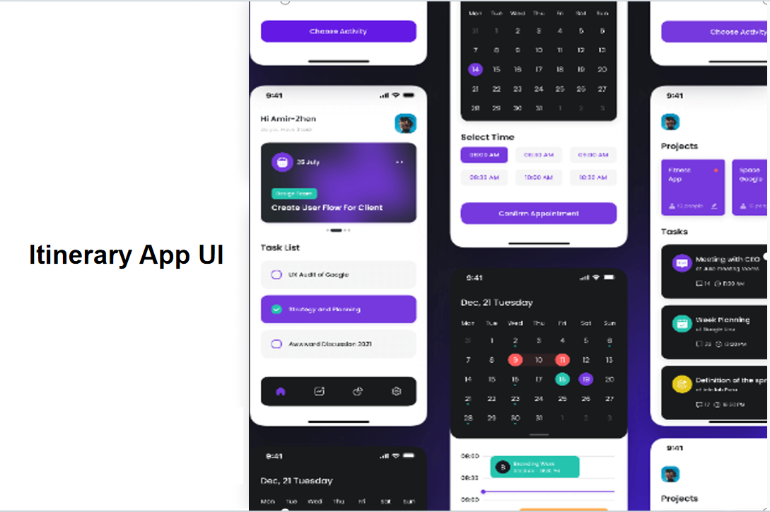
The flat design style is still the most popular design trend out there, and for good reason. It's a safe choice for smart home app design. In this example, the set of app interfaces uses purple as the main color, which is a great way to show off the technological side of smart homes. The whole interface is clean, simple, and really in line with today's design aesthetics. Definitely a style worth looking into.
4. Real-World Scene Simulation
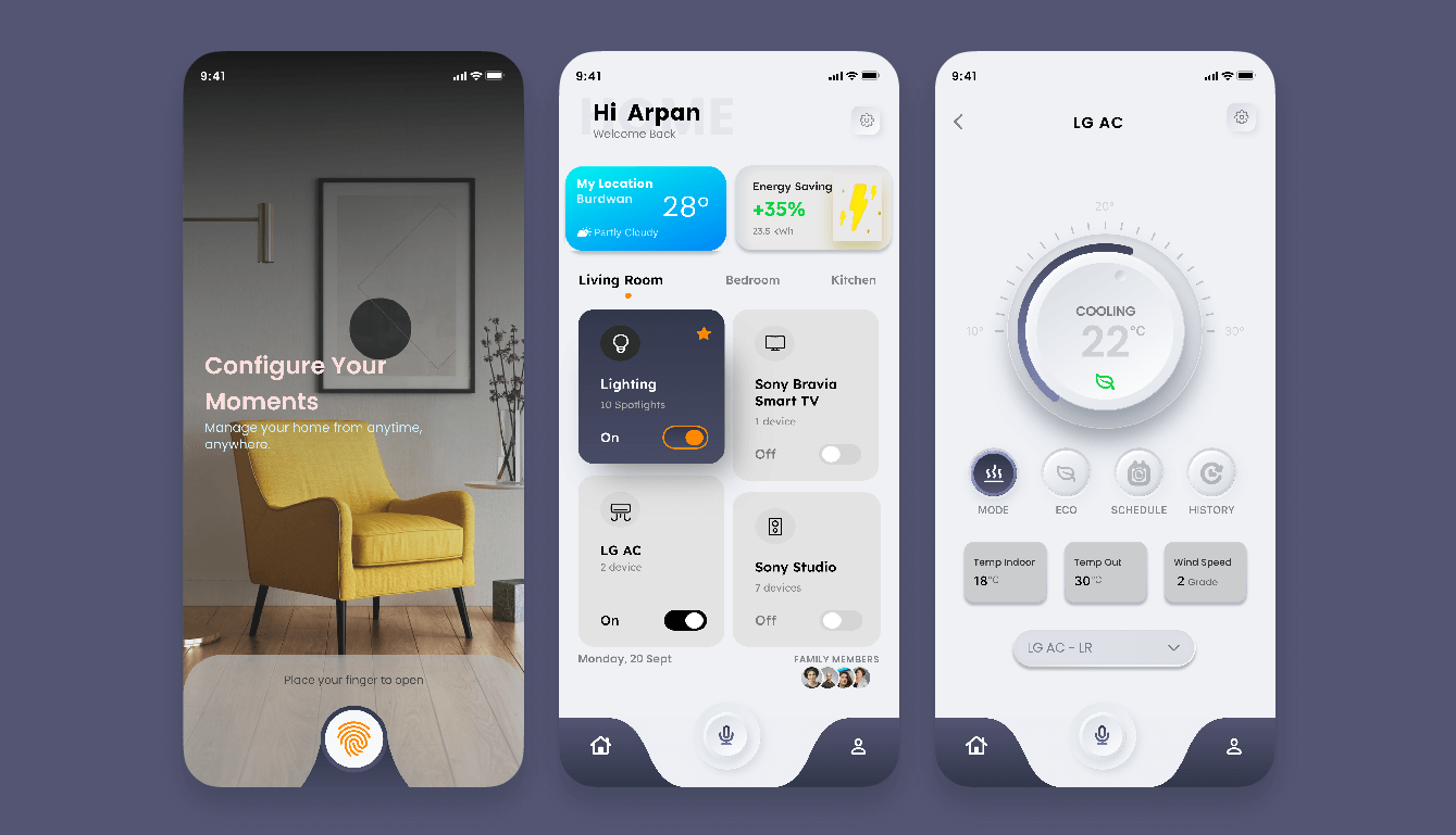
When it comes to smart home app interface design, using real-world scene photos can really help users connect the dots between the app and their actual home devices. In this example, they've combined real-world photos with the trendy soft-neumorphism style. By mimicking real-world objects, it becomes a lot easier for users to match the app with how they think about their devices, and they don't have to spend a lot of time learning how to use it. It's a really creative approach that we can all learn from.
5. Simple Dark - Color Scheme
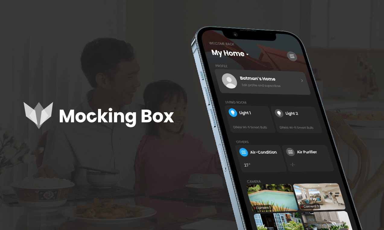
Dark color schemes often give you a stronger sense of being immersed in the app and help you focus. The smart home app interface in this example goes for a dark color scheme and keeps it simple with very few decorative elements. The page interaction is easy to understand, and the structure layout is clear. The whole design looks really modern and stylish. And with just one click on Pixso, you can use this design in your own projects.
6. Dark - and - Warm - Tone Style
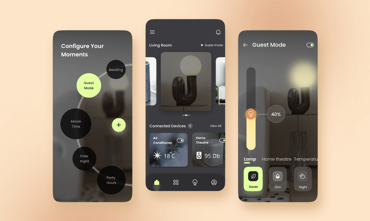
This smart home app interface design is dominated by dark and warm tones, and it uses a bunch of small, detailed icons. These icons create a really clear and unique look, making the whole product feel warm and refined. You can head over to the Pixso official website and download these template materials for free.
7. Green and Fresh Style
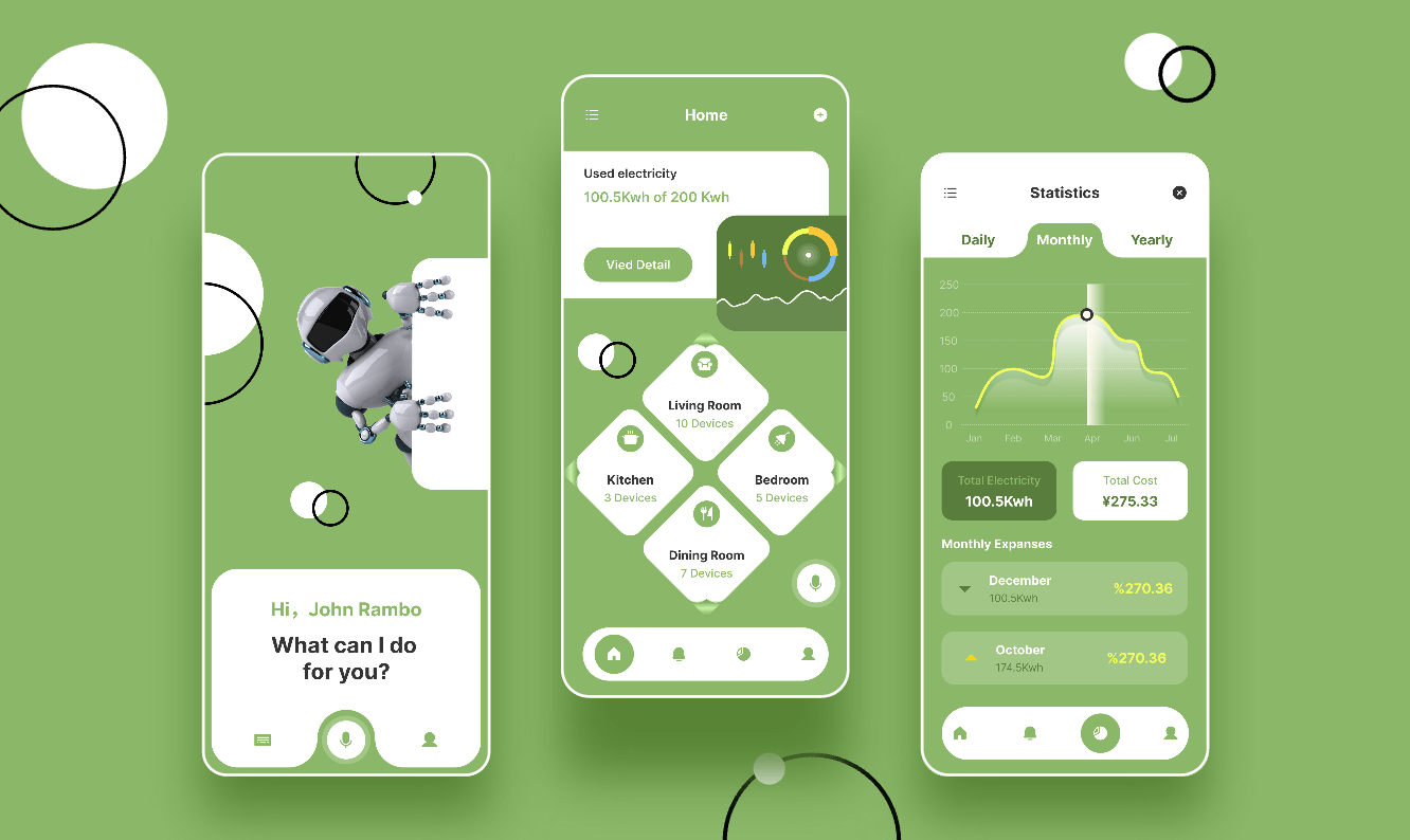
An interface design mainly in green isn't something you see every day, but it can be a great choice if you want your smart home app to stand out. In this example, the layout is different from the usual rectangular card design. They've bravely gone for diamond-shaped cards to hold the main functions. And the realistic 3D elements add a touch of that high-tech feel. If you're looking for something different, this could be a great source of inspiration.
8. Flat Illustration Style
This set of smart home app interface designs has a flat illustration style. With purple as the main color and yellow, red, and other colors as accents, the whole page looks warm and lively. The use of illustration elements makes the content more lively and the page more friendly and inviting.
Final Thoughts
In summary, these 8 smart home app interface design examples are like a toolkit for designers. Each style represents a different approach and design concept, whether you're aiming for a sleek and modern look, a cozy and immersive feel, or something completely unique. Pixso, with its awesome resource community, makes it super easy for you to access these designs. It offers a wide range of free-to-use and commercially - available resources, making it a one-stop shop for inspiration and materials in the world of UI design. So, what are you waiting for? Sign up for a Pixso account today and start exploring the exciting world of smart home app design. Let these examples fuel your creativity and help you create the next great app interface.