Sherry
Have you ever thought your homepage is just... mediocre? Let's discuss a design element that has recently drawn attention: the split screen. It's straightforward but incredibly powerful, like the design equivalent of a magic act. Imagine a single screen with two sides, each of which tells a different tale. It's bold. It's balanced. And when done right, it's downright mesmerizing.
But why is it so effective? It's a visual handshake, to begin with. "Hey, we have options!" it says. It provides consumers with a clear option without being overpowering, whether you're presenting two goods, two concepts, or just two feelings. It's also a fantastic method to showcase your design skills, let's face it. If you get the typography and colors just right, you'll succeed. Your homepage performs rather than merely existing.
So, ready to give it a shot? Let's break it down and see how you can use split screen layouts to create something that doesn't just catch eyes but holds them.
The Lowdown on Split Screen in Web Design
The split screen isn't a recent trend. Like in those vintage silent films, it has existed for a very long time. Remember when they used to display several scenes at once to tell a more complex story? That's how split-screen works!
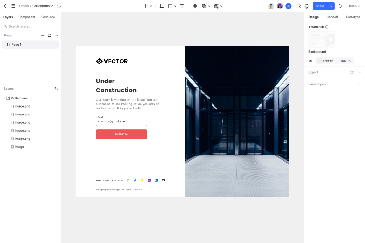
What is a split screen layout, then? It's very easy. Simply split the entire screen into two or more vertical parts. When you nail it, it's like giving your users a front-row seat to two different stories playing side by side. It creates this cool balance that's like a magnet, drawing people in.
One of the coolest things about split screen designs? They resemble web design's chameleons. We all use various gadgets in today's society, including smartphones, tablets, laptops, and desktop computers. All of them can be accommodated with split screen layouts. Consider cell phones as an example. Your content is still accessible and looks fantastic, and the panels stack up perfectly.
Additionally, split displays are excellent for navigation. You can use some clever design techniques to express your creativity. Perhaps you want to point customers to crucial information or make that "Buy Now" button pop. They make guiding your users and motivating them to perform a snap.
When Split Screen is a Win
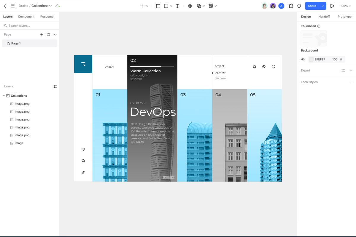
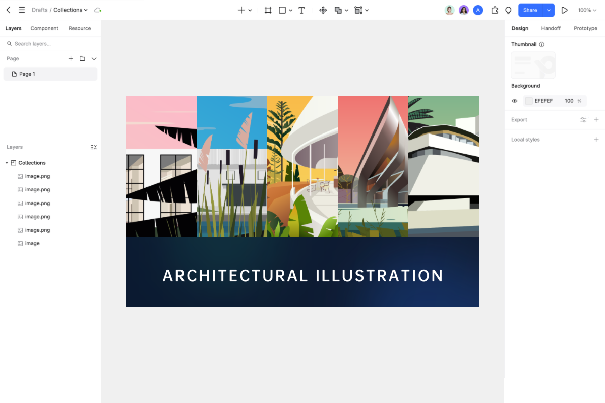
Split screen designs are awesome when you've got two things to show off. Say your site offers two different products or services. A split screen gives each one a chance to shine. It's like having a stage for both of them, and users can quickly compare and pick the one they like.
But split screens aren't perfect for every situation. If you've got a ton of content on your website, a split screen might not be the way to go. A complex layout with too much stuff can look messy and confuse users. That's why split screen layouts are a match made in heaven for minimalist designs.
Figuring Out if Split Screen is Right for Your Site
You need to ask yourself certain questions if you're considering designing your website in split screen. To begin with, is your material compatible with split screens? You might not want to use a split-screen if your topic is too complex and requires a lot of explanation. However, it may be fantastic if you have two easy things to demonstrate.
Then consider negative space. That blank area surrounding your stuff, you know. You need enough of it in a split screen layout to make the layout look tidy and user-friendly. It may appear cluttered and unattractive if there is insufficient negative space. Think about your users as well. Split-screen designs may be adored by some, but they may be a little perplexing to others. You need to know what your users like and expect.
Last but not least, is it possible to successfully divide consumers' attention? Since the user's attention is divided by a split screen, both sections of the screen must be captivating. Users shouldn't feel overloaded or confused about where to look. Keep in mind that the split screen is merely there to support your content, which is the main attraction.
4 Design Tricks for Awesome Split Screen Homepages
1. Mix Bold Colors and Eye-Catching Typography
Bright colors catch your eye like a neon sign. Using dynamic typography makes your writing stand out. These two work together to produce a visually striking split screen design.
Pixso and other similar tools can be extremely helpful while working on such projects. UI/UX designers and product managers commonly utilize Pixso, a professional design tool that integrates many resources from the iOS and Android design systems. This gives you quick access to color schemes and typefaces that follow current design trends, making it simple to create aesthetically pleasing split screen layouts.
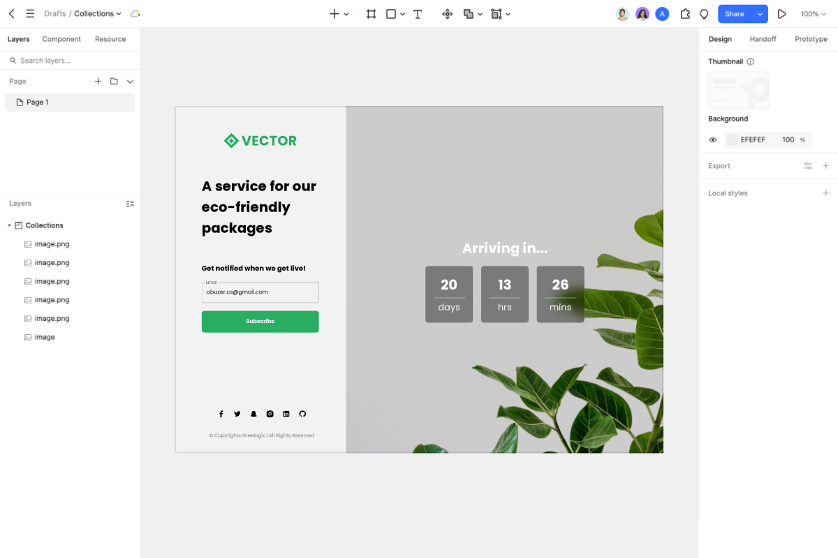
2. Make That CTA Button Pop
You have a fantastic opportunity to direct customers through your website by dividing the screen into two sections. It's the ideal method to draw attention to your call-to-action (CTA) buttons. To clearly separate the two sections of the screen, employ negative space. This way, you can have two different CTAs, and neither one is more important than the other.
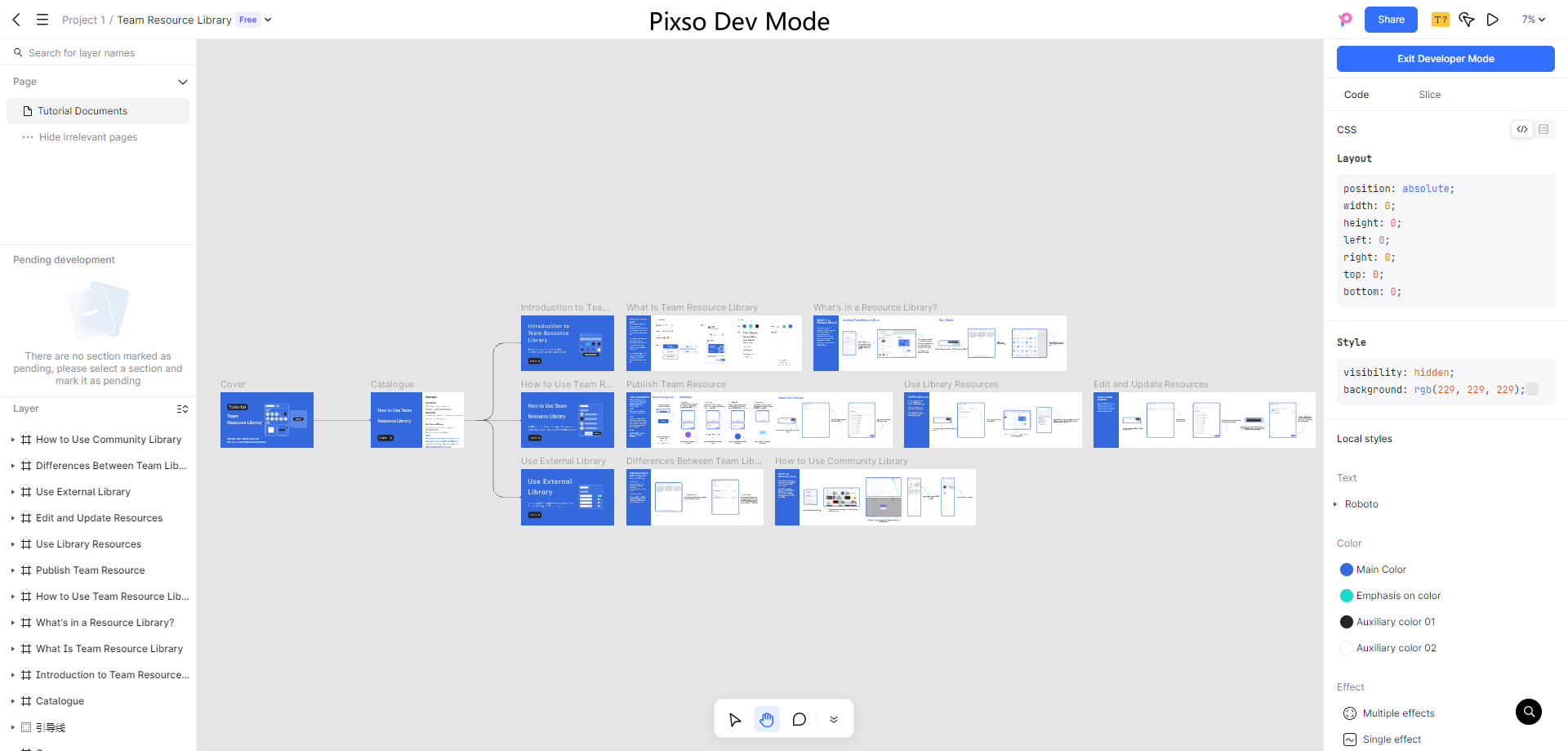
Pixso's online design tool can enhance your workflow when designing these attention-grabbing CTAs. With its online comment and feedback feature, you can quickly share your split screen design with your team members. Additionally, Pixso's design delivery feature automatically provides specification parameters and multi-platform code. The entire process from design to development can be accelerated by simply sharing a link with developers once your split screen design is complete and includes those ideal call-to-actions.
3. Create a Smooth Flow Between the "Screens"
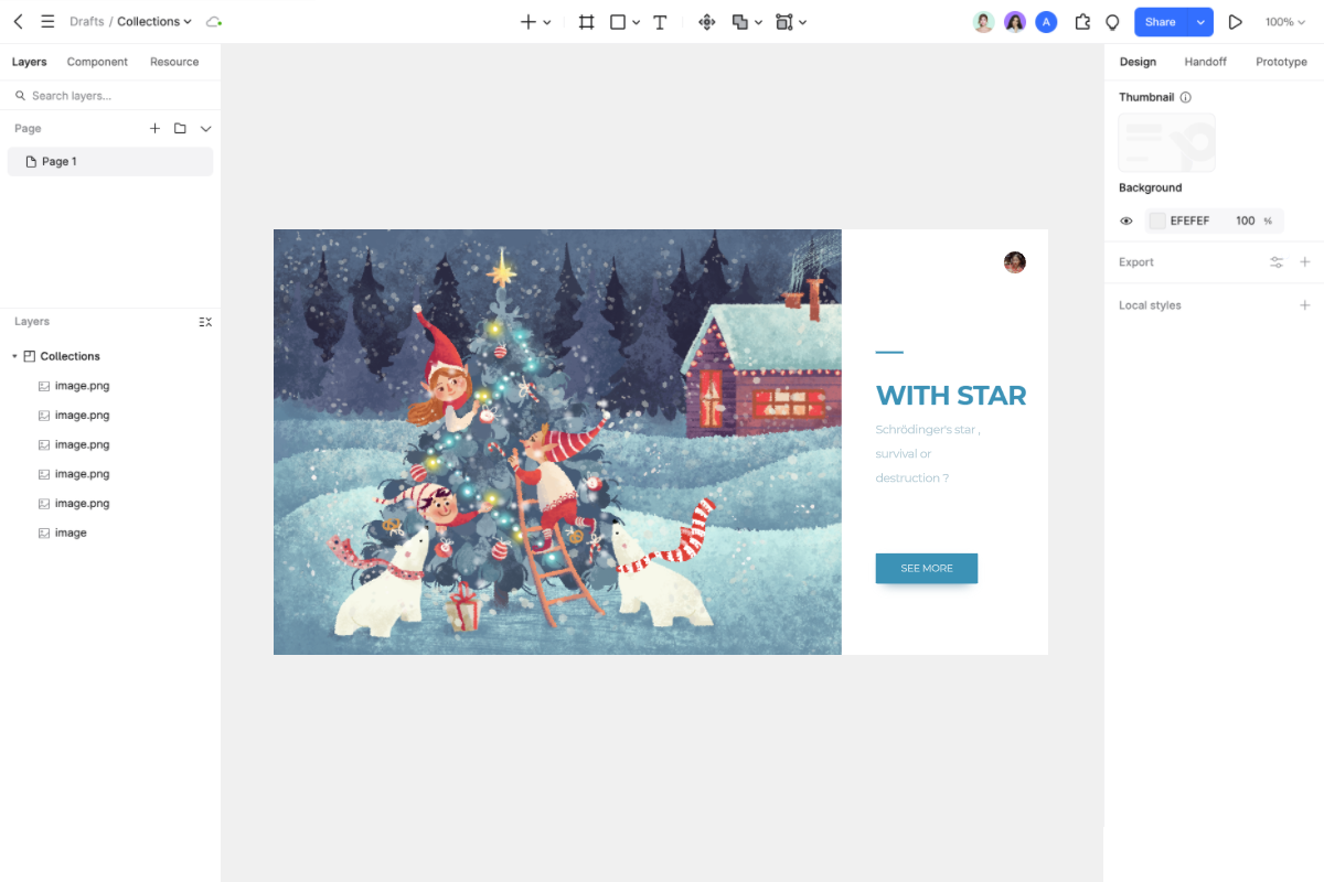
You must ensure that there is a connection between the various components when your split screen displays a single object or related material. Using color is one way to accomplish this. The two screens may appear to belong together if you utilize the same color, particularly a brand color or a striking hue.
Adding layers of text to the screens is another clever idea. In addition to serving as a link between the two sections, overlapping text gives the design an intriguing touch. It functions as a link between the two stories.
4. Use Animation to Get Users Clicking
The secret ingredient that can entice people to click is animation and interactive effects. Check out the website "Chekhov is Alive." Their split screen design features such amazing animation that it almost begs you to click and see what happens next.
Split Screen Layouts in Different Industries
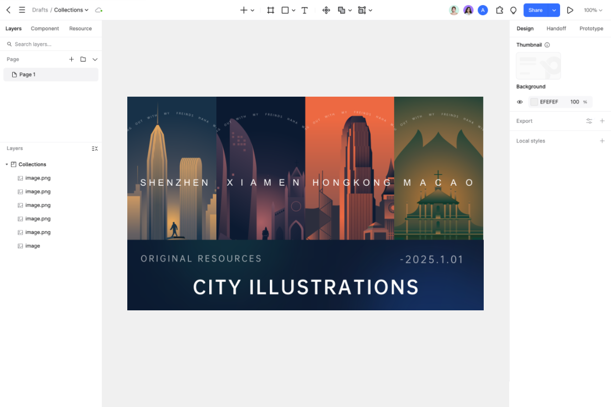
The shocking truth is that split screen layouts are more than just one trick in the toolbox. They're versatile enough to shine in almost any industry. In e-commerce, imagine this: on one side, a stunning product image; on the other, all the juicy details. It's like a virtual store where users can see, learn, and decide without jumping through hoops.
In the service sector, they are able to provide several products at the same time. Do you need to draw attention to various kinds of services? Divide them in half so that users can move around without becoming lost. They can be very effective even in creative portfolios. Display the process on one side and your work on the other. It's a visual conversation that keeps users hooked.
When working on split screen designs for different industries, Pixso's Resource Community can be a treasure trove of resources. It incorporates excellent design specifications from many big companies like Tencent, ByteDance, and Ant Design. There are a ton of design templates and tools available, along with local font resources to suit the needs and style of the business, whether you're creating for e-commerce, services, or education.
Final Thoughts
So, designers, there you have it! A pretty amazing method to make a homepage that people will enjoy is with split screen designs. They're fun, they work on different screens, and they can make your website more engaging. But don't just jump in and use a split screen without thinking. Think about your users, your content, and the overall layout. Make use of the design strategies we discussed, such as utilizing animation, blending colors and text, emphasizing your calls to action, and establishing a flow across the screens.
Keep in mind that visitors form opinions about your website in a matter of seconds. Therefore, a well-designed split screen layout can be the answer if you want to hold them there rather than have them bounce away. Try your hand at split screen designs, regardless of your level of experience. And when you do, remember to use Pixso, the best design tool available. With its complete functions, easy usability, and powerful team features, Pixso is a great companion for both individual and team design.
Let your creativity run wild and create a homepage that'll make your users say, "Wow!" So, go ahead and work that split screen magic and make your website the best it can be.