Elodia
Typography shapes both the visual style and readability of a design, and variable fonts allow designers to adjust weight, width, slant, and other attributes within a single font file. Understanding what is a variable font helps designers experiment with different styles without juggling multiple font files. This article will explore the concept of variable fonts, how a variable font works, and practical ways to apply them in design projects.
Part 1. What Is a Variable Font and Why It Matters
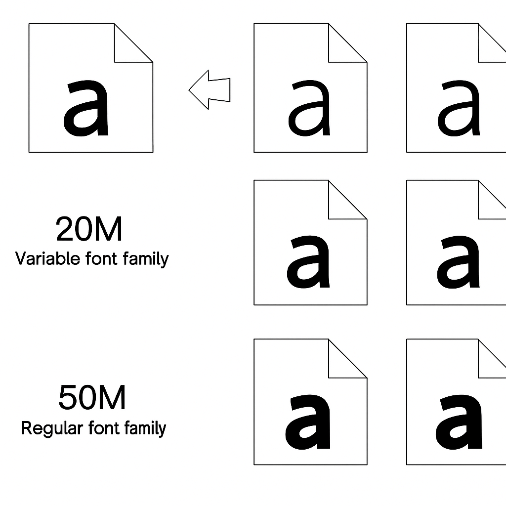
If you have ever worked with several font files, Regular, Bold, Italic, Extra-Light, and more, you already know how confusing typography management is. That's where variable fonts play their role.
So, what is a variable font? It's a highly advanced font format introduced as part of the OpenType specification that allows multiple styles and weights to be present in a single font file. Instead of needing to install five or ten instances of the same font, you can have one, and you can easily modify its properties, like weight, width, slant, and optical size.
The elegance of this tech is how flexible it is. You can adjust the emphasis of a title to make it more prominent or letter width adjustments for readability within one variable font file. To UI designers, this means quicker iteration, fewer assets, and greater control over creativity.
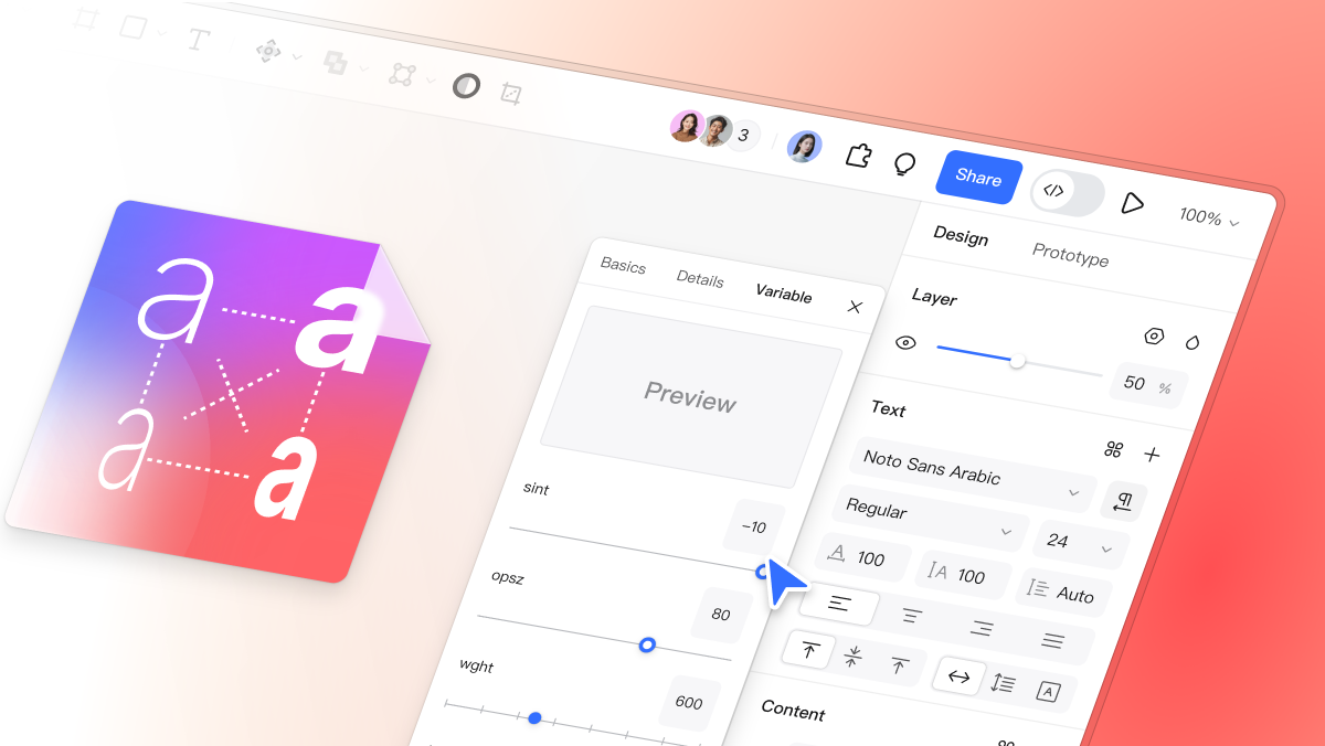
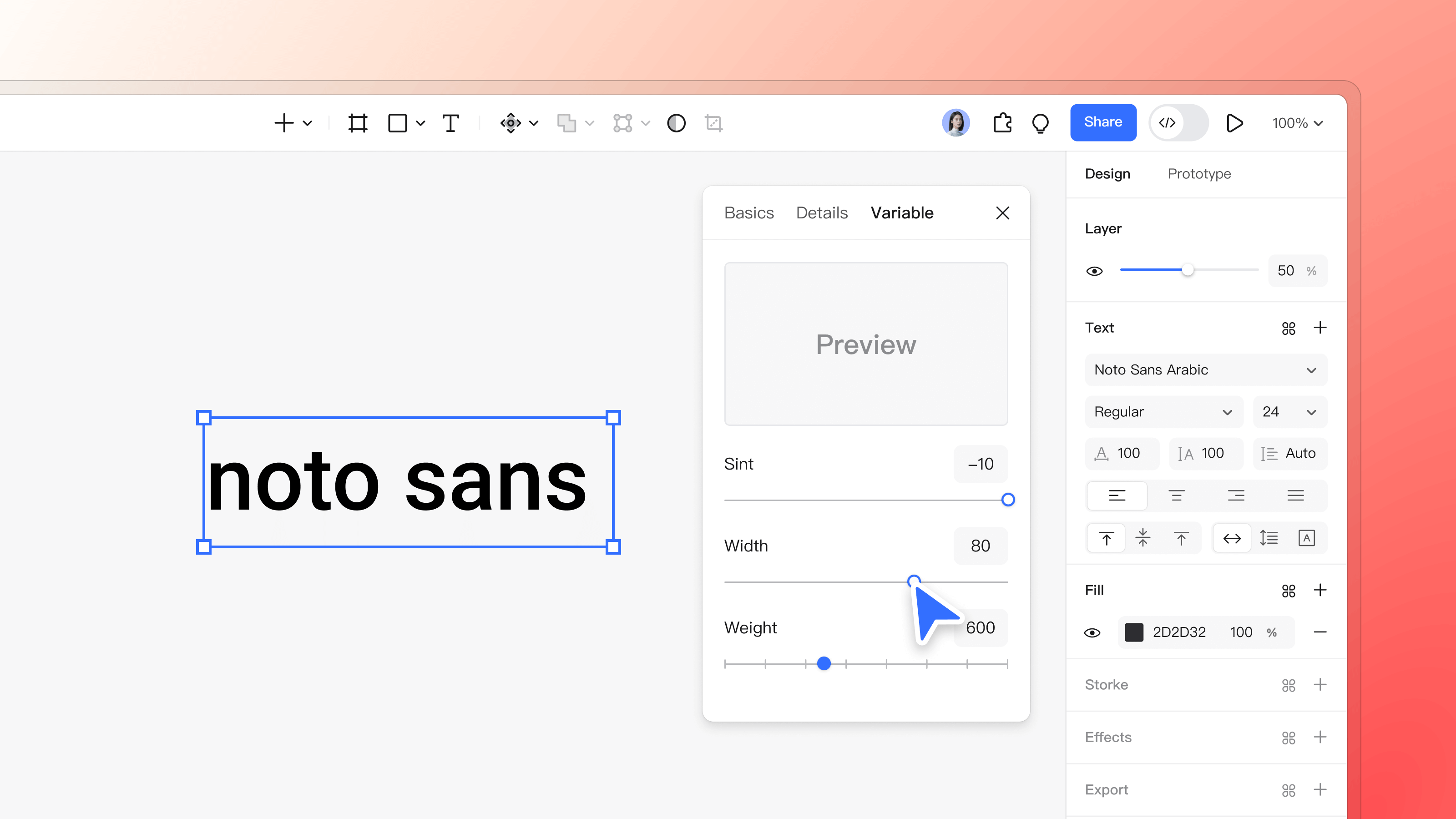
Native support for variable fonts is available in today's design software like Pixso, where designers can easily change these attributes directly on the canvas and witness the effect in real-time. No file shuffling, no mockup typos anymore.
Part 2. The Key Features of Variable Fonts in Today's Design Tools
1. Pinpoint Typography Control
Unlike legacy type families with discrete weights (400, 600, 700…), variable fonts allow for continuous control. You can slide between weights, adjust slant, and even customize width in real time. This allows a designer to find the "ideal middle ground" that suits a brand's tone, neither too light, nor too heavy.
Imagine you get to design a landing page in which every heading, subtitle, and paragraph is absolutely in tune. With variable fonts, you can visually adjust typography instead of toggling between rigid presets. It is like having a full type lab right within your design universe.
2. Improved Performance and Efficiency
One of the biggest advantages of variable fonts is file efficiency. Because all variations are contained in a single file, designers and developers are able to reduce file sizes and page loading exponentially. For web projects, this means fewer HTTP requests and faster rendering.
Front-end developers also get simpler CSS. Instead of referencing several fonts, a variable font can reference them all. This is more maintainable and design-to-code consistent.
In Pixso, assets exported retain variable font parameters, making it simple for developers to pick up and pixel-perfect deploy.
3. Expressive Customization and Creativity
All brands want a strong visual identity, and typography plays a significant role in that. Variable fonts introduce creative variations beyond weight or width, some have custom axes defined by the font foundry, like contrast, roundness, or serif size.
This exposes designers to infinite possibilities for exploration. A brand can express softness, precision, or brawn by altering the type's visual behavior without changing its essential family.
When you design in Pixso, you can work with variable fonts to build prototypes that truly represent your brand's voice, from web to mobile.
Part 3. The Technology Behind Variable Fonts
Driving variable fonts at its core is the OpenType Font Variations technology. Essentially, each variable font file is loaded with a number of "axes" of variation, including:
- wght (weight)
- wdth (width)
- slnt (slant)
- opsz (optical size)
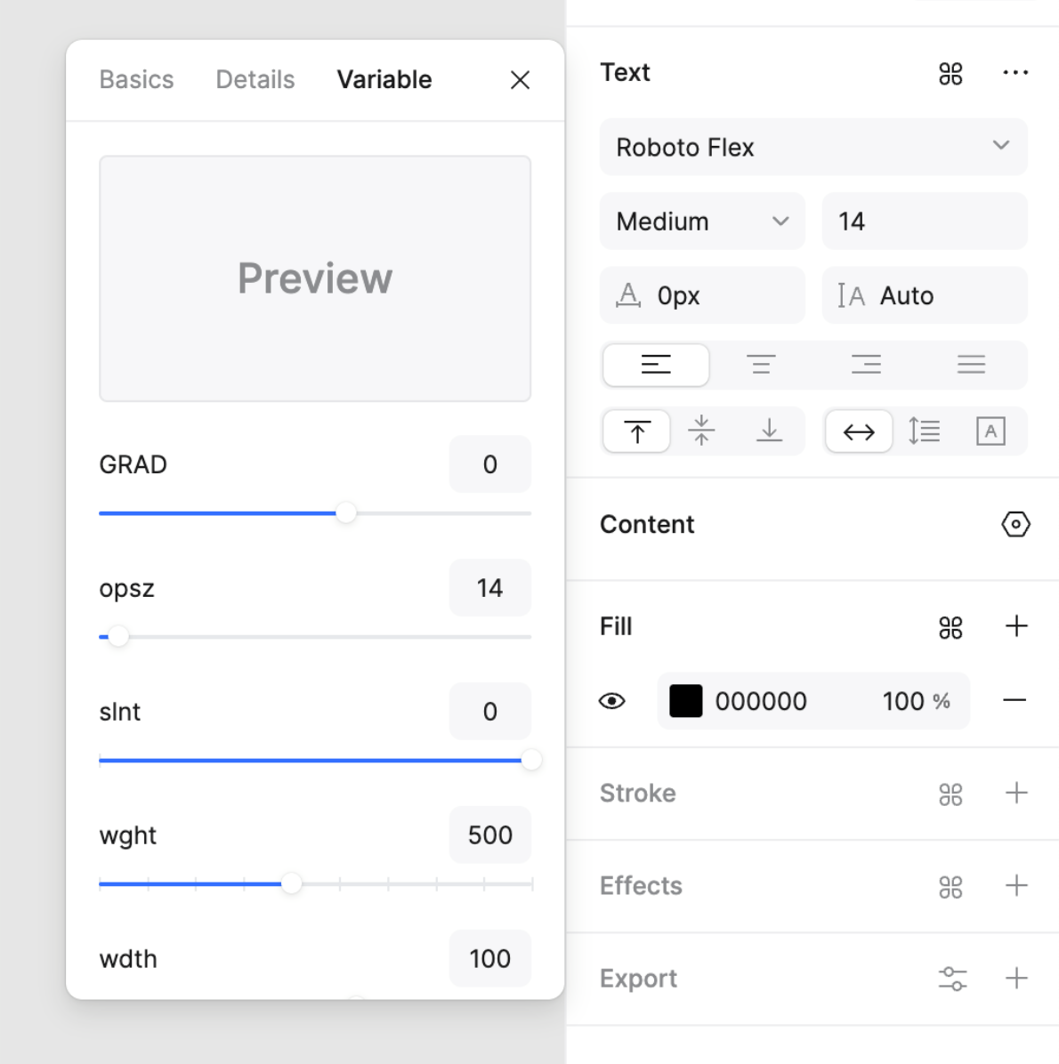
Designers can skew these axes in real time, creating nearly infinite combinations. The font renderer (whether in a design application or browser) will automatically interpolate the shapes themselves for crisp, precise rendering at every value.
For multi-language work, for example, Arabic, Japanese, or Hebrew designs, variable fonts facilitate better control over consistent typographic form from one script to another. Software like Pixso that supports OpenType variations enable such complex languages to be represented appropriately without losing the integrity of the brand.
Part 4. Why Designers Must Adopt Variable Fonts
1. Consistency Across Devices
Typography often seems to be inconsistent across different devices and screen sizes. Variable fonts solve this problem beautifully. Dynamic optimization of optical size or weight makes text readable and harmonious on a mobile phone or a 4K screen.
This coherence spares manual resizing work and maintains the design system with a solid, unbroken sense of coherence.
2. Enhanced Accessibility
Accessibility is no longer on-trend, it's the norm. Variable fonts make everyone read more effectively. Letter spacing can be tweaked subtly or weight can be altered for better contrast, benefiting the experience for visually impaired users or those who find it hard to read.
Consider the possibility of delivering users a dynamic reading experience where font properties are adapting to lighting situations or user preferences. That's what variable fonts bring to inclusive design.
3. Simplified Collaboration and Delivery
For environments where people work in groups, it can be challenging to maintain fonts consistent across the design to development stage. Variable fonts facilitate easier collaboration by bringing all the visual variations into a single definition.
In collaborative software such as Pixso, groups of individuals can share design files wherein all text properties, including variable font parameters are shared. This reduces designer-developer miscommunication and avoids font mismatches when building.
Part 5. Real-world Examples: Using Variable Fonts in UI Design
Consider a modern web dashboard. Designers will need bold headings but legible body text. Variable fonts enable them to gradually reduce the weight from H1 to body text, creating a clear hierarchy without compromising a unified typeface.
Or consider a landing page: a button can have the text a little more tightly set so it fits without resizing the layout. These small micro-adjustments, though subtle, greatly improve visual rhythm.
Pixso’s design environment supports real-time preview of variable fonts, letting teams see exactly how the typography will appear on different devices and interfaces before handing it over for development.
Part 6. The Future of Variable Fonts
The design industry is still exploring what variable fonts can do. We’re seeing them merge into responsive design systems, motion typography, and even AI-driven layouts where text adjusts dynamically based on content or user behavior.
As browsers and design software improve support for variable fonts, designers will face less friction and more control between creativity and execution. The distinction between typography and animation is already beginning to become blurred, and variable fonts are the connection.
Final Thoughts
Typography determines the tone of digital products, and variable fonts redefine how we work with that tone. They condense design workflows, enhance performance, and unlock infinite creative possibilities, and they do it all while providing consistency and precision.
Understanding what is a variable font is now becoming a necessity for every modern-day designer. It's not simply a new file type; it's a new way of thinking about typography as a changeable system.
And with variable font capabilities from products like Pixso, designers no longer have to choose between flexibility or consistency, now they can have both. Whether you're adjusting a headline, establishing a brand identity, or testing out a new app's user interface, variable fonts let you design text that speaks to you.