Elodia
This page revisits the visual patterns discussed in the original 2026 collection. It is a historical overview, not a survey establishing which style was most popular or a forecast for the current year. The enduring question is what a visual choice helps a person do, and what it makes harder.
1. Patterns represented in the original collection
Photography and illustration
Images can explain a subject or establish context. They also consume space and download time. Their value depends on whether they contribute information that the user needs, rather than merely interrupting a long page.
Transparent headers
A transparent header can integrate navigation with a hero image, but it also makes text contrast dependent on what is behind it. Solid headers remain a valid choice when they make navigation easier to see and use.
Neumorphic surfaces
Soft shadows and similar foreground and background colors create an embossed appearance. The same technique can make controls hard to distinguish. The visual style should be assessed separately from focus, state and contrast requirements.
Dark themes
Dark palettes were part of the collection’s visual vocabulary. A dark theme is not a universal remedy for eye strain or a guarantee of battery savings; the device, display, environment and implementation affect those outcomes. Readability and usable states still need review.
3D imagery and motion
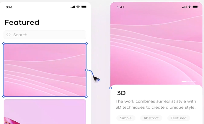
A 3D view may help explain an object or interaction. Decorative motion can instead compete with the task and add processing or download cost. A static alternative and motion preferences matter when adapting this style.
Data visualization
Charts can expose a comparison or change over time when labels and scales support the question. A chart does not automatically improve conversion or make every dataset easier to understand. Sometimes a labeled value or table is the better representation.
Gradients
Gradients can provide a background or a focal area. Text and controls placed over changing colors need to remain legible across the whole background and every responsive crop.
Rounded shapes
Corner shape is one element of a visual system. Rounded corners do not establish that a product is safe, trustworthy or easier to use. Consistent component rules and clear behavior are more useful grounds for a design decision.
2. Original example credits and what they illustrate
The original collection named the following concepts. The descriptions here identify the visual topic they were used to illustrate, not measured business, accessibility or usability outcomes.
- Banking App by Arsan Ali: rounded controls and a soft, dimensional visual treatment.
- Gamers Dating App by Yehor Haiduk: dark surfaces and imagery as a prominent visual element.
- EHR – System Urgent Patient Timeline by RonDesignLab: grouping and timeline hierarchy in a dense interface concept.
- Project Management Dashboard by AR Shakir: hierarchy and data presentation in a dashboard concept.
- Admin Dashboard by HALO UI/UX: sidebar navigation and visual grouping.
See the preserved example images and apply a concrete review task in the UI improvement checklist. The credits are retained from the original collection; they do not imply endorsement or evidence that those concepts were tested in production.
3. Use a design tool to investigate the tradeoff

Pixso supports interface design, prototypes and collaborative review. Use a copy of a screen to compare a visual change against its original, annotate the task and ask reviewers to identify the main action. A tool choice does not guarantee a better user reaction or launch a complete product.
Keep this page as historical context. For a current improvement project, use the companion guide’s checks for navigation, states, themes, motion, data and responsive behavior, and validate the implemented result.