Scott
People grow rapidly tired of trends, and the pendulum swings the opposite way every few years. We have all seen famous fashion trends or artistic movements emerge and demise. In User Interface (UI) design, the same situation exists.
Interface styles range from those that seem like real-world items to those that are really plain and simple. Each of them has perks and drawbacks. Your ability to innovate, advance the design sector, and improve your personal design practice depends on your ability to generate and experiment with new UI trends.
Let's look at the most current UI trends and learn from them for remarkable visual designs. Only then can we comprehend how various aesthetic decisions benefit users and how they relate to the context of usage.
We'll look at 10 UI trends you should know as a UI designer. Let’s dive in.
10 UI Design Trends
Minimalism
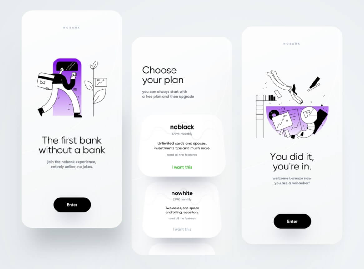
Minimalism as a design option has been growing for many years now, and if you look at the websites of well-known, top-tech businesses, you will notice that straightforward, informative and basic interfaces are getting increasingly popular.
While some may find the minimalistic approach uninteresting since it limits many aesthetic alternatives, a minimalistic design will inadvertently streamline the user-interaction process and provide a seamless user journey.
Also, it might be an intriguing and satisfying task to strive for a simple design and make it seem great along the way.
3D Elements
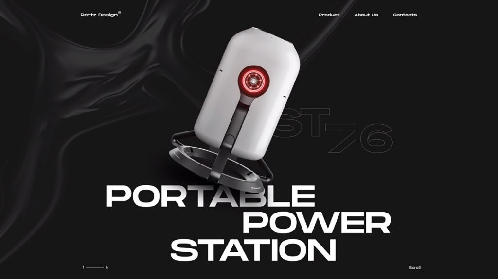
One of the hottest trends in UI design this year, and one that will undoubtedly influence web- and app design for years to come, Is 3D design components. For one, they offer your website more character by adding shadows, animations, or layer effects to give it more depth and dimension.
For another, incorporating 3D features can help your consumers understand the services or items you wish to promote and boost the overall visual attraction. In visual storytelling, employing 3D components may capture your narrative or product in a manner that accentuates depths of field and shadows, making them more life-like.
While 3D design components have undoubtedly been present for many years now, it is only lately that, via simple-to-use and frequently free-to-use tools for 3D design, developers are experimenting more with 3D features on their websites and applications.
Glassmorphism
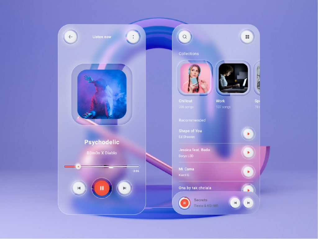
Glassmorphism is a style that, as the name indicates, exploits the qualities of glass to improve your designs. It imparts a translucent or transparent aspect and feels to its pieces. Glassmorphic elements and shapes function well on bold, colourful backgrounds highlighting the glass look. The first traces of glassmorphism might be noticed already in 2020 and 2021 in the form of neomorphism.
Today, it developed into the more full-glass look that is common presently. Elements of glassmorphism are design items that seem like glass or are intended to create a glass effect. This comprises transparency, frostiness, glossiness, backdrop blurring, spheres that appear like glass, and so on. Glassmorphism produces plain yet enjoyable effects and may be blended wonderfully with bright or neon materials to create a stunning prismatic effect.
Holographic and Neon Elements
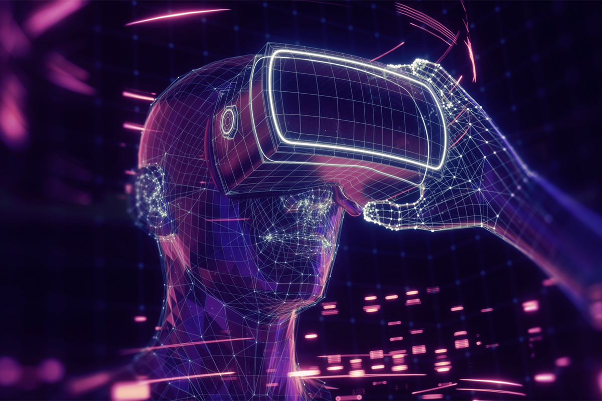
With the emergence of Metaverse ideas and the rising number of individuals investing in cryptocurrency, holographic and neon components on applications and online sites have become more popular.
That is because, first, the various Metaverse ideas, as well as other VR applications, make use of those aspects. Secondly, the burgeoning crypto space also loves to incorporate holographic design features on its sites to emphasize how innovative and futuristic these currencies are.
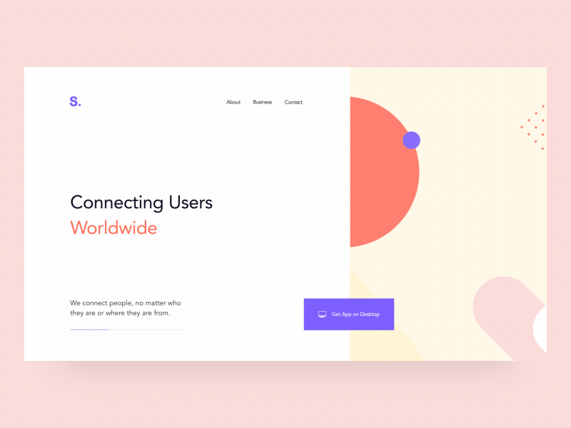
Aurora Backgrounds
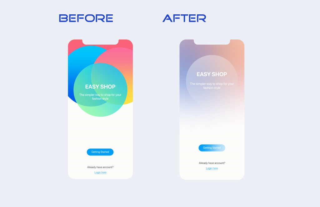
Aurora UI is a design gradient effect that mimics the Northern Lights. You mix multiple hues that effortlessly merge into one another. The designer may blend nearby hues on the colour wheel and altogether distinct colours. The essential point is that they must be compatible. In a similar bright way, the trend of aurora backgrounds from 2021 continues to attract visitors with delicate, blurring flashes of colour that give the website a welcoming and organic touch. You may either fill up the whole backdrop with aurora hues or utilize it to emphasize UI components that are significant to the user.
Split-screen Design
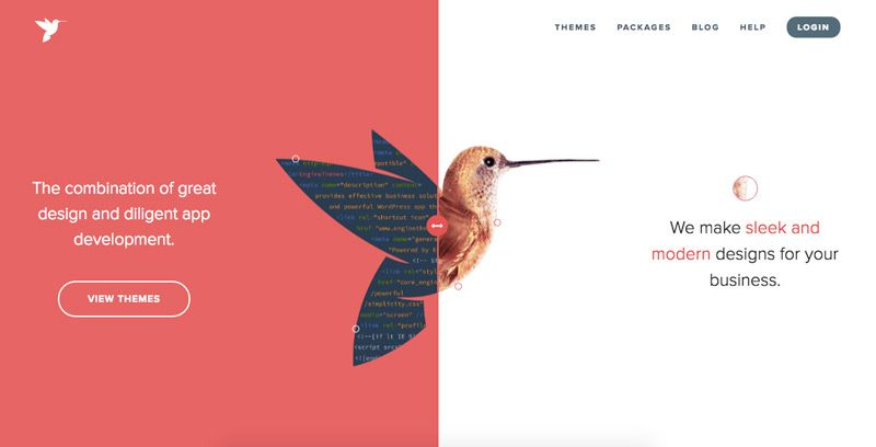
Split screens were fairly popular years ago, and since 2021 they have undergone some type of resurgence. Especially owing to the ever-increasing number of mobile devices, adopting split screens is becoming more attractive.
Split screens enable you to build content that works on multiple devices and looks incredibly attractive. Many designs use side-by-side displays that emphasize the significance of the bigger object, particularly on mobile devices.
If you intend to add split screens to your web page or app, always attempt to achieve these two points:
- Provide the user with a robust and enticing visual experience
- Deploy several access points for the user to explore deeper into fresh content
Motion UI Design
Motion UI refers to the trend of adding appealing and customized animations and transitions to an interface. Motion or animation is a fun method to enhance a user experience and add life-like qualities to an interface. Users become bored by browsing through static and motionless photographs on the page. However, the moving objects and photos on the screen give extra beauty to it via UX and UI. Users become more drawn to animations. Motion UI design adds an excellent aesthetic to the interface and aids in acquiring information without becoming bored. This style improves aesthetic attractiveness by adding the dimension of movement to a design.
If we want moving components to make sense and seem natural, we need to incorporate animations that complement the design rather than detract from it. It is tempting to get carried away with all the entertaining animations, but we must pick intelligently to achieve a great design. For example, you may use animations to guide or even persuade your users to take a certain action or offer them feedback.
Dark Mode
The dark mode UI is a design style where light text rests on a dark backdrop. This colour scheme minimizes the brightness radiated by gadget displays, and some studies indicate that it aids in enhancing visual ergonomics by lowering eye strain. Reducing the eyes' tiredness is particularly important for interfaces where users need to read a lot of text. And dark mode helps preserve battery life to some degree. Dark theme UIs were created as a countermove to the dark-on-light colour schemes, which replicated the look of ink on white paper.
Bauhaus Style
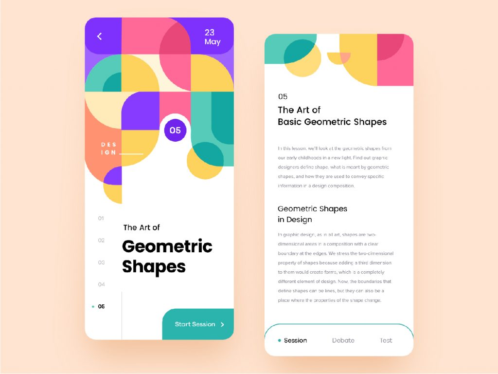
The Bauhaus UI style revolves around geometric graphics: semicircles, circles, rectangles, triangles, etc., inventive use of typography and non-distracting, non-functional features. This design style focuses on the design components themselves: line, shape, and colour, and it incorporates abstract shapes and balanced proportions. The primary concept of the Bauhaus Movement was "Form follows function." This concept has significantly affected design ever since.
According to it, basic geometric forms were constructed based on an object's intended function or purpose, giving in a minimalist style that may still be attractive. It championed a geometric, abstract aesthetic having minimal expression or emotion and no historical allusions. Bauhaus-style interfaces provide an appealing, contemporary, clean aesthetic appeal to digital interfaces.
Neumorphism
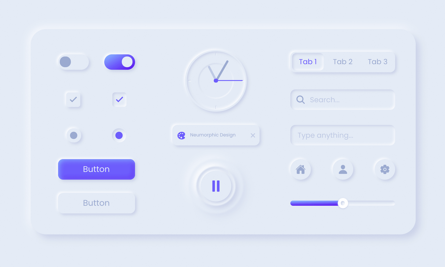
In neomorphic design, components appear to protrude from the backdrop. Neumorphism blends the simplicity of flat design with the realism of skeuomorphism. However, it concentrates on something other than replicating items from actual life but rather on developing products that could work in real life. A neumorphic UI interface appears like you can physically interact with it; you can push buttons and adjust sliders. The key to neumorphism is how it regards depth. Buttons will seem higher until you push them, which will then show on the sunken level.
Neumorphism uses shadows and gradients to generate a three-dimensional aspect, resulting in a clean and new interface design. The key characteristics of neumorphism are low contrast, monochromatic colour schemes and faint shadows. This type of design may come with potential accessibility issues, particularly in dark mode, owing to its typical low contrast. People with visual loss, blindness and colour blindness will find it exceedingly difficult to engage with this interface design.
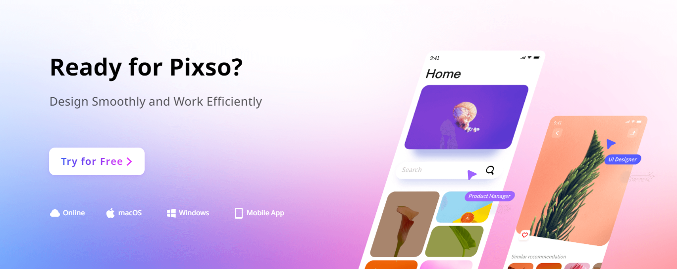
Utilize the UI Design Tool Pixso to Catch up on Trends
What better way to keep up with the trending UI design styles other than using the perfect UI design tool - Pixso? With Pixso, you can create minimalistic, glassmorphic, and many more trending design styles. Pixso encompasses all the required tools to create alluring website and application layouts. There is a rich library of icons and templates to make designing easier and more fun. You can also keep up with the latest trends through the article section on the official website. Pixso is free to start and offers so much value! Why not give Pixso a try right away?
![[Full Guide]What Is UI Design](https://cms.pixso.net/images/articles/what-is-ui-design.png)