It’s impossible to underestimate the importance of a good logo. When well-designed, it can become a shorthand for a company, representing its products and values, and helping to project or reinforce an image.
Although logos should have a long life — otherwise people will never associate them with the brand — they should also reflect the times. It’s important to ensure that a new logo does not already look dated, and to revisit existing branding occasionally to check if it needs a refresh.
Whether it’s to underline reliable performance, accentuate fast-moving innovation, or create an attractive persona, understanding the latest logo trends can help designers to include the elements that reflect the business behind the brand.
Part 1. 10 Creative Logo Trends in 2022
1. Letting the typography do the work
Businesses have long used their brand name as their logo. Known as a wordmark, it means the logo and the brand are one and the same. The world’s best-known brand, Coca-Cola, shows how effective it can be. Get the right typeface and you might already have a bold, memorable logo.
2. Playing with the words
Like a wordmark, designers are increasingly using the brand name creatively. This might be by adding effects to the brand name, such as a blur to indicate change or fluidity, stretching or curving letters and words to create a shape, or even replacing a letter entirely. The UK’s Tate galleries, for example, have a range of logos that move in and out of focus to highlight their dynamism.
3. Using negative space
Effective use of the white space in and around a logo can create additional meaning, helping cement the logo in customers’ minds. The concept is simple, essentially doubling your logo’s effectiveness because people can focus on the logo — the positive space — or the additional meaning in the negative space. Perhaps the most famous example is the bold arrow created between in the gap between the ‘E’ and ‘x’ in the FedEx wordmark, which highlights their movement.

Source: mymodernmet
4. Implying motion
Logos cannot move, of course, but that does not mean they cannot imply motion. One of the growing logo trends is to use tricks to associate the brand with speed or movement. A slant or italic typeface can suggest a business that’s fast-moving or going somewhere. Other elements of logo design can imply motion, like a simple arrow. TikTok uses a ‘glitch’ effect that, even when seen as a still logo, calls to mind the movement of videos.
5. Bright colors
After a period of rather muted logo design, perhaps a reflection of more muted times, bright colors are starting to make a comeback. These will often be combined with simpler logos, helping to maintain focus, but a careful selection of colors can make a colorful logo pop out.
6. The return of gradients
The gradient tool has sat, largely unused, in design software for years, but it’s finally making a comeback. Perhaps the biggest advocate is the market leader in design software, Adobe, who is using a colorful gradient as the backdrop for the Creative Cloud logo, highlighting the range and versatility of their tools.
7. Always retro
Retro is, arguably, in any list of logo trends, only the age that’s evoked changes. Current trends include referencing the groovy design of the sixties and seventies, which works well for products that have that fun element. Design influenced by nineties' grunge is also popular, taking modern trends, but stripping them back to their roots, giving them a more edgy feel.
8. Layering
Layering and overlapping can be applied to any part of the logo. This might be a 3D effect, essentially a logo that suggests layers, or 2D, with overlaps that might, for example, affect the color. Either approach will give the impression of a cohesive whole, made up of many parts, helping to give the logo — and the brand it represents — a sense of depth.
9. Doodling with the logo
You might expect the rough sketch to be at the start of the logo design phase, but hand-drawn logos and playful sketch effects can make an incredibly powerful logo. The use of ‘sketched’ elements create a bold statement, they can evoke fun, expressing a brand’s personality, but also stress a stripped-back, creative, tone.
10. Decorate it
And, having traveled all the way from the simple wordmark, there is still a place for decoration in current logo trends. Whether it’s embellishments that sit around the logo or the full-on McBling logo style, they can all, done well, add to your design. A particular trend this year is to take inspiration from nature, such as flowers or leaves, to create a sense of getting back-to-basics and freshness to the logo.
Part 2. The Extra Tip of Designing a Logo: What Are 5 Characteristics of a Logo?
Logo choice is, ultimately, incredibly personal, it has to represent your brand. But there are five key characteristics that any designer will bear in mind when creating a logo.
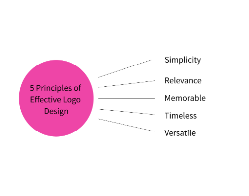
1. Simplicity
A simple logo is more striking, and will therefore have a bigger impact and be more recognizable. That does not mean that it cannot have elements of complexity, but that these should always be justified.
2. Relevance
The logo should be relevant to the brand it represents, financial services, for example, would not want a crayon typeface and playful elements! The relevance, however, does not need to be literal, like a spreadsheet in this example, but might be more subtle, such as tweaking letters a little to reference numbers.
3. Memorable
There is little point in going to the effort of designing a logo if no one can remember it. Hopefully, a memorable logo will result from good design but beware of using elements that are too generic and do not differentiate the logo from others.
4. Timeless
Following logo trends are useful, but make sure they will stand the test of time. A brand should be consistent; while re-branding is possible, it can be expensive and can mean losing some brand recognition.
5. Versatile
Think about all the ways a brand will be used, they aren’t just for websites but might be on emails, buildings, letters, and cards. Ensure that the logo works in each location, and even consider including elements that can change to reflect different uses.
Bonus. A Comprehensive Tool for Logo Design: Pixso
Pixso is the perfect tool for logo design. It contains all the tools you would expect in high-end design software but is cloud-based meaning it’s quick and easy to collaborate on designs, and offers unlimited storage, making it more than enough for even the most prolific designer.

Its intelligent design engine will respond to changes, making last-minute tweaks possible, and even on its free tier it boasts an industry-leading selection of tools that will make great design easy. There are massive free templates in its community, you’re able to copy to directly use in your design files.
Conclusion
Now, more than ever, anyone can have a great design for their brands, whether it’s a one-person start-up or an established business. The secret, really, is having a clear vision for a brand logo. Following logo trends can help stimulate those ideas, but make sure they are right for the brand, and then tools like Pixso can help to bring it to life.
