Scott
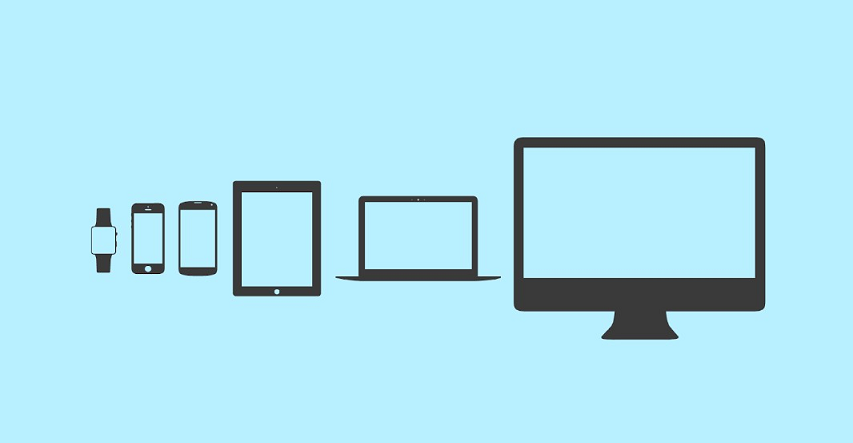
As we know already, web design isn’t limited to PC alone. With many portable devices available today, users want a pleasurable experience on whichever device they use. However, some design optimization is required to cater to many screen sizes. Therefore, it becomes a huge challenge for designers and developers to help users access content conveniently.
Responsive and adaptive web design are two of the most commonly preferred web design techniques by designers and developers. Even though both give pleasurable user experiences, they have their differences. Hence, this could make you wonder which web design could be the right fit for you. This blog will go through the differences between responsive and adaptive design.
Part 1. The Definitions of Adaptive & Responsive Design
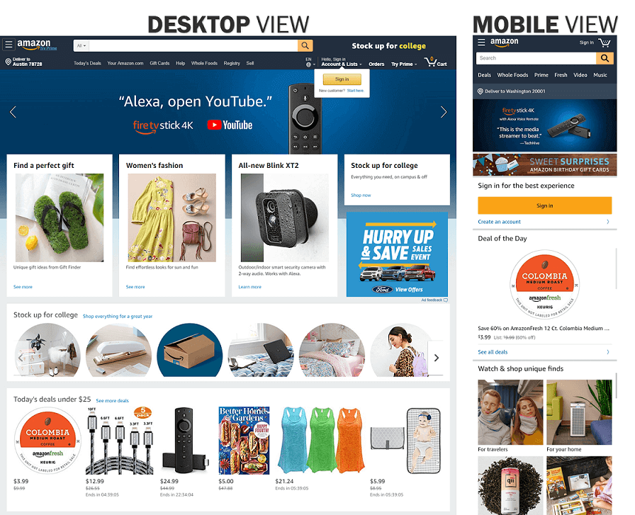
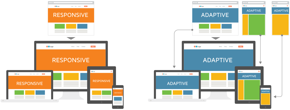
Responsive web design is a reactive web design. It responds to the changes made in the browser width or screen size by shrinking the content elements to fit in the available space. It ensures all the contents are visible no matter what screen size it is. In a nutshell, think of responsive design as web design that allows content elements to fill in the available browser space.
Source: Web Flow
Adaptive web design offers a different function when compared to responsive design. The adaptive layout has a different screen layout or website with functionalities catered to that device. An example is a mobile version of the site. In most mobile version websites, you will find smaller menus or a hamburger menu to filter more content options. In a nutshell, resizing the browser doesn’t impact the design, but the site chooses the optimum layout for that device screen.
Source: Web Flow
Part 2. What's the Difference between Adaptive Web Design and Responsive Design?
Let us go through some of the differences between adaptive and responsive web design. For better understanding, let us consider some key factors and compare both under various factors:
Source: UX Planet
1. CSS
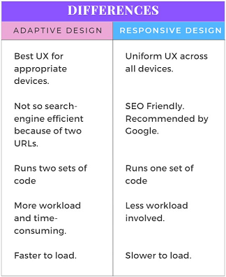
Developers will need to use CSS to optimize each web page based on the resized or modified screens. In responsive web design, developers utilize breakpoints to ensure the site adjusts to accommodate available browser space.
In comparison, adaptive design requires a different web layout for specific devices and screens. Therefore, developers make an entirely new CSS for the site that caters to specific screen sizes.
2. Scalability
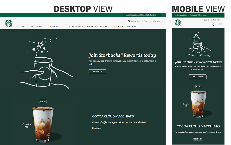
Responsive design has the same user interface on every device, so it always accommodates available space. As a result, desktop screens could have a three or four-column layout, while a mobile screen could have only a single-column web layout since contents get squeezed in to fit the screen.
On the other hand, adaptive web design ensures a different interface and layout for specific devices. It offers an appropriate user experience for at least 6 screen sizes. Example: 320px, 480px, 760px, 960px, 1200px, and 1600px.
3. Speed
In responsive design, developers implement the same line of code on whatever device. As a result, it will take time to load.
On the other hand, adaptive sites will deliver code for the specific device or screen size. Therefore, they are much faster to load compared to responsive sites.
4. Workload
In responsive design, developers require more coding to optimize each web page content to respond to different screen sizes. But having said that, it is a much easier project to take on for developers, especially if there is a tight deadline.
When it comes to adaptive design, it is easier to implement for developers because they make specific code for the given device. However, adaptive web design projects can be a lot of weight on the developer’s shoulders as they may need to design up to 6 screen sizes.
5. SEO
Google highly recommends responsive sites. Because it has one set of code and the same URL, it becomes more search-efficient on Google.
On the other hand, Google has to crawl two sets of code when it comes to adaptive sites. It makes it less search-efficient in the search engine. Furthermore, there is a risk of link dilution because two URLs offer the same content.
Part 3. When to Choose Adaptive Design & Responsive Design?
Choosing either to go for adaptive design or responsive design can depend on various conditions. For instance, it depends on:
- Client requirements: Specific requirements from the client can influence your decision. If the client requires a separate mobile version of the site that caters to their users, then you are better off using adaptive design.
- Your target users: If your audience only requires to use the desktop version, then responsive design is all you need. If your audience uses various devices and needs a better user experience, then the adaptive design is the way to go.
- Budget: When the client has the budget, then the adaptive design is more feasible. On the other hand, responsive design is more cost-effective in comparison./li>
- Time constraints: If the project deadline is tight and you need that quick turnaround, responsive design is much more suited to meet your deadlines.
- Loading speed: Adaptive design would be much faster to load compared to responsive sites. That is because responsive sites download everything from the desktop version to be compatible with other devices. Hence, it is not always the best solution for smartphones. When it comes to speed and better user experience in mobile devices, adaptive design is best in this situation.
Source: Adobe XD
Part 4. Bonus: A Free Collaborative Design Tool
Do you want to know a tool that can cater to your adaptive and responsive web design needs? Then, look no further and use Pixso as your collaborative design tool. Pixso can import various design files from Figma to Sketch. It has a built-in auto layout feature that helps create responsive and adaptive designs that can cater to your target users. You can design interfaces specifically for any device using all the design features and plugins available. Moreover, Pixso offers free unlimited files and templates for teams to work on design projects together.
Pixso also allows you to preview prototype interactions without downloading any apps. Whether your design project involves adaptive or responsive web designing, you will require a design tool that offers numerous functionalities. Moreover, it ensures you meet those project deadlines on time. Save your time and allow all your team members to work together efficiently using Pixso’s collaborative design tool.

Conclusion: Use Adaptive and Responsive Design Across All Devices…
Because of its flexible nature, many designers often prefer responsive web redesign over adaptive web design. However, both have their pros and cons. It depends on using the best technique for the appropriate project requirements and constraints surrounding it.
A lot goes into designing the most satisfying user experience across multiple devices. With the magic of responsive and adaptive web designs, you can ensure users are continually satisfied when you leverage its capabilities.
![[User Guide] How to use developer view in Pixso](https://pixso.net/assets/dev-view_68a58eacfb81157ae473.png)
![[Must-know] 8 UX Design Principles](https://cms.pixso.net/images/articles/ux-design-principles-1.png)