On this page
Try Pixso for Free

Scott
In graphic design, alignment places related elements along shared edges, centers, or baselines. It helps readers see which items belong together and compare information without repeatedly searching for its position. An orderly layout is useful only when those alignments reflect the content.
When arranging an interface in a collaborative UI design tool, decide what should line up before pressing an alignment command. This guide covers edge and center alignment, then applies them to three plan cards with different amounts of text.
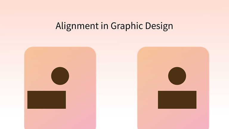
Part 1. Definition and Importance of Alignment in Design
What Is Alignment in Graphic Design
Alignment places elements along a shared edge, center or baseline. A common reference helps readers see relationships: labels in one column belong to the same group, while aligned values are easier to compare.
Choose the reference that supports the task. A shared left edge can connect a heading with the text below it, while aligned prices make competing plans easier to scan. Consistent positioning should reveal relationships, not just make objects look tidy.
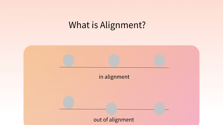
Why Is Alignment Important in Graphic Design
Alignment is an important design principle because it gives consistency to the work. Even big brand names use alignment to add an aesthetic touch to their logos. Designers usually apply alignment in text, images and shapes to achieve various visual effects.
In a nutshell, effective alignment contributes to:
- Better organization and structure
- Better user experience
- Contextual connection
- Aesthetic appeal
- Harmony
Part 2. Types of Alignment in Design
Two useful starting points are edge alignment and center alignment. Text baselines, grids, and optical adjustments add more control; they are not all the same operation.
1. Edge Alignment
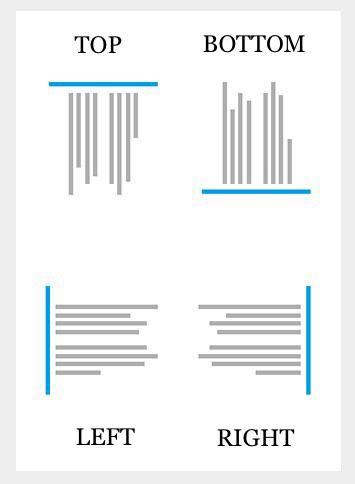
Source: 254 Online
Edge alignment gives several objects a shared left, right, top, or bottom edge. That edge can belong to a card or content column, not just the page. For example, a form heading and its field labels can share a left edge while a row of cards shares a top edge.
Alignment and distribution solve different problems. Alignment places objects on a shared reference; distribution adjusts the gaps or positions across a group. Justified text is different again: spacing within a line is adjusted so that the text meets both margins. It is not a general command for lining up images.
2. Center Alignment
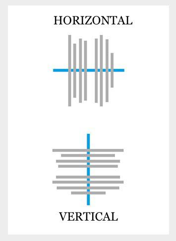
Source: 254 Online
In center alignment, the invisible line is drawn down the middle of the content or elements. Thus, the arrangement is aligned more centrally. It can include horizontal center alignment and vertical center alignment. On web layouts, you see this commonly used in big headings to grab the user's attention and in many logo designs.
Part 3. Principles of Alignment in Design
1. Use Hierarchy
In a design, the importance of elements differs. That's why you need to show the hierarchy in the work. Generally speaking, experienced designers will apply different types of alignment to accentuate the central composition.
2. Pay Attention to the Harmony
Hierarchy and harmony work together. Design considers the overall effect, so the alignment used to emphasize one element should still fit the relationships among the other elements.
3. Take Advantage of Contrast
Use a change of alignment to distinguish a role, not simply to make an item look important. In a price row, the description can align to the leading edge while the amount aligns to the trailing edge, making values easier to scan. Importance still depends on hierarchy, wording and context; alternating left and right alignment does not establish it by itself.
4. Leverage Repetition
Repetition can make a design more consistent. Reuse the same alignment for elements with the same role, such as section headings or card titles, so readers can recognize the pattern.
5. Leave Room for Imagination
Leave enough space for alignment to reveal groups. A field label should usually be closer to its own input than to the previous field. Equal gaps everywhere can obscure relationships even when every edge is mathematically aligned.
Part 4. Examples of Alignment
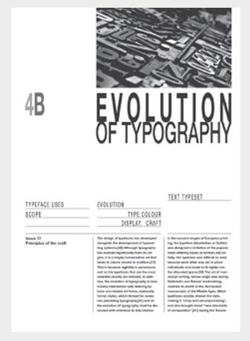
1. Uniform Alignment
Source: 254 Online
This example uses a three-column layout with consistently aligned text. Repeating the same alignment gives each column a clear structure and makes the content easier to scan.
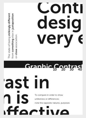
2. Mixed Alignment
Source: 254 Online
This example combines different alignments for different kinds of content. Compare how the headings and body text establish their own reference lines while remaining part of the same layout.
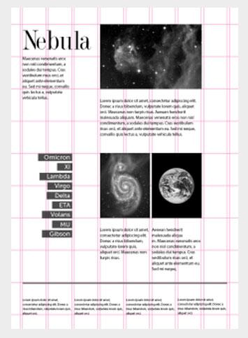
3. Helpful Grid Lines
Source: 254 Online
Nowadays, design software provides invisible grid lines which can help designers align text, images, and other design elements in a well-organized way. And sometimes you can also visualize these lines to create a unique style. In the above image, you can see how grid lines assist in positioning the content elements and arranging them neatly.
Worked example: align three plan cards without hiding their differences
Suppose a pricing comparison has Starter, Team and Enterprise cards. One description is a single line; another needs three. Each card has a plan name, a price or contact message, benefits and an action. Aligning only their outer rectangles leaves the useful comparison points scattered.
| Element | Shared reference | Reason |
|---|---|---|
| Plan names | Top position and text baseline | Readers can scan the options as one group |
| Prices and contact message | A consistent information region | Different kinds of offers remain comparable without inventing a price |
| Descriptions | Leading edge; flexible height | Longer text stays readable instead of being clipped |
| Actions | Common bottom region on the wide comparison | The next step stays easy to locate |
Start with the longest real description. Reserve a sensible description region if the three plans must be compared side by side, but do not fill it with repeated copy. If the content grows beyond that region, let the row or card grow. A fixed height that hides the third line is not successful alignment.
On a narrow screen, the cards become a vertical sequence. Large blank regions that aligned desktop buttons may no longer help. Let each card follow its own content while preserving the same internal order. Alignments serve a comparison task; they do not need to preserve desktop empty space on a phone.
Geometric alignment may need an optical adjustment
An icon's bounding box can be centered while its visible shape looks offset. Compare a triangular play icon with a symmetrical square. Start from the mathematical center, then inspect the visible mass at the actual display size. Keep any optical adjustment consistent across repeated instances rather than nudging each card independently.
Build and compare the alignment in Pixso
Place the three plan cards in one Pixso frame. Use the same text styles and card padding, then align the names and main information regions. Auto Layout can help maintain gaps inside a card as text changes; it does not decide which information deserves a shared line.
Duplicate the frame for a narrow layout and replace one plan name with a longer phrase. Compare the reading order, price positions and action locations. Add a note where the design intentionally changes from side-by-side comparison to stacked reading. Share the file with a teammate and ask which plan has the relevant benefit: their route through the cards is more informative than whether the boxes look tidy.