Scott
A color scheme is the combination of colors used in various design disciplines, from fine art to interior design to graphic design. It is a selection of colors that work well together for artistic and design needs.
In both web page development and areas of graphic design, the color scheme is the choice of colors used on the page. A basic color scheme could be the choice of a white or light gray background with single-colored text, like black text.
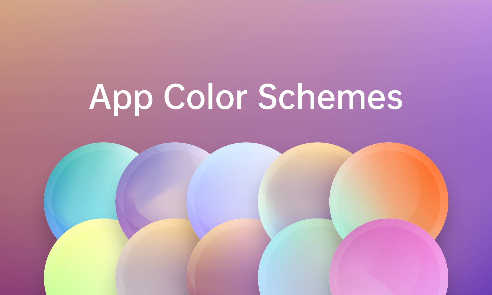
By pairing different colors with each other, you can create endless color palettes to use in any composition. Different color combinations evoke different moods or tones by using color theory and color psychology.
In this article, you’ll learn about complementary colors, and explore different color schemes such as two-color- three-color, four-color, and monochromatic schemes. Let’s get started.
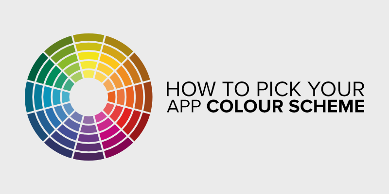
How to Decide Your App Color Schemes
Follow the Basic Principles of Color Schemes
Get Familiar with the Color Terminology
Understanding the terms used in developing the UI design with colors is required according to the first tenet. Terms like hue, tint, shade, tone, contrast, value, saturation, etc., are employed in this context.
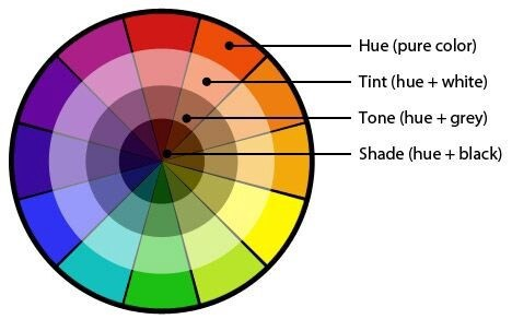
Therefore, you must understand what a hue (a saturated color or a parent color) and a tint represent when referring to UI colors (any color, when added with white, is referred to as tint). To build the ideal color scheme for your design, understand the definitions of other terms and use them.
Use Colors to Display the Component Hierarchy
We know that, as opposed to the components below the fold, the components above the fold are significant and designed to produce the most value. However, you may indicate the significance of a website or application's components everywhere using UI colors.
One approach to achieve this is to use a color tint to give each component equal weight inside an interface or on the same page. For instance, you could immediately make the CTA obvious to the user inside the header.
It would be beneficial to use a tint for the other elements of the header and a parent color for the CTA.
Create a Visual Balance
Have you ever viewed a painting up close—up close—to the point where you could hear their breath if you looked at a person up close? Paintings are made with a variety of materials and by combining colors to provide a visual effect.
Similarly, you must utilize the appropriate values for each color when utilizing and selecting UI colors. Values, in this instance, represent the gradations of color from lighter to darker shades. As a result, you will need to use many color variations to make the pattern, with three being the ideal quantity.
By utilizing several tones and the appropriate tints for each UI design element, the goal is to achieve a sense of equilibrium.
Use the Principles of Color Psychology
The spectators' reactions are brought on by colors. Therefore, you can elicit a response from viewers by selecting the appropriate UI colors. Utilizing color psychology allows you to alter the viewer's reaction and influence their behavior to achieve your intended goal.
Additionally, knowing color psychology can enable you to spot the ways that various cultures, geographies, and age groups perceive color differently.
Knowing everything, there is to know about color and how it affects viewers' emotions is incredibly empowering.
Use Limited Colors to Create Better Attention
All shades of hue elicit an emotional response from observers, as is well known. Therefore, using too many might easily cause confusion, which can turn people away.
When you utilize fewer colors, the areas beautified with color respond better than those without color. Use colors accordingly to elicit a response in the precise regions you wish to welcome.
Contextual Consistency
The UI color schemes you select for the application or website should be uniform. In other words, if you use a certain color for one element, such as the background color of the header, you shouldn't use it for another element, such as the CTA.
Maintain Consistency by Using the 60-30-10 Rule
Every type of UI design must incorporate the 60-30-10 guideline, one of the most crucial topics to discuss in UI color schemes. According to this rule, the dominant color should account for 60% of the color composition, the secondary color for 30%, and the accent color for 10%.
The 60-30-10 ratio is helpful because it promotes equilibrium and offers the eyes a special level of comfort when navigating various regions of the application or website.
You must be aware of the ideal tool for creating the best UI design in addition to the principles of UI colors in UI design, as this will help you put these concepts into practice.
Choose A Type of Color Scheme
Check out Colors Referring to Your Industry
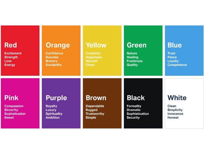
Most industries have colors that are preferred as they convey the messages they usually want to communicate. Let's have a look at which industries match with which colors!
- Red: Entertainment, Food, Sports, Retail
- Orange: Entertainment, Food, Health, Transportation
- Yellow: Food, Sports, Transportation, Travel, Leisure
- Green: Environment, Banking, Real estate, Farming, Non-profit
- Blue: Technology, Security, Finance, Health care, Accounting
- Purple: Humanitarian, Psychic, Religion
- Pink: Women targeting, sweet
- Black and White: All industries
Understand the Color Preferences of Your Target Demographic
Some people perceive colors differently. That's why you will need to know your audience preferences.
Get Inspiration for Your Color Schemes
If you need help knowing where to start, do not panic! Some websites can help you find out great inspirations for your color schemes. For example, Behance, Color Hunt, Pinterest, Dribbble, etc.
Pixso - Your One-Stop Color Palette App
Creating the best UI design takes work, but it can surely be systematized using the right tool. Namely, Pixso. With this tool, you can create pixel-perfect icons, graphics, and other UI design elements embellished with rich UI colors based on the core tenets of UI color schemes.
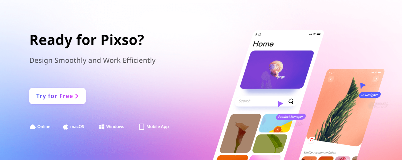
Pixso is free to use and available as an online version boasting a simple yet powerful interface consisting of all the required features and functions. Everything you need to create a UI element for the digital solution is available in Pixso. Here is how you can create your own app color schemes in Pixso.
- Pick a primary color.
- Determine your color combinations.
- Choose your background.
- Wireframe your design.
- Play with some different color schemes.
Pixso further gives you the ultimate tool required by every designer: collaborate with other team members in real-time, reducing the to and fro while making the changes on the spot.
If you want to make the most of your app color scheme, just try Pixso right now!
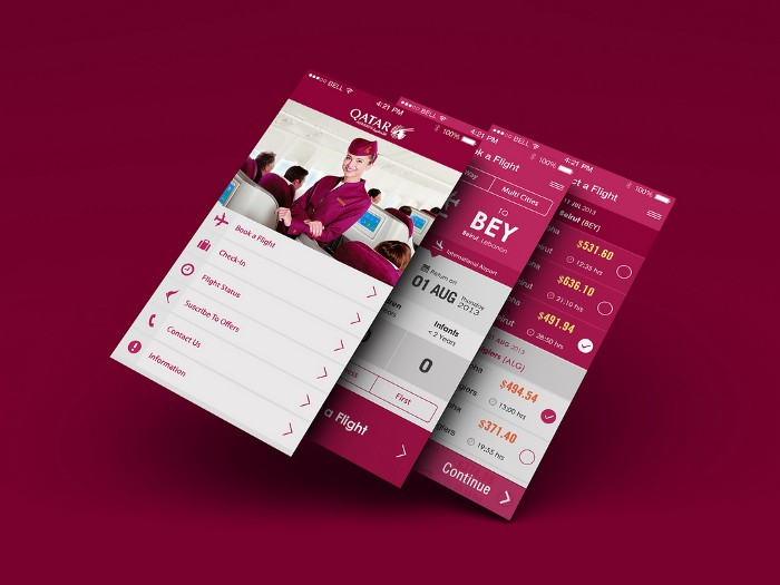
6 Trendy App Color Schemes
Analogous Scheme
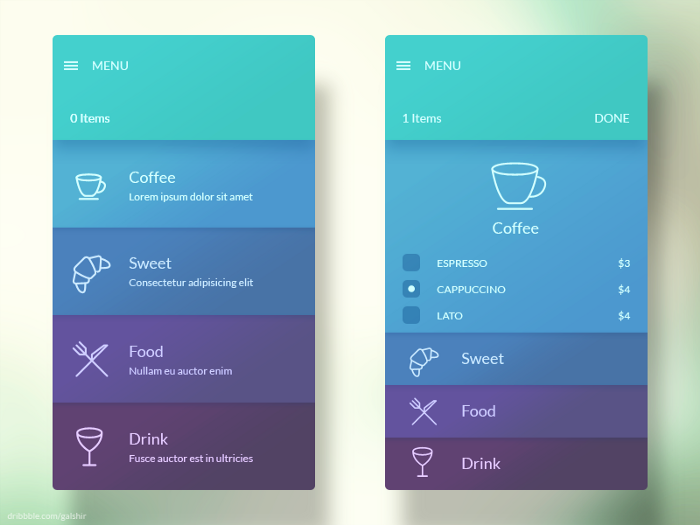
One of the common color schemes designers use is the analogous color scheme. It is an arrangement of similar hues close to one another on the color wheel. Usually, one hue dominates the scheme while the others add richness. However, certain designs allow for the equal employment of all the hues in a comparable color scheme. In nature, it's simple to find similar hues. They are particularly aesthetically pleasant in mobile app design because they are very harmonized.
Monochromatic Scheme
Designers can create a basic, unified, attractive look for the mobile app using a monochromatic palette. An enlarged palette of one base color's shades and tones is used in monochromatic color schemes. Designers add white to the basic hue to create tints, whereas black or grey is required to create shades. When using greens or blues, such color schemes provide a calming effect on the eye.
Triadic Scheme
A triadic color scheme comprises three hues evenly spaced throughout the color wheel. The key to successfully employing a triadic color scheme is to let one hue dominate while emphasizing others. Thus, the triadic color scheme's harmony was accomplished by the thoughtful usage of each color.
Colorful Illustrations
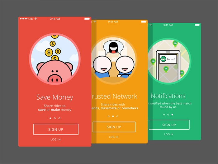
Colorful images on onboarding slides are a frequent approach in modern mobile app design. Colorful visuals in simple applications are particularly effective. Typically, they have a strong contrasting effect and aid in emphasizing the brand message. The mobile app design also includes vivid and colorful drawings adding life and humor. Users of mobile apps are readily captured.
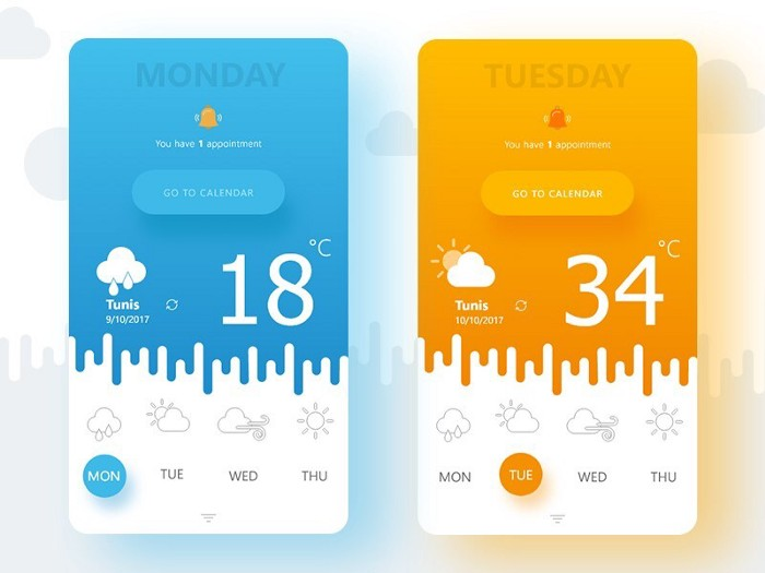
Colorful Gradients
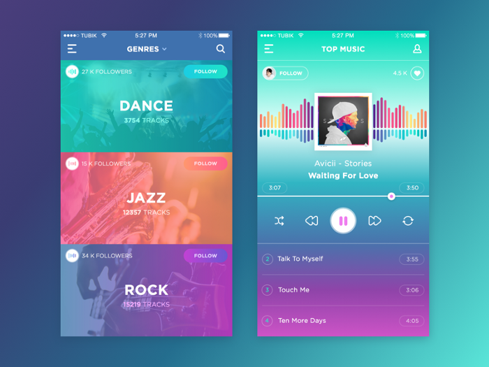
Colorful complementing gradients are one of the intriguing trends in contemporary app design. Nowadays, high-contrast complementary gradients are more common than earlier same-color gradients. Red-to-orange and purple-to-blue transitions can be used to create stunning visual effects. But it's crucial to pair these vivid color gradients with simple iconography and imagery.
Black & Shades
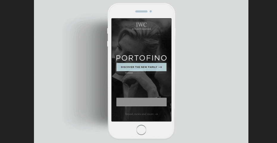
The sparse use of colors is a natural outcome of the trend toward basic mobile app design. Black always stands out from the rest of the design, but white and gray can produce a striking contrast that isn't harsh. The color black now plays a sophisticated function in mobile user interfaces; in many ways, the little black dress has become a fashion icon of elegance.