Scott
The gaming industry is booming and most of it is due to the in-game design that helps to improve the user experience and engage gamers into playing for long hours.
The evolution of game design has evolved throughout the years and we are now in an era where there is the addition of aesthetically-pleasing design elements that improve the gaming experience.
However, are they all that worth it, and are the aesthetics compromising the basic UX of gamers out there?
In this blog, we will review the game Cyberpunk2077 and see if the Cyberpunk UI design is intuitive or not according to standard UI design guidelines.
Part 1. Cyberpunk UI: The Good
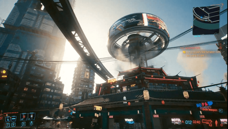
Cyberpunk is an action RPG (role-playing game) that follows the main story of V—in an action-packed adventure for survival. The general aesthetic outlook of the game looks visually pleasing. The buildings, the citizens walking on the streets, etc., all have a realistic touch. If you are someone who is just a fan of sight-seeing the game architecture, then Cyberpunk is surely a good place to admire its aesthetics.
Source: Uxdesign.cc
During shooting scenes, there is a good indication of the character’s health getting affected or being shot at with the screen blurring slightly red. So, the basics during the shooting gameplay are pretty spot on for usability.
Moreover, the in-game UI also has a neat touch. For example, when exploring websites in the game, you can see the webpage layout is similar to the websites in the late 90s. Thus, bringing a bit of nostalgia back for some users.
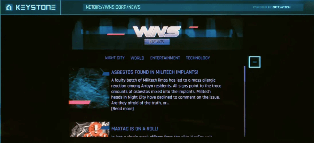
Source: Uxdesign.cc
Part 2. Cyberpunk UI: The Bad
Despite having appealing gaming aesthetics and interesting gameplay features, there are some drawbacks in the UI design for Cyberpunk. Most noticeably the basic UI design under the following screens:
Game map
One of the UI design issues was spotted in the game’s map. First and foremost, the elements in the map looked as if they were cramped up when it comes to each icon’s proximity. Moreover, it didn’t help when there were no clear labels with real-life object conventions to help distinguish items on the map better.
Furthermore, the default red font in a red background layout makes it a bit difficult to read. Hence, that is one contrast issue spotted.
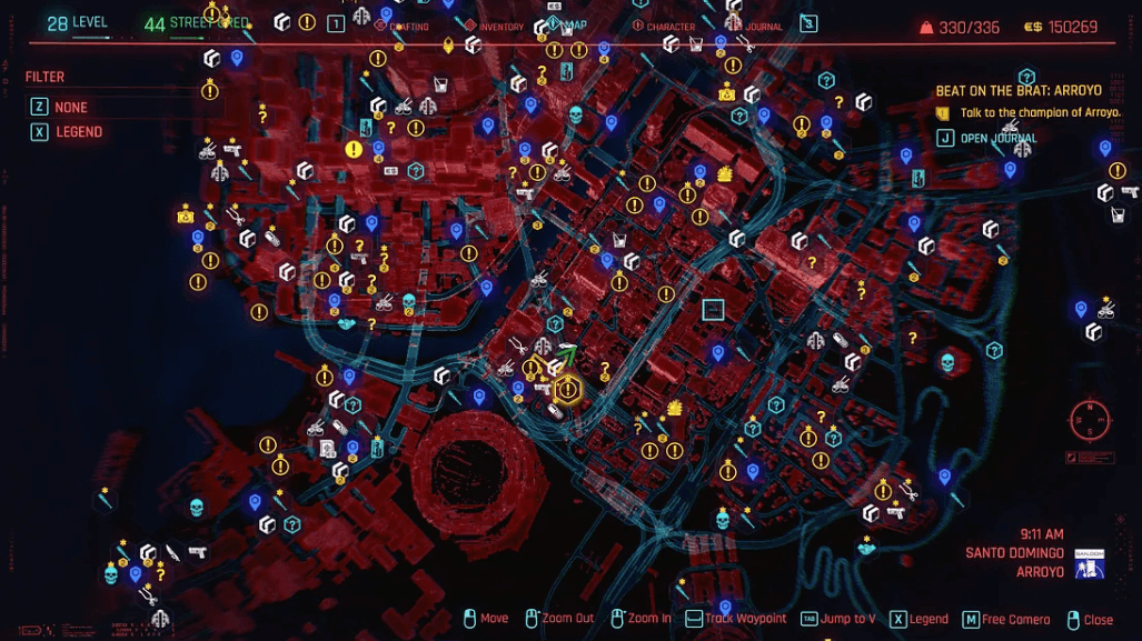
Source: Uxdesign.cc
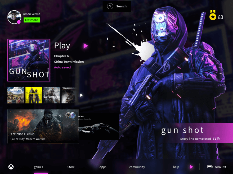
Game HUD (Heads Up Display)
Probably one of the most important game screen elements, the HUD poses a similar issue as spotted on the game map. There is no clear visual hierarchy for all the icons and their unorganized nature makes it difficult to perceive critical information in an already-detailed game world like Night City. As a result, it creates more clutter and can distract a user’s live gameplay.
Source: Uxdesign.cc
Game Inventory
The item list is crucial in helping users navigate a weapon of choice successfully using headers and filter/sort fonts. However, the font choice is a bit poor on this screen as well with the filter heading font size being the same as the inventory headers. Thus, making it difficult to distinguish its text hierarchy properly.
There is little indication that the two separate sections on this page are actually two separate lists. Moreover, when viewing each item, there is more design information cramped up on the screen—creating clutter and more information overload.
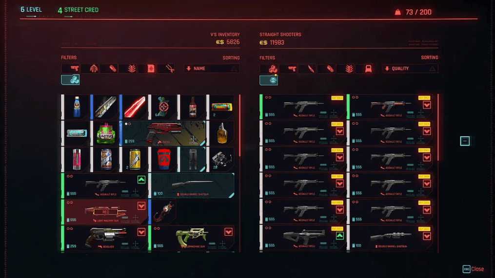
Source: Uxdesign.cc
Part 3. Designing Intuitive Gaming UI with Advanced Tools (with Example)
The game UI design analysis of Cyberpunk has helped you point out some noticeable flaws in the game. But, if you are an aspiring game designer, you can always implement improvements and features in the game that helps to improve the user experience better. For that, you will need an advanced design tool to help you create those intricate designs.
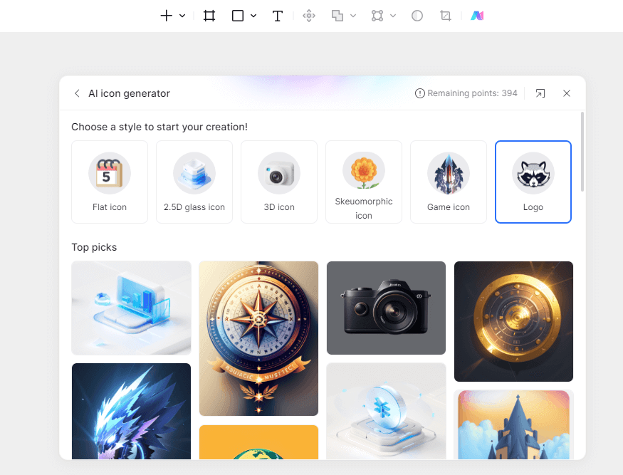
Pixso is a collaborative design tool that helps designers to express their creativity freely and imprint visually-pleasing designs. Thus, contributing to the creation of several wireframes and prototypes.
Why Pixso is the right tool for designing gaming UI?
- It offers a wide range of advanced design tool options—allowing users to apply their creativity to another level and implement beautiful designs.
- It offers a built-in auto layout feature that can allow users to scale design content across various screen sizes—from smartphones to larger desktop screens.
- It allows teams to collaborate efficiently on the platform with user-sharing tools—making it a team-friendly design tool for larger gaming UI projects.
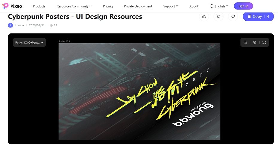
- It has a design community where you can get inspiration from other designers for their gaming UI creation. You can view the following Cyberpunk2077 UI templates in Pixso’s design community below:
Cyberpunk UI Examples
Design Next-Generation Game UI with Pixso
Overall, Cyberpunk2077 is an interesting game to play. Despite its pros in aesthetics, it does have a few UI design flaws that could be addressed better for an optimized gaming experience.
In gaming, user experience is essential to look at and next-generation game design shouldn’t overlook and compromise the basics of UI design for better usability of the game.
If you are looking to hone your game-designing skills, then Pixso is the right tool for you to start expressing your creativity and start implementing intricate gaming designs into reality.