Scott
As a designer, you are going to be required to design more than one dashboard UIs for various projects. Most applications need to have at least one screen dedicated to data visualization. Therefore, dashboard UI design is essential even for the smallest project.
In this article, you are going to discover the principles of dashboard UI design and a great tool that will help you create interfaces that will meet users’ demands. Moreover, we are going to give you some examples of great design to get inspiration for your dashboard UI. Stay tuned.
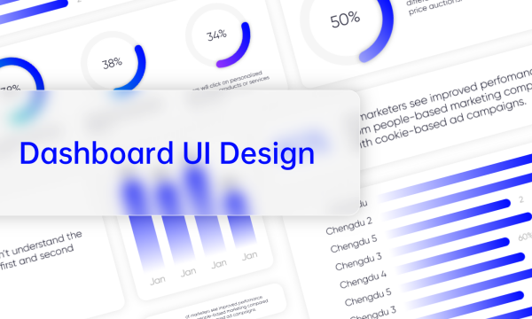
What Is Dashboard UI Design
A dashboard is a page that provides users with a visual representation of all the relevant data. Through the dashboard UI, users can monitor the KPIs that interests them at any given time. For this reason, dashboard UI design focuses on creating simple interfaces that can convey the information needed in a concise manner. The most straightforward the representation, the most effective the overall design will be.
Before you start designing a dashboard UI, you must consider the platform where it will be implemented. For example, an analytics app will require a different dashboard UI design from a time management or a food delivery app. This is because the objectives of each platform are vastly different and each user is interested in different metrics. In any case, your dashboard UI design ought to follow the basic principles, which we will explain in more detail later.
How to Create Amazing Dashboard UI Design
In the majority of the cases, the dashboard UI is at the center of any application. For this reason, you must prioritize its usability to help users find what they need intuitively. This becomes possible by following the dashboard UI design principles that guide you through the process. In addition to this, there is a powerful tool with which you can create seamless designs for any platform.
Basic Principles of Dashboard UI Design
Designing the perfect dashboard UI takes a lot of time, effort, and constant usability testing to ensure that it works as it should. However, by following these design principles, you can rest assured that you are on the right track to enhancing the user experience of your dashboard.
Prioritize the Users’ Needs
Even though a dashboard UI is a visual representation of various KPIs, the numbers shouldn’t be your main priority. Instead, at the heart of every dashboard UI design should be the end user. As we have mentioned above, the design process will vary depending on the application at hand. This is because an executive, for example, will need to review different metrics from a secretary or any other low-level employee.
A very useful technique that will help you to place the user as your top priority is to create a persona. In essence, this is a simple representation of the average user that the specific platform will have. Then, you simply need to remind yourself who will use this interface and what he will want to see. This way, your dashboard UI design will be effective.
Decide How You Want to Visualize the Data
The next step to creating a dashboard UI that will satisfy the app’s users is the way you will choose to visualize the data. For instance, there are multiple types of graphs, charts, maps, and tables to choose from. However, you need to make sure that you don’t get carried away and pick something that is just visually pleasing without any substance. Each decision of dashboard UI design should be practical and have a specific purpose.
Once you have decided on the data that will be displayed on the dashboard UI, you will have a better idea of how you can show them. A great piece of advice is to keep your data visualization simple and clean by choosing just a few different types. By doing this, the users’ eyes will easily find what they are looking for, thus improving the user experience.
Explore Data Storytelling
Dashboard UI design is such an important task because these screens provide users with an overview of their business at a glance. For this reason, the data shouldn’t be displayed randomly on the screen. Instead, you need to understand what each user will want to review first and place each data visualization in a prespecified order.
Data storytelling is such an integral part of any dashboard UI that most users will subconsciously realize that it’s missing. This is the reason why you should pay extra attention to it and make storytelling an integral part of your process. Using the persona technique that we have explained above will also help you display the data in a way that users will expect.
Always Keep It Simple
When designing a dashboard UI, it is very easy to lose track of your objective. This might result in creating a page extremely cluttered with various charts and graphs. In this case, users can’t easily find what they are looking for, thus feeling more and more frustrated with the interface. An easy way to avoid this is to hierarchically place the data on the screen and remove any unnecessary details. If you need to show more detailed charts, the best practice would be to show them on different screens.
Be Mindful of the Color Scheme
Color is a visual element that can influence the way that users will perceive the interface. For this reason, the color scheme is just as important as the hierarchy of the data. When it comes to dashboard UI design, it would be best to select just a couple of colors and use them consistently. For instance, if a color represents a high value in a chart, then it should represent the same in all others.
Keep Relevant Data Easily Accessible
Most users will visit their dashboard to take a quick glance at the data that interest them. In reality, every user that visits the interface should be able to scan the page and review the displayed data in only 5 seconds. This is the reason why minimalism is so much favored in designing usable dashboard interfaces.
Optimize for Different Screen Resolutions
In recent years, more and more people are using their mobile devices for communication, work, entertainment, and even shopping. Each one of the apps installed on a mobile device has a dashboard that displays the relevant information. Therefore, when your team is asked to create a dashboard for an app, you need to keep in mind that it will be displayed in various screen resolutions. For this, it comes as no surprise that you should adopt a dynamic dashboard UI design.
Try the Inverted Pyramid Layout
Over the years, usability tests have proven that users don’t read when they are on a screen. Instead, they tend to quickly scan the content before their eyes and only stop to read whenever they spot something that interests them. This is also the case in any dashboard UI.
To deal with this behavioral pattern, UI/UX designers have developed the inverted pyramid layout. According to this technique, you place the most important information at the top of the screen. The remaining data are placed in a logical order with the less important at the end of the page.
Make Data Easy to Remember
When the dashboard you are creating will include a lot of data that take numerical values, you might want to be as precise as possible. However, the data will not be memorable -and thus helpful- to users by adding multiple decimals. Unless your client specifies that you display the data as precisely as possible, opt for rounding up the numbers. The average user of your dashboard UI will thank you for it.
Spread Data on Multiple Pages
One of the most helpful principles that will make your dashboard UI design top-notch is that you don’t have to display every on a single page. The main dashboard should contain only the most important data. The rest can be split into other pages so that users can follow them more easily. When you divide the data into multiple pages, you can also go into more detail.
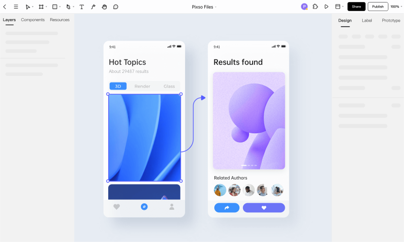
A Handy Online Tool for Dashboard UI Design - Pixso
Keeping all of the above principles in mind will help you design a dashboard UI that will satisfy the users’ demands. In addition to these though, there is also a very handy online tool at your disposal. Pixso is an all-in-one platform that will change your dashboard UI design.
With Pixso, you have all the right tools to create a clear and intuitive dashboard. The app has implemented various component variants and supports automatic layouts to make the process easier and faster than ever before. You can immediately visualize the dashboard UI design you have envisioned. The app also utilizes interactive animation so that you can actually see the path that the user is going to follow in your prototype. This makes the designing process easier as you no longer need to deal with wireframes that don’t include any information.
Apart from boosting the design process, Pixso is a platform that encourages collaboration. Every member of your team can view the progress made on the project and leave feedback in real time. Furthermore, the changes that you or the other designers make are instantly visible to everyone, thus making the cooperation run smoothly. Once the prototype is ready, you can quickly share a link with other team members and extract the code for delivery.
All of these features, have established Pixso as a great option for dashboard UI design. And now this tool is free to use, without no limitation. Thus giving it a try will be easy and cost no cent.
6 Best Examples of Dashboard UI Design
A dashboard UI can take many forms, depending on the application or the page that it’s going to be integrated into. For this reason, every designer should dedicate some time to view other people’s work to get inspired. Below, we have gathered some of the most impressive dashboard UI designs to help you get new ideas.
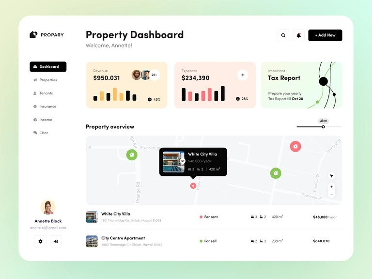
Property Dashboard User Interface
This property dashboard by Halo UI/UX is a great example of a minimalistic design approach. The overall layout of the page is clean and allows users to quickly review the data. Moreover, the most important graphs are placed at the top, while the details for each apartment are placed at the bottom.
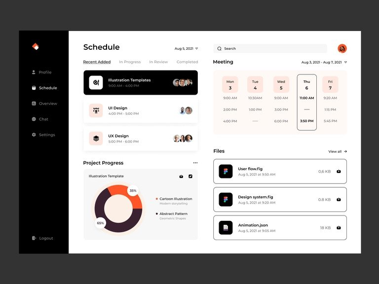
Task Manager Dashboard User Interface
Another great example is this task manager dashboard, designed by Taras Migulko. This is yet another case of minimalist design that prioritizes the most important graphs that the app’s users will want to view. The user can see at a glance all the relevant information about his schedule.
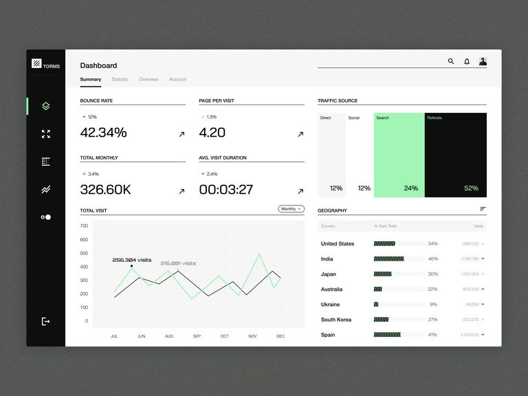
Analytics Dashboard User Interface
This analytics dashboard UI by Layo is a great example of a usable dashboard. The screen shows the KPIs that any executive will want to check throughout the day. Moreover, the dashboard is divided into multiple tabs to make sure that every piece of data is properly shown.
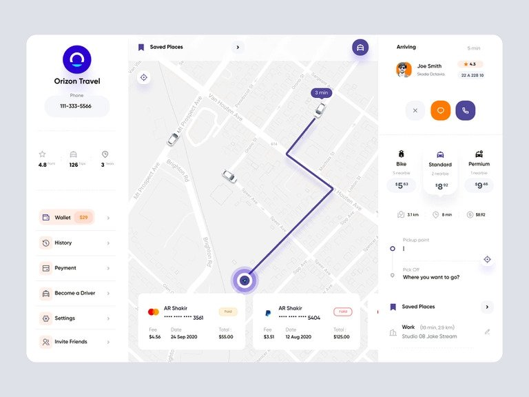
Online Taxi Dashboard User Interface
As we have already mentioned, every app needs a dashboard. Therefore, this online taxi application needs a screen where users can view their bookings and routes. This dashboard by AR Shakir shows all relevant information that any user might need.
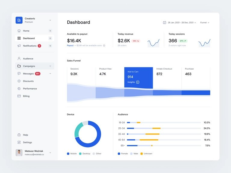
E-commerce Dashboard User Interface
One more example of a great dashboard UI design is this e-commerce dashboard by Mateusz Wozniak. An overview of the most important metrics is displayed on the screen, while the user can also click on any graph to view a more detailed visual representation.
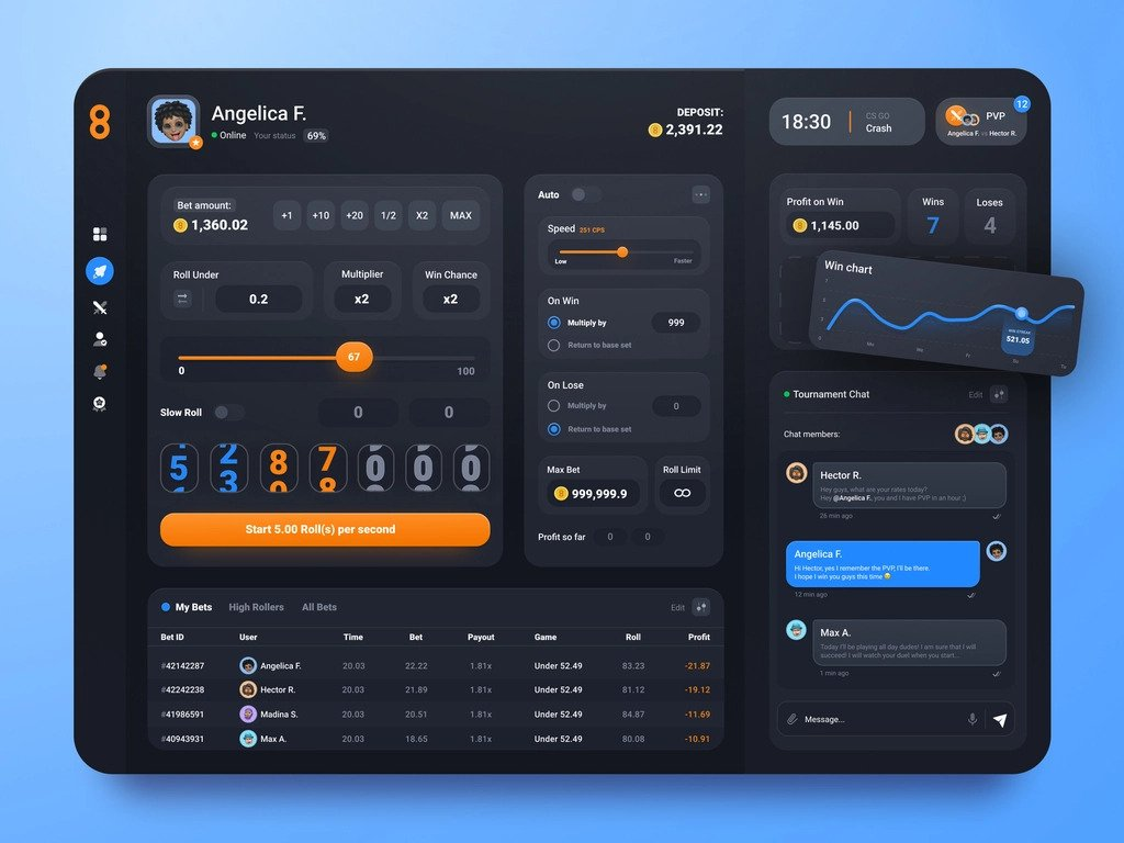
Betting Dashboard User Interface
Betting dashboards are usually busier in their design approach, compared to other applications. This dashboard by Lev Modeon is an example of an effective design for this particular industry.
The Bottom Line
Throughout your design career, you will create numerous dashboards as they are an integral part of many applications. Therefore, you need to be aware of the principles of effective dashboard UI design. Pixso is an app that will help you complete the task quickly as you have innovative tools at your disposal. Take advantage of its features to collaborate with your team and create seamless designs that meet your clients’ demands.
![[iOS 16] Differences Between Android and iOS UI Design](https://cms.pixso.net/images/articles/ios-ui-vs-android-ui.png)