Scott
Graphic design, like every other profession, has its own language. A designer could use design words you don't understand when working on your project. The same holds true for new designers, who may stumble onto phrases they've never heard of before.
Marketing professionals may also benefit from these concepts, as the design is a major component of their work. Branding relies on design decisions, and a lack of communication with your in-house designers might undermine any marketing campaign or project.
This post will provide you with a collection of the most often used terms in the world of graphic design, as well as their meanings.
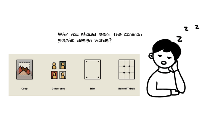
Part 1. Why You Should Learn the Common Graphic Design Terms
Graphics is not only about designs that are pleasing the eye — it also serves as a tool to reach out to your target audience.
Graphics are used across the marketing funnel to enlighten, engage, and ultimately convince potential consumers to place an order or perform the desired action. Hence, why every marketer must learn the common graphics design words.
Why else do you need to understand these terms? Below are reasons why you need to familiarize yourself with the design glossary:
- Graphic design is a vital component of every company's marketing strategy.
- A well-designed brand projects professionalism and trustworthiness.
- Graphic design is an excellent tool for conveying business ideas quickly and clearly.
- It helps your business stand out as the level of competition rises.
- Graphic design helps tell your brand's narrative to both present and potential customers.
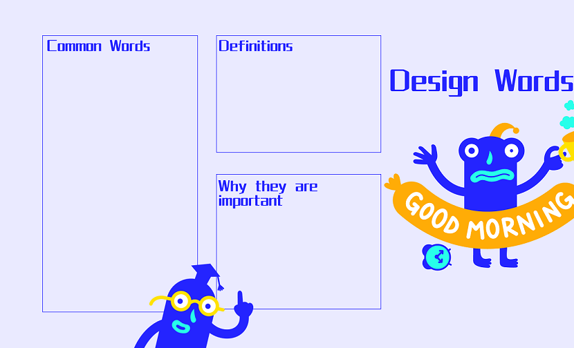
Part 2. 50 Design Words and Tips to Level Up
Below are some of the common graphics design words and definitions that every marketer should know:
1. Texture
Texture refers to the surface properties of any image, such as leather, bricks, and more.
2. White Space
Typically referred to as negative space, white space is the portion left empty in a design. It is essential to understand that white space may not always be white. It just denotes a void and can take on any color.
3. Knolling
This technique gives a design a uniform and structured appearance. At a 90-degree angle from one another, a variety of objects are positioned against a contrasting background and captured from the top.
4. Blur
The blurring of an image diminishes its clarity. This practice may be used to emphasize text or specific image elements by obscuring the remainder of the image. It can render certain items out of focus to call attention to a particular feature.
5. Resolution
A picture's resolution reflects its quality. High-resolution images have higher clarity than those of low-resolution.
6. Saturation
A color's saturation refers to its purity or intensity. In general, colors with high saturation look brighter, whereas those with low saturation appear dimmer.
7. Grid
Refers to evenly-spaced rows and columns used to properly arrange design elements and maintain design cohesion.
8. Cropping
Cropping is the process of deleting undesired portions of a picture. It is one of the most fundamental image editing techniques. You can easily modify the orientation or focus of any image by cropping out unneeded parts.
9. Contrast
5. Resolution
Using two distinct items on the same page provides contrast. For example, it may be light vs. dark colors. Applying contrast helps make designs more attractive.
10. Pixels
A pixel is essentially the basic programmable image unit that can be shown on a computer monitor. It is sometimes referred to as an image element. Thousands (or perhaps millions) of pixels are interconnected to create an image's design.
11. Flat Design
It is a design technique that emphasizes simplicity and usefulness. Flat designs are typically two-dimensional, brightly colored, and have sharp edges.
12. Vector
This alludes to images consisting of curves, lines, and points. Scaling these images does not diminish their quality.
13. Raster
Raster images are the ones that are generally made up of rectangular pixels grid. Changing the size of such images can make them blurry.
14. Aspect Ratio
Aspect Ratio is a design concept that relates to the proportion of a screen's width to its height.
15. Scale
Scale refers to the relationship between the sizes of elements in a design. Visual information can be effectively conveyed through the creative use of scale.
16. Rule of Thirds
This theory states that when an image is split into horizontal and vertical lines, the zones where these lines meet will be the focal point.
17. Margin
This refers to the blank area at the page edges. Margins can be added or reduced to create tranquil and powerful patterns.
18. Die Cut
This entails cutting printed pattern regions into varied shapes to achieve distinct effects as part of the design-finishing process.
19. Thumbnail Sketch
A thumbnail sketch depicts an unfinished design concept. This helps designers conceptualize and polish their ideas before commencing a project.
20. Font
A typeface (such as Helvetica) and all its derivatives (bold, italic, etc.)
21. Lorem ipsum
Latin for "random text," which is utilized in the design process as a placeholder for an actual copy until you're ready to go forward with it.
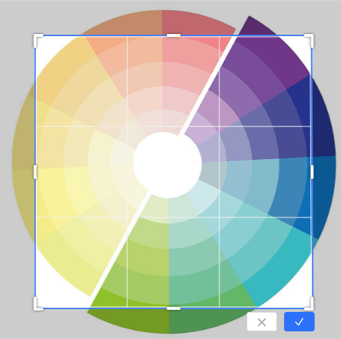
22. Color theory
Aspects of color matching, such as color relationships and harmony, as well as the usage of diverse colors in a design.
23. Hue
A particular shade of a primary color (For instance, there are several shades of blue).
24. Tint
This simply means making a design lighter or darker. When you add white or a lighter color to something, it gets lighter. When you add black or a darker color, it gets darker.
25. Tone
Describes the range of shades of gray that exist between the extremes of white and black in a picture.
26. Palette
A selection of colors to choose from during design.
27. Warm colors
Yellows, oranges, and reds are regarded as "warm" colors because they evoke feelings of heat and warmth. These colors tend to make people feel more comfortable, friendly, and lively.
28. Cool colors
Greens and blues are deemed "cool" because they conjure up images of chilly climates. Using these colors can help to create a calming and relaxing environment.
29. Monochrome
A color scheme in which the brighter and deeper shades of the same color are used.
30. Analogous
This term is used to describe sets of three colors that are situated near each other on the color chart.
31. Gradient
Adjustment in color tone, saturation, or intensity among two or more colors incrementally or progressively.
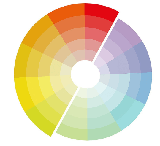
32. Complementary
A combination of two colors that are extremes on the color chart (like blue and orange, yellow and purple).
33. CMYK
A set of colors is used for printing designs including Cyan, Magenta, Yellow, and Key (black).
34. RGB
RGB is the color scheme most often used to show and create images in electrical devices like computer displays and screens.
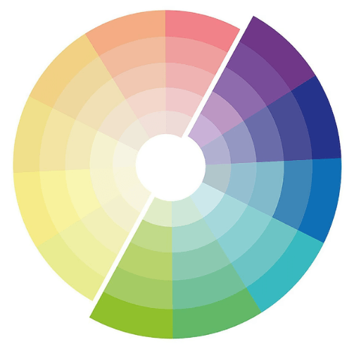
35. Triadic
Three colors, evenly spaced apart on the color chart, make up the Triadic color scheme.
36. Opacity
The degree to which the design conceals or reveals what’s behind it. The lower the opacity, the more transparent it is. A 100% opacity means it’s practically invisible, whereas 0% opacity means not transparent whatsoever.
37. Pantone
This refers to matching a solid chip with a printed piece of paper or other media to provide a consistent hue.
38. Pica
Pica is a graphic design term representing the measuring unit utilized in typesetting. A pica is one-sixth of an inch.
39. Sans serif Typeface
These are fonts lacking stylistic strokes at the termination of each character's horizontal and vertical lines. For a more modern and simple design, opt for sans-serif typefaces like Verdana.
40. Serif Typeface
A typeface has artistic strokes at the letter and symbol terminals. Serif typefaces like Times Roman convey a professional and conventional tone.
41. Slab Serif Typeface
This is a heavy, blocky serif typeface usually employed in headlines and headings but seldom in body writing. Slab serifs provide a more robust, powerful, and bolder design.
42. Hex Code
A six-digit value is used in programming to indicate colors. For instance, black is represented by the hexadecimal value #000000, while that of white is #ffffff.
43. Body Copy
The primary font is employed in designs with lots of text.
44. Bleed
This is a portion of the page that is trimmed off after printing a design.
45. Orphans
This refers to certain out-of-context words or phrases at the end of a text block.
46. Logomark
This has to do with the use of a shape, picture, or object to represent a brand instead of words, similar to Twitter's bird and Apple's apple.
47. Logotype
A form of the logo in which the company's name is represented visually. Notable examples include Disney, Ikea, and Google.
48. GIF
It is a popular visual format that can be stationary or dynamic.
49. Kerning
Kerning refers to the gap between the writings that makes every pair of letters look better.
50. X-Height
The x-height of a typeface is a measurement of the real height of the lower-case letter x.
Conclusion
It’s always best to know your onions in whichever field you are. Therefore, familiarizing yourself with these popular graphics design words and their definitions is essential for your marketing success. And when it comes to putting these design concepts into practice, Pixso is an excellent tool that can provide you with powerful features and a seamless design experience.
However, this isn't a comprehensive list of all the graphics design terms you'll ever need to know; there's always more to learn. Nevertheless, this graphic design glossary is a great way to start!