Elodia
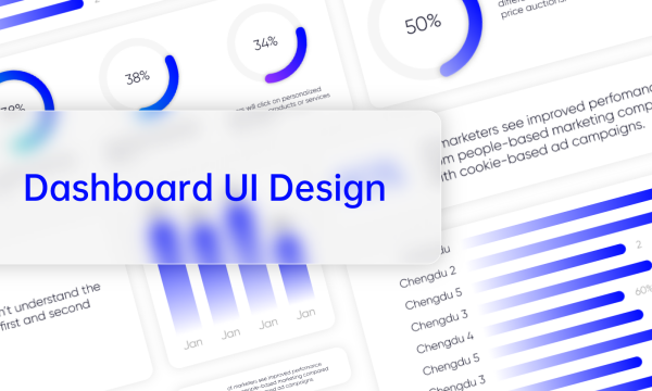
The primary objective of UI design is to create highly responsive interfaces that boost user experience. A lot of components are used to achieve this goal, and the common one is the Expand Collapse component, namely, accordion, which is necessary for batching information and delivering a more compact interface.
As an UI designer, it is a must-learn lesson about expand collapse UI design. Stay tuned and know more about the expand collapse UI design as you read further into this article.

Quick Learning of Expand Collapse UI Design
1.1 What Is Expand Collapse UI Design
The expand collapse UI design is also called the accordion UI design as it acts similarly to the accordion where content is collapsed vertically. The accordion UI design can also be called the expansion panel and is a vertically arranged list of content and information which helps to show and hide information through the expand and collapse option.
It is especially useful when designers want to display or contain large amounts of information in a minimal space on a page. It is also very helpful for mobile devices where screen areas are limited as it helps to reduce scroll area and allow for the sequential display of data. Typically, the accordion consists of an icon and a header which triggers expansion of the content that has been hidden or collapsed.
1.2 Expand Collapse UI Design Vs. Common UI Design
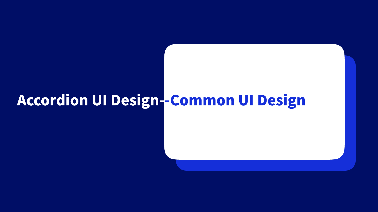
Expand collapse UI design, and the common UI design interface seeks to attain the same goal of better interaction and responsiveness. Expand collapse UI design only possesses some components, which makes it different from common UI design. Additionally, you might have to include expand collapse design in a common UI design concept.
The difference between these two kinds of designs can only be seen in the types of elements that they contain. They share similarities in some principles, including color, visual hierarchy, and typography. The interaction of expand collapse UI design with common UI design is a great recipe for delivering a functional and highly responsive interface.
How to Polish Your Expand Collapse UI
The Expand Collapse UI design is the best way to compact numerous content or information within a sport to prevent a page or segment from looking crowded. As a very common element of responsive design, adopting the best practices for the expand collapse UI is crucial as it helps enhance the user experience on an interface.
This section informs design about the most basic elements to be incorporated in an accordion UI design and certain principles to follow so that the UI design sufficiently fulfills its need.
Basic Elements in Expand Collapse UI
The accordion UI has three main elements, including the title or headers, icons, and panels.
- Headers: This tells about the content of a section. The header tabs should contain titles sufficient to describe what the user should expect by clicking on them. It should also infer progressive disclosure with the appropriate heading style for the information architecture.
- Icons: The presence of icons in the expand collapse UI design is specifically for indicating the expansion function. The icons can indicate in what states the accordion design is, either collapsed or expanded. By default, the icon present in the design should indicate collapse and unveil the available information when clicked. The icon which can be present on either side of the title bar might be a chevron, a plus sign, a caret, or other similar icons indicating possible expansion. Note that there would be two sets of icons to indicate when an item on the accordion has been expanded or collapsed.
- Content panel: The content panel or drawer is associated with a title and contains the information which is held by the header tab. Typically, clicking on the header or title reveals these panels and may include content in bullet points or paragraphs. In an accordion, the content panels are usually arranged vertically rather than horizontally.
Basic Principles for Expand Collapse UI Design
- Great visual: An expand collapse UI should be easy to identify through visual elements and design. The icons representing expand and collapse stage should be visible enough so that the user can know about the information that has been collapsed into content panels.
- Uniform alignment: Because some experts believe that the left part of the screen gets the most attention as most cultures read from left to right, it is recommended that the icon representing the collapse and expansion is placed at the left of the page. This is not a hard fast rule and has even been questioned by some; the key is ensuring that the icons are noticeable regardless. It is vital that the icon representing the accordion is well aligned either on the left or the right and should not be easy to miss, whatever side of the header it is.
- Clear hierarchy: It is clear that accordions are used to display progressive disclosure of information, and sufficient hierarchy should be present. The rule of thumb is that the accordion titles should not be equal to or greater than the size of the main titles on the page and should not also be equal to the text size of the contents in the drawer. The use of different font sizes and weights is one of the prominent ways to attain visual hierarchy in accordion UI design.
- Good use of symbols: Occasionally, one might choose to have symbols on the header titles to provide more clarity as to the contents of the container, but this should be used sparingly so as not to cause an overload of content on the headers.
- Aesthetical color scheme: For your expand collapse UI design, colors can help with readability, and using a consistent scheme across your accordion list can help in the quick identification of elements.
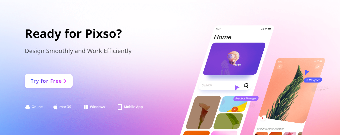
Pixso - A Must-have Tool for Expand Collapse UI Design
To facilitate the best and most functional expand collapse UI design fully incorporating best practices and principles, a resourceful UI design tool is the greatest asset. With so many tools out there, it can be difficult to set your hands on one which would provide an adequate function for the expand collapse UI design and other necessary elements of UI design.
Pixso stands out as a desirable tool for creating stunning and efficient expand collapse UI design with numerous resources to facilitate ease of designing. This tool is a must-have for designers. It provides over 3,000 built-in components, which makes prototyping smooth and without any hassle. With the cloud-enabled design, team members can interact and collaborate in real time on design projects, and changes are synchronized immediately.
Pixso eliminates the need for numerous tools as it incorporates component variants, automatic layouts, plug-ins and prototype playback. It is your all-in-one tool for high-fidelity prototypes and brilliant interface design.
With Pixso, you can conduct a full stack prototype, design and delivery as it supports one-click exportations and compatible with various file formats, including Figma, XD, Zip and SVG. With tons of features designed to smoothen the path for UI designers, Pixso stands at the top of the list of superb tools and is poised to overthrow popular names in design with innovative methods.
Just give it a try now!