Scott
A longer button label or an extra card can disrupt a manually positioned layout. Figma Auto Layout lets a frame arrange its children with rules for flow, spacing, padding, and size, so you can explore content changes without moving every layer separately.
This tutorial explains the main properties and fifteen practical ways to use them. Start with a small component, then test how it behaves when its text, contents, or available space changes.
Part 1. What is Auto Layout in Figma?
Auto Layout is a set of layout properties for frames and components. It controls how child layers are arranged and how the frame or its children respond to content and size changes. You can combine nested frames to build more complex layouts.
It is useful for designing responsive behavior, but it does not turn a design into a working responsive website. Developers still need to implement the layout rules and test them in the product.
Use Auto Layout to make recurring relationships explicit:
- Content sizing: Let a button grow with its label or a card grow with its description.
- Consistent spacing: Keep repeated items aligned as you add, remove, or reorder them.
- Layout exploration: Resize a frame to see which elements should stay fixed, stretch, wrap, or move into a different arrangement.
Part 2. 15 practical Figma Auto Layout tips
Use these techniques on a component with realistic text. A short label can hide problems that appear as soon as content becomes longer.
1. Learn the useful shortcuts
Select the relevant frame or layers before using a shortcut. Adding Auto Layout and removing it are different from grouping and ungrouping layers:
- Add Auto Layout: Shift + A.
- Remove Auto Layout: Shift + Alt + A on Windows, or Shift + Option + A on macOS.
- Removing Auto Layout returns the selection to a regular frame; it does not require ungrouping its children.
- For a reusable layout, make a component or duplicate the frame so its structure and settings stay together.
- When transferring settings, inspect padding, gap, and resizing on the destination rather than assuming that copying appearance copies every layout rule.
- Duplicate a selected item with Ctrl + D on Windows or Command + D on macOS, then inspect its position in the frame.
2. Choose a flow that matches the content
Use a horizontal flow for a row of actions and a vertical flow for stacked content such as a title, description, and button. Figma also provides a grid flow for arrangements that need rows and columns. Select the frame to edit its flow in the Auto Layout controls.
For horizontal or vertical layouts that must break onto additional lines, consider wrapping. Test it at narrower sizes and check both the item gap and the distance between wrapped rows or columns.
3. Separate padding from gaps
Padding is the space between a frame's boundary and its contents. The gap separates children from one another. For a button, padding surrounds the label; for a card list, the gap separates cards. Adjust the property that matches the relationship you want to change.
Set individual sides when the content needs unequal padding. For example, a card with a full-width image may need different spacing around its text section. Keep deliberate values instead of making small, unrelated adjustments to each instance.
4. Choose resizing rules for each axis
Width and height can use different rules. Inspect both the parent and child when a layer does not resize as expected:
- Fixed: Keep the selected layer's dimension at a specified value. Longer content may then need to wrap, truncate, or overflow according to its own settings.
- Hug contents: Let the frame grow or shrink around its children and padding. This is useful for a button whose width follows its label.
- Fill container: Let a child use the available space in its Auto Layout parent. For example, a text field can fill the remaining width beside a fixed-size action.
5. Align items and distribute free space
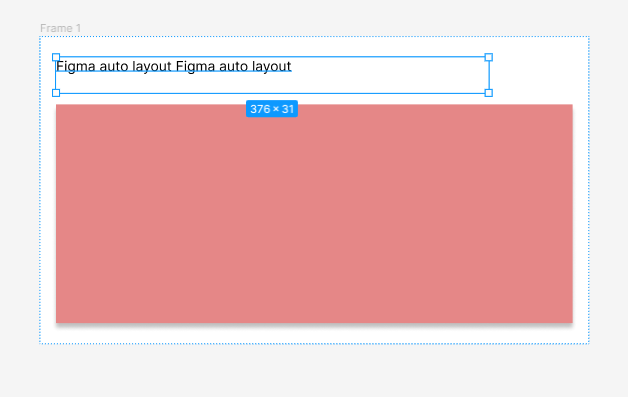
Alignment controls where children sit within their frame. Use it to align an icon and label or to place a group at the start, center, or end of the available area. Check the frame's dimensions when an alignment change appears to do nothing.
A fixed gap preserves a chosen distance between items. Automatic spacing distributes available space according to the selected spacing mode. Resize the frame to decide which behavior suits the component.
6. Position an overlay with Ignore auto layout
Use Ignore auto layout, previously called absolute position, for an overlay such as a notification badge or a close button. The layer remains a child of the frame but is excluded from its normal layout flow.
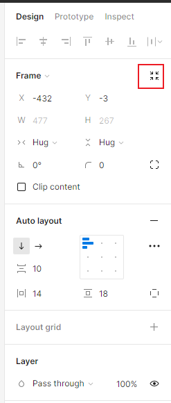
Select the child, enable Ignore auto layout, and set its position and constraints. Resize the parent to check that the overlay remains attached to the intended corner without covering important content.
7. Use gaps deliberately
Set a consistent gap for repeated items such as menu entries or cards. When the distance looks wrong, inspect nested frames too: the visible space can include both a parent's gap and a child's padding.
Negative gaps can create overlap, as in a row of avatars. Use them intentionally and review which item appears in front. Overlap is less suitable when it obscures labels or makes separate controls difficult to identify.
8. Reorder children without rebuilding the frame
Move a child within the frame to change the order of a list or toolbar. Keep the intended reading order in mind, especially when a row will later wrap or stack on a narrow screen. Two useful ways to work are:
- Drag the child to a new position on the canvas and inspect the insertion point before releasing it.
- Reorder the child in the Layers panel when overlapping content makes canvas selection difficult.
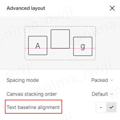
9. Use text baseline alignment where it helps
Baseline alignment helps text of different sizes share a reading line. It can be useful in a price row with a large amount and a smaller currency label. Compare it with center alignment for an icon-and-label pair.
Enable text baseline alignment in the relevant Auto Layout controls, then review the actual letterforms and icon. An icon's drawn shape may still need an optical adjustment even when its box is mathematically aligned.
10. Decide how long text should behave
Choose between wrapping and truncation based on the information people need. A description can often wrap, while a compact table cell may need a limited number of lines. Give the text layer an appropriate width so its behavior can be evaluated.
When using truncation, inspect the ellipsis with a realistic long string. Make sure the full information is available where the user needs it; shortening a critical instruction or error message can remove its meaning.
11. Account for strokes in layout measurements
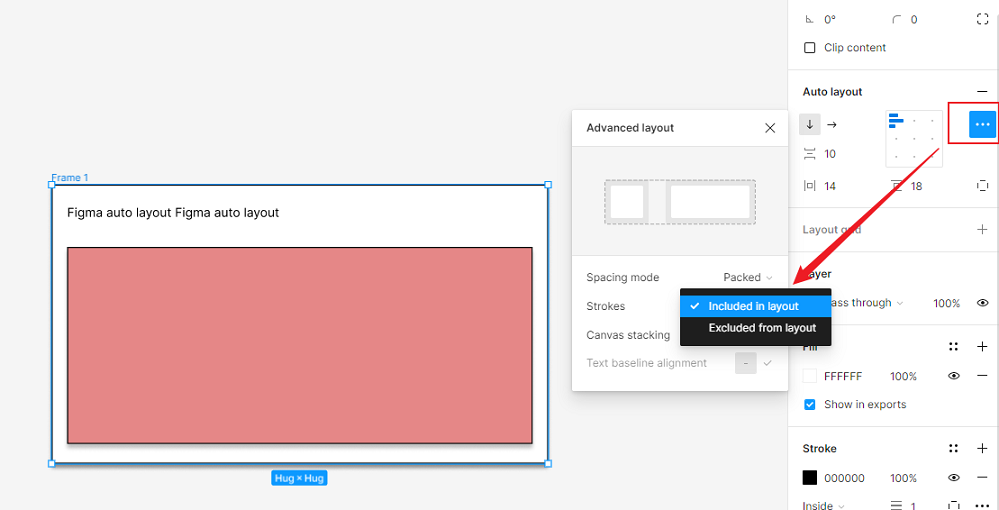
Figma provides a setting for whether inside strokes are included in Auto Layout calculations. Outside and center strokes do not affect the layout measurements. Inspect each frame's setting when outlined components have unexpected gaps or dimensions.
12. Use automatic spacing for flexible rows
For a toolbar with controls at opposite ends, set the gap to Auto and use the default Between spacing. Then resize the frame and test additional actions. If the row becomes crowded, change the arrangement or allow wrapping instead of relying on free space that no longer exists.
13. Navigate nested frames deliberately
Nested layouts are easier to edit when you know which layer is selected. Use the Layers panel and keyboard navigation to move between a component and the frame that controls it:
- Press Enter or Return to select children of the current selection.
- Press Shift + Enter (or Shift + Return) to select the parent layer.
- Press Esc to clear the selection.
- Use Tab to move through sibling layers, checking the Layers panel when the hierarchy is complex.
14. Keep a dragged object in the intended parent
When dragging a layer near an Auto Layout frame, inspect the highlight that indicates where it will be nested. Hold Space while dragging when you want to prevent automatic nesting. After releasing it, check the Layers panel to confirm that the object belongs to the intended parent.
15. Inspect collapsed frame bounds
A very short wrapper frame can leave its children visible outside its bounds when clipping is off. That is different from giving those children space in the surrounding flow. Do not rely on a tiny decimal height rounding to zero as a layout method. For an overlay, use Ignore auto layout; for ordinary content, give the frame a size that reflects its children.
Part 3. Keep the layout maintainable
1. Use Auto Layout where relationships matter
Buttons, lists, cards, and forms usually have clear spacing relationships. Freeform artwork or deliberately overlapping compositions may need other positioning methods. Add a layout rule because it explains how the content should behave, not simply because every frame could have one.
2. Reuse components and test their limits
Create components for repeated patterns and use instances in larger layouts. After changing a main component, inspect representative instances with long labels, extra content, and narrow widths. Reuse makes changes easier to distribute, but it does not replace checking how those changes affect the surrounding layout.
Part 4. Build reusable layouts in Pixso
You can also use Pixso to organize interface elements with Auto Layout and reusable components. Start with a card or button, define its padding and spacing, and try longer content before adding it to a complete screen. This gives the team a concrete component to review together.
Open Pixso to build a reusable component

Test the rules with content changes
Duplicate a finished component and give it a long label, an extra item, and a narrower frame. Observe what grows, wraps, or overlaps. The useful result is a layout whose behavior you can explain and hand off, not a frame that only works with its original sample content.