Scott
What Is Filtering UI
A filter UI lets people narrow a set of results using criteria such as size, price, status, or location. A filter changes which items remain; a sort control changes their order. Keeping those roles distinct helps people understand why the list changed.
Filtering is one part of UI design: the controls, labels, result count, and list must communicate the same state. This guide uses five interface examples to explain multiple selection, applied filters, and recovery when no results match.
How to Design Clear Filter Behavior
Begin with the decision the visitor is making. A shopper comparing shoes may need size and intended use; an operations team reviewing orders may need status, owner, and date. Showing every field as a filter usually makes that decision harder, not more personal.
Principles of Filter UI Design
Useful filters let people predict the effect of a choice, see what is currently applied, and reverse it without losing the whole search.
User Friendly
Place the most useful controls near the results and use labels that describe their purpose. After a selection, keep the result count and applied choices visible. Do not depend on a change of color alone to show that a filter is active.
Consider the Human Language/Behavior
Use the names people use for the objects they are finding. Internal database fields can be precise yet meaningless to a shopper or a colleague outside the team.
For clothing, a label such as “Sleeve length” is easier to use than an internal merchandising code. Keep product categories separate from style attributes.
Someone looking for a shirt dress should be able to select “Dresses” and then relevant attributes such as size or sleeve length. Do not make them guess which unexplained collection name contains that product.
Check the labels against actual catalog values. If an item can be both “Running” and “Waterproof,” make the categories and attributes work together rather than forcing shoppers into only one of them.
Provide Category-specific Filters
Filters should match the selected category. Running shoes can use size, surface, and cushioning; a monitor needs screen size, resolution, and ports. Changing category should remove incompatible criteria visibly, not leave a hidden shoe-size filter suppressing all monitor results.
Compatible with Multiple Selections
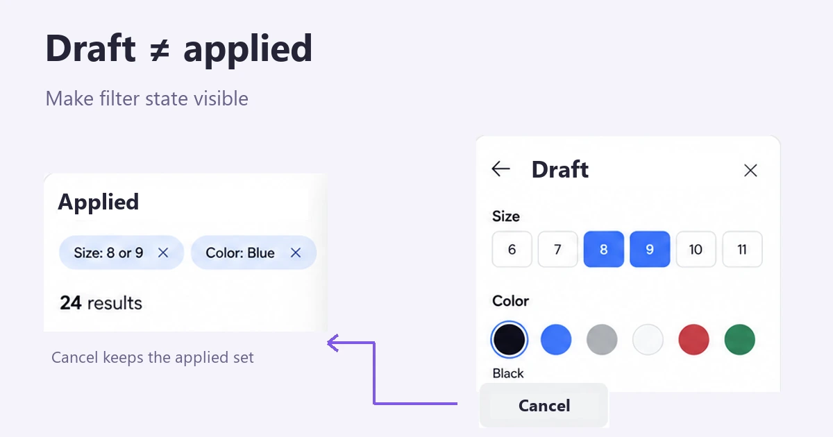
Allow multiple selections when people are considering alternatives. For a shoe catalog, selecting size 8 and size 9 can mean “either size,” while selecting “Blue” as well means a blue shoe in either selected size. Define these relationships before drawing the controls: combining all choices as strict matches would return no shoe that has only one size.
Choose when changes take effect. Instant filtering can work well for a short, quick-updating list. In a mobile drawer or an expensive search, an explicit Apply button lets people finish several choices first. Keep the drawer’s draft selections separate from the filters already applied to the results; Cancel should restore the applied set.
Adapt to Browser Behaviour
Decide what Back should do after someone changes filters, opens an item, and returns. The list should recover the agreed query, selected filters, sort order, and useful scroll position. If each filter change creates a history entry, a long series of Back presses can become frustrating; choose the history behavior deliberately.
Browser caching alone does not define that behavior. The application must restore the relevant state, often using the URL and history entries. The MDN guide to the History API explains how browser history and application state can be coordinated.
Show the applied set and a way out of zero results
Put a compact summary of applied choices above the list, especially when the original controls are offscreen or inside a drawer. In the shoe example, “Size: 8 or 9” and “Color: Blue” each need their own removal action. Clear all should reset the agreed filters without unexpectedly deleting the search query or changing the sort order.
Baymard’s applied-filter research highlights the value of an overview for confirming and removing selections. On mobile, that overview is especially useful after the filter drawer has closed.
If adding “Under $40” produces zero results, keep the selected sizes and color visible. Explain “No blue shoes in sizes 8 or 9 under $40” and offer to remove the price limit. Silently resetting every filter produces results but loses the visitor’s intent. A failed network request needs a separate retry message; it is not an empty result.
Prototype the Filter States in Pixso
Build three related screens in Pixso: the results list with applied filters, an open drawer with an uncommitted change, and a zero-results state. Reuse the checkbox, chip, and result-card components so the same selection has a consistent label and appearance.
For the prototype example, start with 24 blue-shoe results in sizes 8 or 9. In the drawer, select Black but leave it unapplied. Connect Cancel back to the unchanged blue results and Apply to the new state. This makes a review question concrete: can the reader tell which choices affect the list now?
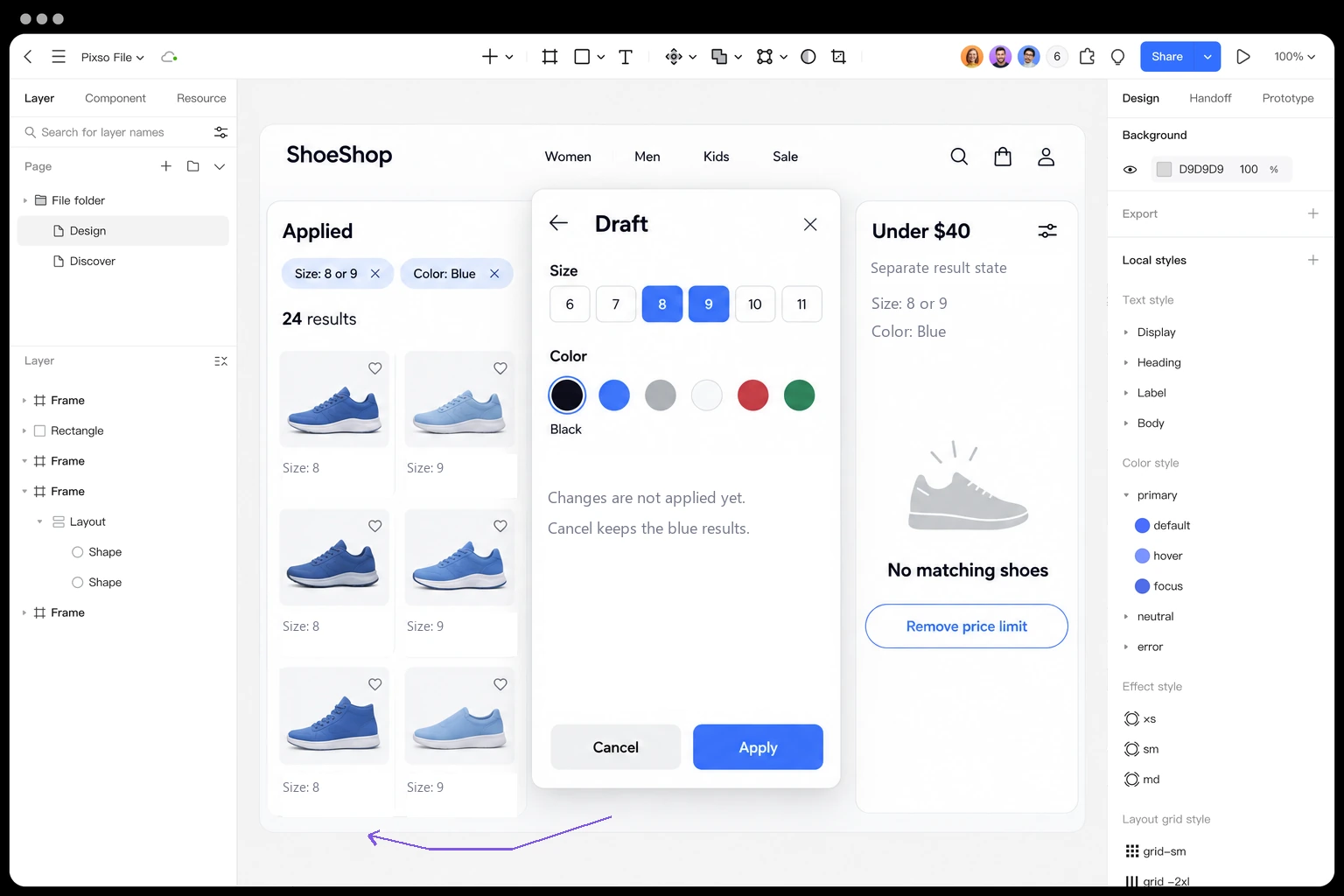
Include a Clear all interaction and the no-results recovery path in the same prototype. Review the screen names and transitions with a developer so the proposed filter logic is explicit; a visual prototype illustrates that logic but does not implement the catalog search.
Five Filter UI Examples to Study
Dashboard/Order Details Page by Caglar Cebeci
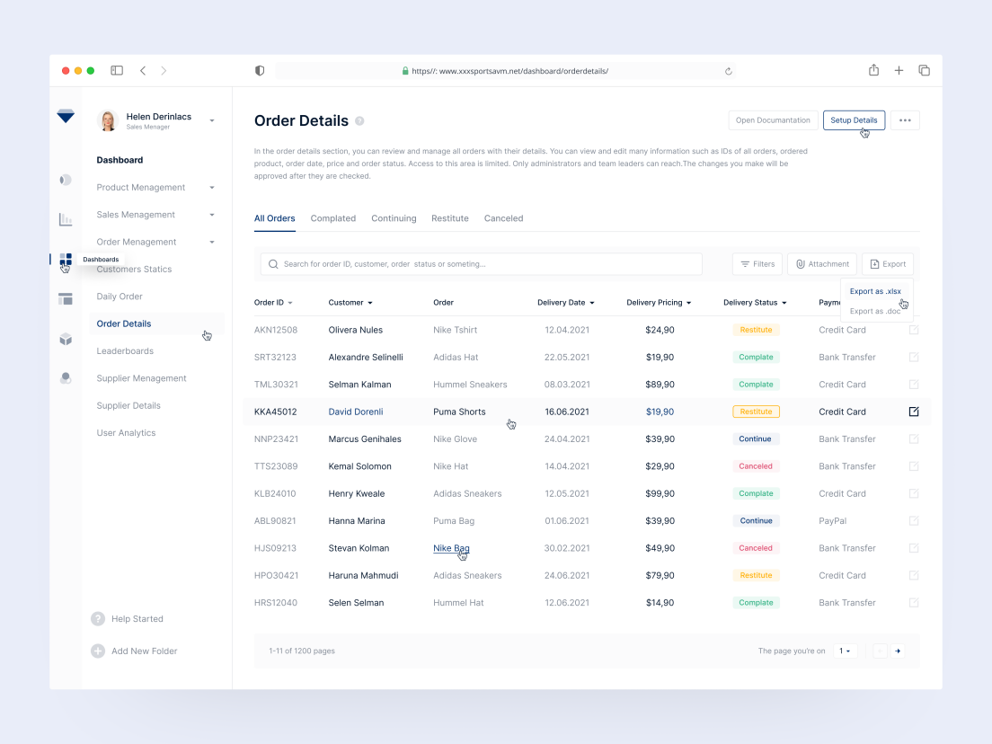
The order-details example places search and filter controls close to the data they affect. Keep the search scope clear—for example, order number or customer—and show when a status filter is already limiting the table.
Products List Search by Salah Elliman
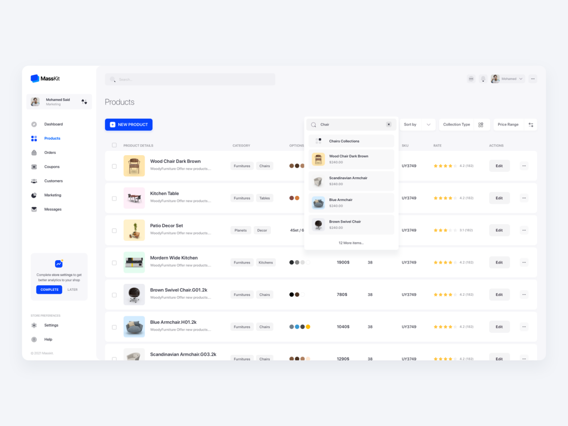
This product-list design puts search and other controls above the table rather than among the rows. That makes them easier to find while scanning products. In your own version, distinguish filtering from sorting in both the labels and the visible selected state.
Rechain Order Page by usrnk1
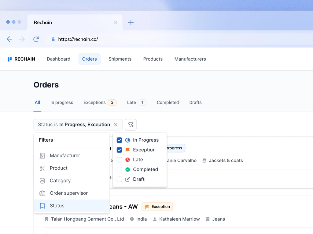
The Rechain example groups order criteria in a dropdown and shows selected status information nearby. Grouping reduces the width needed for controls, but the closed dropdown should not hide the fact that the list is filtered. Keep an applied summary outside it.
Filtering Component + Table Exploration by Micah Carroll
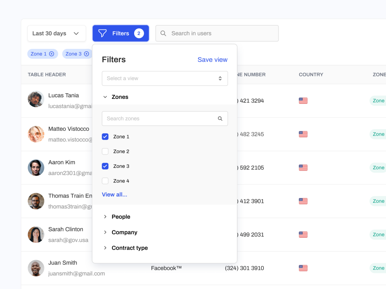
The table exploration shows selected zones and an applied-filter area above the rows. A person can see the current restriction without reopening every dropdown. Make each removal control identify the choice it removes, and update the count together with the table.
Himalayas. app by Jordan Hughes
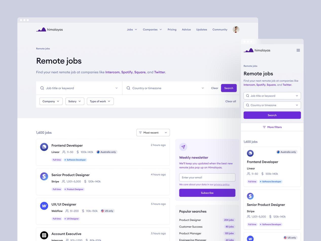
The Himalayas job-search example brings search and location-related controls together above the listings. Job seekers need to understand whether a location describes their own eligibility, an office location, or a remote-work restriction; a concise label or helper text should make that distinction.
Conclusion
A good filter UI keeps the controls and results in agreement. Define selection logic, distinguish draft from applied choices, and give people a precise way to recover from no results. Then use the example layouts as starting points, not substitutes for those decisions.

![[Full Guide] Tags UI Design](https://pixso.net/assets/media/tags-ui-intro-fdf1d4dad4511eb5.webp)