Scott
A website footer helps people find the next useful destination after they reach the end of a page: support, contact details, related content, or account and legal information. Good footer design makes those choices easy to scan without repeating the entire site. The eight examples below show different ways to group links and give the bottom of a page a clear purpose.
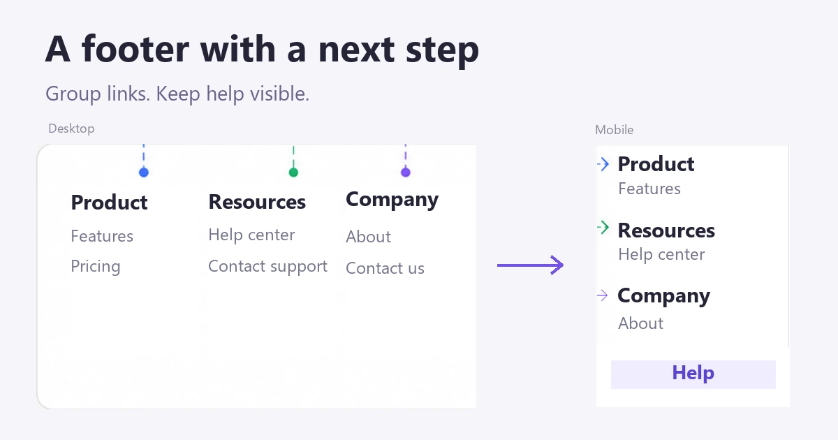
Part 1. Why Footer Design Matters
A footer is part of the site’s navigation design, not spare space for everything that did not fit in the header. Start with the questions visitors still have at the end of a page, then choose links and actions that answer them.
Below are some of the most compelling reasons for investing time in website footer design:
1. The footer concludes the page
The footer adds an effective conclusion to a page. Through footers, users are informed they have reached the end of one page and should proceed to the next or return to the home page. Even better, users can learn more about the website by clicking on any of the links at the bottom.
2. Helps in building trust and credibility
Contact details, an identifiable business, and clear policy links help visitors understand who operates the site. Display certifications or awards only when they are current, relevant, and verifiable; a row of unexplained badges is not a substitute for useful information.
3. Inspires readers to act
A reader who finishes a product page may be ready to start a trial; someone reading a support article may need further help. Give the footer a clear next action for that context. If a newsletter form is useful, explain what readers will receive and keep its submission state understandable.
4. Makes useful pages discoverable
Descriptive links can help people discover relevant pages. Use labels such as “API documentation” or “Contact support” rather than repeated keywords or a long list of near-identical search phrases. A footer is not a reason to add links to pages that do not help visitors.
5. Crucial to UX design
Visitors often look near the bottom of a page for contact, help, and policy information. Keep those destinations recognizable and consistent. Grouping “Guides,” “Templates,” and “Help center” under “Resources” is easier to scan than mixing them with company addresses and account settings.
6. Ensures consistent interaction with users
Use the same group names and link order across related pages so visitors do not have to relearn the footer. A product page can have a contextual call to action above it while the shared support and policy links remain in their usual positions.
7. Offers vital information
Footers commonly contain copyright information, privacy policies, terms, and contact details. Which notices a business needs depends on its service and applicable requirements; do not treat one generic footer as a complete legal solution.
Part 2. What Should a Footer Include?
The following seven elements are common in website footers. Choose the ones that help visitors navigate your site or complete a task:
- Social media icons
- Logo
- Map
- Copyright, terms of service, privacy policy
- Contact details
- Support
- Call-to-action
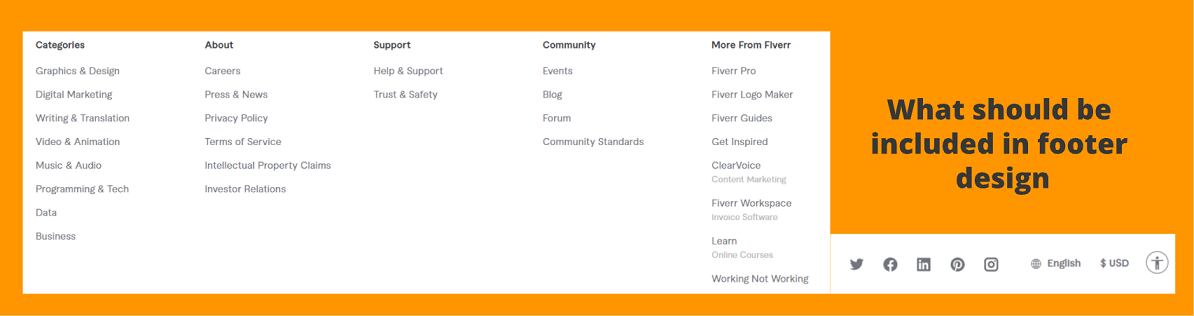
Choose groups before choosing columns
For a software site, “Product,” “Resources,” and “Company” can separate feature pages from learning material and organizational information. Keep account-specific actions near the account controls rather than mixing them into a large promotional list. A local business may need its address and opening hours more than three columns of navigation.
Give each group a short, concrete name, then read the links without the surrounding page. “Help center” is clearer than “Explore more” when the destination contains support instructions. Remove duplicate destinations unless a second placement serves a distinct task.
The GOV.UK footer guidance is a useful reference for separating secondary navigation from supporting links. Its structure is an example to adapt to your service, not a requirement to copy a government site’s content.
Decide what stays visible on mobile
Start with a single-column footer and real labels. If the list is long, collapsible groups can reduce its height, but they add an interaction. Keep frequently needed help and essential policy links easy to reach rather than hiding every destination by default. A language selector should show the current language in words, not rely only on a flag.
Try the longest translated labels and a large text setting. A link should wrap without overlapping the next item, and the newsletter form should not push its submit button outside the screen. On a keyboard, the focus indicator needs to remain visible on every link and control.
Part 3. 8 Best Web Footer Examples
These saved website examples illustrate different footer structures. Use them to study grouping, hierarchy, and content choices; the screenshots show earlier versions of the sites, not an audit of their current pages.
1. Site Inspire
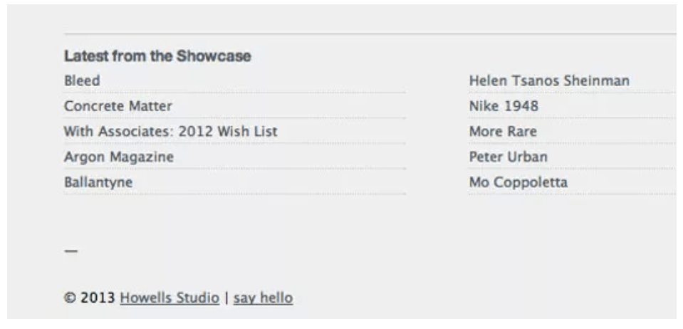
An editorial site can use its footer to offer a few relevant ways to continue reading. The choice should be selective: a short set of recent or featured items is easier to understand than an unstructured archive of links.
Site Inspire combines a brief site description with links to recent content. That pairing explains what the site is for while offering a next read. For an article-heavy site, use specific article names and keep the number of recommendations manageable.
2. Chivichivi
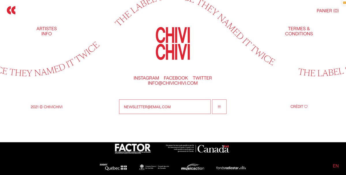
Innovative typography and whitespace dominate the footer design of Chivichivi's website. Consequently, it's a good illustration of how to make a website footer seem both beautiful and instructive.
The Chivichivi example combines contact and navigation details with a subscription form and partner logos. Notice the distinct visual groups: visitors can look for a practical link without first reading the promotional elements. If adapting this approach, give the form a visible label and enough room for validation messages.
3. The Ministry Of Type
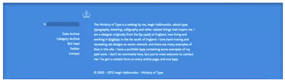
The Ministry of Type places a short biography of its author, Aegir Hallmundur, beside supporting links. This suits a personal publication: readers can understand the author’s focus before exploring more work. A large corporate site would need a different balance of biography and service navigation.
4. Asos
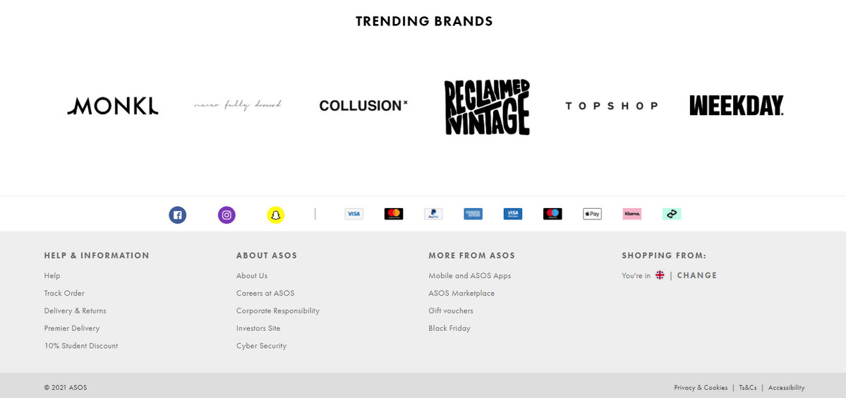
The Asos example uses several horizontal layers: brand links, social and payment symbols, and grouped navigation. Different types of information remain visually separate instead of competing in one long list.
Payment symbols can help shoppers recognize available methods, but the actual options still need to be clear at checkout. Keep utility links such as delivery, returns, and contact easy to scan beside the promotional content.
The region and language area also has a distinct position. Make its current selection readable and explain what changing it affects; a flag alone does not identify a language or prove that currency conversion is available.
5. Cantilever Fish & Chips
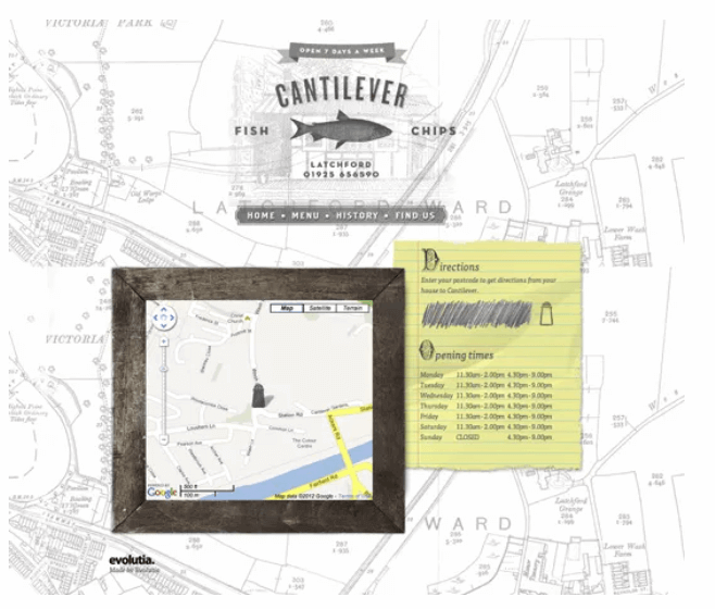
With just one webpage, the location, phone number, and hours of operation of Cantilever Fish & Chips may be found at the bottom of the page. In doing so, they've followed the usual practice of presenting this information at the bottom of each page, but what sets this site apart is its inventive and elegant presentation.
6. Reader’s Digest
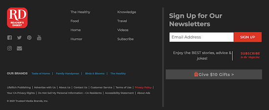
Reader’s Digest groups a large set of content and company links and gives email signup a separate area. The lesson is to separate two tasks: finding an existing section and subscribing to future content. A newsletter form should not make the navigation harder to scan.
7. Fiverr.com
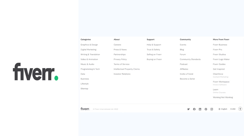
Fiverr’s example uses a restrained background, consistent type, and clearly separated columns. The useful idea is the hierarchy between group headings and links, not a particular brand color. With many destinations, spacing between groups can do more for scanning than decorative borders around every link.
8. WPForms
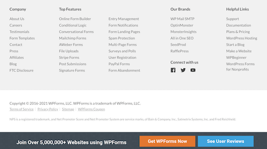
WPForms organizes links to company information, product features, and related WordPress resources into groups. These categories give readers a way to continue from a product page without putting every destination in the primary navigation.
The call-to-action bar is visually separate from the link columns. If you use a persistent bar in your own design, make sure it does not cover the last footer links or keyboard focus; the screenshot alone does not establish how that bar behaves while scrolling.
Part 4. Design a Responsive Footer in Pixso
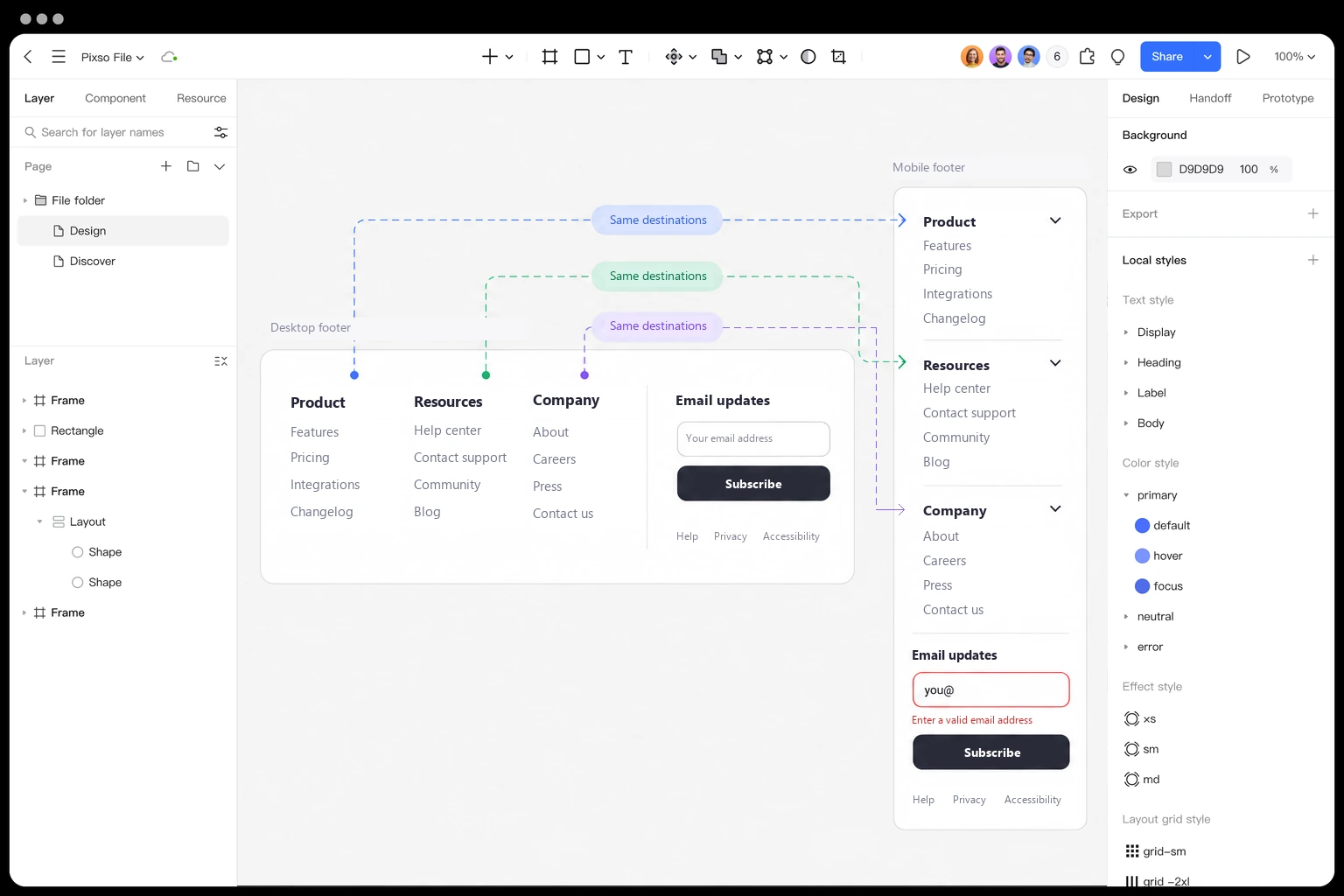
Make a desktop footer with three groups in Pixso: Product, Resources, and Company. Use reusable text styles for group headings and links, then arrange each group with Auto Layout so a longer label increases the row height instead of overlapping its neighbor.
Create a narrow version beside it. Keep the same destination names, place the groups vertically, and compare two options: all links visible, or expandable groups with Help, Privacy, and Accessibility links kept outside them. The desktop and mobile designs should offer the same useful destinations even when their presentation changes.
For the expandable version, prepare an open and closed state with a clear trigger. Connect those states in a prototype and ask a teammate to find the support contact without prompting. Watch whether the group label makes sense before changing color or adding icons. Also try a long newsletter error message; it should not collide with the footer links.
A useful footer finishes the page, not the conversation
Keep the links people need, group them by task, and make them work at narrow widths. The strongest footer is not the one with the most content: it is the one that gives readers a clear next step without making them search through another whole page.