Sherry
Game UI design helps players understand what is happening and what they can do through controls, graphics, animation and supporting audio. It turns complex game states into information someone can use while playing.
The interface must communicate the information a player needs at the moment they need it: remaining health, a selected item, the current objective or a way back from a menu. Novel visuals can support the game's identity, but novelty is not a substitute for readable information and predictable controls.
Prepare HUD and menu states in a shared UI design workspace, then verify their behavior in the game. This guide covers the main presentation choices and works through a healing-item selection task, where a visually attractive menu can still fail under pressure.
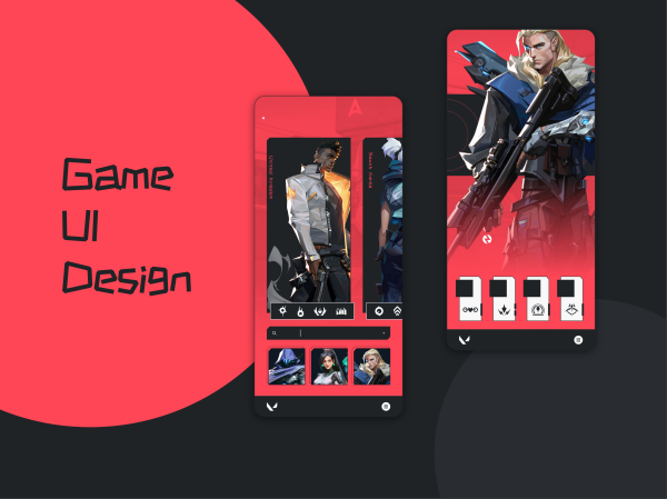
Everything About Game UI Design
A game interface connects the player's intention with the available actions. The design must explain which controls are available now, what an action changes, and where the player can find information they need.
What Is Game UI Design
Game UI comprises the information and controls through which a player understands and acts in a game. It can include menus, HUD indicators, prompts and information presented within the game world. It is not the engine or the entire game platform.
Start with decisions the player makes repeatedly. In combat, health and available actions may matter immediately; in a loadout menu, comparing equipment may take priority. The same information can need a different presentation in each context.
The interaction also depends on the input device and viewing situation. A small pointer target that works at a desk may be difficult to use with touch or a controller.
Choose visual and interaction patterns together. A selected inventory item needs a recognizable state, a way to confirm or cancel, and feedback after use; drawing an attractive item card covers only one part of that interaction.
Differences Between Game UI Design and Common UI Design
Games share many UI needs with other products: navigation, understandable labels, feedback and recovery. Their context can change the design priorities. A player may need to read a changing status while moving, use a controller from a distance or distinguish a menu from an action happening in the world.
More Appealing Visuals
A game's visual language can be expressive, restrained or deliberately unobtrusive. Choose emphasis around the information hierarchy. An urgent warning should not compete with every decorative frame, and an inventory label still needs to remain legible over a detailed background.
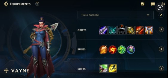
Gaming Guides and Process
Tutorial prompts can teach an action at the moment it becomes useful. Other products also use onboarding and contextual guidance; this is not unique to games. In a game, consider whether the prompt interrupts play, whether it can be revisited, and whether the displayed input matches the active device.

The Use of Gesture Keys
Touch gestures also appear in ordinary apps. The game-specific decision is how the supported inputs map to actions during play and in menus. Design touch, keyboard and controller routes where supported, including focus, confirmation, cancellation and input-remapping implications.
How to Create an Excellent Game UI Design
Define the player's task, the state information it requires and the supported inputs before styling the interface. The principles below help organize those decisions; the worked example then applies them to choosing a healing item.
General Principles
Apply these principles to a specific interaction, not just to the appearance of a finished screen.
1. Make actions understandable
Show the action associated with the current control and acknowledge the result. Selecting an item, previewing its effect and using it should not look like the same event. Make it possible to recover from an accidental selection before a consequential action.
2. Make Room for Flexibility
Difficulty in the game does not require difficulty operating its menus. Where the game supports different inputs or accessibility settings, review the UI with those options instead of assuming that one preferred setup works for every player.
3. Adequacy in Information
Too little information makes your game hard to play. Too much information on the interface can be distracting; certain key information should be spelled out in the interface to assist users through their exploration.
4. Striking Visuals to Draw The Attention of The Audience
Use emphasis where it supports a decision. A low-health warning can combine a recognizable icon, a meter change and an optional audio cue. Color or motion alone may be missed; background effects and decorative animation should not obscure the information needed to act.
5. Easy Navigation
Keep menu navigation predictable. Make the current location, available next steps and return action clear. In-world navigation is a separate design decision: an intentionally difficult route should not be confused with a player being unable to find the menu's back action.
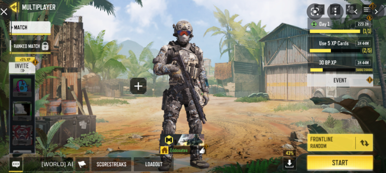
Necessary Elements
The following terms describe how interface information relates to the fictional world and to the space shown on screen. They are design choices, not four ingredients every game must contain. Fagerholt and Lorentzon's research, Beyond the HUD, explores these relationships in FPS interfaces.
1. Diegetic Elements
Diegetic information belongs to the fictional world and is presented within that world, such as a readable instrument on a character's equipment. Its placement should fit the fiction without making essential information difficult to perceive.
2. Non-diegetic Elements
Non-diegetic information is presented to the player outside the fictional world, such as a conventional overlay health meter. The character does not need to see that meter. This presentation can make detailed status information clear and stable.
3. Meta Elements
Meta cues can convey a character's condition through an overlay effect, such as a damaged-screen treatment. Related terminology distinguishes perception-like effects from representations of fictional devices shown outside the world. A cue should communicate its state without obscuring necessary play information.
4. Spatial Element
Spatial or geometric indicators are positioned in the displayed game space without necessarily being objects in its fiction, such as a waypoint marker. Unlike an invisible rule, they are visible information. Their position helps communicate where something is.
Worked example: choose a healing item under pressure
Imagine an action game with three healing items. The player has low health, opens the inventory, compares recovery values and uses one item. Before styling the panel, decide whether play pauses, which item receives focus and whether highlighting an item already consumes it. These are different states, not minor variations of one screenshot.
| State | Information needed | Interaction decision |
|---|---|---|
| Inventory opens | Current health, available items and counts | Predictable initial focus; clear back action |
| Item highlighted | Recovery effect and remaining quantity | Highlight is distinct from confirmation |
| Item unavailable | Why it cannot be used | No silent failure or misleading enabled action |
| Item used | Updated health and item count | Focus stays useful if the final item disappears |
Choose what the player must compare. If one item restores health immediately and another restores it over time, show that difference near the choice rather than burying it in a distant tooltip. Keep selection, keyboard/controller focus and unavailable states visually distinct. A bright outline should not mean all three.
The Xbox guidance on additional information channels recommends not relying on color alone. For this inventory, pair item status with a label or symbol. Its UI-navigation guidance also emphasizes meaningful focus order and a route back. Test the inventory with each supported input rather than assuming a pointer interaction proves controller usability.
Design and review the game interface in Pixso
Use Pixso to lay out the HUD, open inventory, selected-item detail and post-use state. Keep item names, counts and health values consistent so reviewers can follow the change. Place a note beside the inventory stating whether gameplay continues while it is open.

Reusable components help compare item rows and state styling. Connect the visual states in a prototype to discuss selection, confirmation and return. Pixso supports interface design and prototyping; gameplay logic, real-time input handling and engine integration must be implemented and tested in the game.
Ask reviewers to choose an item for a specific situation, then explain what they expect to happen. A mistaken choice may reveal an unclear effect description, not a need for a more elaborate border. Test a longer item name and larger text before settling the panel size.
Conclusion
Good game UI helps a player make the intended decision without fighting the interface. Choose where information belongs, make its meaning distinguishable, and specify how supported inputs move between states. The healing-item task is complete only when the player can choose, confirm and return to play with a clear understanding of the result.