Scott
A useful font pairing gives readers a clear route through a page: a heading that attracts attention, body text that is comfortable to read, and labels that remain legible at smaller sizes. The two families should have distinct jobs.
Start with the content you need to set. An editorial article needs a dependable text face; a campaign page may need a more expressive headline. Choosing both fonts from a single attractive sample can hide problems with long headings, numbers, or navigation labels.
These ten Google font pairings offer different starting points for websites and interfaces. Each example explains where the combination can work, how to establish a hierarchy, and what to inspect in your own layout.
Part 1. 10 Google Font Pairings for Websites and Interfaces
The sizes below are starting points for a desktop mockup, not fixed rules. Set real content, adjust the scale for your layout, and review the result at its intended display size.
1. Oswald & Source Serif Pro
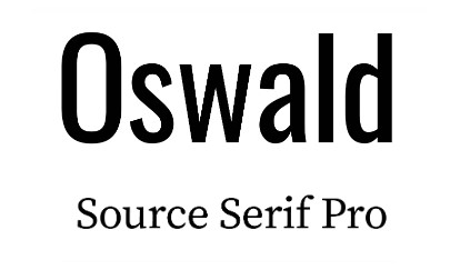
Use Oswald for compact, emphatic headings and Source Serif Pro for article text. The contrast suits editorial landing pages or publication websites. Try a 36 px Oswald heading above 18 px Source Serif Pro body text with generous line spacing. Check narrow screens with your longest heading: condensed letters save width, but several tightly packed lines can still feel heavy.
2. Nunito & Nunito Sans

Nunito and Nunito Sans provide a quieter contrast. Nunito’s rounded forms can give headings a friendly character, while Nunito Sans keeps supporting text restrained. Try a 32 px bold heading and 16–18 px regular body text for an onboarding flow or educational site. Because the families look related, use size and weight to make the hierarchy clear rather than relying on the font change alone.
3. Elsie & Roboto

Elsie brings decorative detail to a short headline; Roboto gives descriptions and controls a simpler rhythm. This pairing can suit a cultural event, portfolio, or lifestyle campaign. Start with Elsie at 40–48 px and Roboto at 16–18 px. Test the exact headline, including punctuation, and keep Elsie out of dense paragraphs where its distinctive forms can compete with the message.
4. Lato & Raleway

Give Raleway the heading role and Lato the supporting text. Both are sans-serif families, so the difference needs help from scale and weight: try a 36 px semibold Raleway heading with 18 px regular Lato copy. This can work for a portfolio or service website. Review numerals, navigation labels, and bold text together before deciding whether the pairing creates enough contrast.
5. Dancing Script & Josefin Sans

Dancing Script works best as a brief accent, such as an invitation title or a few words in a campaign. Pair a 40–48 px script heading with 18 px Josefin Sans supporting text, and keep the copy short. Check the letter joins at the actual display size. For a page with substantial reading, use a less decorative text face instead of forcing this pairing into long paragraphs.
6. EB Garamond & Poiret One
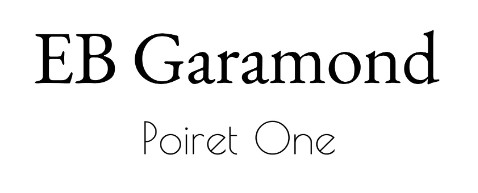
Use Poiret One for a large display heading and EB Garamond for the reading text. Poiret One’s thin strokes and geometric shapes can suit an arts or exhibition page, but they need enough size and contrast. Try a 44–56 px heading above 18–20 px EB Garamond. Inspect the heading on a small screen; Poiret One is a display choice, not a good default for lengthy body copy.
7. Corben & Nobile

Corben gives a heading a rounded, substantial shape; Nobile can carry the supporting explanation. Try this combination on a food, craft, or community page with a 36–40 px Corben heading and 18 px Nobile body text. Leave space around the heading and compare it with your images. A heavy headline and a busy photograph should not fight for the same attention.
8. Sansita & Open Sans
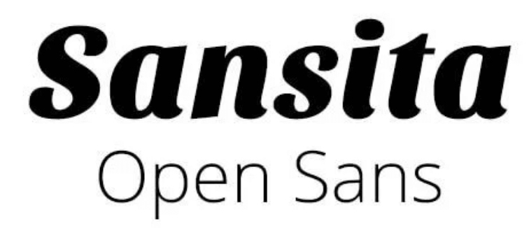
Sansita adds character to headings without using a script face. Open Sans provides a straightforward companion for descriptions and interface text. Try a 32–36 px bold Sansita heading with 16–18 px Open Sans on a course page or small business website. Check the same pairing in cards, forms, and longer paragraphs so the expressive heading remains consistent across the page.
9. Lobster & Mulish
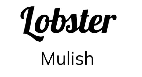
Lobster is a strong accent for a short, informal headline, while Mulish can handle the supporting copy. Try a 40 px Lobster title with 18 px Mulish for an event or promotional page. Avoid setting whole paragraphs or navigation menus in Lobster. Its connected letterforms need to be read as words, so do not add wide letter spacing to imitate a conventional sans-serif heading.
10. Abril Fatface & Roboto
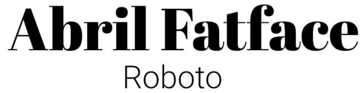
Abril Fatface creates a bold editorial headline; Roboto keeps the rest of the layout comparatively quiet. Start with a 44–56 px Abril Fatface heading and 18 px Roboto body text for a feature story or campaign landing page. Check whether the headline wraps around your image and whether its fine details remain visible on mobile. Reduce the heading size only as far as legibility allows.
Part 2. Try Font Pairings in a Pixso Layout
Build a small typography sample using the content your project actually needs: one heading, two paragraphs, a button, a form label, and a few numbers. A pairing that looks appealing in a large specimen may behave differently in a compact interface.
In Pixso, apply your chosen families to text layers and compare alternatives side by side. Check the font menu for availability; if a required family is missing, follow the local-font setup in the help center. Confirm the weights you need before creating reusable text styles.

Keep the wording, frame width, and spacing the same when comparing pairs. This makes it easier to see whether the font itself improves readability. Share the layout with a teammate and ask which information they notice first, then inspect the longest headings and smallest labels together.
After choosing a pair, save clear text styles for headings, body copy, and labels. Record the font family, weight, size, and line height so the same decisions can be carried into implementation.
Choose Fonts That Support the Content
Start with the most demanding part of the page. For an article, choose the body font first. For a short campaign page, establish the headline treatment and then find a quieter companion for the details.
Test the characters your audience uses, including accents, currency symbols, and numerals. During implementation, check font loading and fallback fonts in the browsers and devices that matter to the project.
Keep the pairing that makes the hierarchy easier to follow. If a second family adds little, one family with a well-chosen range of weights may serve the design better.