On this page

Scott
A gradient is a gradual transition between two or more colors. In UI design, use it to create a focal area, separate a surface or support a visual identity—not to make every component louder. Start with two colors, choose a direction, and check the content placed over every part of the transition.
The most useful gradient is one that works inside the interface. When designing UI in Pixso, compare the gradient with a solid-color version at the actual display size. This guide explains the main gradient forms, preserves a step-by-step Pixso workflow, and applies it to a readable event card.

What Is Gradient Design?
How gradient colors work
A gradient blends colors across an area. Color stops define the colors and their positions; the gradient type and direction determine how that blend is distributed. Changing the distance between stops can make a transition feel gradual or concentrate the change into a narrow band.
For example, ocean blue and a pale sand color can suggest a shoreline. The transition is a design choice, not a requirement to reproduce every color in a photograph. If the intermediate colors become muddy, try colors that are closer together or add a deliberate middle stop rather than adding many unrelated hues.

Where a gradient can help
- Hero and campaign backgrounds: establish a focal region while leaving a calm area for text.
- Cards and illustrations: suggest depth or distinguish a featured object from its surroundings.
- Brand graphics: repeat a recognizable color relationship across a website, presentation and social asset.
- Image overlays: reduce variation behind a caption, while checking that the final contrast remains sufficient.
Dense forms, tables and long reading surfaces often work better with a solid background. Do not use a gradient as the only way to explain selection, success or an error; those states need recognizable text, symbols or other persistent cues.
Types of Gradients and What They Are Good For
1. Linear gradients
A linear gradient blends along a straight axis. The axis can be horizontal, vertical or diagonal, and it can contain more than two stops. Use it when the direction supports the layout—for example, a dark text region on the left transitioning toward an illustration on the right.

2. Radial gradients
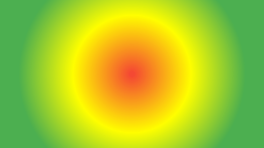
A radial gradient spreads outward from a center as a circle or ellipse. That center does not have to sit in the middle of the canvas. Moving it toward the object you want to emphasize can create a soft spotlight, but avoid a bright patch directly behind a pale label.
3. Corner-focused compositions
“Corner gradient” describes a placement rather than one universal gradient type. A diagonal linear gradient, an off-center radial gradient or several layered gradients can concentrate color in a corner. Specify the actual construction when handing the design to a developer.
4. Diamond gradients
A diamond gradient distributes color around a diamond-shaped center. It can be useful in illustration or a distinctive visual effect, but availability and implementation differ between tools. Keep it separate from the radial, linear and conic gradient families used in CSS.
5. Angle, conic and reflected gradients
An angle or conic gradient changes color around a center point, like a sweep around a circle. A reflected gradient mirrors a color transition across an axis; it does not mean reflecting the entire image. Names vary by design tool, so describe the shape, stops and direction rather than relying on a label alone.
The MDN gradient guide explains the linear, radial and conic forms used on the web. A visual effect available in a design tool may need a different construction or an exported asset in the finished interface.
Make Gradients Support the Interface
Gradients can create depth, direct attention and connect a brand’s colors, but they are not automatically more modern or more usable than solid fills. Their value depends on what the surrounding content needs.
- With illustrations: use the lightest or most saturated area to reinforce the focal object, not compete with its edges.
- With textures: keep texture subtle enough that small text and controls remain distinct. Check the compressed export because fine texture can become noise.
- With typography: give the text a predictable background. A headline that crosses both bright and dark regions may need a different position or a more uniform surface.
Worked example: an event card that remains readable
Imagine a card for a weekend photography walk. It contains the event name, location, time and a “View event” button. Start with a dark navy-to-blue linear gradient, such as #102A43 to #315A85, behind the title area. Treat these as starting colors for the example, not a substitute for checking the finished design.
- Place the content first. Write a realistic event name that wraps to two lines. Set the date and location below it, then place the action where it will remain visible when the title grows.
- Choose one transition. Put the darker region behind the text and let the brighter region support the photograph or illustration. Compare a horizontal direction with a diagonal one.
- Test the whole text area. A gradient has many background colors. Check the least favorable region behind the title, smaller details and button label—not just one end stop.
- Compare the small card. Reduce it to its intended list width. If the gradient becomes a distracting patch or the details disappear, reduce the color difference or use a solid text panel.
- Prepare a non-gradient alternative. Keep a solid surface option for dense lists or contexts where the background must be especially predictable.
WCAG’s text-contrast guidance specifies at least 4.5:1 for ordinary text and 3:1 for qualifying large text, subject to its exceptions. A gradient does not relax those requirements. Check the rendered background beneath the text, including overlays and opacity.
For an interactive card, keep the selected state recognizable without relying on a slight change in gradient color. A clear border, marker or label can explain selection, while the gradient continues to serve its decorative role.
How to Create a Gradient in Pixso
Use a single frame or shape for the first experiment. Keeping the gradient on its own layer makes it easier to compare color and direction without changing the text hierarchy at the same time.
Step 1: Create the surface. Make a frame or shape at the card’s intended size. Place the event title, date and action above the background layer so you can judge the gradient in context.
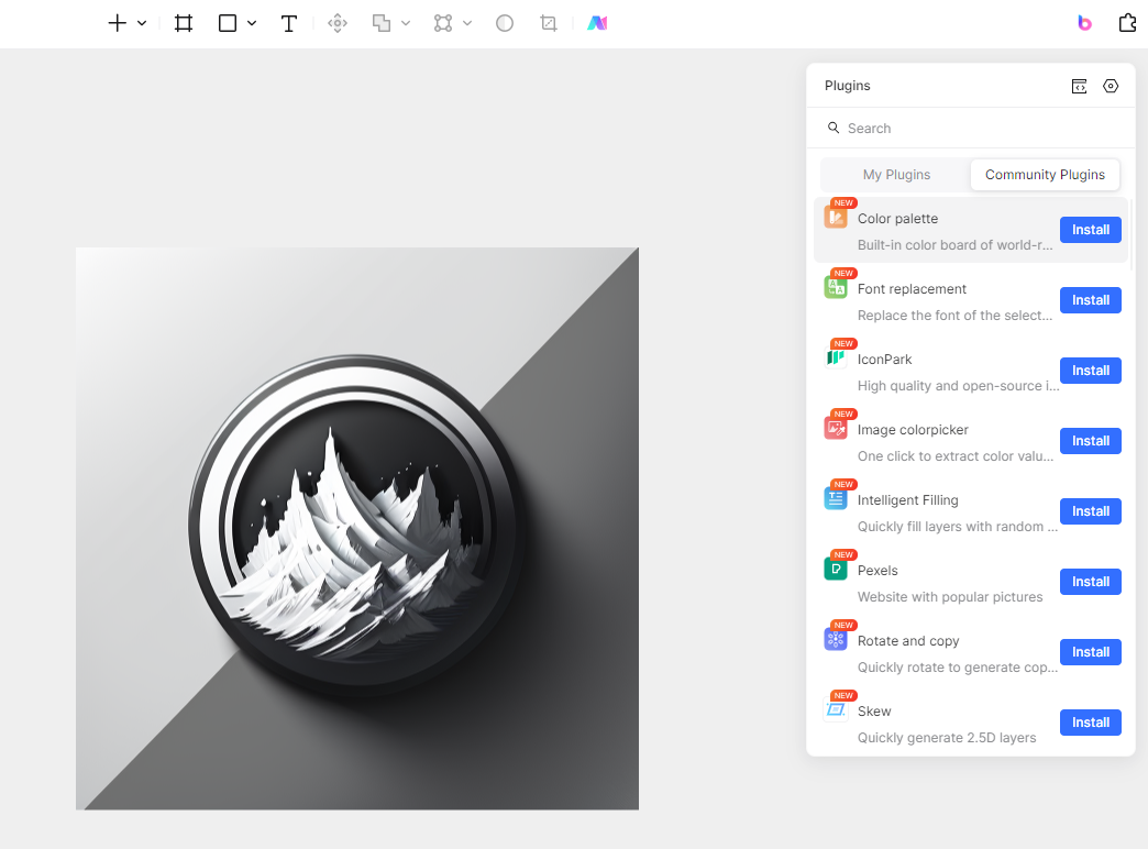
Step 2: Open its fill controls. Select the background layer and open the color control in the Fill section of the right panel.
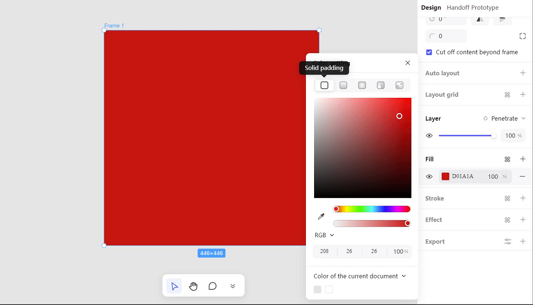
Step 3: Change the fill type. Choose a linear gradient for the event-card example. The fill options shown in the interface also include radial and angle treatments; select the form that matches the intended visual relationship.
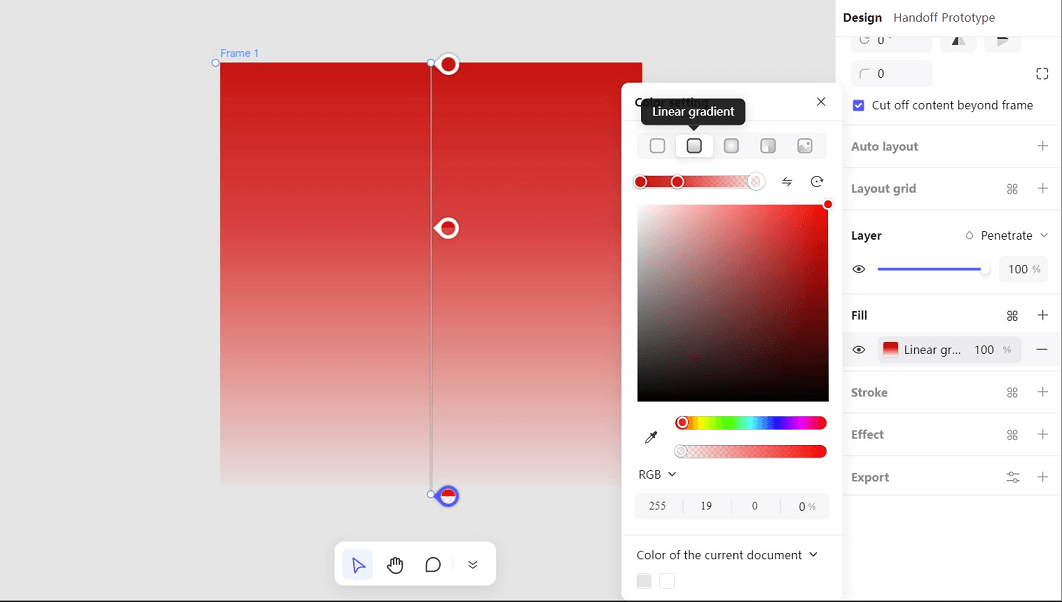
Step 4: Set the stops and direction. Start with two stops, set their colors, and adjust the gradient direction. Move a stop only when it improves the content area; adding more stops is not inherently better.
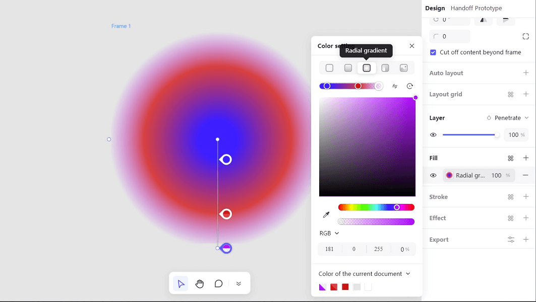
The fill controls also let you experiment with other gradient types. The following radial example shows color stops around a circular transition; it is a different treatment from the linear event-card background.
Step 5: Compare opacity and size. Check the actual surface behind any translucent fill. Duplicate the card at the smaller list size and use the longest likely title. Make sure the action remains distinct from the background.
Step 6: Reuse the finished card. Once the relationship between background, text and action works, make the card a reusable component. Keep content variations visible during review rather than judging the component only with its shortest example.
For handoff, record the gradient type, stop colors and positions, direction and opacity. Then compare the implemented result: the same numeric values can look different when the element’s proportions change.
Choose the Gradient That Makes the Content Clearer
Begin with a purpose, not a trend. A restrained gradient can give an event card or hero a clear focal area; a solid fill may be the better answer for the form beside it. Keep both versions in the Pixso file and review them at the size and with the content people will actually encounter.