Scott
A grid gives a layout repeatable positions for content. It helps you align a heading with a card, keep columns related across pages, and decide how the design should change at different widths. Choose the grid around the content and its hierarchy, then adjust it when the reading experience calls for a different arrangement.
Part 1. What is grid layout design?
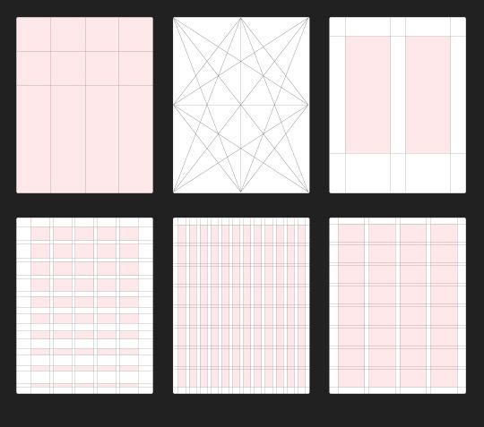
A grid is a system of guides used to organize a layout. A column grid commonly consists of columns, gutters, and outer margins. Other grids use rows, modules, or a single text area. A grid is useful structure, but it is not a requirement for every composition.
Parts of a grid
The terms below describe common grid elements. A particular layout may use only some of them; a single-column article and a modular dashboard do not need identical structures.
1. Format
The format is the area containing the design, such as a printed page or a digital frame. On the web, distinguish the viewport from the content container: the container may stop growing while the browser window continues to widen.
2. Margins
Margins separate the content area from the outer edge of the format. They give the layout room and keep content away from boundaries. Set them with the reading width and available screen space in mind.
3. Flowlines
Flowlines are horizontal guides that establish shared positions for elements or divide the layout into bands. For example, several cards may align their images or headings along one line. A baseline grid serves a different purpose: it aligns the baselines of text.
4. Modules
Modules are the rectangular units formed by intersecting rows and columns in a modular grid. An element can occupy one module or span several. This can help organize repeated content such as a dashboard's charts and summaries.
5. Spatial zones
Spatial zones group neighboring modules into areas for a particular type of content. A large image might span several modules, while supporting text occupies an adjacent zone.
6. Columns
Columns are vertical bands that organize content from top to bottom. Text, images, or cards can fit within one column or span several. The guides mark their edges; the columns themselves are areas, not lines.
7. Rows
Rows are horizontal bands that organize content across the layout. In a modular grid, they intersect columns to create modules. Their height should suit the content rather than force every text block into an identical amount of space.
8. Gutters
Gutters are the spaces between columns or rows. Consistent gutters help repeated items feel related, while a deliberately larger gap can separate groups. Keep the distinction intentional so spacing communicates structure.
9. Markers
Markers establish consistent positions for recurring information such as page numbers or running headers in a publication. Similar repeated positions can help users orient themselves across related digital screens.
Part 2. Why use a grid in UI design?
A grid supports several practical layout decisions:
- Organization: Align related headings, content, and actions so users can recognize which elements belong together.
- Repeatability: Reuse alignment and spacing rules instead of positioning every similar item independently.
- Typography: Give text a deliberate reading width and align it with the surrounding content.
- Consistency: Keep shared regions, such as navigation and content columns, recognizable across related pages.
- Hierarchy: Use differences in position and span to give important content more prominence. The grid supports hierarchy; it does not choose it for you.
- Adaptation: Define how columns combine or stack at narrower widths. A grid still needs realistic content and spacing decisions to avoid a crowded layout.
Part 3. Four useful grid types
Choose a grid by the relationships in the content. These four types provide different starting points:
1. Manuscript grid
A manuscript grid uses one main content area, often for continuous reading. It suits a book page, essay, or article. Set a comfortable text measure and use the margins to position that reading area within the format.
2. Column grid
A column grid divides the content area into vertical bands. A landing page might place text and an image in adjacent spans; a listing page might use repeated card columns. Choose the column count and gutters to support those arrangements rather than adding columns without a purpose.
3. Modular grid
A modular grid adds rows to columns, creating a set of units for arranging content. It can suit dashboards, schedules, or catalogs where repeated items need shared alignment in both directions. Allow content to span modules when its importance or size requires more room.
4. Hierarchical grid
A hierarchical grid uses alignment and proportions chosen around the content's importance. The zones may vary in size rather than follow equal divisions. It can suit a page with a prominent lead story and smaller supporting items, as long as their relationships remain clear.
Part 4. Five practical tips for grid design
1. Define the relationships before the measurements
List the elements that should align, the content that repeats, and the information that deserves the most space. Then choose columns, rows, margins, and gutters that support those relationships. This makes the grid easier to explain and adapt.
2. Test the grid with actual content
Place a long heading, a short heading, a dense paragraph, and a realistic image into the layout. If every sample requires a different exception, reconsider the structure. The grid should serve the content rather than make the copy fit an arbitrary rectangle.
3. Use proportions as a starting point
The golden ratio, approximately 1.618, can suggest an initial relationship between two regions. It is an optional compositional aid, not a rule that makes a UI usable. Compare the resulting widths with the amount of text and the importance of each region.
4. Apply the rule of thirds selectively
Dividing a composition into thirds can help position an image subject or a focal point. For a content-heavy interface, reading order and task priority may be more useful guides. Keep the alignment that supports the page rather than forcing every element onto a third.
5. Plan whitespace and narrow screens
Leave enough space to distinguish groups and keep text readable. At smaller widths, reduce the number of columns or stack related regions in a meaningful order. Check the spacing after the change; a desktop gutter is not automatically the right mobile gap.
Build a grid that can handle the content
Use Pixso to compare a few grid arrangements with the same real content. Keep the version that makes the reading order clear and adapts without awkward exceptions. Document the margins, gutters, and stacking behavior so the layout can be implemented consistently.