Scott
Icons condense an action, object, or status into a small visual form. Good icon design balances recognizability, clarity at the intended size, and consistency with the rest of the interface. An attractive symbol is not useful if people cannot predict what it means.
This guide walks through a practical icon design process, from identifying the concept to checking the exported asset in context. It also explains how to build and review an icon set in Pixso.
What Is Icon Design
Icons appear in navigation, controls, warnings, and application launchers. Their meaning depends on context and familiarity; they are not a universal language. A symbol that is clear to one audience may need a visible label for another.
Icon design is the creation of a visual symbol for an object, action, application, or state. In a toolbar, for example, a magnifying glass may identify search, while a bell may lead to notifications. The surrounding label and placement help establish that meaning.
Decide what the icon must communicate before drawing it. “Delete this file,” “remove this filter,” and “close this panel” are different actions even if each could be represented by an X. The interface must make the consequence clear.
How to Create Amazing Icon Design
In this part, we'll walk through the icon design process and introduce some basic principles as well as a powerful tool for icon design.
Step 1: Get familiar with the object.
Start with the object or action the icon represents. Look at familiar visual references and the conventions already used in your product. Write down what the user should understand or do when encountering the icon.
Compare several references and identify the distinguishing features. For a camera, the lens and body may carry more meaning than small buttons. Preserve the features that help recognition and remove details that will disappear at the intended size.
Step 2: Break it down.
Break the object into simple shapes such as circles, rectangles, and lines. Sketch several versions before refining one. Compare the silhouette first: if the icon needs a tiny interior detail to be recognizable, the construction may be too complex.
Step 3: Start designing!
Choose the size used by the component that will contain the icon. A 24 × 24 px frame is a useful starting example, not a universal requirement. If the product uses 16, 24, and 32 px icons, inspect each intended size and adjust weight, spacing, and detail where needed. Use the pixel grid as an aid, not a reason to distort the recognizable shape.
Step 4: Test your design.
Show the icon in the interface where it will be used. Ask representative users what action they expect, then give them a relevant task. Recognition without context and successful use in a toolbar are different tests. Add a visible label when meaning is uncertain.
Step 5: Tidy up.
Inspect the icon at its actual display size and intended pixel density. Sharpness depends on stroke width, stroke alignment, scaling, and rasterization—not on making every coordinate an integer. Adjust edges and optical balance, then check the actual export rather than trusting inspector values alone.
Step 6: Export your design.
Export the formats your implementation needs. Use a vector asset where supported and raster assets at the required densities where necessary. Open the exported files, confirm bounds and transparency, and test them against the real background. Keep descriptive filenames and a record of the intended size and role.
Principles of Icon Design
Before tackling icon design, several standards and principles are worth knowing. To create good icon designs, you should take a holistic approach to the audience, size, simplicity, lighting, perspective, and style. This section provides a solid starting place for generating icons that function well together and integrate effortlessly into your designs.
1. Build with simple forms
Use a small set of geometric forms to simplify construction. Judge the final silhouette and balance, not just whether every part follows a grid. A small optical adjustment may make a circle or diagonal feel consistent with the rest of the set.
2. Use familiar concepts
Use familiar symbols for familiar actions when they fit your audience. A magnifying glass is a common search cue, but the surrounding control still needs a clear purpose. An unfamiliar symbol makes people learn a new convention before they can act.
Express the brand through weight, corner treatment, and proportion without obscuring meaning. Where a symbol has no established meaning, pair it with text and check comprehension rather than relying on visual novelty.
3. Design the icon at sizes to be utilized
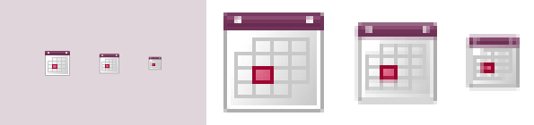
Vector graphics can scale mathematically, but detail and visual weight do not always scale well perceptually. A complex 512 px illustration may become unreadable at 16 px. Review each required output size and simplify small variants where necessary; do not create extra variants without a real display need.
4. Use simple details
Small interface areas leave little room for fine detail. Thin gaps can close up, adjacent strokes can merge, and decorative marks can become noise.
Keep the details that distinguish the concept. Compare the icon at actual size, not only while zoomed in, and check both light and dark backgrounds when your product supports them.
5. Be consistent
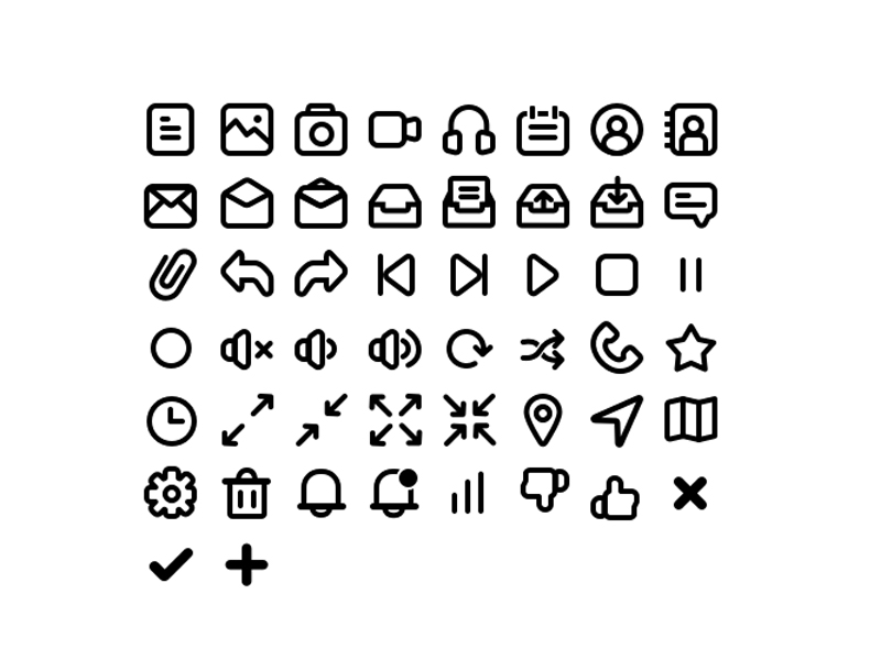
An icon set should share a visual language without making every silhouette identical. Compare stroke weight, corner treatment, filled versus outlined style, and apparent size across the set.
Review the icons together in the component where they will appear. A narrow symbol may need different bounds from a wide one to feel balanced. Consistency is a perceptual goal, not a requirement that every object occupy the same rectangle.
6. Test your work
Test recognition and use with people who represent the audience. A quick teammate review can catch obvious issues, but it does not replace checking unfamiliar or high-consequence icons with intended users.
Ask what the icon means before supplying its label, then observe a task in context. If people expect a different action, change the symbol or label. For icon-only controls, document an accessible name; decorative icons beside equivalent text should not create duplicate announcements.
7. Harmonious Lighting
For dimensional or illustrated icons, use compatible lighting and perspective across the set. Flat interface icons may not need lighting at all. Choose the treatment that supports the product rather than adding shadows simply to make a small control appear more elaborate.

A Powerful Icon Design Tool - Pixso
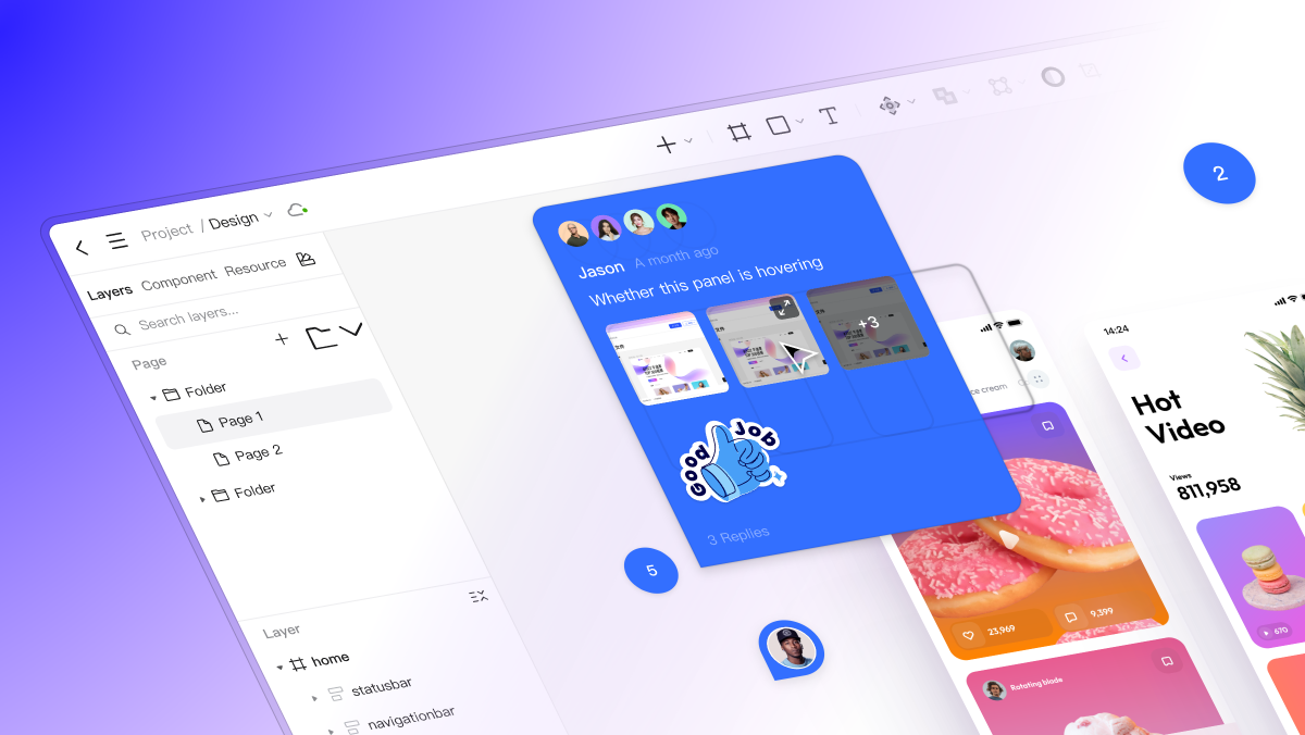
Pixso gives you a shared canvas for constructing and comparing vector icons. Place a small set beside the toolbar, navigation, or form where it belongs, then review meaning and visual balance with your team.
Keep the icon’s source geometry editable while preparing the required output assets. Check the current import and export options for your format, and inspect an imported icon for altered strokes or bounds. Do not assume a successful import means the rendered result is unchanged.
Rich Icon Design Resources in Pixso Community
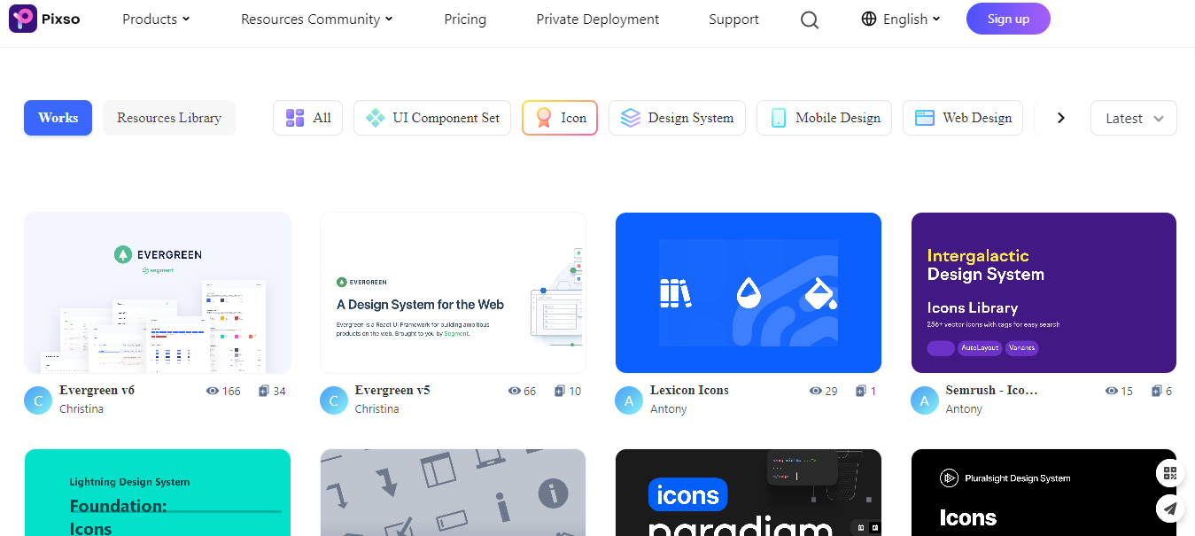
You can also explore the Pixso icon resources for a starting set. Check each resource’s usage terms and whether its style, sizes, and meanings fit your interface. A ready-made library still needs review in the product where people will use it.