
Sherry
iOS app design combines a clear task with familiar platform behavior. The difficult decisions often appear after the first polished screen: a larger text setting, an open keyboard, a long translation or a failed save can change what the user sees and can reach.
Use a UI design workspace such as Pixso to compare those states before implementation. This guide covers principles, views, controls and bars, then applies them to an appointment-booking screen. Apple's Human Interface Guidelines are the primary reference for current platform patterns.

Part 1. What Are the Principles of iOS App Design?
Use these five principles to review how an iPhone interface supports the person's task. Apply them to specific controls, content and transitions, then check the relevant platform guidance.
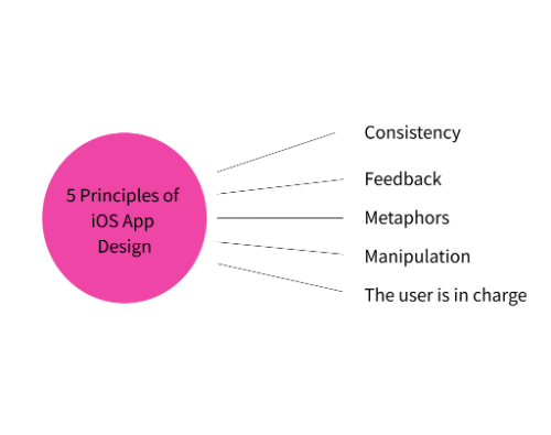
1. Consistency
iOS app design should be consistent, both within the app and outside. This means that even a new user should be able to recognize and predict what elements will do. For example, buttons should offer a clear indication of the action they will perform.
2. Feedback
An app should not leave the user guessing what has happened. Whether it’s visual, audio, or haptic feedback, the iOS design system offers many ways to keep the user informed.
3. Metaphors
iOS UI design should use visual cues to inform users of what elements are. These will frequently relate to real life, like the desktop metaphor in computing, but they can increasingly reference virtual actions, like the ‘share’ icon.
4. Manipulation
Direct manipulation can make a task concrete: dragging an item shows what is moving and where it will go. But a gesture should not be the only way to perform an essential action. Consider a visible alternative and the behavior of assistive technologies rather than assuming everyone can drag precisely.
5. The user is in charge
Let people understand and control consequential actions. Explain what a confirmation will do, provide a way to cancel where appropriate, and preserve useful input when someone returns to an earlier step. Avoid disguising an unwanted action as the obvious next step.
Part 2. How to Design an iOS App: The Interface Essentials
There are three core elements to iOS design: views, bars, and controls. Each should have a clear purpose in the interface.
1. Views
The view is the most important element in the design since this will be the main focus of the user. It will contain the main content they are using or interacting with, such as text, graphics, or interactive objects. As such, it will likely be the dominant feature of the screen.
2. Controls
As the name suggests, the controls are part of the iOS design system that can initiate actions, such as buttons or sliders. They can also offer some feedback, such as a progress indicator integrated with the button.
3. Bars
Bars occupy a hybrid position between views and controls. They can support the view by providing things like navigation or status. But they can also offer some control-like functions, such as offering a toolbar or search.
Part 3. Five Tips and Recommendations When Designing an iOS App
Perhaps the best tip is to read Apple’s Human Interface Guidelines and think about how they have been applied in the apps that you love. That will provide inspiration and understanding that can inform your design. However, here are some general, important tips for iOS app design.
1. Design for humans holding the device
Always think about how people will use the app. Consider how people hold their phones and how they reach the controls. Is everything within thumb reach? Or will simple, but necessary, actions require a difficult stretch or a second hand?
2. Make sure the UI adapts
Review changes in available width, orientation, appearance and text size. A row that fits at the default size may need to become a vertical group when text grows. Keep the relationship between the label, value and action clear instead of shrinking text to preserve one screenshot.
3. Use points, not pixels
Specify interface dimensions in logical points and export raster assets at the density the implementation needs. Points do not automatically make a layout adaptive. Review the implemented app on supported device sizes and in the simulator, including text enlargement and the on-screen keyboard.
4. Inform at a glance
You should endeavor to make sure your UI contains enough, but just enough information, that the user only needs to glance at it. Aside from being a smaller screen, which can look cluttered, users may be using your app while doing something else. Ensure you use bars and controls effectively to allow them to do that.
5. Keep it focused
Use features like pop-up warnings or notifications only when necessary, and always offer a clear route for someone to cancel an action. As the Human Interface Guidelines say, your iOS app design should be there to serve humans, not to annoy them with alerts or frustrate them with irreversible options.
Worked example: an appointment screen that survives real settings
Suppose a patient chooses a clinic, date and available time, then reviews the booking. The screen has a navigation title, a list of slots and a confirmation action. Begin with the important content: the clinic, date, time and any preparation the person must understand before confirming.
| Condition | Design decision | Failure to look for |
|---|---|---|
| Larger text | Let the clinic name and slot descriptions wrap; stack secondary information if needed | Clipped names or a time separated from its date |
| Keyboard open | Keep the active note field and a way to continue reachable | The keyboard covers the only confirmation action |
| System bars and hardware cutouts | Respect the relevant safe areas around essential information and controls | A bottom action is difficult to use or obscured |
| Dark appearance | Review text, surfaces and selected-slot contrast together | A selected time is distinguishable only by a subtle color change |
| No slot available | Explain the empty date and offer another date | An empty list that looks unfinished or broken |
Apple's layout guidance explains safe areas as regions that protect content from hardware features and surrounding interface elements. Its accessibility guidance recommends supporting larger text, including through Dynamic Type. In your design file, show the consequences for this booking task; in the native app, verify the actual behavior.
Also review the information someone hears with VoiceOver. A visually adjacent date and time can still be announced in an unhelpful order if the implementation groups them poorly. Ask the development team to test whether each slot's label communicates its date, time and availability, and whether selection is announced. A static mockup cannot confirm accessibility semantics.
Part 4. Four iOS App Examples That Will Inspire You
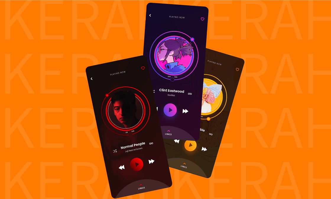
The four examples below show different approaches to content and controls. Treat the screenshots as design references rather than a record of each app's current version. Examine how the layout supports its particular task.
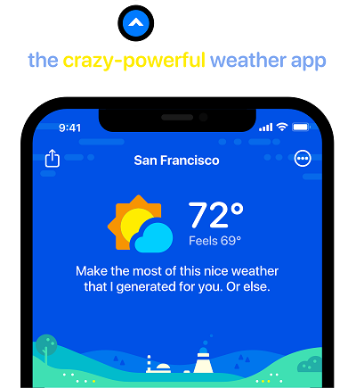
Carrot Weather
In the Carrot Weather example, compare the prominence of current conditions with secondary forecasts. The useful design question is which information a person needs immediately and which can wait for closer inspection.
Slopes
In the Slopes example, inspect how activity information is grouped and how a person moves from an overview to detail. For an outdoor activity, the legibility of important values matters more than filling every available area.

Darkroom
The Darkroom example gives the image a large working area while keeping editing controls available. Compare the visual weight of the content with the controls, and consider how someone knows which adjustment is active.

Toca Life World
The Toca Life World example is useful for a different reason: the scene itself invites exploration. Consider how visual cues distinguish interactive objects from decoration without assuming that every player will discover the same gesture.

Bonus. Review the iOS app flow in Pixso
Create the appointment list, selected slot, review and unavailable-slot states in one Pixso file. Duplicate the key screen for larger text and a narrow layout, keeping the same clinic name and dates. Reusable components help compare the same control across states rather than redrawing a slightly different version each time.
Connect the screens into a prototype to discuss the booking sequence. Leave implementation notes for keyboard behavior, safe-area handling and accessibility labels beside the affected frame. Use comments to resolve specific questions, such as what remains selected after a slot becomes unavailable.

Conclusion
A useful iOS design review asks whether the person can complete the same task under different device and accessibility settings. Keep the central information visible, make controls predictable, and test the implemented app where a design file cannot establish behavior. The goal is not an immaculate default screenshot, but a booking that remains understandable from selection to confirmation.

![[Full Guide] Expand Collapse UI Design](https://pixso.net/assets/editorial/20261006/refresh-6665/refresh-6665-en-accordion-shipping-hero-8f07cac4a9ce.webp)


